Design
Biophilic Graphic Design Trends in 2026 (Pro Tips & Examples)

March 9, 2026
February 5, 2025

Nature brings the aesthetics of a website.
What if your brand stays behind in the technology race as every business is passing through a sustainable era of web design?
Maybe a biophilic graphic design idea sparks your insights on this.
Let’s talk about the upcoming trends of biophilic graphic design.
Additionally, we’ll cover expert tips on how to go for a sustainable biophilic graphic design.
What is Biophilic Design?
Biophilic design is an architectural approach that leverages natural elements into human spaces to foster a connection with nature.
The concept of biophilia, derived from the Greek for 'love of life or living systems,' reflects our intrinsic affinity for the natural world.
Traditionally, a concept in architecture that introduced features like indoor gardens and open terraces, biophilic design is now shaping digital environments as well.
Web designers can cultivate a sense of peace, focus, and harmony by using nature-inspired imagery, organic forms, and warm, earthy colours.
Let’s see what’s trending.
Biophilic Design for Sustainable Web Design Trends in 2025
1. Lightweight Scripts Boost Speed and UX
By the year 2025, the adoption of lean coding principles and optimized scripting techniques will become increasingly common in the mainstream development landscape.
Long and complex code raises server load times, reduces web browsing speed, and results in increased energy consumption across digital platforms and networks.

The key solution is to write code that remains both simple and efficient.
Though it may take time and effort, optimizing coding methods is certainly an essential move toward fostering a more eco-friendly network.
A great way to initiate the streamlining process is by conducting an audit focused on green coding.
This process helps detect redundancies and inefficiencies in coding, making it easier for you to eliminate excess clutter effectively.
2. Green Hosting Balances Power and Efficiency
Hosting website files on conventional servers consumes a significant amount of energy.
However, eco-friendly hosting lowers energy consumption by relying on renewables and positioning data centres closer to end users.
Green servers minimize data transmission distances, significantly saving energy.
Without question, they contribute positively to a more eco-conscious digital environment.
The adoption of virtual private servers (VPS) is growing rapidly among shared hosting users.
They adapt and distribute resources dynamically as needed without interference from other users' operations.
This allows for greater efficiency and performance while remaining cost-effective.
Green hosting and VPS not only decrease your website's energy consumption but also boost its speed efficiently.
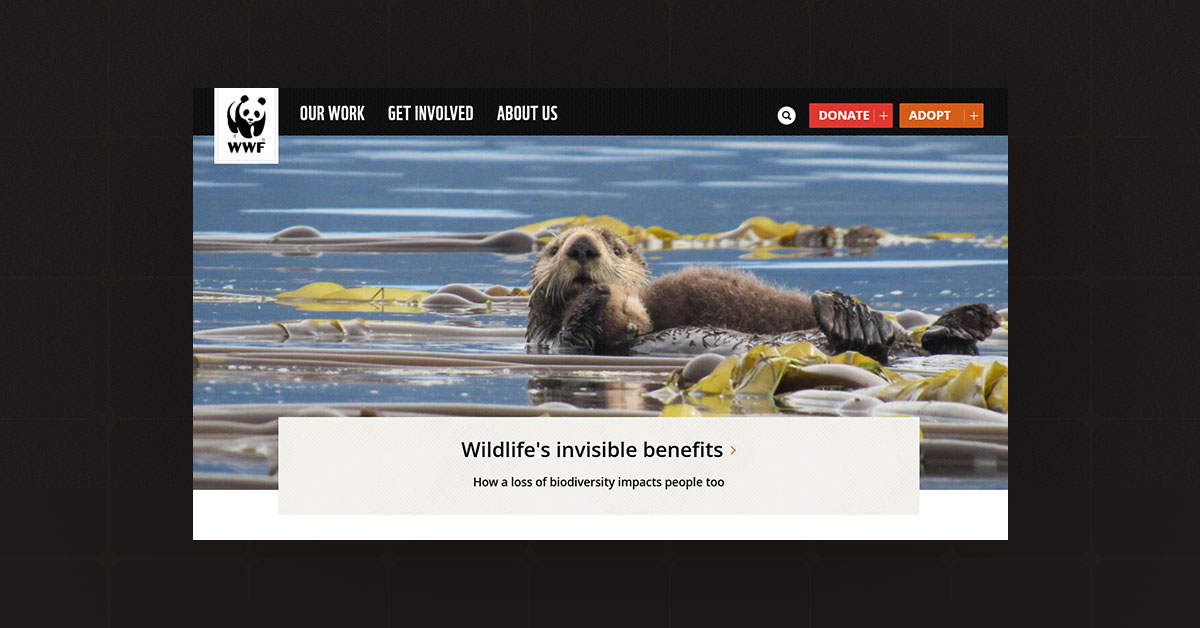
Top organizations, including WWF, have adopted environmentally friendly hosting solutions. They maintain their websites on eco-friendly servers using renewable energy sources.
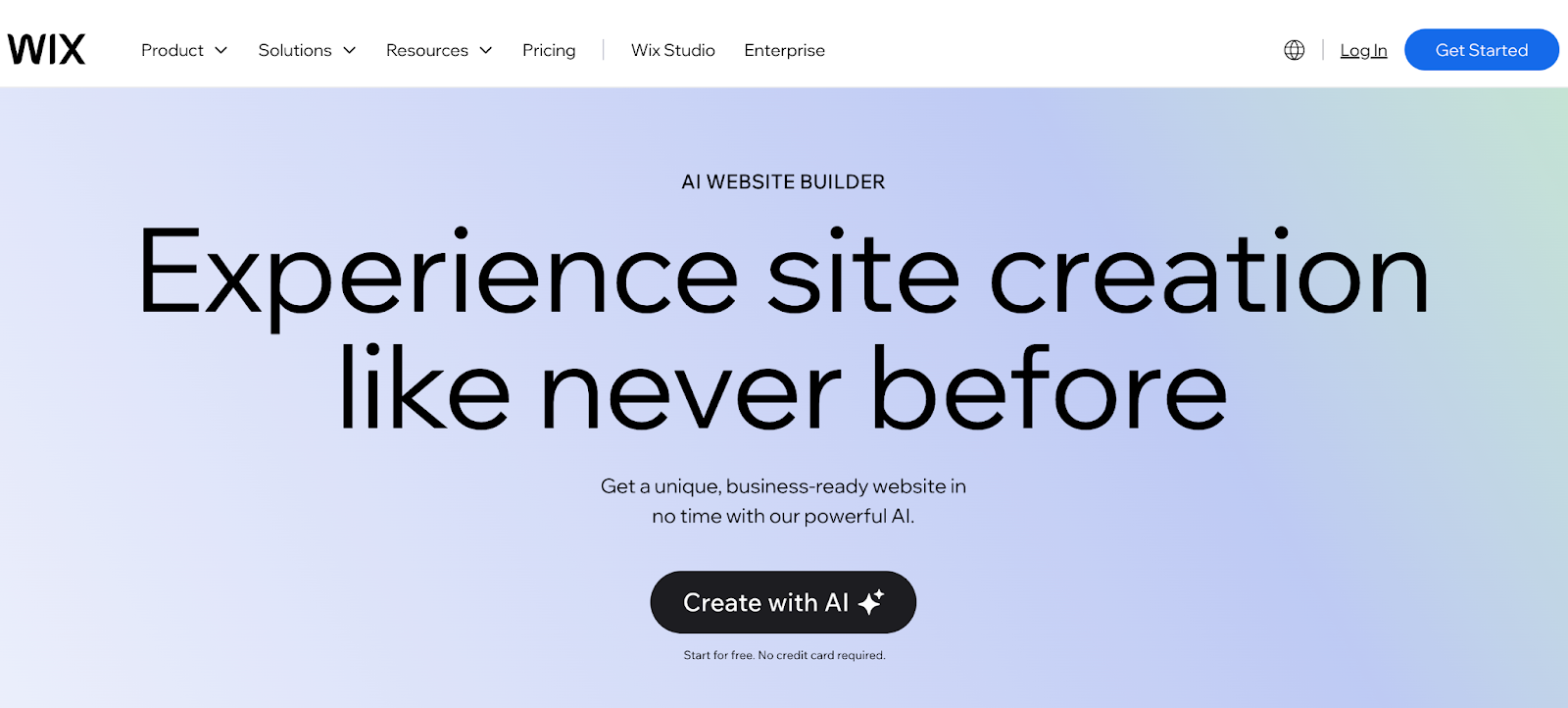
3. AI Automates and Personalizes Web Design
AI-based web design tools assess your taste and generate compelling website templates customized just for you.
Then, they will continuously modify the design based on your desired adjustments.
This process, which once demanded hours or even days, has now been reduced to a few convenient clicks for efficiency.
Moreover, beginners diving into web design can find numerous instructional videos and text-based explanations, offering them an easy way to develop essential design knowledge and hands-on skills.
Nowadays, with AI-driven website builders like Wegic, Wix, and Squarespace, you can effortlessly design and generate a highly customizable website in minutes.
4. Dark mode Enhances Visual Depth
The role of colour in web design remains vital, bringing a new sustainability-focused development trend in 2026 for environmentally conscious digital experiences. Dark shades and pastel hues are widely preferred by designers.
In addition, these colours not just for trends but also for their ability to decrease screen brightness needs and enhance energy efficiency.
Black, dark green and rich red are becoming the most fashionable choices in design.
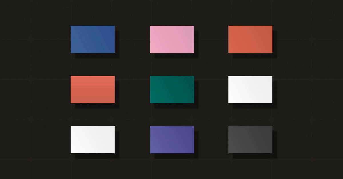
This design seamlessly blends style with sustainability while improving pixel energy efficiency, establishing itself as a model for eco-friendly design practices.
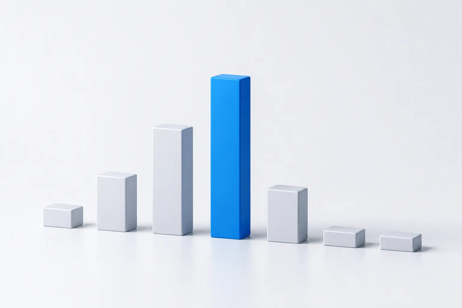
As per Google’s data, dark mode usage significantly lowers power consumption by up to 63%.
Consequently, dark design functions as both a stylish innovation and a growing sustainability trend in user experience design.
This strategy not only conserves energy but also creates a visually stunning and contemporary design experience.
5. Efficient images Boost SEO
By 2025, more brands are expected to replace high-resolution images with energy-efficient options to reduce environmental impact.
SVG-style illustrations, known for their signature "grainy" appearance, are a smart choice for energy-conscious brands aiming for efficiency.

Compared to traditional raster and photographic images, vector images use fewer pixels, have smaller file sizes, and better align with sustainable web design.
As technology advances, vector-style illustrations may steadily replace traditional high-resolution images. Half-tone illustrations are appearing more frequently on websites, marking a shift toward energy-efficient web design. This trend speeds up websites and saves energy, benefiting both users and servers.6. Responsive Design Enhances Accessibility
The mobile-first design drives the 2025 Green strategy by reducing heavy content, improving small-screen browsing, and saving energy with Night Mode.
Designers first optimized small screens, then expanded to larger ones, improving creativity and boosting design efficiency.
The mobile-first strategy helps designers prioritize key content and actions before expanding to larger screens.
As demand grows, UX designers are naturally prioritizing small-screen design for a better user experience.
Statistics says mobile searches surpass 64% as businesses are embracing mobile-first design to enhance user experience.
Besides, voice search reduces energy use since users can get answers without loading full web pages.
In short, mobile-first design is a strategic choice that enhances user experience and drives web design toward a more sustainable, energy-efficient, and eco-friendly future.
7. Minimal Dependencies Ensure Longevity
In 2025, minimalist design will return as a dominant trend, shaping cleaner, faster, and more user-friendly digital experiences.
Beyond its visual appeal, it significantly reduces website energy consumption, improving performance and sustainability.
Cutting down files on the login page enhances site speed, reduces load time, and strengthens your digital footprint for a better user experience.
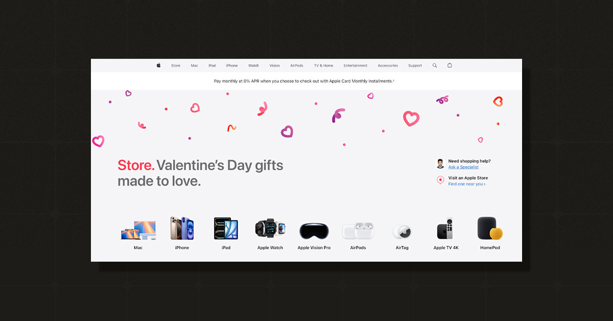
Minimalist design not only enhances aesthetics but also drives higher user spending, leading to better conversions and customer retention.
Apple, a pioneer of minimalism, drives user experience trends with smart white space usage, simplifying navigation while balancing beauty and sustainability.
How to Execute Biophilic Design in Digital Media
So far, you have earned the knowledge of biophilic graphic design trends and how it’s shaping the graphic design era.
Now, it's time to implement it in your next project.
Let’s do it professionally!
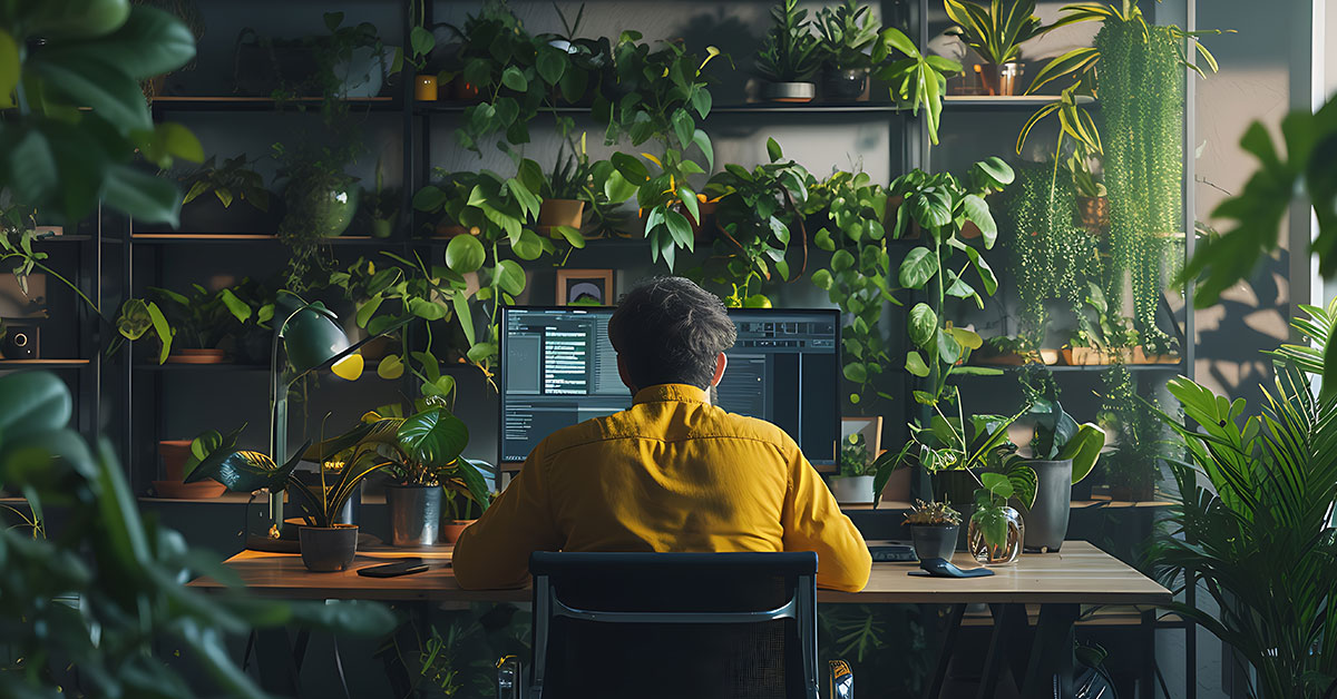
1. Use High-quality Nature Photos for a Better Look
Choose sharp, high-resolution images of landscapes, rivers, or dense natural forests.
These images can enhance hero sections, sliders, or soft and subtle background elements.
2. Apply nature-based Colours To Feel Fresh
Use greens, browns, blues, and soft natural shades. Avoid bold, unnatural colours that disrupt the harmony of a natural theme.
3. Keep Organic Shapes
Use rounded, flowing shapes instead of sharp edges and geometric designs. This makes the design look more natural and organic.
4. Bring Life to Your Design
Add subtle animations that mimic nature, like water gently rippling or leaves moving gracefully with the breeze.
5. Use natural textures for real depth
Choose textural designs that reflect materials like stone, wood, or woven fabric for a natural feel.
Use these textures in backgrounds, buttons, or overlays for visual interest.
6. Enrol Nature Nounds Like Birds or Water
Incorporate calming nature sounds such as birds chirping or ocean waves. Provide users with a mute option for these sounds if needed.
7. Integrate with minimalism for simplicity
Minimalist layouts and biophilic design work together, showcasing nature-inspired elements without cluttering the user experience.
Final Thoughts on Biophilic Graphic Design
The biophilic design uses calming imagery, natural animations, and earthy colours to reconnect users with the natural world in digital spaces.
More than a trend, it’s a design philosophy that connects deeply with our instincts and emotions.
So folks!
Ready to add nature to your website? Let’s collaborate on a biophilic design that captivates users, increases engagement, and distinguishes your brand.
Contact us now to begin your biophilic design journey!