Design
15 Best High Converting Landing Page Templates for SaaS Marketing Companies

January 4, 2026
March 19, 2025

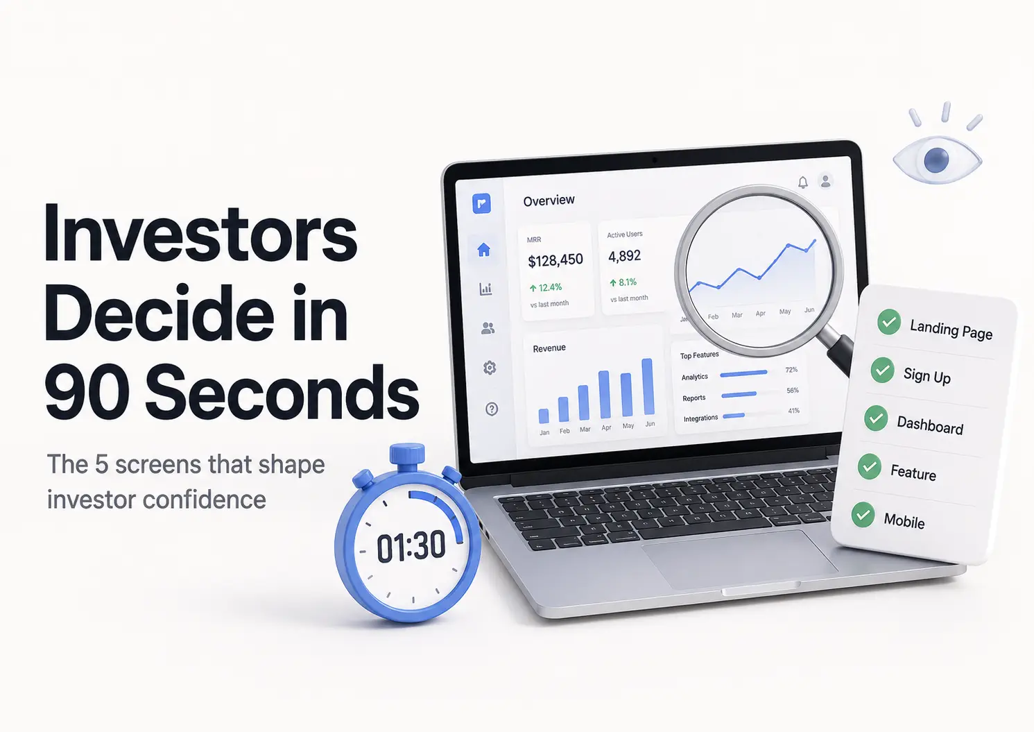
A great SaaS landing page turns curious visitors into happy customers!
Your brand's journey starts when potential customers see an ad or social post or hear a friend's praise.
With some luck, they'll head straight to your landing page, eager to explore.

While conversion-driven landing pages are common, SaaS pages also aim to augment sign-ups, educate users, boost engagement, and enhance customer lifetime value.
We've explored some of the most effective SaaS landing pages that target lead, announcement, and adoption.
Let's explore their main focus and how you can apply their strategies.
Let's dive in!
High Converting Landing Page Templates
1. Ofspace Digital Agency

We’re not trying to hype ourselves up, but visiting our landing page could be just what you need for some fresh insights.
As an example, we merge a precise value proposition with a minimal contact form, optimizing the SaaS landing page for a seamless visitor experience.
Another thing you’ll notice is that we gather company details to personalize the demo and better address the lead’s needs in advance.
You’ll observe that we’ve added our case studies and team member pictures to our landing page to make it more engaging and personable.
Notable Features on Spotlight
- Minimal words, maximum impact
- Centralized contact form for conversions
- Trust-building customer testimonials
- Genuine visuals strengthen connections
- Tailored interactions boost relevance
2. Airtable
.webp)
Airtable ensures each product has a dedicated SaaS landing page, clearly highlighting key features.
A minimal hero section and structured content guide users to the CTA, showcasing core benefits and product visuals.
Notable Features on Spotlight
- Minimal and structured header design
- Core benefits brought into focus
- Real-time product display
- DIY guides for customer assistance
3. Asana
.webp)
Asana’s landing page uses whitespace and a refined color palette to make the CTA stand out. It features product demos and highlights key features with internal links for seamless navigation.
Notable Features on Spotlight
- Direct and visible call-to-action
- Headlines prompting immediate user action
- Essential product aspects are visibly emphasized
- More content for detailed exploration
4. WeTransfer
.webp)
WeTransfer enhances user engagement with a clean landing page design, using concise microcopy and a simple font for clarity.
A bold black CTA button leads visitors directly to pricing and subscription details.
Notable Features on Spotlight
- Minimal wording
- Cohesive CTAs
- Graphics-focused
- Subscription box
5. Bitly
.webp)
Bitly’s high-converting landing page blends informative content with clean spacing and eye-catching illustrations. The contrasting CTA button improves visibility and subtly influences users to take action.
Notable Features on Spotlight
- Clean layout
- Bold action button
- Value-driven points
- Verified testimonials
6. Hubspot
.webp)
HubSpot’s landing page maintains a strong CTA strategy with a bright orange button that encourages action.
It enhances credibility with awards, testimonials, and support tools like chatbots and FAQs for instant assistance.
Notable Features on Spotlight
- Real-time support
- Interactive demo
- Market leader status
- Real user feedback
7. Miro
.webp)
Miro’s high-contrast landing page highlights an animated demo and a standout yellow thumbnail to capture interest.
A strategically placed blue CTA button and testimonials improve navigation and credibility.
Notable Features on Spotlight
- Clean and impactful layout
- Well-defined page layout
- Miro’s competitive advantages chart
8. Loom
.webp)
With a multimedia-rich design, Loom’s landing page boosts conversions by prioritizing video content.
It highlights essential product features while emphasizing cross-device compatibility with mobile and web screenshots.
Notable Features on Spotlight
- Prioritizes media elements
- Feature demonstrations
- Business applications
- Community engagement stats
9. Wistia
.webp)
Overview
To maximize effectiveness, Wistia applies essential best practices, including a singular, distraction-free CTA, high-contrast backgrounds for button clarity, and smart interlinking to relevant product integrations.
Notable Features on Spotlight
- Focused call-to-action
- Bold background emphasis
- Smart navigation links
- Virtual chat assistant
10. Figma
.webp)
Figma’s high-converting enterprise landing page combines personalization with a sleek, vibrant design.
Business-focused content, compelling CTAs, and customer success stories drive engagement and trust.
Notable Features on Spotlight
- Tailored user experience
- Success-driven case studies
- Research & learning tools
- Well-defined value points
11. Canva
.webp)
Canva optimizes its SaaS landing page with minimal text and high-impact visuals. A rich violet CTA button and user-friendly design process make logo creation effortless.
Notable Features on Spotlight
- Easy-to-spot CTA
- Visual product screenshots
- Inspiring logo templates
- Clear instructional process
12. Zoom
.webp)
Designed for ease of use, Zoom’s landing page organizes industry-specific sections for quick navigation.
Personalized videos, data-driven insights, and tailored benefits highlight its value for businesses.
Notable Features on Spotlight
- Industry-specific solutions
- Real stats, real impact
- Helpful learning materials
- Proven client achievements
13. Shopify
.webp)
Shopify’s high-converting landing page keeps things straightforward with clear copy and trust-building testimonials.
A step-by-step process ensures new users can start selling with confidence and ease.
Notable Features on Spotlight
- One clear goal
- A clear call-to-action
- Easy-to-follow steps
- Consistent branding style
14. Monday
.webp)
With real-time customization, Monday tailors the user experience for efficient project management.
The landing page includes key stats to help users compare software options easily.
Notable Features on Spotlight
- Effortless site navigation
- One button, one move
- Custom experience for users
- Data-backed credibility
15. ExpressVPN
.webp)
Designed for high engagement, ExpressVPN’s landing page uses SEO-friendly structure and smart CTAs.
It organizes content with game categories and subpages, ensuring easy navigation and strong conversions.
Notable Features on Spotlight
- Tailored visuals and messaging
- Granular customer segmentation
- Strategic action prompt
- User-focused visual elements
Key Elements on a SaaS Landing Page
You'll find that most SaaS landing pages out there share a few essential components.
Alright, let's get to it. Here are the elements that make up most landing pages.
1. Hero Section
The hero section is the first visible part of a SaaS landing page. It must quickly provide key information to engage users and prevent them from leaving.
2. Features
The features/benefits section is crucial for SaaS landing pages. A detailed comparison table of subscription tiers is the most effective.
3. Social Proof
Social proof on SaaS landing pages convinces users to sign up. Use testimonials, notable customers, ratings, or case studies.
4. Contact Form
A contact form is essential. Not everyone is ready to hit “Start free trial,” but positioning a form lower on the page can capture those on the fence.
After submission, nurture them with an automated onboarding flow—this SaaS email marketing guide breaks down the first three emails to send and when.
5. Demo Video
Product demo videos are fantastic for showing off what your product can do and solving user problems.
They're super important for complex products that are hard to grasp.
6. Clear Call-To-Action(CTA)
Think twice before using multiple CTA buttons—they can be distracting.
Ready To Grow Your SaaS Landing Page?
As long as your landing page has social proof, super clear CTA buttons, and a SaaS product that's actually worth using, you should have no problem getting potential customers to click that button.
You can only continuously improve your SaaS website's copy and overall design until potential customers become paying customers.
We ofspace has retained the web design market as a lead design agency.
Ready to give your users the best experience possible? Get your free Ofspace demo today!
Get a strategic call if you need any assistance with landing page design.
It's free and candid!

FAQ on High Converting Landing Page Templates
How do you make your landing page high converting?
Focus on a user-friendly design, clear headlines, and a strong CTA. Keep it simple and ensure the navigation is intuitive.
What are the best converting landing page colors?
Red and orange buttons often perform well, but it depends on your audience and brand. Test different colors to see what works best for you.
How do you improvise a landing page for conversions?
Optimize the copy and design. Highlight key features, address pain points, and ensure the CTA stands out. Consistency with your pre-click experience is also crucial.
How do you make an impressive landing page?
Use an engaging hero section with a well-crafted headline. Ensure the design is visually appealing and matches your brand identity. Highlight benefits and keep the design minimalistic.