Design
How to Simplify a Complex SaaS Product Without Removing Powerful Features

September 14, 2026
September 14, 2026
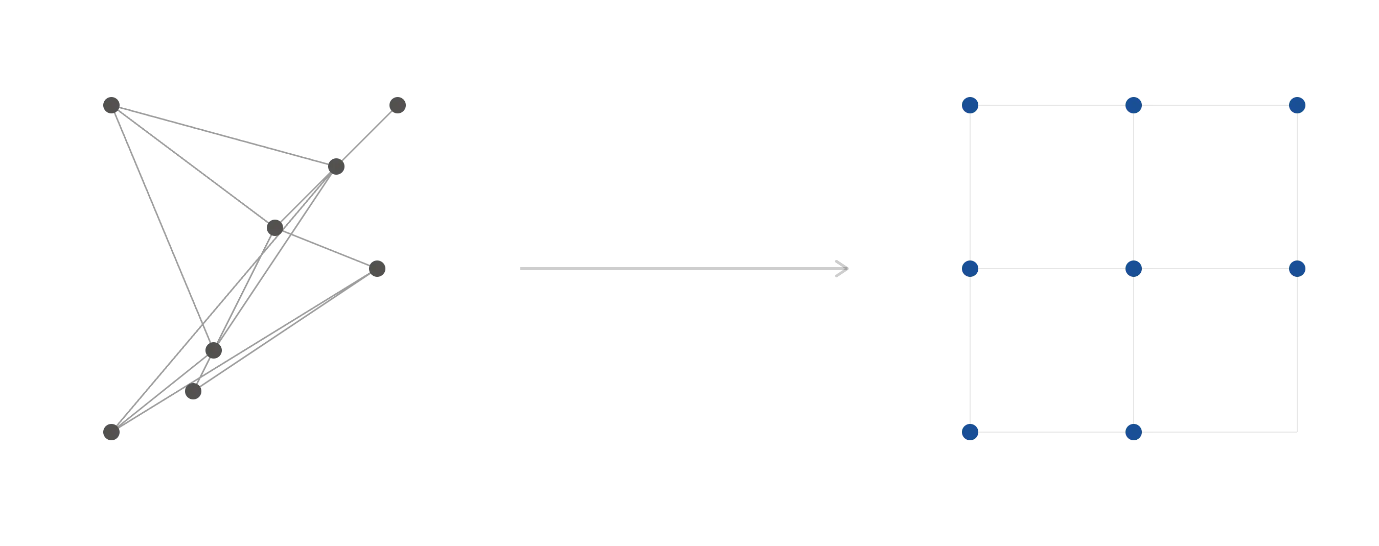
A SaaS product doesn't get complex because of bad decisions. It gets complex because good decisions pile up without a structure to hold them.
Reporting, permissions, and automations each solve a real problem. The trouble starts when users have to understand all of them just to complete a simple task.
The instinct is to cut features. That's usually the wrong move.
The real fix is diagnosing where complexity actually lives, workflow, information, interface, configuration, decision, or terminology, before changing anything.
Get that wrong, and you simplify the part that was never the problem.
Why SaaS Products Become Harder to Use
Three things usually compound:
1. Features ship faster than the structure gets updated.
Each addition solves a real problem on its own. Nothing goes back to fold it into the existing workflow.
2. Teams build for their own users, not the whole product.
A permissions system built for enterprise admins and a reporting tool built for analysts both make sense on their own. Together, they add paths a single user never touches.
3. Nothing gets removed.
Cutting something is riskier than adding something, so unused paths stay live indefinitely, and every new addition lands on top of them.
None of this shows up as one broken screen.
It shows up as simple tasks needing multiple workflows, valuable features going undiscovered, new users needing heavy guidance, and every role carrying complexity built for someone else's job.
That's why we diagnose by type, not by symptom.
A crowded screen and a confusing setup flow can look identical from the outside and come from entirely different causes.
Necessary vs Accidental Complexity
Not all complexity should be removed. Some of it exists because the problem itself is complicated.
A finance platform needs compliance rules. An enterprise CRM needs permissions.
An analytics tool needs advanced filtering. Remove this and the product stops solving the problem it was built for.
Accidental complexity is different. It's complexity the user carries that the product's own structure created, not the problem itself.
A technical setting before a basic task. A workflow split across screens because of internal architecture, not the task.
Two teams seeing the same interface despite needing different things from it.
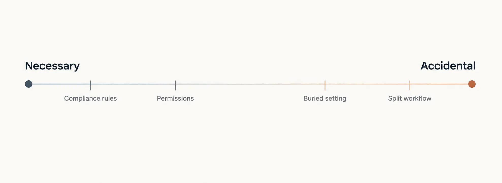
The test: if removing it makes the product less capable, it's necessary. If removing it only makes the internal structure less visible, it's accidental.
Getting this wrong in either direction has a cost. Cut necessary complexity, and you lose a customer segment that depended on it.
Leave accidental complexity in place, and users keep carrying friction the product should have absorbed.
Find Where the Complexity Comes From
Before simplifying anything, identify which type of complexity is creating the friction.
We use this as a working audit across six areas.
1. Workflow
Simple tasks span too many steps or screens. Fix the process before the interface.
2. Information
Priorities get lost in the data shown. Fix hierarchy and filtering, not just volume.
3. Interface
Users can't find or understand actions. This usually means navigation that doesn't match how people think about the task, actions buried in menus instead of surfaced where the work happens, or inconsistent patterns that force users to relearn the product screen by screen.
Fix discoverability and structure, not just visual polish.
4. Configuration
Setup delays value. Fix with defaults and templates, without stripping advanced options.
5. Decision
Users don't know the right choice. Fix with guidance and context, not fewer choices.
6. Terminology
Product language doesn't match user language.
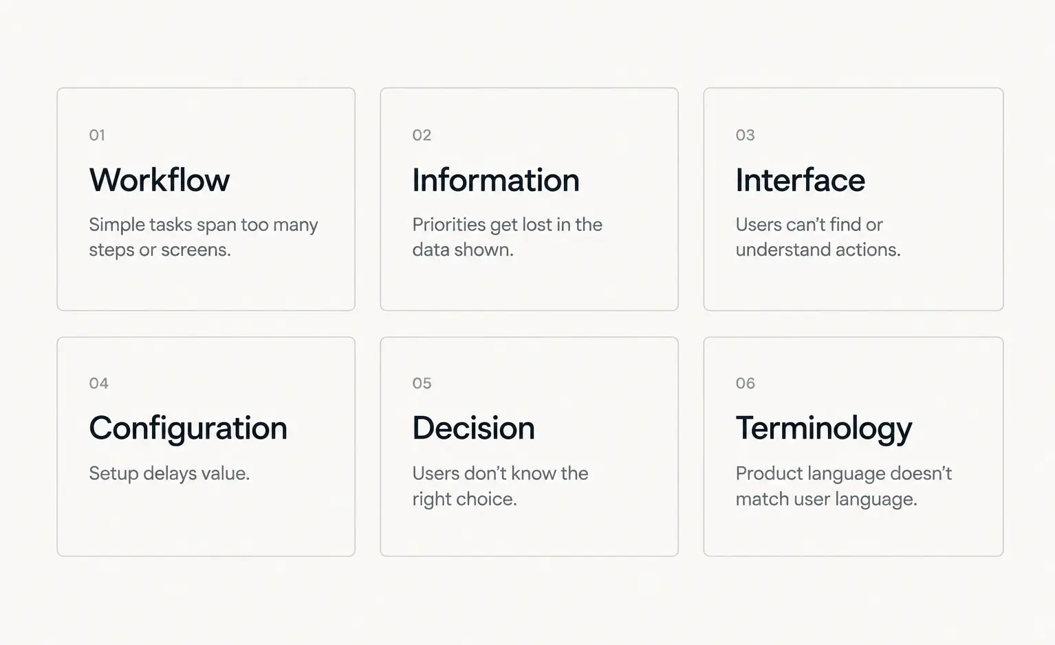
Most products show friction in two or three of these, not all six.
Choose the Right Simplification Technique
Each technique solves one type of complexity. Used on the wrong type, it hides the symptom and leaves the cause in place.
Decision complexity
Defaults and recommendations. Use when most users would choose the same thing anyway.
Trade-off: a default tuned for the average user can frustrate a segment that doesn't fit it, so the underlying choice still needs to stay reachable.
Configuration complexity
Templates and presets. Should speed up the common path, not remove flexibility advanced workflows still need.
Information complexity
Progressive disclosure. Not a fix for decision complexity: applied to a confusing decision instead of an overload, it just delays the same confusing choice.
Interface complexity
Restructured navigation and surfaced actions. Users can find things but can't act on them where the work happens.
Move actions closer to the task, don't add a search bar to compensate for the structure underneath it.
Terminology complexity
Language that matches how customers describe the work.
Beginner/expert mismatch
Role-based views, when one group's clarity is another group's missing tool.
Design for Beginners Without Slowing Down Experts
A complex product has two types of user with opposite needs.
Beginners
Are working through decision complexity: too many unfamiliar choices, not enough context.
They need guided workflows, defaults, templates, and explanations timed to the moment they're needed.
Experts
Already solved that problem. They need speed: dense information, advanced controls, custom views, saved configurations.
One simplified experience fails both. It under-serves experts and doesn't resolve the beginner's decision complexity, it just delays it to later.
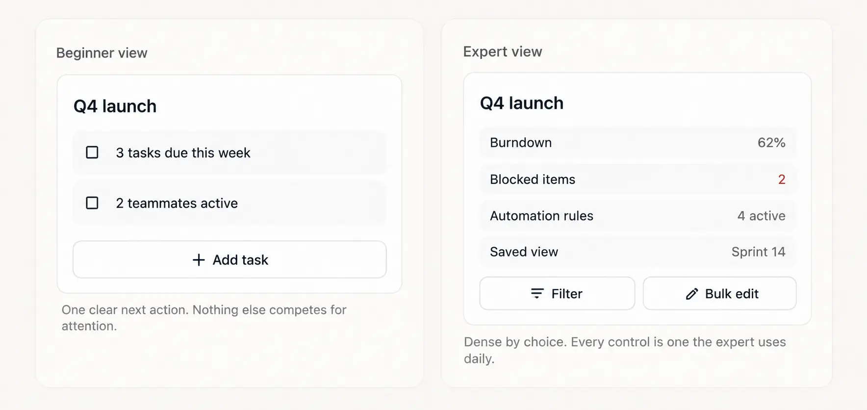
The fix is layered complexity
A guided path by default, deeper controls reachable as soon as someone needs them.
Progressive disclosure and role-based views do this, but they cut both ways:
- Hiding a rarely-used control lowers confusion for a beginner.
- Hiding a control an expert uses daily adds friction back, and it usually surfaces as a support ticket, not a complaint about the redesign.
The goal isn't less complexity. It's matching the complexity shown to the person doing the task.
Applying the Framework: Worked Example
A hypothetical project-management tool: new users abandon setup before creating their first task.
Same symptom, three possible causes.
Run the audit:
- Too many steps to start → workflow complexity
- Too many choices before value → configuration complexity
- Unclear which project type to pick → decision complexity
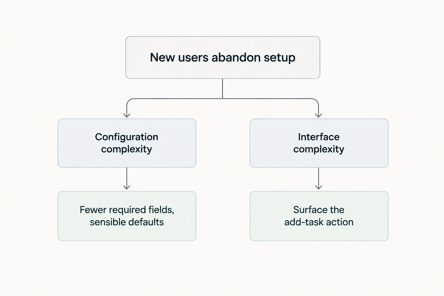
If setup requires ten fields before any value appears
That's configuration complexity. Fix: fewer required fields, sensible defaults, a working example to edit instead of a blank state to fill in.
If users finish setup but can't find where to add a task next
That's interface complexity, a discoverability problem, not a configuration one.
Same symptom, different cause, different fix.
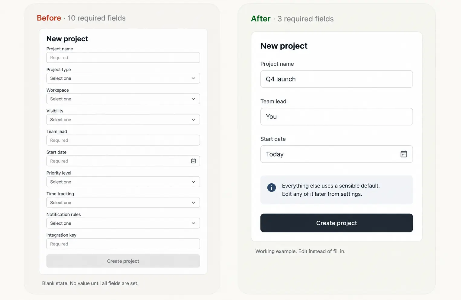
The fix isn't free.
Removing a required field means checking what already depends on it, reports, automations, integrations built on the assumption it's filled in.
Diagnosis takes an afternoon. Confirming nothing breaks takes longer.
Diagnosis tells you what's wrong. Deciding what to do about it is a product, design, and engineering call, not a design call alone.
Measure Whether It Worked
A simpler product should be easier to use, not just easier to look at. Measure the specific complexity type you changed, not the product in general.
Fixed workflow complexity?
Track whether key tasks now take fewer steps. Fixed configuration complexity?
Track setup time and where onboarding drops off. Fixed decision complexity?
Track whether users pick the right option without support.
Beyond that: task completion, time to first value, error rate during critical workflows, and support requests for the specific confusion you targeted.
If the change touched a capability customers actually use, feature adoption and retention are worth watching over a longer window, since unused capability is capability people eventually stop paying for.
That's a pattern worth tracking, not a guarantee.
One caution: fewer clicks isn't automatically better. A shorter workflow that strips necessary context just moves the confusion somewhere else.
The goal is removing accidental effort, not removing steps for their own sake.
Final Takeaway: Make Complexity Easier to Navigate
A complex SaaS product doesn't need fewer capabilities. It needs a clearer structure for how users reach them.
Diagnose first: workflow, information, interface, configuration, decision, or terminology.
Then choose the response that fits that type, not the one that's fastest to ship.
Defaults and templates aren't neutral, they trade average-case speed for edge-case friction, and that trade-off is a decision, not a formality.
Some of what looks unnecessary is actually load-bearing for a customer segment you don't want to lose.
Some of what looks necessary is just complexity the product never organized.
Telling the two apart, and being honest about what the fix costs to build, is the actual work.
This is the audit we run before recommending any redesign: find which type is causing the friction, fix that layer specifically, then measure whether it moved.
For teams building complex products, simplification is a structural problem as much as a visual one.
The strongest solutions let the product keep growing without making users work harder to keep up.