Design
Your SaaS Has Too Many Features. Here's How to Fix It Without Deleting Anything

August 12, 2026
August 12, 2026
Most founders with a feature overload problem have already tried the obvious answer.
They considered cutting features.
Then they listed the customers who depend on each one and stopped.
The problem is not what you built. It is that you built 40 things and your interface shows all 40 on day one.
Sequencing is the fix nobody talks about because it is less visible than a redesign and harder to put in a release note.
But it is almost always the right first move.
Here is how it works.
Why deleting features is usually the wrong first move
When we go through a product line by line with a client, we rarely find features nobody uses.
Most features exist because a customer needed them, a team depended on them, or a workflow became important over time.
The problem is that mature products often treat every feature as if it deserves the same visibility.
Removing features can solve the wrong problem. A capability can be valuable and still be shown at the wrong moment, to the wrong user, or in the wrong place.
Complexity is not created by having more capabilities alone.
It appears when feature exposure does not match how often a feature is used, who needs it, or when it becomes useful.
How to Tell Your Product Is Showing Too Much Too Early
Teams usually notice the symptoms before they identify the cause.
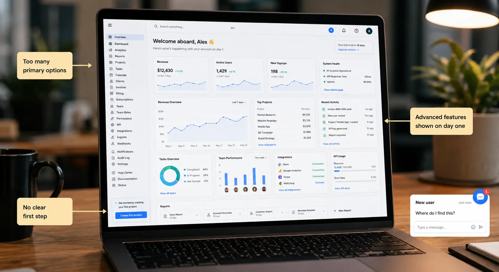
1. Users ask where things are, not for something new.
When customers keep asking "where do I find this," the feature is rarely missing. It exists.
Users just cannot predict where it lives or why it matters at that moment.
If a product depends on a sales demo to explain its own layout, sequencing is the issue, not scope.
That is also why sales cycles stretch: the salesperson is compensating for a clarity problem that should not reach the demo at all.
2. New users explore instead of completing anything.
Giving new users access to everything from the first login usually comes from a good instinct: show them the full value, fast.
In practice, they spend their first session browsing reports and settings instead of completing the one workflow that would show them the product works.
Trials that stall before the first meaningful action are almost always a sequencing problem, not a feature problem.
3. The team explains the product better than the product explains itself.
In audits, this is one of the clearest gaps we see. The team knows why every section exists because they built it. Users arrive without that history.
When a product needs someone to walk new users through how it fits together, the experience has not kept up with what the product became.
Where SaaS products start exposing the wrong things
We see the same two situations repeat across audits.
A feature outranks the workflow it should support.
In one CRM, a lead-scoring model, territory management, and a commission calculator sat on the main dashboard for every role, including a sales rep who logs in multiple times a day just to move deals along.
None of those tools were badly built.
The commission calculator was arguably the most sophisticated part of the product. But the rep had to visually step around it every morning to reach her own pipeline.
The product was making her work harder to access the thing she needed most, in service of features she touched once a month.
Navigation preserves history instead of priority.
In a fintech dashboard, the top sidebar item was the oldest feature in the product: a manual reconciliation tool used by under five percent of accounts.
It sat above the payments workflow every customer touched daily, because it shipped first and nobody had revisited the order since.
Lower on the same screen, a portfolio export tool used occasionally carried identical visual weight to that daily workflow.
Neither of these was a decision anyone made on purpose.
They accumulate because each feature ships with equal care and no one revisits the whole surface afterward.
The framework we use to decide what users see first
One question decides most of it: does a new user need this to reach their first meaningful outcome?
- If yes: it earns visibility on day one.
- If no: ask whether it only becomes useful after the core workflow is completed. If so, surface it after that point, not before.
- The rest: features relevant only to a specific role or used infrequently belong in settings, role-specific views, or secondary navigation that does not compete with the daily workflow.
Most features fail the first question on day one. That is not a problem with the feature.
It is information about when it should appear.
What this looks like in practice
During an audit of a B2B logistics platform, the dashboard showed 14 primary navigation items from the first login: shipment tracking, carrier management, rate negotiation, custom reporting, API access, team roles, billing, and more.
Every item had equal placement because the team could not agree on what to cut, so they cut nothing.
We ran the filter against all 14. The result:
All 14 features remained in the product. New users reached their first completed shipment faster. Support volume about navigation dropped.
Nothing was deleted. The sequence changed.
Three Things to Check Before Redesigning Anything
These do not require a designer. They require honesty about what your analytics and your own experience are showing.
1. Map your most-used features against their current visibility
Pull your analytics and find the five features used most often. Find where each one lives in the current interface.
If your most-used features are not in your most visible positions, the navigation is organized around history, not use.
This mismatch is the most common finding in audits and the most fixable without touching the product itself.
2. Run your own product cold
Log in as if you have never used it. Time how long it takes to complete the one task that matters most to a new user, without help or navigation explanation.
If it takes more than a minute, that is roughly what new users are experiencing in their first session.
The features are probably all there. The path to them is not obvious enough.
3. Compare your navigation structure to how users actually work
When a sidebar's grouping matches the engineering team's internal organization rather than how a task flows from the user's perspective, that is almost always inherited structure nobody chose on purpose.
The question to ask: if you were building the navigation today for a user who has never seen the product, would you build it this way?
What Changes When You Make the Sequencing Decision
Most teams we work with on this have never formally answered which features belong in the first session versus the second versus later.
The decision was never made explicitly, so it was made implicitly through build order: whatever shipped first got the most visible position, and it stayed there.
Making the decision explicitly changes:
- What appears on the default dashboard
- What appears in the primary navigation
- What appears only after a specific user action
- What appears only in a role-specific view
None of this requires removing a single feature from the product.
It also changes the conversations that happen around the product.
Users who reach their first meaningful outcome in the first session come back.
Users who spend their first session navigating to understand what the product contains often do not.
That difference shows up in trial conversion, onboarding time, and how much the sales team has to explain before a deal closes.
The product does not need to become simpler. It needs to stop showing its full complexity before users have a reason to engage with it.
That is a sequencing decision. It is quieter than a redesign and usually faster to implement.
And it is almost always the right first move before anything else is changed.