Design
We Studied 100 Startup Hero Sections: 74% Failed (Here’s How to Fix It)

March 9, 2026
September 23, 2025

Over the past few weeks, we’ve spoken with several startup founders facing the same problem.
Their websites look solid, but the hero section isn’t converting.
It’s the first thing visitors see, yet it often fails to explain the value, build trust, or guide action.
We wanted to know if this was an isolated issue or something bigger, so we reviewed 100 startup hero sections.
The results were striking: 74% repeated the same mistakes.
Here’s what we found, why it matters, and how you can fix it.
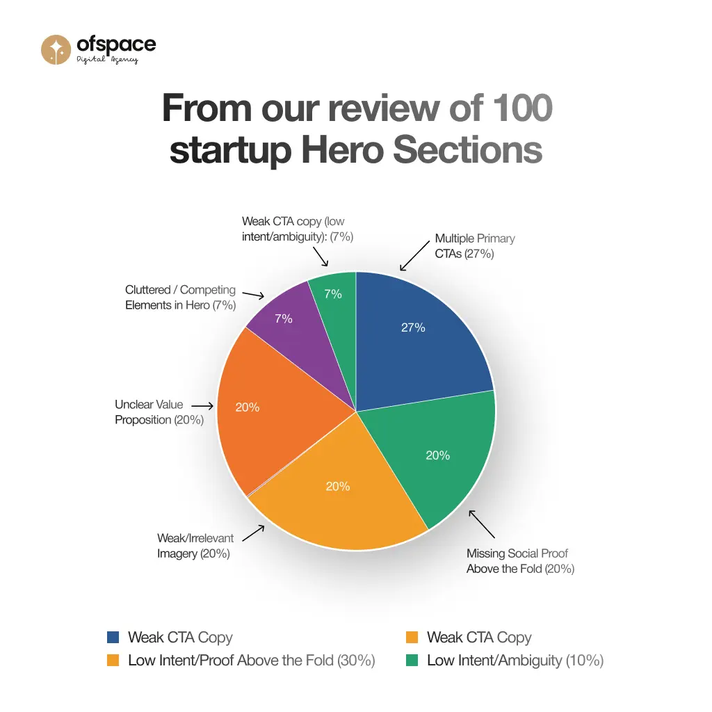
Our Study: 100 Startup Hero Sections
The same mistakes appeared again and again, often in combination.
For example, sites with multiple CTAs were nearly three times more likely to also miss trust signals, compounding the friction that drives users away.
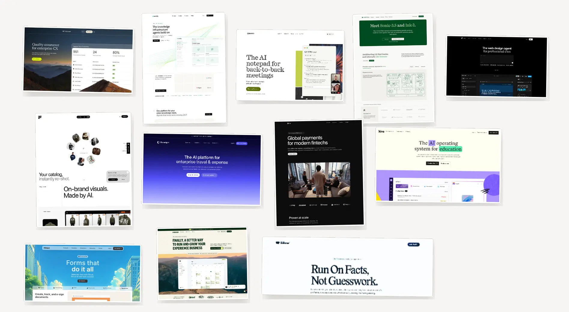
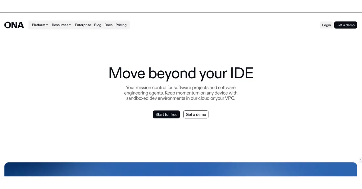
Mistake #1: Unclear or Vague Value Proposition
.webp)
The hero section is where users decide if your product is worth exploring.
If the value proposition isn’t instantly clear, users bounce.
In fact, studies show 37% of visitors leave a site if they can’t understand the offering within 3 seconds (WP Rocket).
Design Problem
Headlines often compete with backgrounds, busy mockups, or weak typography.
Without clear hierarchy, the product’s promise gets buried and the section feels confusing instead of clarifying.
Our Findings
20% of startups in our study failed to clearly communicate their value proposition.
Visitors couldn’t identify the product’s main benefit and left before exploring further.
Actionable Fix
- Make the headline the visual anchor with bold, high-contrast typography.
- Surround it with whitespace so it dominates.
- Tone down decorative visuals so they frame, not compete.
- Add a smaller subhead focused on one tangible benefit.
Mistake #2: Multiple Primary CTAs Competing for Attention
A hero section should guide users toward one clear action.
But in our review, 27% of startups added two or more equally styled CTAs, creating friction instead of clarity.
Design Problem
When multiple elements share equal visual weight, the eye doesn’t know where to land.
We saw this in several cases: two CTAs styled the same, long body copy, and decorative imagery all competing.
The result? No single action stands out, so users stall.
.webp)
One startup we reviewed, FastWill, had a clean headline but presented two equal CTAs (“Create Your Trust” and “Create Your Will”).
Neither was prioritized.
Instead of guiding the user forward, the layout forced them to choose, or worse, abandon.
Our Findings
This wasn’t an isolated case. Among the startups with multiple CTAs, 50% also failed to include social proof (vs. 17% overall).
This confusion + no credibility pairing created double friction and drove drop-offs.
Actionable Fix
Design with a single path in mind.
- Choose one primary CTA and make it visually dominant.
- Style secondary actions with lower emphasis — outlined buttons or smaller links.
- Maintain consistent placement so the flow is clear: headline → subhead → primary CTA.
Mistake #3: Missing Trust Signals Above the Fold
Users silently ask: “Can I trust this?” If trust isn’t addressed upfront, skepticism grows.
In our review, 20% of startups failed to include any credibility markers above the fold.
Design Problem
Too many startups launch sleek hero sections that lack visible trust anchors, logos, testimonials, review scores, or security badges.
When credibility is buried below the fold or styled too subtly, users don’t see it when it matters most.
Our Findings
20% of startups showed no trust signals above the fold.
When combined with multiple CTAs, this drove friction 3x higher.
Actionable Fix
- Place trust signals directly beneath the primary CTA.
- Keep them lightweight (grayscale logos, subtle stars) so they reassure without distracting.
- If space allows, surface one strong testimonial in the hero.
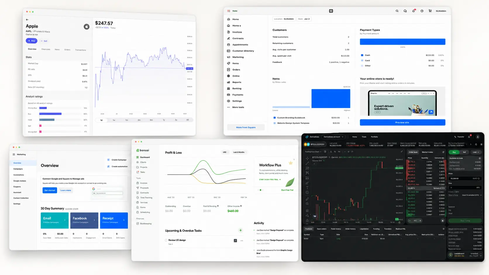
Mistake #4: Weak or Irrelevant Hero Imagery
.webp)
The hero image or illustration is often the first visual element users notice.
When it fails to connect with the product’s core value, it creates cognitive dissonance and reduces clarity.
Design Problem
Many startups rely on abstract illustrations or generic stock graphics that feel trendy but disconnected.
Instead of showing the product or outcomes, visuals add decoration without meaning.
In other cases, imagery is so busy it competes with the headline.
Our Findings
20% of startups used imagery that didn’t align with their core message.
Users hesitated, sensing a disconnect between visuals and copy.
Actionable Fix
- Replace decorative art with context-driven visuals (interface, outcomes, workflows).
- Use visuals that reinforce the main message rather than compete with it.
- Keep the design lightweight so text remains dominant.
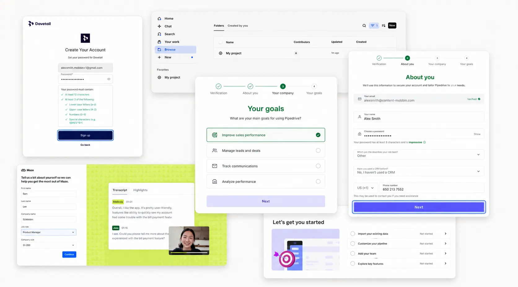
Mistake #5: Poor Use of Whitespace and Alignment
.webp)
Whitespace isn’t wasted space. It’s what gives structure and breathing room to the hero section.
Without it, everything competes and nothing stands out.
Design Problem
We saw cramped layouts: headlines pressed against imagery, unevenly stacked CTAs, and secondary text crowding primaries.
The result was visual tension that slowed scanning.
Our Findings
7% of startups had cluttered layouts.
Users had to “decipher” the hero instead of naturally flowing from headline → subhead → CTA, leading to higher bounce rates.
Actionable Fix
- Adopt a consistent grid and vertical rhythm.
- Add 24–40px spacing between headline, subhead, and CTA.
- Keep a clear margin around the hero block for breathing room.
- Remove non-essential elements to reduce noise.
Mistake #6: Ignoring Mobile Responsiveness
.webp)
Mobile accounts for 58% of global website traffic (Statista, 2023).
If your hero breaks on small screens, you’re losing more than half your audience.
Design Problem
Several startups had polished desktop designs that collapsed on mobile: CTAs pushed below the fold, headlines wrapping awkwardly, and buttons too small for thumbs.
Our Findings
Nearly 25% of hero sections we reviewed had major mobile usability issues.
Users bounced quickly when CTAs weren’t visible without scrolling.
Actionable Fix
- Design mobile-first, then scale up.
- Keep CTAs visible above the fold on mobile.
- Test across devices to ensure readability and tap-friendly sizes.
Mistake #7: No Clear Emotional Appeal
.webp)
Research shows emotionally driven campaigns outperform rational ones by 2:1 (IPA, 2020).
An emotionally engaging hero section can forge a deeper connection with the user, increasing the likelihood of conversion.
Design Problem
Many startups default to technical jargon.
Instead of evoking relief, confidence, or aspiration, they describe features in functional but uninspiring terms.
Our Findings
7% of startups lacked any emotional appeal in their hero.
Messaging failed to connect, leaving users unmotivated to explore further.
Actionable Fix
- Highlight emotional outcomes, not just features.
- Use visuals that evoke trust, aspiration, or excitement.
- Refine headlines to show how life improves (“Save Hours on QA — Launch Faster with Confidence”).
The Hero Section Design Checklist
Before you ship your homepage, run your hero section against this quick checklist:
1. Clear Value Proposition
Can a first-time visitor explain what you do and why it matters in under 5 seconds?
2. One Primary CTA
Is there a single, visually dominant action above the fold?
3. Visible Trust Signals
Are logos, reviews, or testimonials placed early enough to build credibility?
4. Clean Layout & Whitespace
Does the design breathe, with a clear flow from headline → subhead → CTA?
5. Mobile-First Design
Is the hero just as effective on a phone as on a desktop?
6. Emotion Over Features
Does the headline evoke relief, confidence, or aspiration, not just technical jargon?
7. Fast Load Time
Does the page load in under 2 seconds to prevent bounce?
Conclusion
Your hero section is not decorative. It is the first five seconds of your product pitch.
Our review of 100 startups showed most misses weren’t about weak products but weak presentation.
Fix clarity and hierarchy, commit to one primary action, surface proof early, and make it fast on mobile.
Do that, and your hero stops leaking attention and starts compounding conversions.