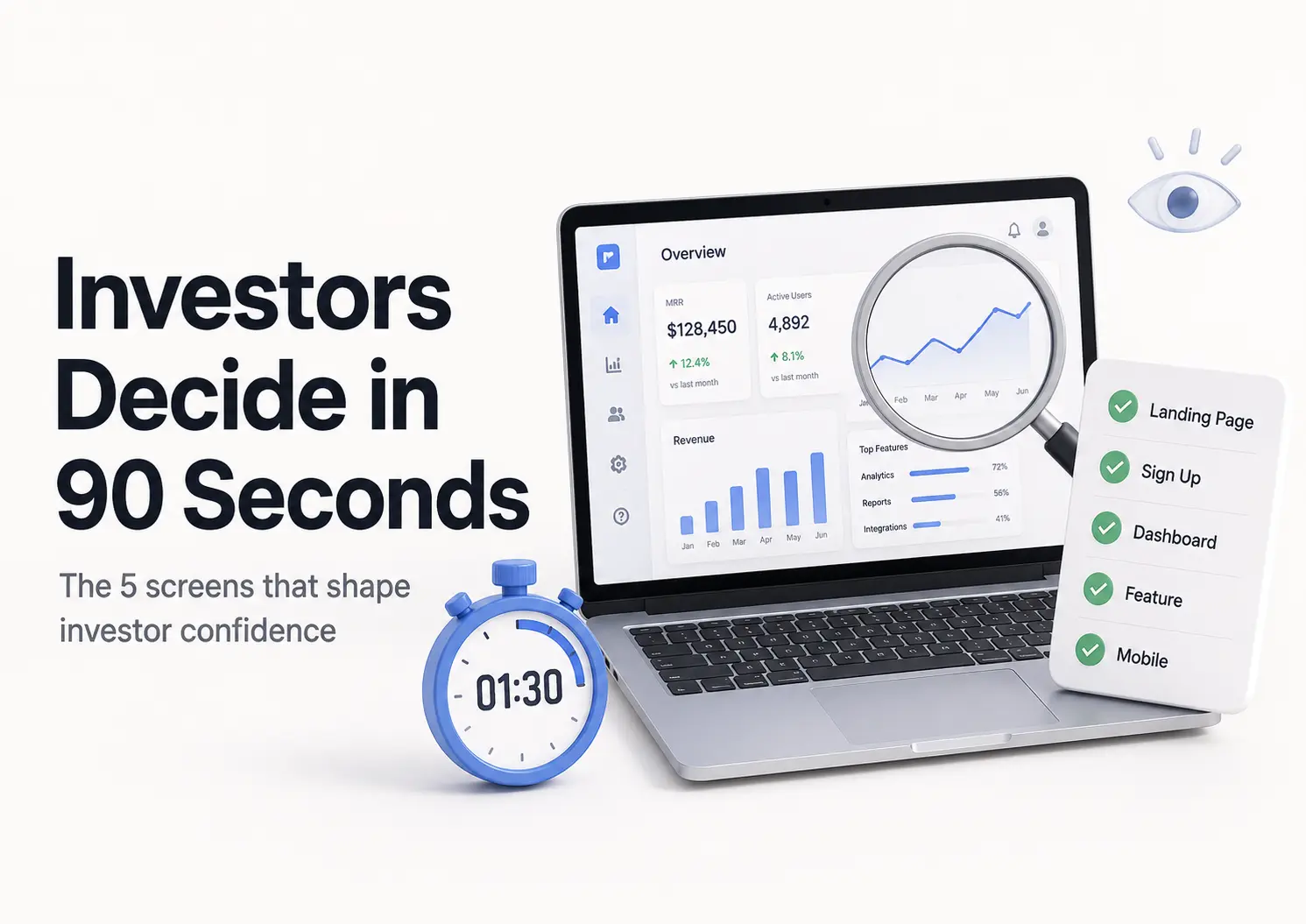
Design
What 100+ Startup Interfaces Taught Us About Building Products That Scale

February 23, 2026
November 10, 2025

Startups move fast, and design rarely keeps pace.
After building and testing over 100 startup interfaces, we wanted to understand what actually makes early products usable, clear, and scalable under pressure.
This research comes from real projects, not theory, where we measured what helped users act faster and what slowed growth.
What follows are the most consistent lessons we found, distilled into practical guidance for teams building their next interface.
Lesson 1
Clarity is the fastest way to improve activation
Across more than 100 early interfaces studied, users formed an impression in under five seconds.
When layouts prioritized novelty over clarity, most first time users failed the initial task.
When hierarchy was strong and actions were obvious, success rates jumped.
What consistently improved performance
- A primary action that can be identified instantly
- Labels that describe actions, not abstractions
- Screens focused on a single goal
- Reduction of unnecessary text and steps
- Visual decisions grounded in helping users act faster
In one mobility app, reducing text by 40 percent and merging steps increased activation significantly.
The refined version wasn’t visually louder it was simply easier to interpret. Clarity produced measurable lift.
Design takeaway: Clarity drives activation. Make hierarchy, language, and action cues measurable, not decorative.
Lesson 2
Design is a hypothesis until users confirm it
Teams often treat polished mockups as solutions, but every interface is only a guess about how users think.
In the first set of launches analyzed, products built without early testing required several major redesigns.
Lightweight prototypes tested with even a handful of users exposed issues far earlier and at a fraction of the cost.
What changed outcomes
- Defining the expected first action for each screen
- Identifying the behavior that would confirm the design works
- Tying each iteration to a measurable metric
- Running small, early tests with minimally styled prototypes
In one B2B product, simple prototype testing revealed that a mislabeled filter caused most user errors.
Correcting the copy improved task completion dramatically before visual design even began.
Principle: Design work reduces uncertainty only when users are involved.
Lesson 3
Scale Consistency Before You Scale Features
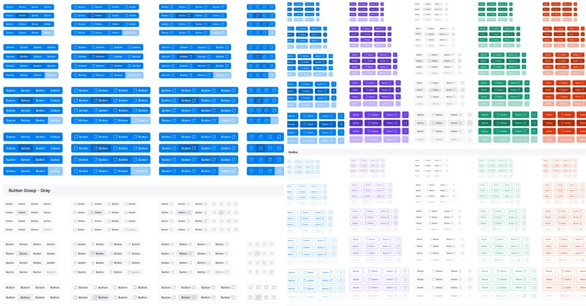
Inconsistency is the fastest way to slow a startup. Across 100+ interfaces, teams without a basic design system spent 30–40% more time per feature after month three.
In one app, four teams built features independently. We counted 19 button styles and five alert patterns.
Standardizing them cut delivery time by half and reduced reported UI bugs by 32%.
A design system doesn’t need to be big. It needs to be real. Start with:
- Color and spacing tokens synced with dev.
- Reusable components built in the same grid.
- Clear naming shared between design and code.
When components repeat, design speed compounds. Users learn faster, and every new feature feels familiar.
Design takeaway: Ship a system before you ship scale. It’s cheaper to maintain clarity than to clean chaos.
Lesson 4
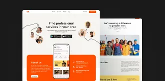
The Interface Should Tell a Story
.webp)
Users understand products through sequence, not screens. Each click should reveal intent, not confusion.
In our user studies across 40 early-stage pps, products that guided users with context-driven messaging had 2.3× higher task completion than those using static UI text.
An interface tells a story when every state answers three things:
- Where am I?
- What just happened?
- What can I do next?
Most startups miss the second part. Without feedback loops, users feel lost and abandon the flow.
When designing onboarding for a finance app, replacing generic “Next” buttons with task-based labels like “Secure My Account” improved completion by 34%.
Progress bars and small success messages increased return visits by 18%.
Clear narrative cues made users feel in control.
We treat microcopy as design, not decoration. Words define rhythm.
A single misplaced label can break a user’s mental flow as easily as a misaligned element.
Every button, alert, and success message should sound like one consistent voice guiding the user through the story.
Design takeaway: Interfaces work when they communicate cause and effect. Write and design for sequence. Each state should confirm progress and lead to purpose.
Lesson 5
Design for the Unknown: Startups Evolve
Startups change direction faster than design systems catch up. The goal is to build for that movement, not fight it.
Across 30 growing products we tracked, 58% of redesign work came from layouts that couldn’t flex to new features or longer content.
Products with modular grids and neutral components reused 70% of screens during pivots.
Design for change, not features:
- Grid first: Define spacing and columns that scale from one card to ten.
- Component scope: Design elements for patterns, not content. A “card” should fit any data type.
- Navigation budget: Leave space for at least two new sections without rethinking IA.
In one analytics startup, early planning for extra menu slots saved six weeks of redesign when they launched a new reporting tool.
The cost of foresight: one extra layout variant.
When we see users hacking the interface to reach new goals, we flag it. It means the product has outgrown the frame.
Updating the framework, not just visuals, keeps usability intact through pivots.
Design takeaway: Design structures, not screens. Flexibility is cheaper than redesign.
Lesson 7
Measure What Matters
Design isn’t finished at handoff. It’s finished when it moves a metric.
Across 100+ startup interfaces we tracked, only 38% of teams linked design changes to measurable outcomes.
Those that did were 2.4× more likely to reach product-market fit within the first year.
We measure three things on every project:
- Activation — can users reach the first value in one session?
- Task success — can they complete the main action without help?
- Retention — do they return within seven days?
Design reviews mean little without data. We validate each update with click heatmaps, completion rates, and short feedback prompts (“Was this page clear?”).
If the metric doesn’t improve, the design goes back for testing.
Design takeaway: Track one core behavior per release. A design that doesn’t change what users do hasn’t shipped value.
Lesson 8
Common Interface Traps (and How to Avoid Them)
After auditing more than 100 startup interfaces, we found that 8 out of 10 usability issues fall into the same few traps. They’re avoidable if caught early.
1. Over-complex MVPs
Startups often try to launch everything at once. In 60% of MVPs we reviewed, more than half the features went unused in the first month.
Each extra option adds cognitive load. Build for one primary outcome first, validate, then layer secondary actions.
2. Ignoring onboarding and empty states
A product with no data looks broken. Yet 70% of early interfaces fail to explain what to do next.
A clear empty state should teach the product’s purpose and show a first step. When we added instructional empty states to a task app, activation rose from 47% to 79%.
3. Copying big-tech UI patterns
Startups often borrow patterns from apps like Airbnb or Notion. Those designs serve mature products with trained users and large teams maintaining them.
In small products, they create friction. Use familiar controls, but simplify flows. A startup’s UI should teach itself in under a minute.
4. Designing without data
Visual appeal isn’t validation. Teams that tested prototypes with even five users uncovered 80% of usability issues before launch.
Skipping that step doubled post-launch revisions on average. Small tests early save months later.
5. No feedback loops
Interfaces that stay static stop learning. Add simple metrics, task success, time to value, retention, and review them weekly.
A five-minute heatmap session reveals more than a week of internal debate.
Design takeaway: Every successful startup interface stays simple, teaches itself, and measures what users actually do. If your UI feels clever but can’t be explained in one line, it’s a signal to simplify.
Turning Lessons into Practice
To apply these insights in your own startup:
1. Audit clarity
Ask five users to complete one key task. If more than one hesitates, your interface isn’t clear enough.
2. Treat every feature as a test
Before building, write one measurable hypothesis.
3. Start your design system early
Document color, spacing, and component rules after your second feature.
4. Measure every release
Track one activation or retention metric per iteration.
5. Run a “UI trap check” monthly
Remove visual noise, review empty states, confirm data flow clarity.
We use this same loop in every project. It keeps design adaptive, measurable, and aligned with growth.
Conclusion (From 100 Interfaces to One Principle)
After designing and testing more than 100 startup interfaces, one pattern stands out: the best design teams learn faster than they build.
Every strong product grew from short feedback loops, clear decisions, and measured improvement.
Great interfaces aren’t born from inspiration. They come from systems that turn user behavior into design choices.
Clarity, testing, and iteration compound over time, that’s what scales usability and trust.
Startups that treat design as a learning engine, not a service, move faster and waste less.
When design drives discovery, it becomes a strategic capability, not a cost.
Build your interface to learn. Every click should teach the team something about what works.
That’s how design becomes growth.