UI/UX Design
The 12 Most Inspirational User Interface Examples in 2026

January 1, 2026
February 10, 2025

Users decide in just 0.05 seconds whether to stay on your website or leave.
A well-designed user interface (UI) plays a key role in making a strong first impression.
By studying great user interface examples, you can create a smooth and engaging user experience for your product.
But what makes a UI truly effective in driving engagement?
In this guide, we’ll explore 10 real-world UI design examples, break down why they work, and show how you can apply their best practices for your next project.

12 Best UI Design Examples for Ideas and Inspiration
We’ll explore 12 exceptional UI examples that redefine design excellence and elevate user interaction to new heights.
1. Wokka’s Smooth Interactions
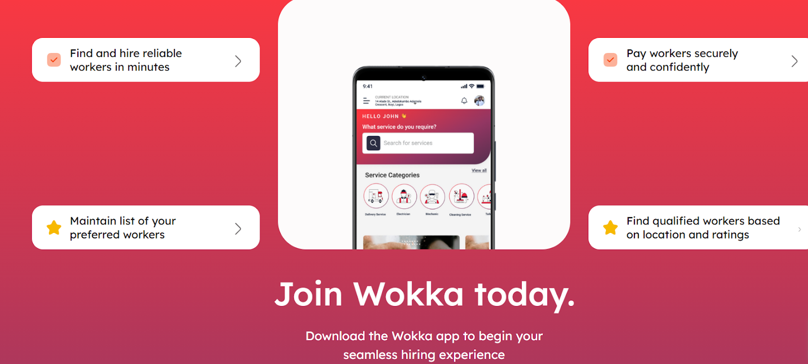
Wokka’s UI is an excellent example of how playful animations and intuitive design create an engaging experience.
It’s developed by the Ofspace team. Wokka ensures that every interaction feels smooth and enjoyable.
Overall, it embraces a clean, interactive approach.
What Sets It Apart?
- Engaging Animations – Fun and interactive effects make the UI feel alive.
- Smooth Navigation – Every action feels effortless and natural.
- Minimalist Layout – White space is used effectively to prevent clutter.
Strengths of Wokka’s UI
- Consistent Design – Looks polished across all pages.
- User-Friendly Interactions – Every transition is seamless.
- Effortless Usability – First-time users can navigate with ease.
2. Notion’s Minimalist Onboarding Screen

Notion makes getting started simple. Instead of long tutorials, it offers a clean, distraction-free onboarding experience that guides users step by step.
The UI focuses on clarity and ease of use, making sure new users aren’t overwhelmed. No clutter, just what you need to get started.
What Sets It Apart?
- Minimalist Design – No distractions, just the essentials.
- Step-by-Step Guidance – Users learn as they go.
- Subtle Color Use – Highlights important actions without overwhelming users.
Strengths of Notion’s UI
- Simple Onboarding – Helps users start quickly.
- Intuitive Layout – Easy to follow, even for beginners.
- Aesthetic Simplicity – Clean and visually appealing.
3. FlowMapp's Clear Interface
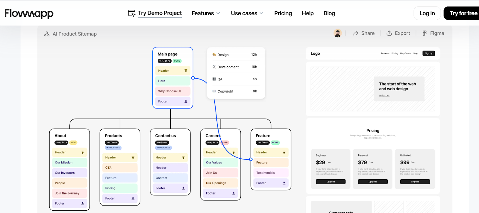
FlowMapp is designed for UX designers who need a clean and structured workspace. The interface prioritizes clarity, organization, and usability.
With drag-and-drop features and a well-structured layout, users can map out UX flows with ease.
What Sets It Apart?
- Drag-and-Drop Simplicity – Users can build and adjust flows easily.
- Well-Organized Workspace – Everything is exactly where it should be.
- Clear Typography – Enhances readability and usability.
Strengths of FlowMapp’s UI
- User-Centric Design – Focuses on efficiency.
- Smooth Navigation – No confusion, just seamless use.
- Functional Yet Aesthetic – A balance of beauty and usability.
4. Drink Half Past's Consistent Color Palette

Drink Half Past keeps its branding consistent and visually appealing. The use of a harmonious color palette helps create a strong and memorable brand identity.
By using strategic color choices, the UI naturally guides the user’s focus to key elements, like product highlights and call-to-action buttons.
What Sets It Apart?
- Strong Visual Identity – Colors make the brand recognizable.
- Strategic Contrast – Highlights important information.
- Clean Layout – Keeps everything looking polished.
Strengths of Drink Half Past’s UI
- Memorable Branding – The color scheme sticks with users.
- Guides User Attention – Users instinctively know where to look.
- Aesthetic Consistency – Everything feels cohesive.
5. Mailchimp's Warning Message
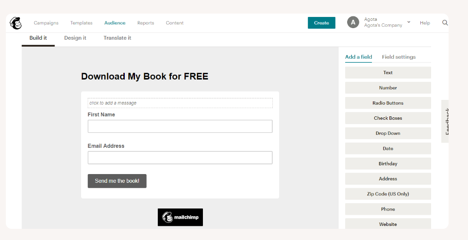
Mailchimp ensures users don’t miss important messages. Instead of annoying pop-ups, it uses bold, clear, and well-placed alerts that grab attention without disrupting workflow.
What Sets It Apart?
- High-Contrast Alerts – Users notice warnings instantly.
- Concise Messaging – No unnecessary text, just clear instructions.
- Direct Call-to-Actions – Tells users exactly what to do next.
Strengths of Mailchimp’s UI
- Non-Intrusive Warnings – Alerts without frustration.
- Quick Problem Solving – Users fix issues fast.
- Clear Communication – No confusion, just clarity.
6. Figma's Smooth Navigation for Beginners
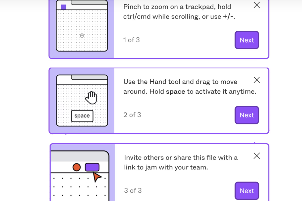
Figma provides helpful tooltips and in-app guidance to ensure new users don’t feel lost.
Instead of long tutorials, it delivers quick, helpful tips at the right moment.
What Sets It Apart?
- Real-Time Tooltips – Guidance without interruption.
- Step-by-Step Learning – Users learn naturally while working.
- Minimal Disruptions – Keeps the workspace clean.
Strengths of Figma’s UI
- Easy for Beginners – Learning feels natural.
- Smooth Navigation – Users find tools effortlessly.
- Smooth User Experience – No steep learning curve.
7. Slack – Smart and Informative Feedback
.webp)
Slack makes communication easy with instant feedback. Whether you're sending a message, searching for a chat, or adjusting settings, the UI confirms every action with simple design animations or notifications.
This helps users stay informed without being overwhelmed.
Why It Stands Out
- Real-time feedback – Every action gets an instant response.
- Clear status updates – Shows when messages are delivered or unread.
- Helpful animations – Small visual cues make interactions smoother.
Strengths of Slack’s UI
- Fast and responsive – Users never feel lost.
- Easy to understand – No confusion about message status.
- Feels natural – Everything flows smoothly.
8. Typeform – Beautiful and Simple Forms

Typeform makes creating forms fun and easy. Instead of boring, static designs, it offers visually appealing templates that users can customize quickly.
Why It Stands Out
- Ready-made templates – Makes form-building effortless.
- Simple navigation – Users can find and apply templates easily.
- Mobile-friendly design – Forms look great on any device.
Strengths of Typeform’s UI
- Easy to use – Anyone can create a form quickly.
- Looks modern – Forms feel interactive and engaging.
- Customizable – Users can tweak forms to fit their needs.
9. Semrush – Customizable View Settings
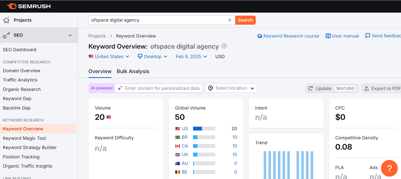
Semrush lets users customize their interface instead of forcing them to use a fixed layout.
This makes the experience more flexible and user-friendly.
Why It Stands Out
- Adjustable layouts – Users can switch between different views.
- Simple toggle controls – Easy to change settings on the go.
- Personalized experience – Users can tweak settings to match their style.
Strengths of Semrush’s UI
- Gives users control – They can adjust the interface to their liking.
- No complicated menus – Simple and straightforward.
- Makes browsing easier – Adjusting settings improves usability.
10. Google Docs – Auto-Save and Version History
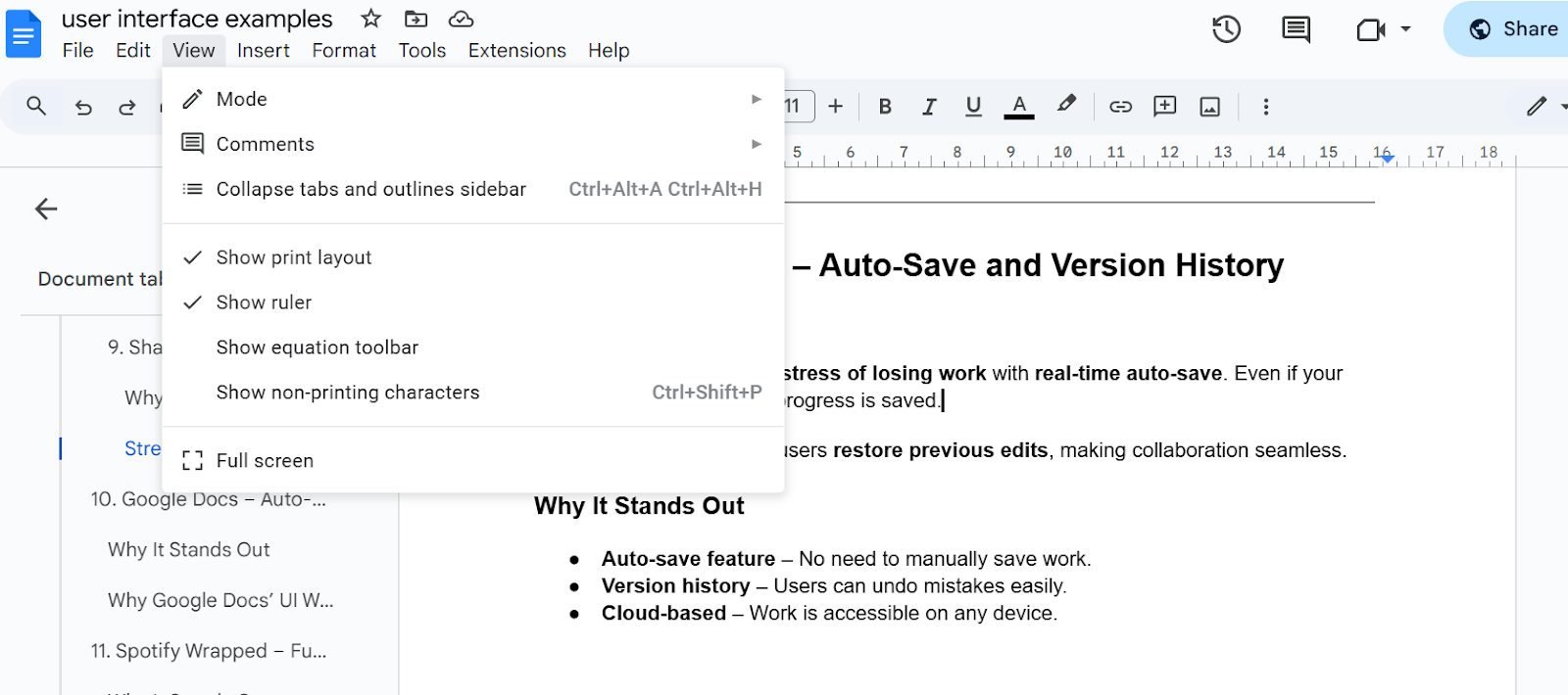
Google Docs removes the stress of losing work with real-time auto-save. Even if your internet disconnects, your progress is saved.
Plus, version history lets users restore previous edits, making collaboration seamless.
Why It Stands Out
- Auto-save feature – No need to manually save work.
- Version history – Users can undo mistakes easily.
- Cloud-based – Work is accessible on any device.
Strengths of Google Docs’ UI
✔ Stress-free writing – Users never lose their work.
✔ Easy collaboration – Multiple users can edit at the same time.
✔ Works anywhere – Saves progress across devices.
11. Spotify Wrapped – Fun and Interactive Experience

Spotify Wrapped turns listening data into a fun, shareable experience. Instead of showing plain stats, it uses animations, bold graphics, and storytelling to engage users.
Why It Stands Out
- Personalized recap – Users get a music story, not just data.
- Engaging animations – Keeps the experience exciting.
- Easy social sharing – Users can post their wrapped results instantly.
Strengths of Spotify Wrapped’s UI
- Highly engaging – Feels more like an interactive journey.
- Visually fun – Bright, bold graphics make it exciting.
- Memorable experience – Users look forward to it every year.
12. Apple – Perfect Use of White Space
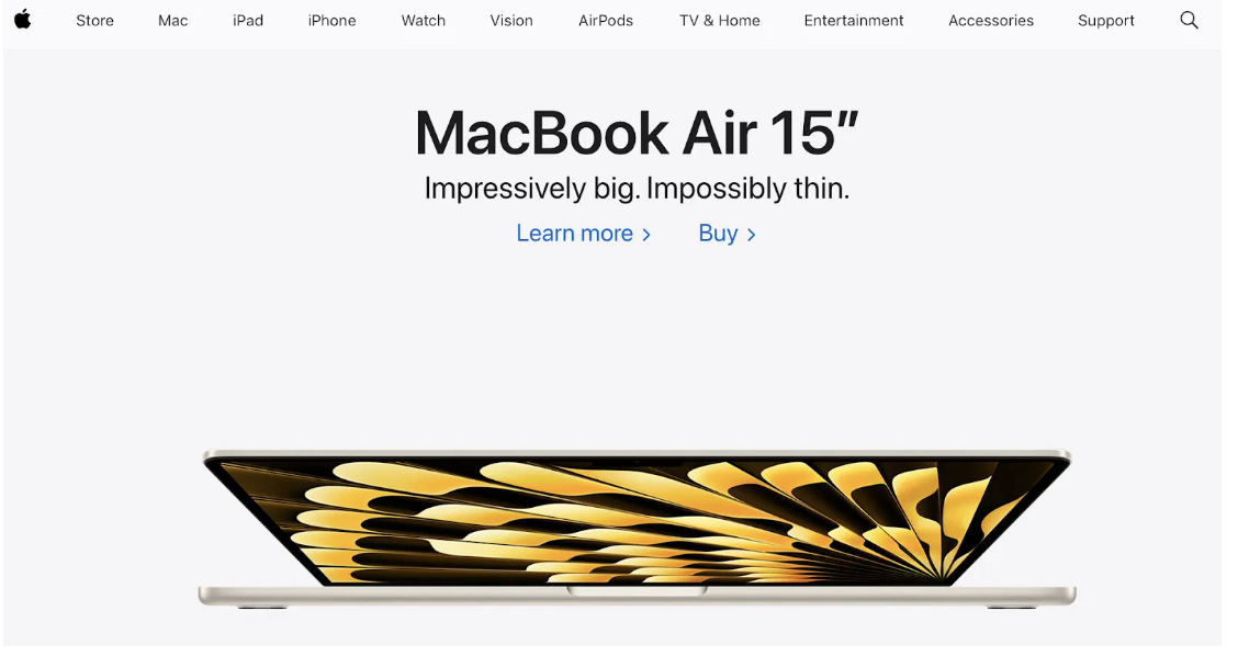
Apple’s website is a masterclass in clean design. Instead of cluttering pages with too much content, it uses white and clear space to keep the focus on products.
This makes the UI look premium and easy to navigate.
Why It Stands Out
- Minimalist approach – No unnecessary distractions.
- Strategic white space – Keeps content easy to digest.
- Smooth scrolling – Enhances the browsing experience.
Strengths of Apple’s UI
- Looks high-end – Feels polished and premium.
- Easy to browse – The layout is well-structured.
- No clutter – Just clean, clear content.
What Makes a UI Design Amazing? Key Elements and Best Practices
A good UI design is simple, clear, and easy to use. Users should feel comfortable and find what they need without effort. A well-designed UI keeps users engaged and happy.
1. Simplicity
- Keep the design clean and straightforward.
- Avoid clutter. Only show what's necessary.
- Use whitespace effectively to make content breathable and easy to read.
Example: Minimalist designs like Apple’s website are a great example of simplicity.
2. Consistency
- Consistent elements (buttons, colors, fonts) create familiarity and help users navigate easily.
- Stick to one design style throughout the app or website.
Example: Google’s apps all have a consistent design, so users feel familiar with the layout across platforms.
3. Responsive Design
- Ensure your UI works on any device, whether it’s a smartphone, tablet, or desktop.
- Optimize for different screen sizes and resolutions.
Example: Websites like Amazon adjust their layout smoothly on both mobile and desktop devices.
4. Intuitive Navigation
- Make navigation simple. Users should never feel lost.
- Keep menus and buttons easy to find and use.
- Use icons and labels that are clear and understandable.
Example: Websites like Airbnb have user-friendly navigation, helping users quickly find what they’re looking for.
5. Visual Hierarchy
- Important elements should stand out more. Use size, color, and placement to highlight key areas.
- Guide users’ eyes through the interface naturally.
Example: On e-commerce websites, the product image and price are often the largest and most prominent.
6. Clear Typography
- Use legible fonts (Typography). Avoid too many different styles.
- Make sure the text is easy to read, with proper spacing (Tracking).
- Master Leading in Typography and make your design font great.
- Know the Kerning vs Tracking and apply them in you design.
Example: Websites like Medium use simple, readable fonts that enhance the overall reading experience.
7. Feedback and Interactivity
- Show users that their actions are being processed (e.g., button changes when clicked).
- Use loading indicators, success messages, and error alerts to keep users informed.
Example: When you submit a form on a website like LinkedIn, you get clear confirmation once your information is saved.
8. Color Psychology
- Colors affect how users feel and interact with your design.
- Use colors thoughtfully to convey the right emotions and guide users through tasks.
Example: Blue often represents trust (used by Facebook and Twitter), while red can evoke urgency (used by sale banners).
9. Accessible Design
- Make your design accessible to all users, including those with disabilities.
- Ensure text has enough contrast, images have alt text, and your design works with screen readers.
Example: Websites like BBC are known for their accessibility, providing a great user experience for everyone.
10. Testing and Iteration
- Continuously test your design with real users.
- Make adjustments based on user feedback to improve usability.
Example: After launching, companies like Dropbox often refine their design by testing with users and making changes based on insights.
Best Practices for Amazing UI Design
1. Prioritize User Needs
Always design with the user in mind. Understand their needs and expectations.
2. Minimize Loading Times
Slow interfaces drive users away. Optimize images and scripts for faster loading.
3. Use High-Quality Images
Quality visuals make the interface more appealing and professional.
4. Incorporate Microinteractions
Small animations and interactive details make the design feel more dynamic.

FAQs About UI Design Examples
What are the 3 main types of user interfaces?
- Graphical User Interface (GUI): Involves visual elements like icons and buttons (e.g., Windows OS, mobile apps).
- Command-Line Interface (CLI): Uses text commands for interaction (e.g., Linux terminal).
- Voice User Interface (VUI): Allows voice-based interaction (e.g., Alexa, Siri).
Can you give a real-life example of a user interface?
A smartphone is a great example. It uses a touchscreen interface where you tap, swipe, and pinch to interact with apps, notifications, and settings.
What is an example of a UI?
Spotify's mobile app is a UI example. It has buttons, icons, and interactive features that let users navigate and play music easily.
What is the most common type of user interface?
The Graphical User Interface (GUI) is the most common. It’s used in operating systems, mobile apps, websites, and software applications.
What is the best example of UI/UX?
Netflix is a top example. Its clean, easy-to-navigate UI, combined with personalized recommendations and seamless playback (UX), creates a great user experience.
Build Your Own Best User Interface Examples
As mentioned, excellent UI design enhances user engagement, simplifies navigation, and improves the overall user experience.
That said, if you need to create a more user-friendly UI experience, you can book a free call to discuss how to add the best UI design and boost user engagement.