How We Designed C Teleport to Make Crew Travel Feel Simple, Flexible, and in Control
C Teleport came to us with a clear ambition: make complex business and crew travel easier to manage, without losing the flexibility that fast-moving operations demand.
Crew travel is rarely as simple as booking a flight from A to B. Schedules change, crew rotations move, flights get cancelled, and travellers need to be where they need to be, often with very little notice.
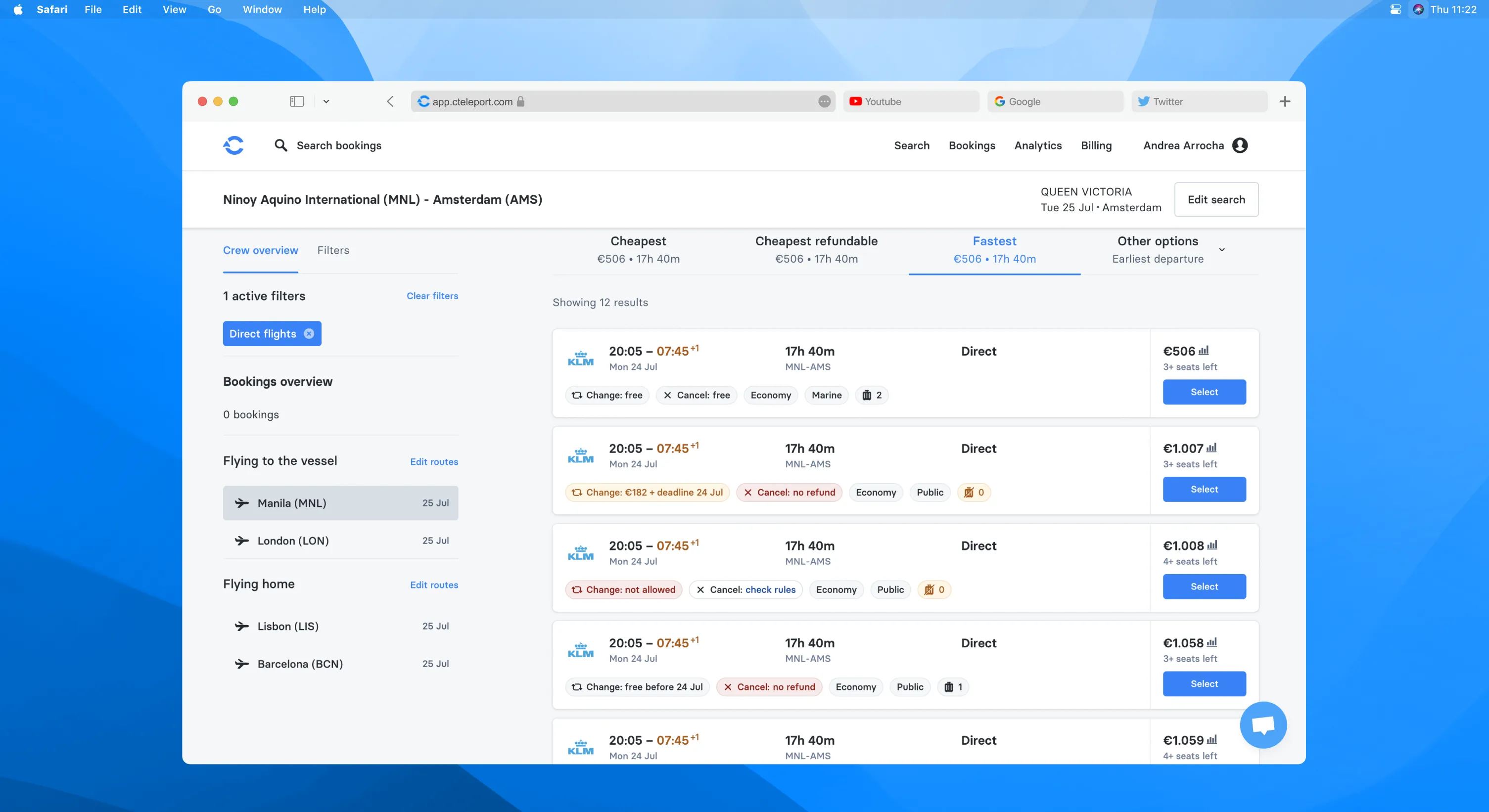
For maritime, aviation, and offshore teams, every booking is connected to a much larger operational picture. Travel managers need visibility over costs and policies, while crew managers need the freedom to make changes quickly when plans shift.C Teleport brings these moving parts together in one platform. Flights, hotels, travel policies, approvals, reporting, and integrations work together to reduce manual coordination and keep operations moving.
Our challenge was to turn that complexity into a product experience that felt straightforward.
We worked across brand, visual identity, product design, and digital experiences to create a system that could communicate speed and reliability while remaining approachable for the people using it every day.
Services
- Branding
- Visual Identity
- UI/UX Design
- Digital Product Design
- Motion Design
Website
Problem and Solution
C Teleport needed more than a visual refresh. They needed a brand system capable of representing a sophisticated travel platform while remaining approachable for the people using it every day.
The challenges were to:
Build trust with travel and operations teams
Communicate speed, flexibility, and control
Make complex travel workflows feel simple
Create consistency across digital and marketing experiences
We developed a flexible visual system grounded in movement, clarity, and connection. The identity reflects C Teleport’s role in bringing travellers, travel managers, crew operations, and booking systems together.
A bold blue palette that signals movement and technology
A typography system built for clarity and fast information scanning
A logo mark inspired by connection, direction, and travel
A flexible graphic language built from the logo
Applications across the platform, campaigns, mobile, and operational communications


Logo Development
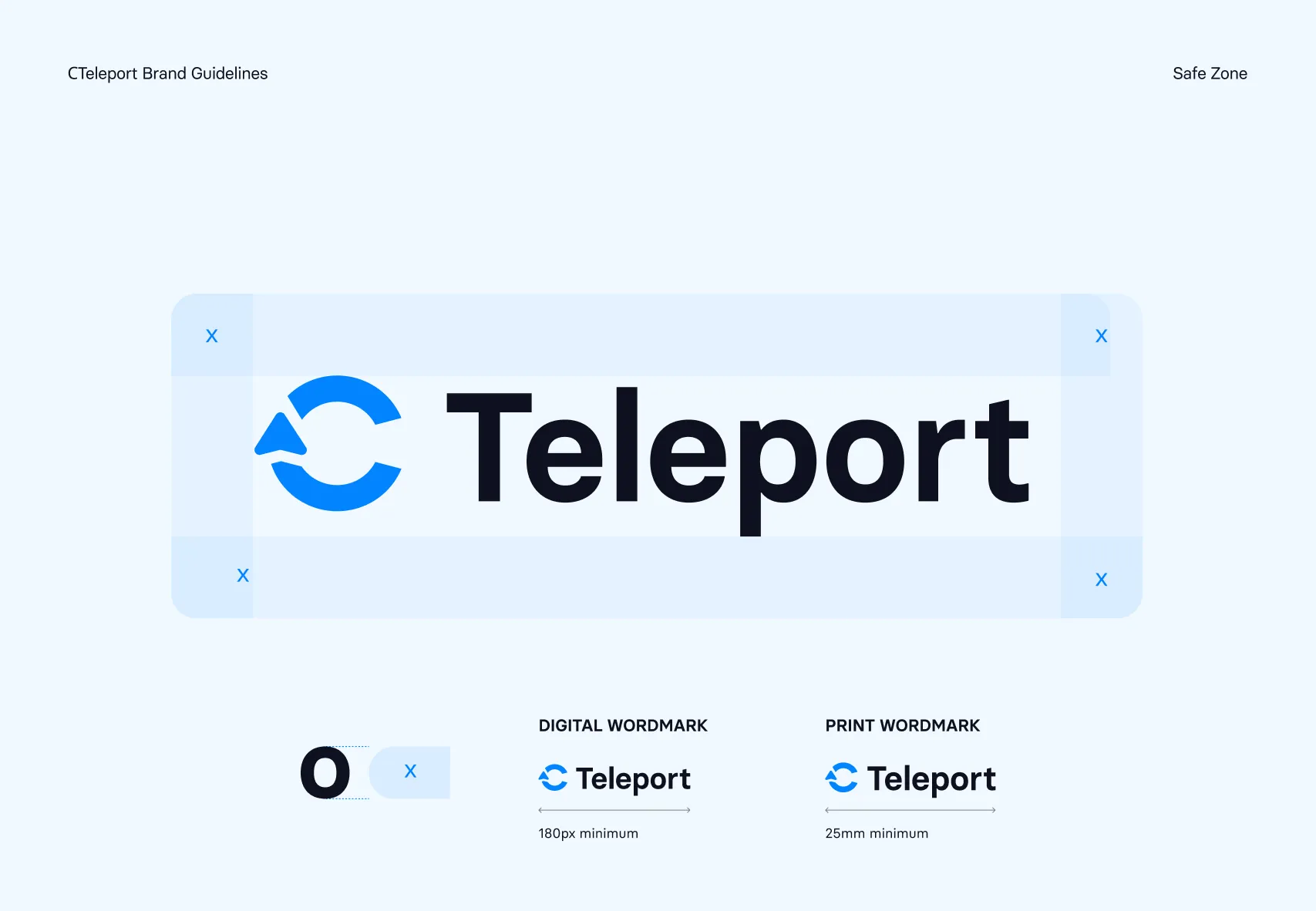
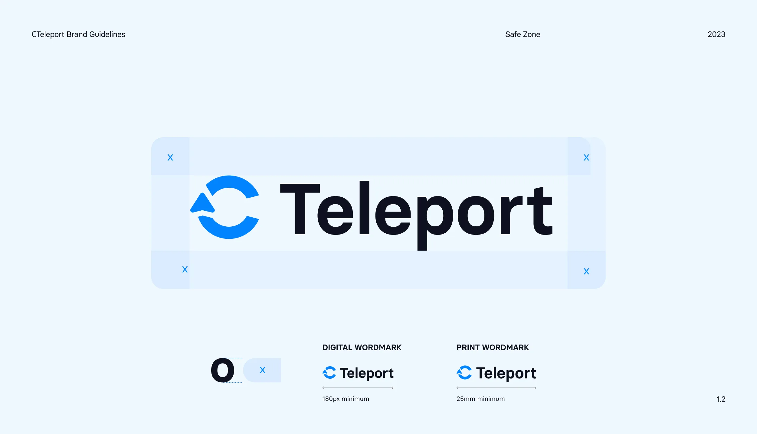
The C Teleport mark is built around a simple idea: movement through connection.
The circular form represents continuity and the journey itself, while the directional cut introduces movement and forward momentum.
The opening in the mark creates a sense of transition — a visual reference to moving from one place, system, or stage of a journey to another.
The C Teleport mark is built around a simple idea: movement through connection.
The circular form represents continuity and the journey itself, while the directional cut introduces movement and forward momentum.
Typography & Colour
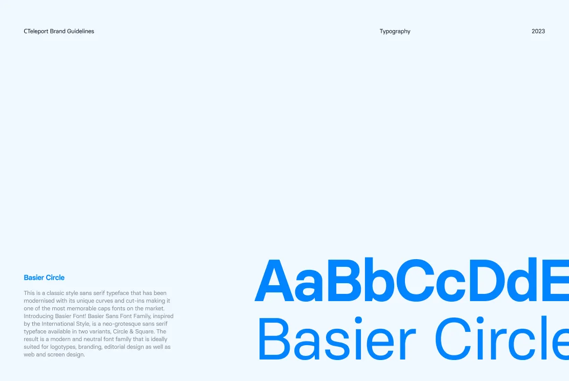
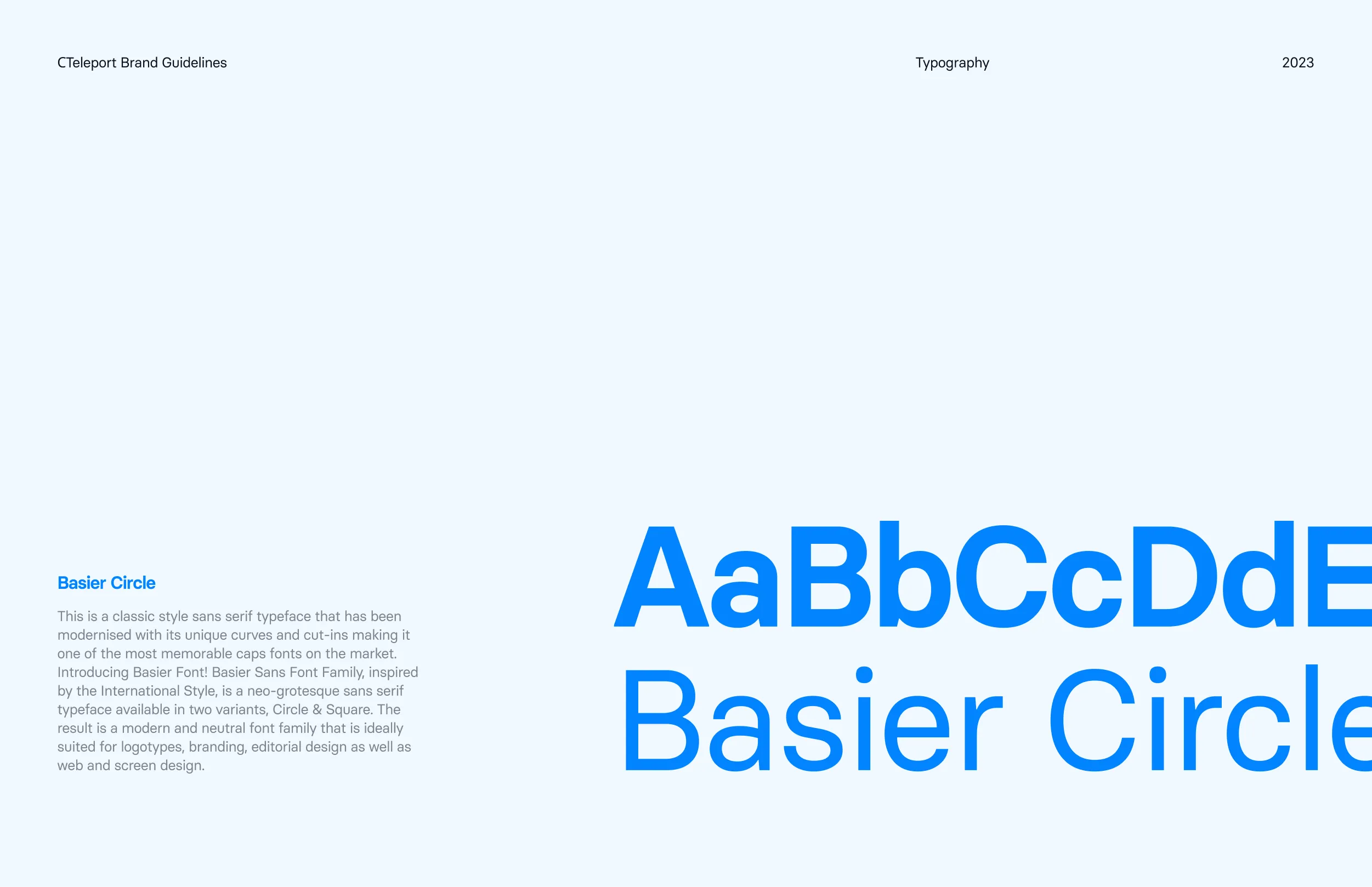
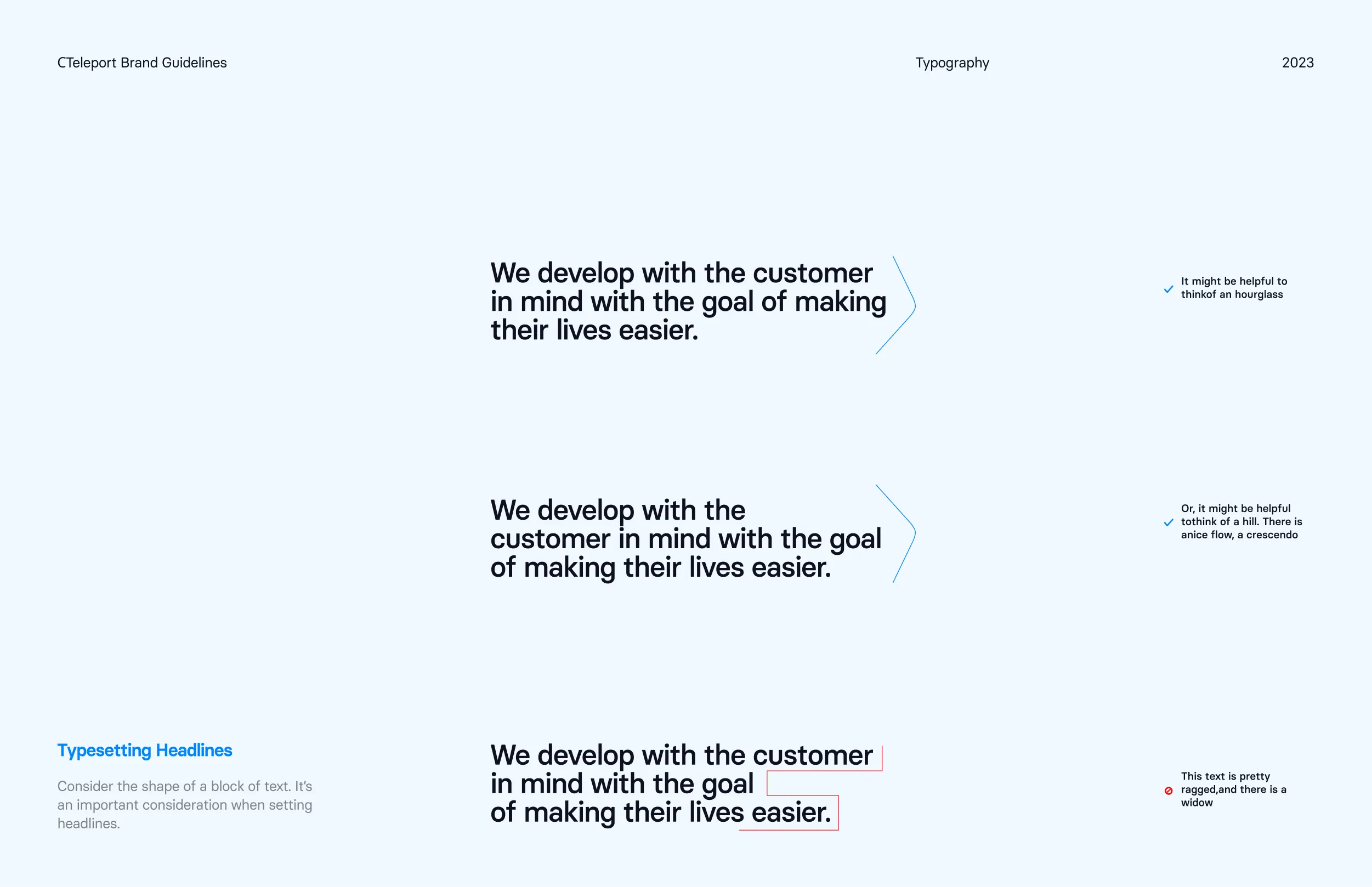
Basier Circle iis the entire type system. One family, two registers. We tested a serif for headlines and rejected it. In a tool people open under pressure, a decorative headline reads as marketing, and marketing is the last thing an operations manager wants to see when a flight has just been cancelled.
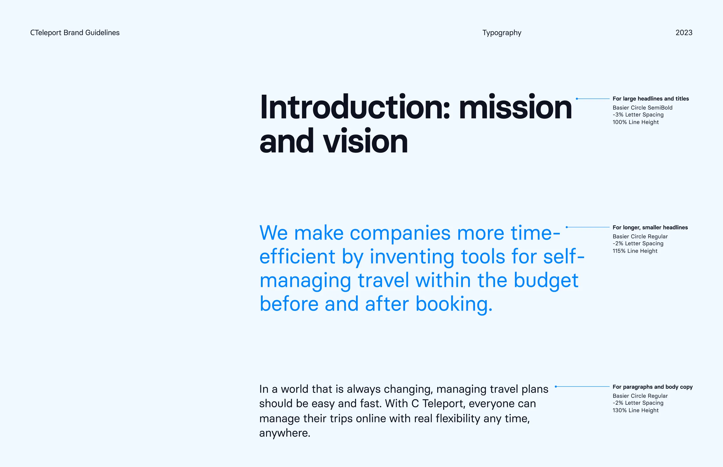
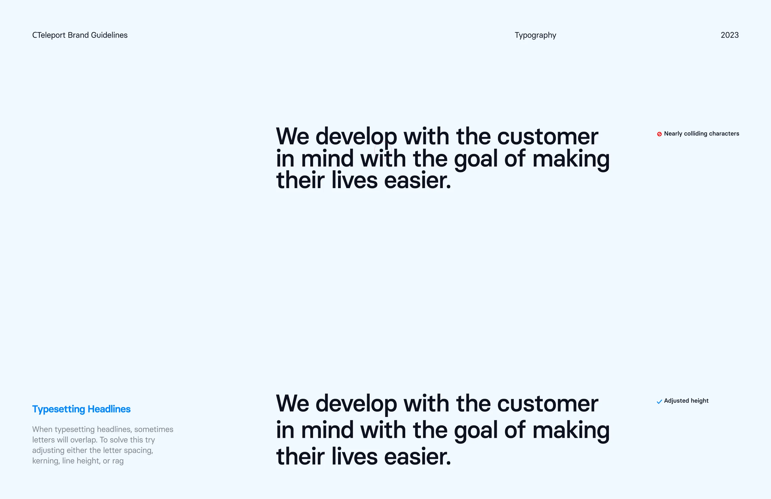
Basier Circle SemiBold carries the display layer. Set large with tight tracking at minus three percent and a hundred percent line height, it gives headlines weight and momentum without ornament. Used for hero statements, section headings, and campaign lines.
Basier Circle Regular handles the functional layer. Clean, neutral, and built for body copy, captions, and UI where clarity is critical. In a booking screen, neutrality is a safety feature. Nothing in the letterform competes with the fare, the departure time, or the cancellation rule on screen.
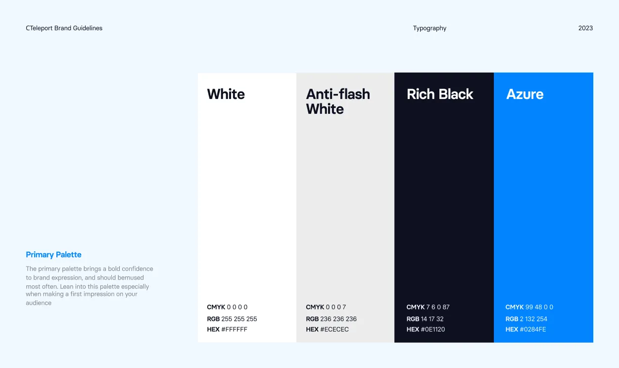
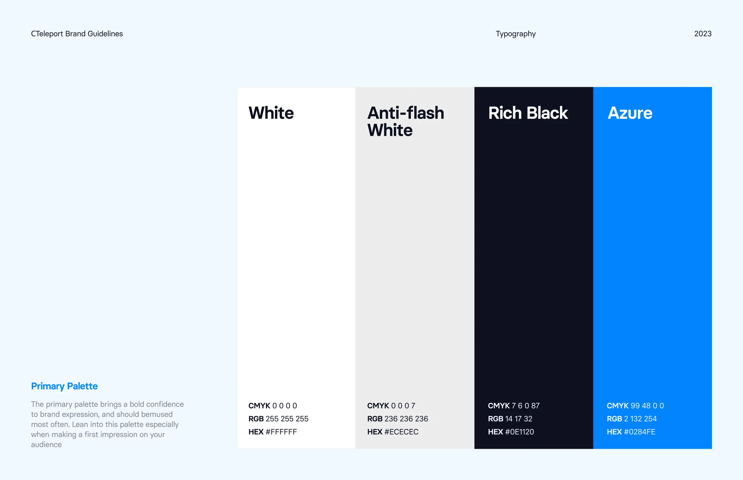
The colour palette is built around four colours that are most instantly recognisable as C Teleport.
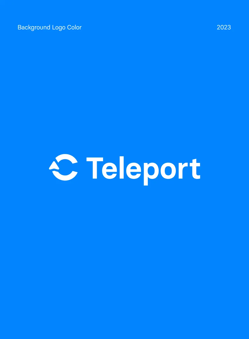
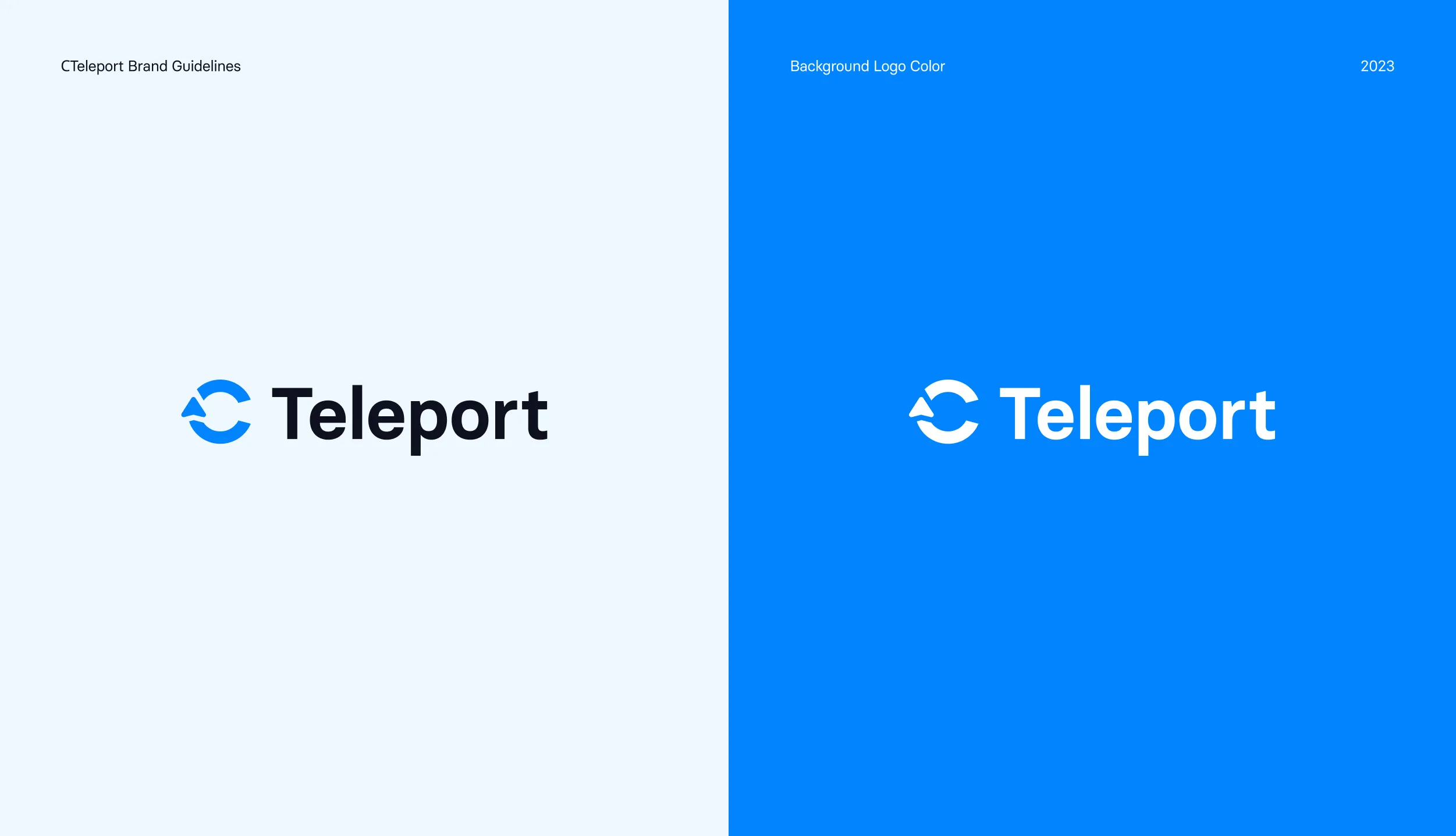
Azure #0284FE — is the primary signal colour. It carries the logo, buttons, links, and every core brand moment.
Rich Black #0E1120 — is the anchor that grounds the palette. Used for headlines, body copy, and every surface that needs weight and seriousness.
Anti Flash White #ECECEC — brings quiet separation to cards, tables, and the dense areas of the interface.
White #FFFFFF — gives the system its breathing room across screens and printed material.
When combining pieces in a layout, the colour pairings are used for consistency and legibility. Over solid backgrounds, these combinations should be used for most communications.
Iconography
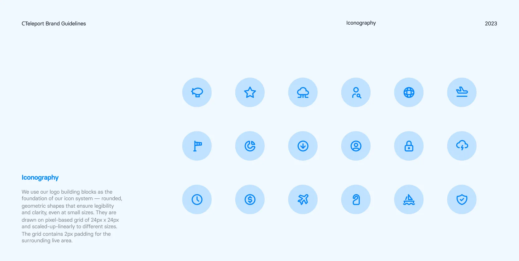
The icon set is drawn from the same building blocks as the logo. Rounded geometric shapes, a consistent stroke weight, and one shared set of curves make every icon feel like it came from the same hand.
Each icon sits on a pixel based grid of 24px by 24px with 2px of padding around the live area, then scales up linearly. That discipline is what keeps a padlock legible at sixteen pixels inside a table row and equally clear at sixty four pixels on a landing page.
The library covers the specific language of crew travel. Flights, vessels, ports, baggage, refunds, invoices, analytics, and support all needed a symbol of their own, because a generic icon pack quietly erodes trust in a product this specialised.
Icons most often sit inside a soft blue circle. The container gives them presence in a dense interface and echoes the circular geometry of the mark without ever repeating it outright.
Graphic Elements
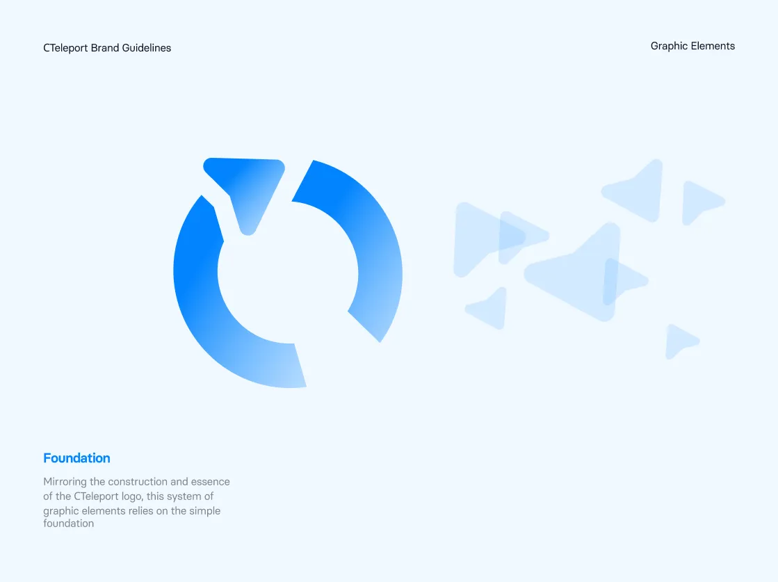
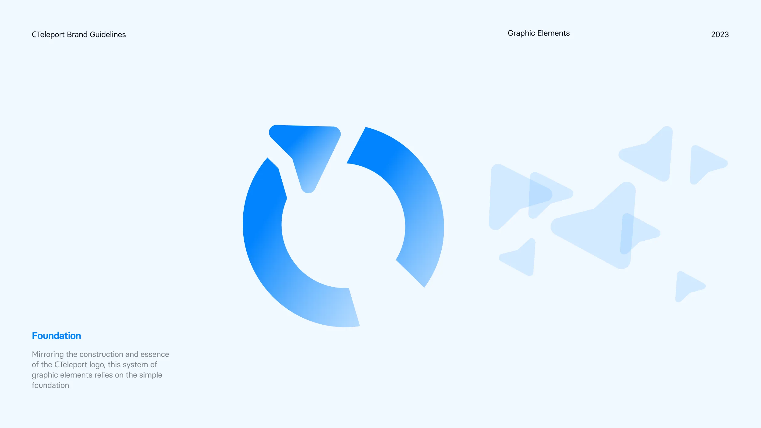
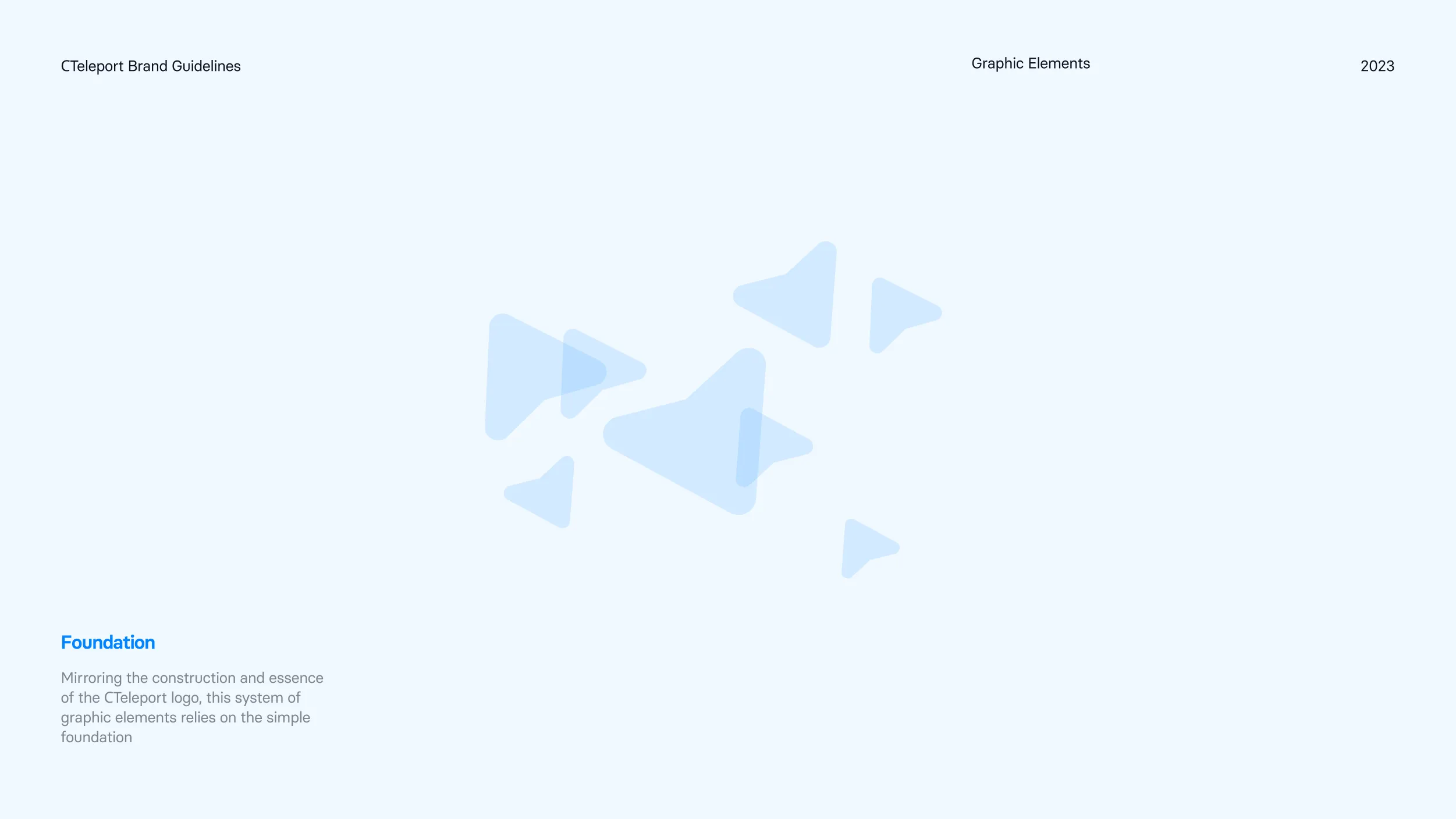
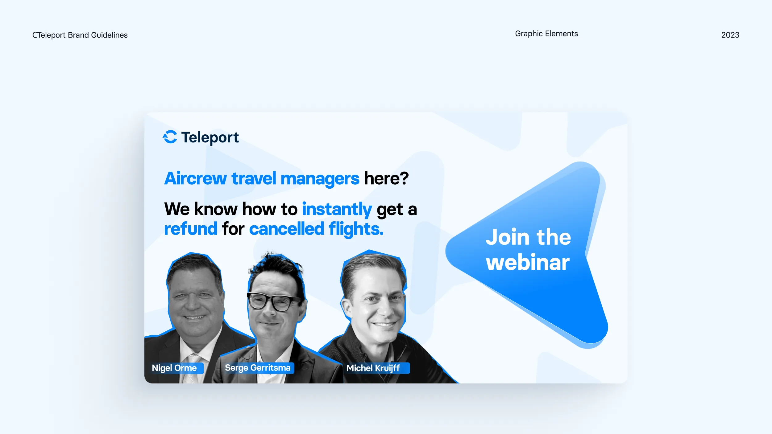
The graphic system lifts the arrowhead out of the logo and lets it live on its own. Mirroring the construction and essence of the C Teleport mark, the whole language is built from that one simple foundation.
At large scale the arrow becomes a hero shape, filled with a gradient that moves from Azure into light. At small scale it multiplies into a soft drifting pattern that fills a background without ever competing with the message sitting on top of it.
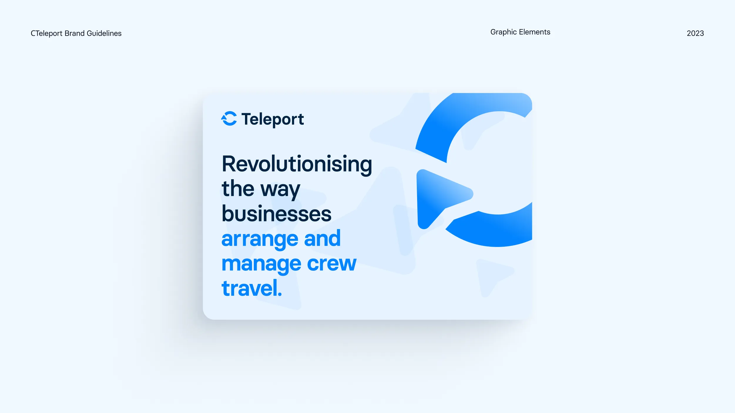
The loop appears as a framing device on campaign cards and covers, cropped and rotated so that every layout feels different while staying unmistakably C Teleport. It gives the marketing team a shape to compose with instead of a template to fill in.
Because everything is vector and gradient based, the system holds up wherever the brand shows up. Webinar promotions, social posts, event banners, sales decks, and product announcements all draw from the same short vocabulary.
Photography
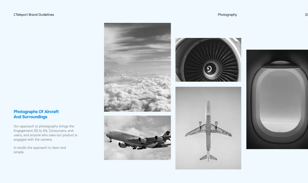
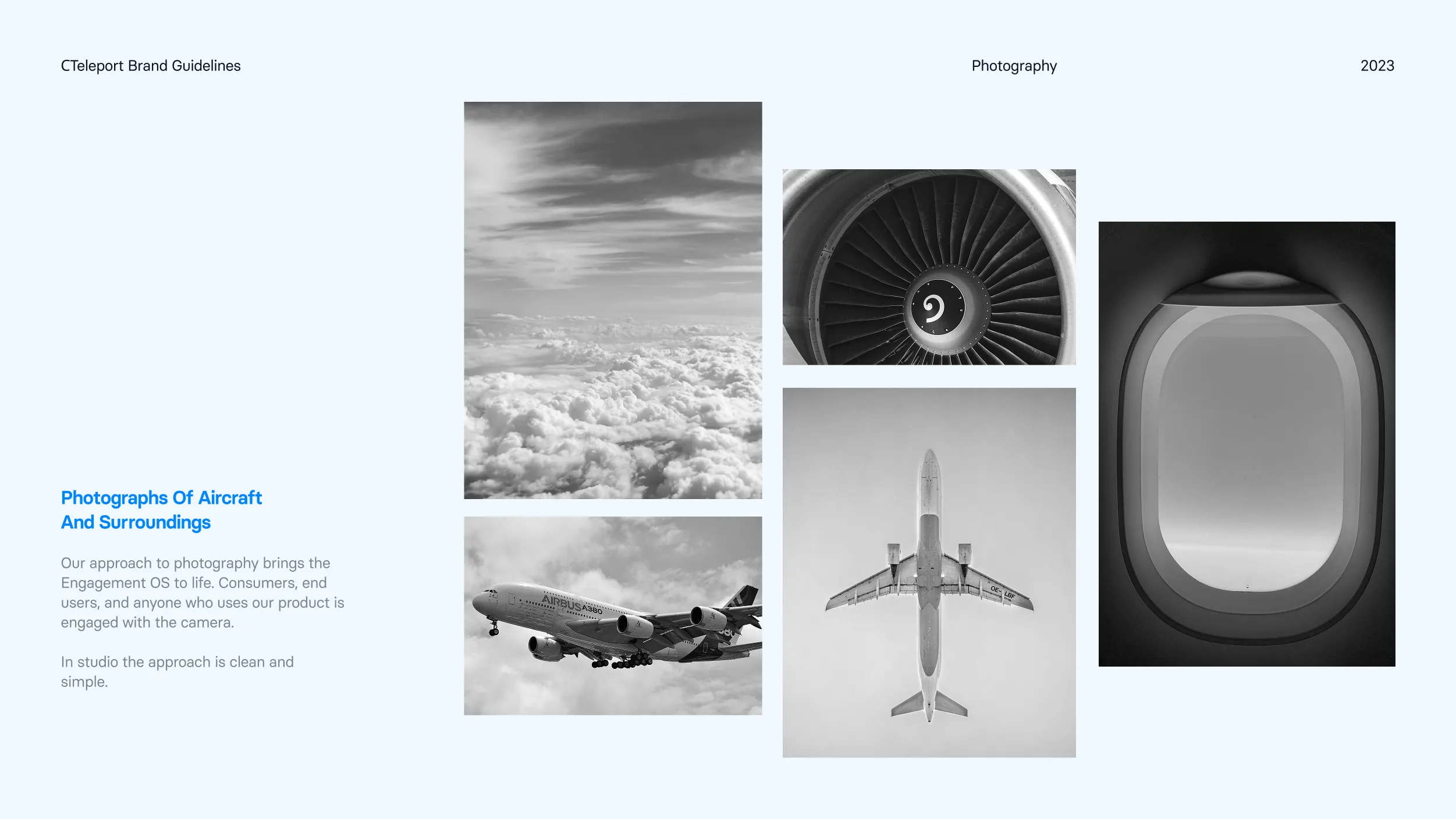
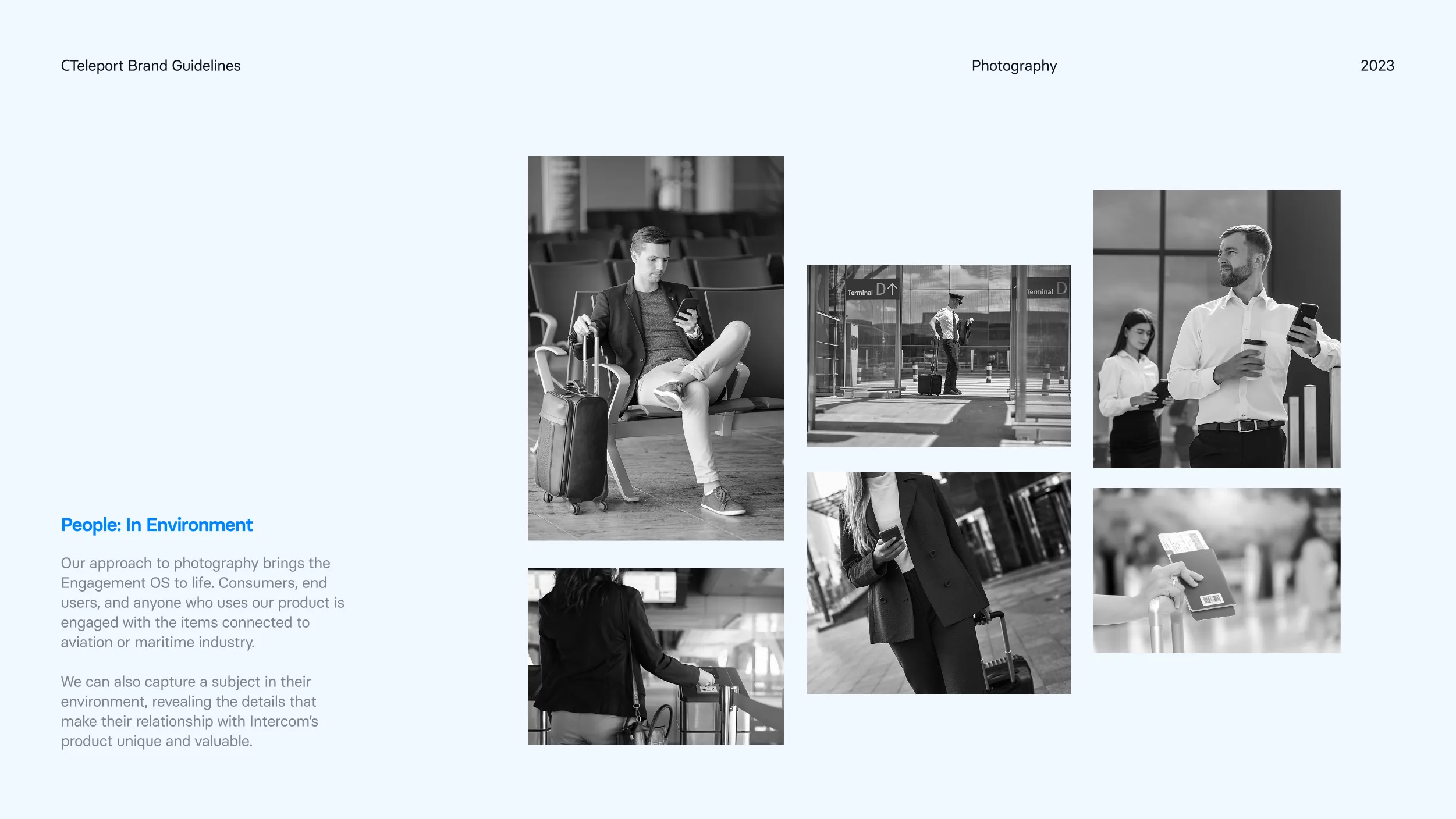
Photography is deliberately quiet. Everything is black and white, which keeps Azure as the only colour in the frame and lets the brand read instantly even inside a crowded feed.
The first stream is aircraft and surroundings. A wing above cloud, the blades of an engine, the soft curve of a cabin window. These images carry the feeling of travel without ever tipping into stock photography about smiling passengers.
The second stream is people in environment. Crew and travel managers inside terminals, at gates, checking a phone between legs of a journey. The camera stays observational and catches people mid task rather than posed, because the product lives in exactly those moments.
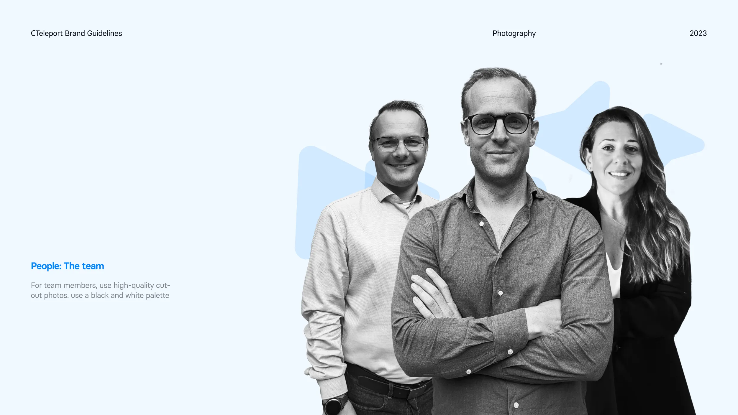
For the team, the approach is a high quality cut out portrait on a light background with the graphic elements sitting behind. It puts real faces beside a technical product and keeps the company human at the point where trust is actually decided.
C Teleport Product and
Responsive Overview
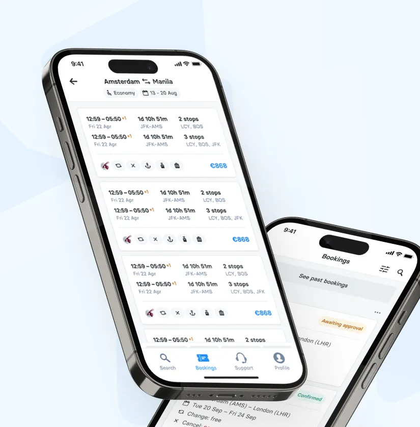
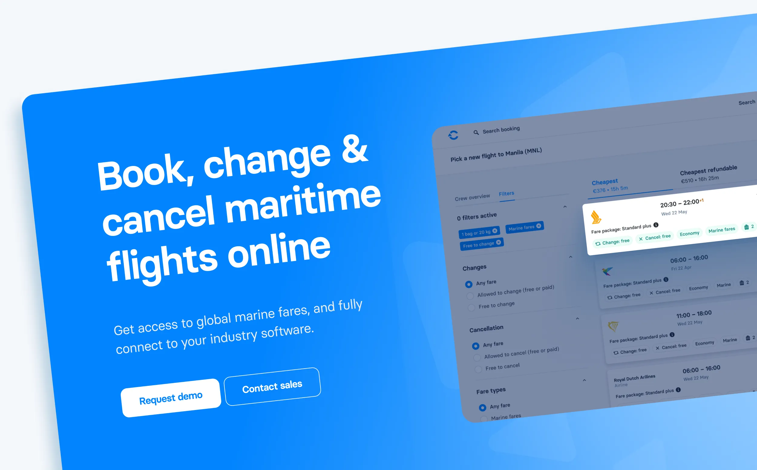
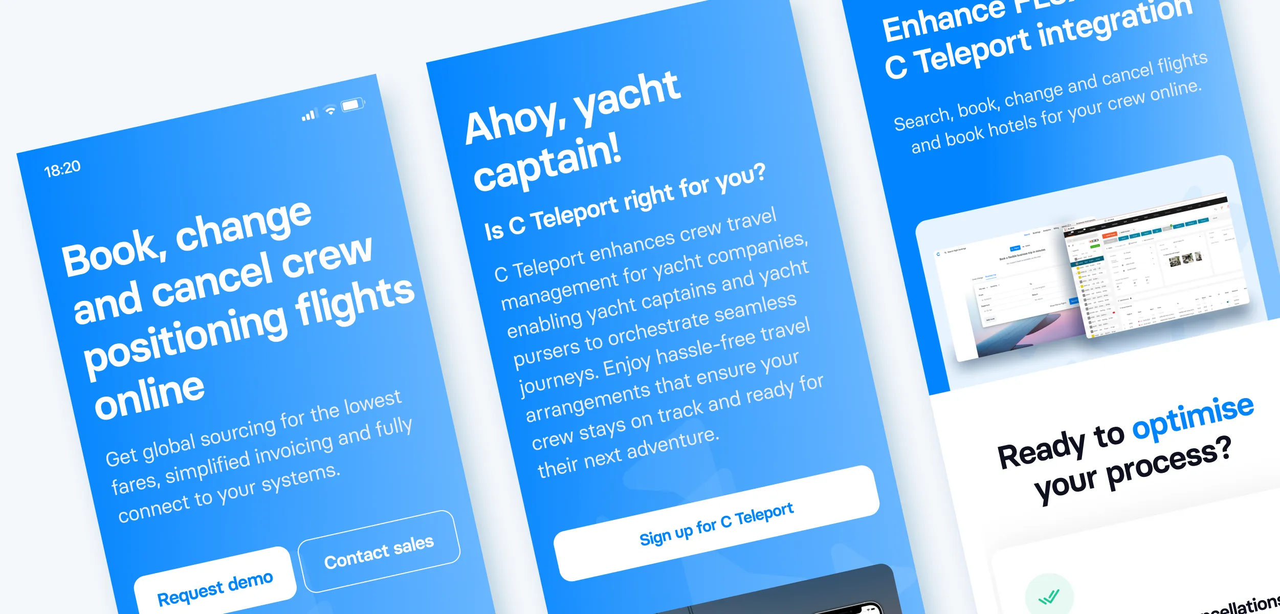
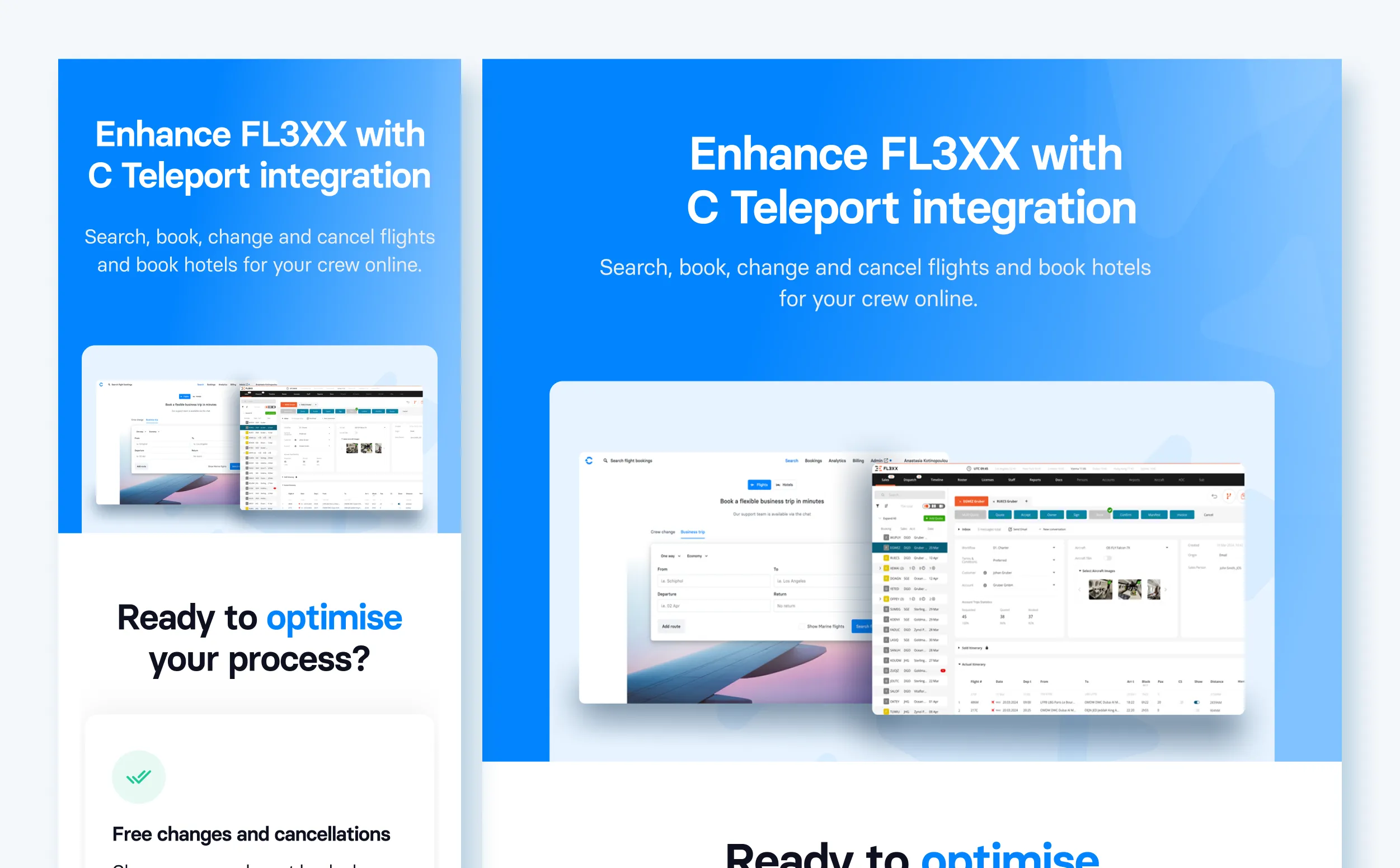
C Teleport is built for the people running crew rotations. The desktop first platform handles search, booking, changes, cancellations, crew overviews, fare rules, analytics, and invoicing in one place. Marketing pages, integration pages, and support content stay fully responsive for managers and crew checking a booking from a phone.
Components are built to scale. The design system powers the booking flow, the dashboard, integration pages, campaign landing pages, and email, reducing cognitive load and reinforcing C Teleport as a platform that stays steady even when a schedule does not.
Remarkable success story of Lionstep
We are thrilled to share the incredible success story of Dorik. One of Dorik’s most significant achievements has been empowering small businesses and individual creators to establish their online presence with ease. Since its launch, Dorik has achieved remarkable milestones, transforming the lives of countless people around the world.
The platform’s subscription-based model and additional premium features generated substantial revenue. The company has successfully entered international markets, translating the platform into multiple languages and adapting it to meet diverse user needs worldwide.