
How We Designed the Ezycourse Brand to Make Online Learning Feel Effortless
Ezycourse came to us with a clear vision and a real positioning challenge to solve. Course creators, educators, and knowledge entrepreneurs were navigating a crowded e-learning market filled with platforms that felt either too technical for beginners or too generic to inspire confidence. Building a course was supposed to feel empowering. Most tools made it feel like a chore.
Ezycourse had built a powerful platform to help anyone create, manage, and sell online courses without friction. What they needed was a visual identity and brand language that could communicate that capability immediately, without overwhelming the very audience they were trying to welcome.
We were brought in to lead branding, visual identity, and design across the platform and marketing surface.
Services
Website





Problem and Solution
Ezycourse needed more than just a logo. They required a complete identity system to position themselves as a trusted, modern platform in education. The challenge was to:
Build trust and authority in a competitive space
Reflect their mission of growth and scalability
Ensure consistency across digital and physical platforms
We developed a comprehensive and scalable brand identity system firmly grounded in the principles of clarity, confidence, and approachability. This system not only reflects their core values but also ensures their brand resonates with their audience in a meaningful way.
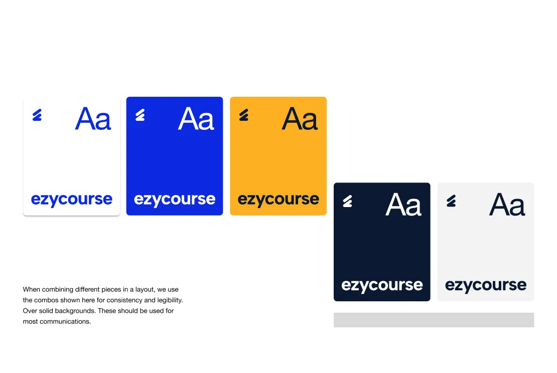
A colour palette built around bold EzyBlue with a warm Bold Yellow accent
A typography system balancing editorial authority with clean functional clarity
A logo mark symbolising growth, independence, and financial freedom
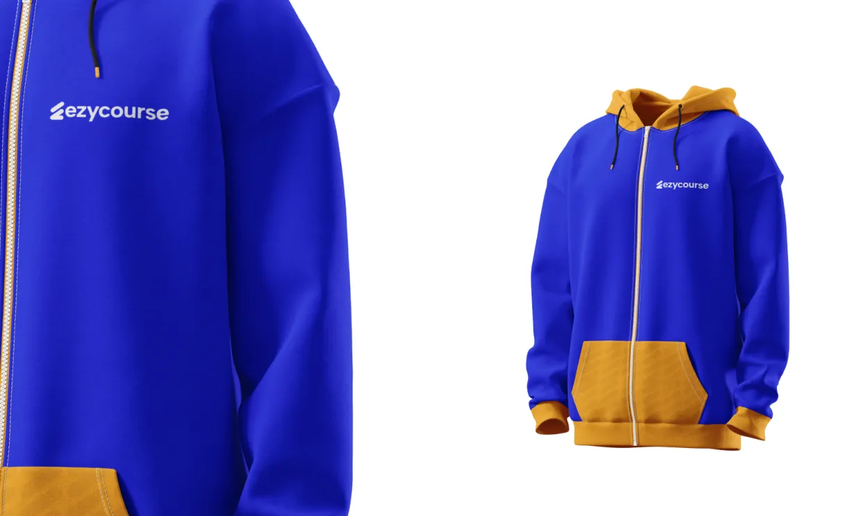
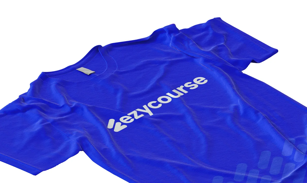
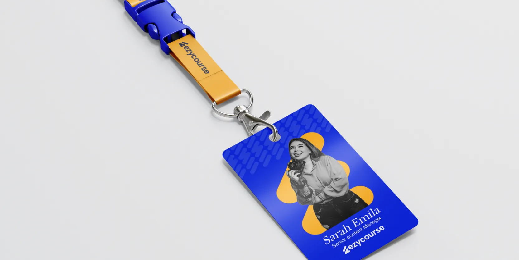
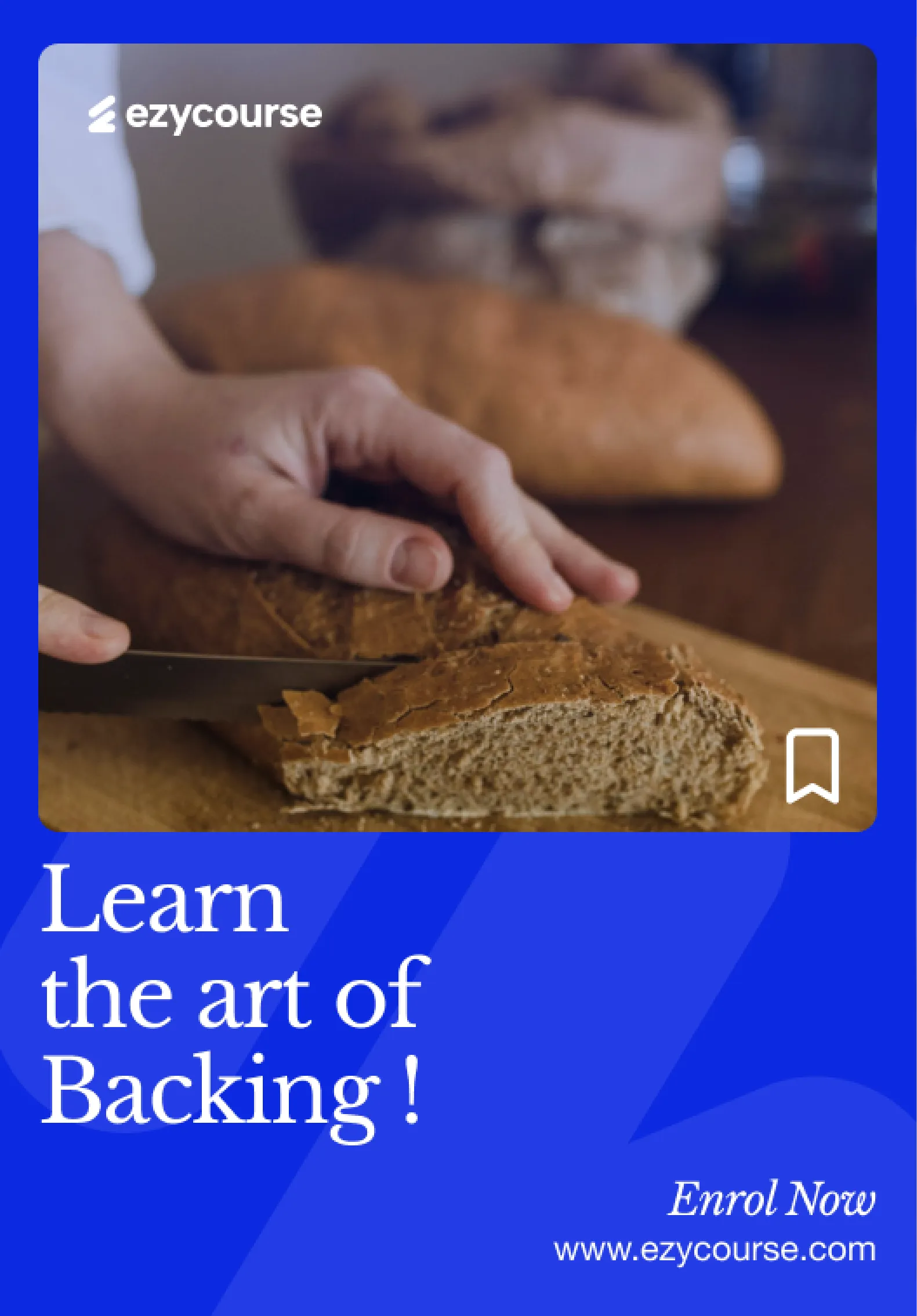
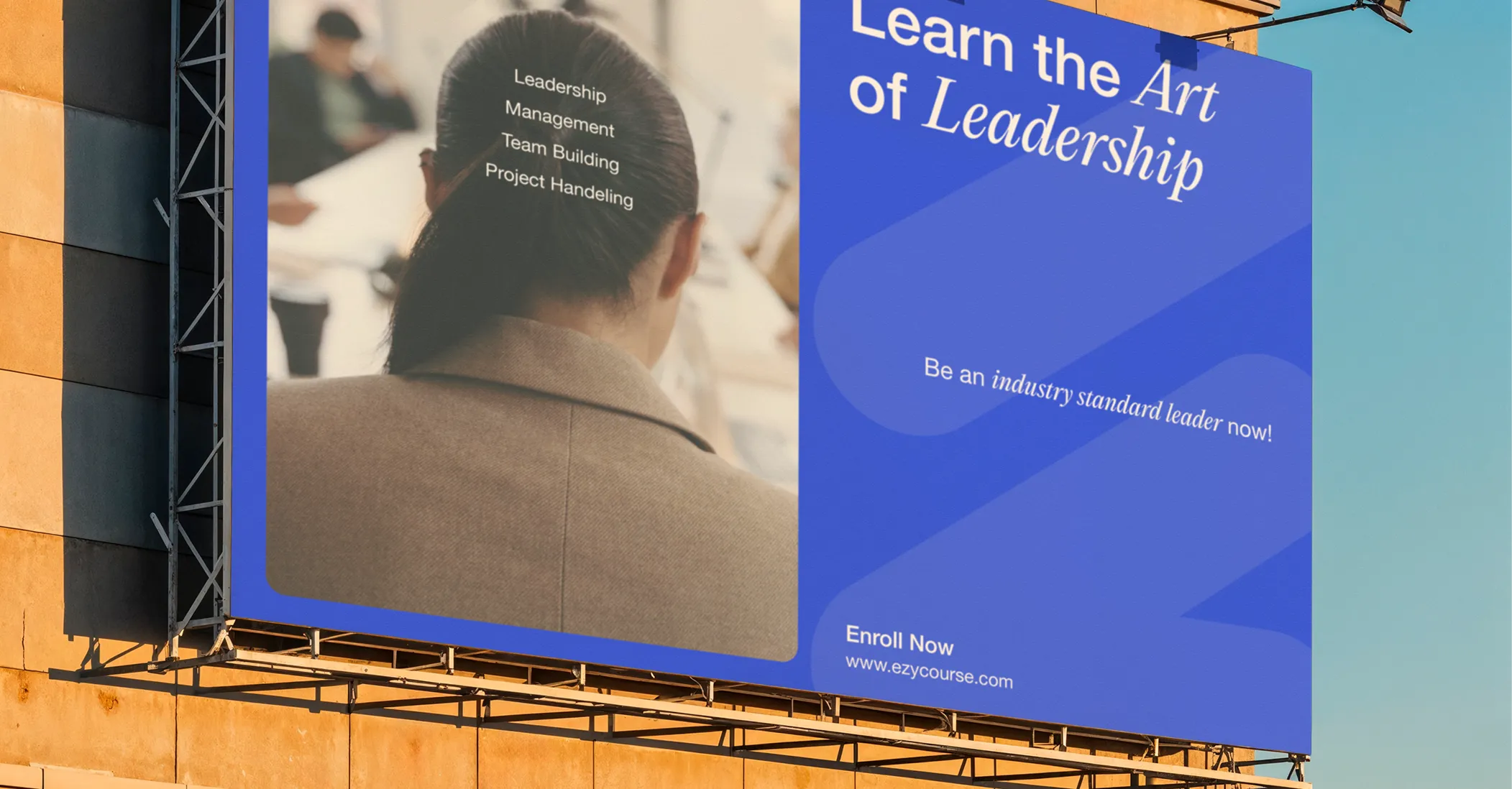
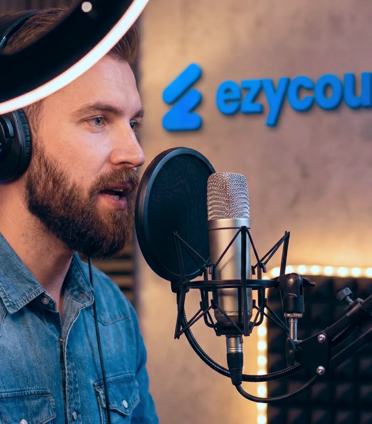
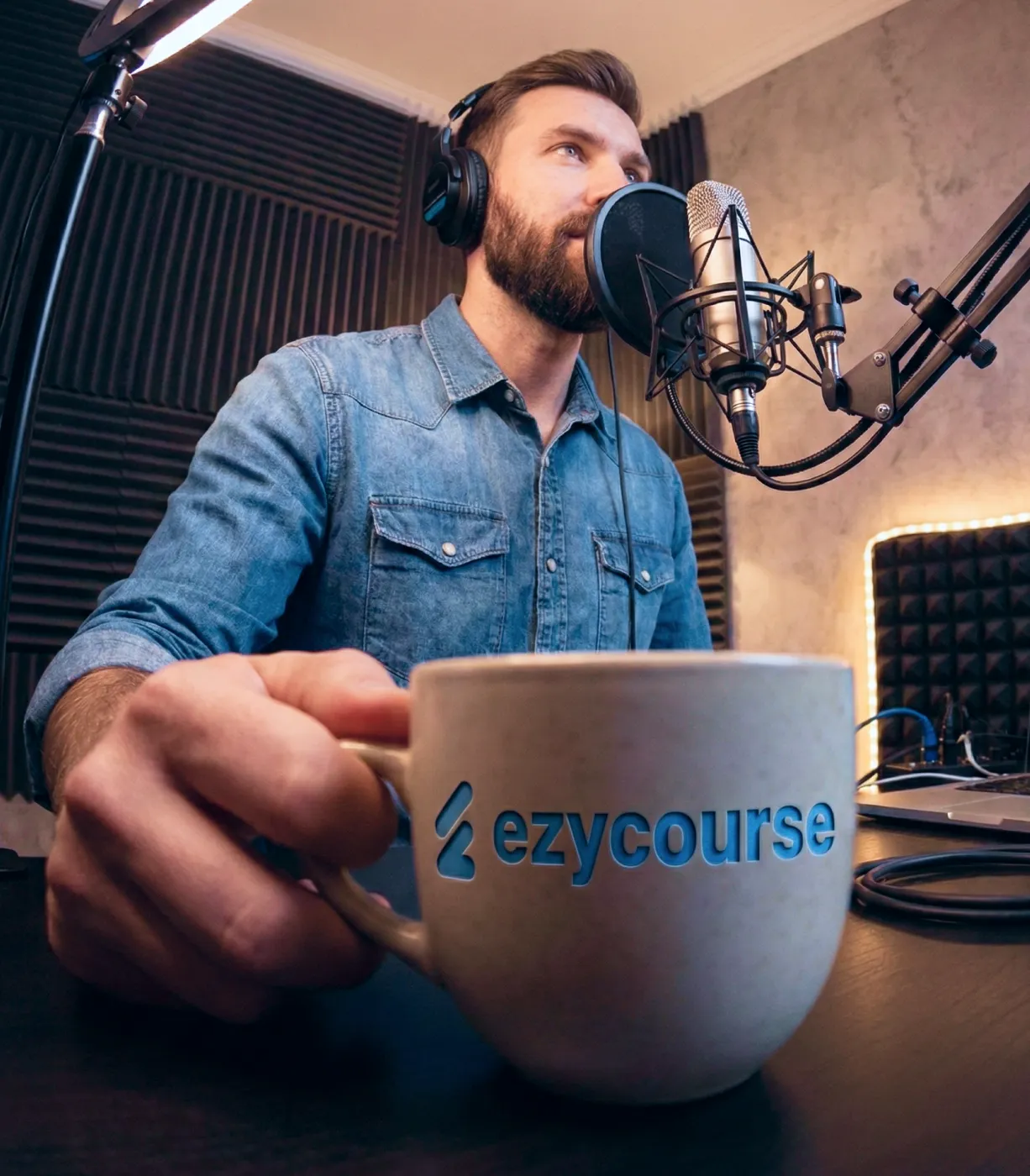
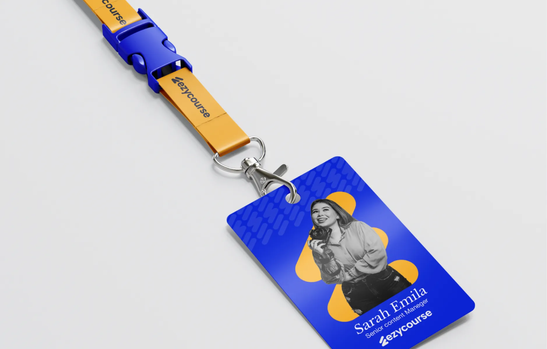
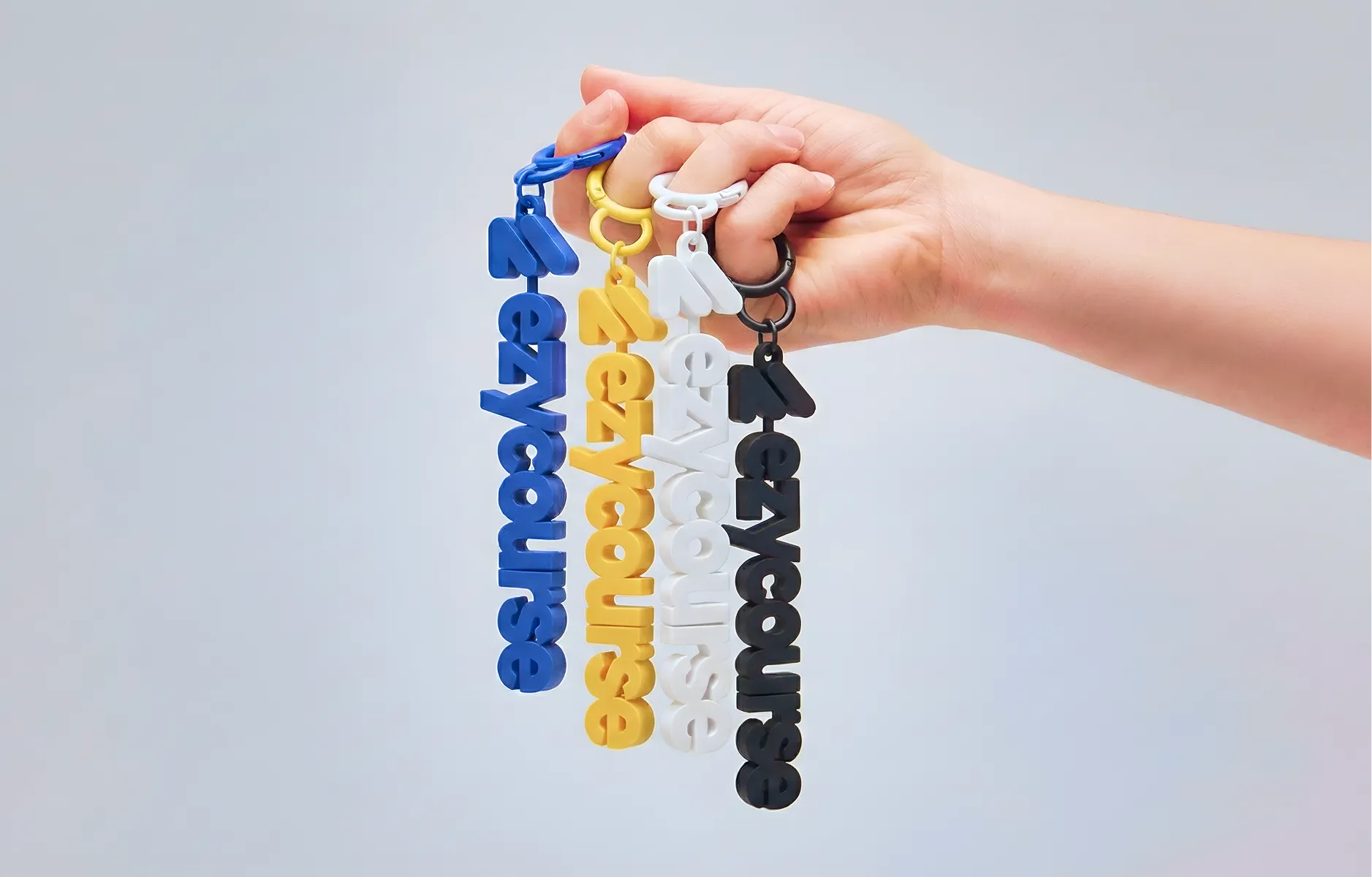
Applications spanning digital platforms, apparel, print, and environmental signage

Logo Development
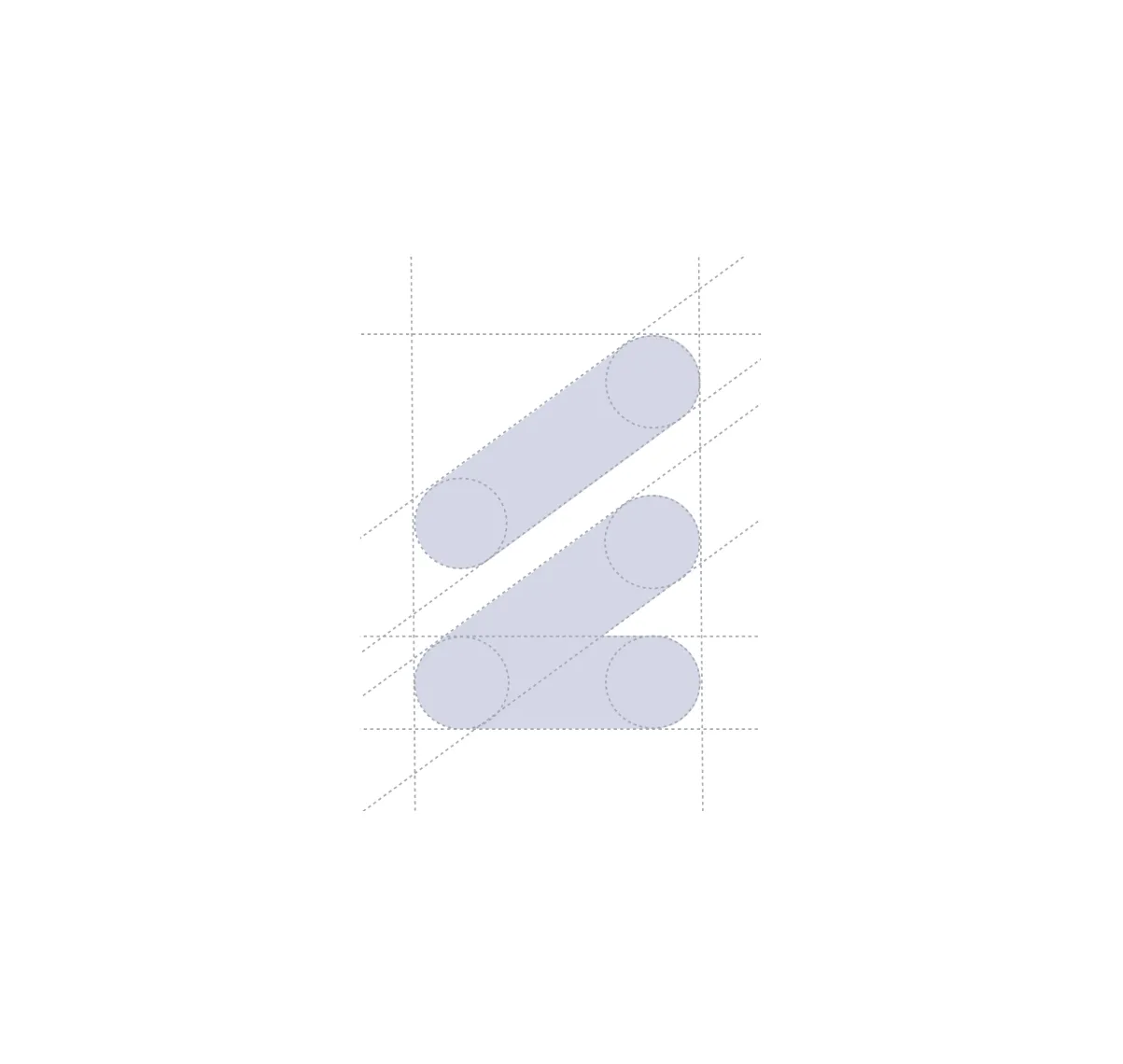
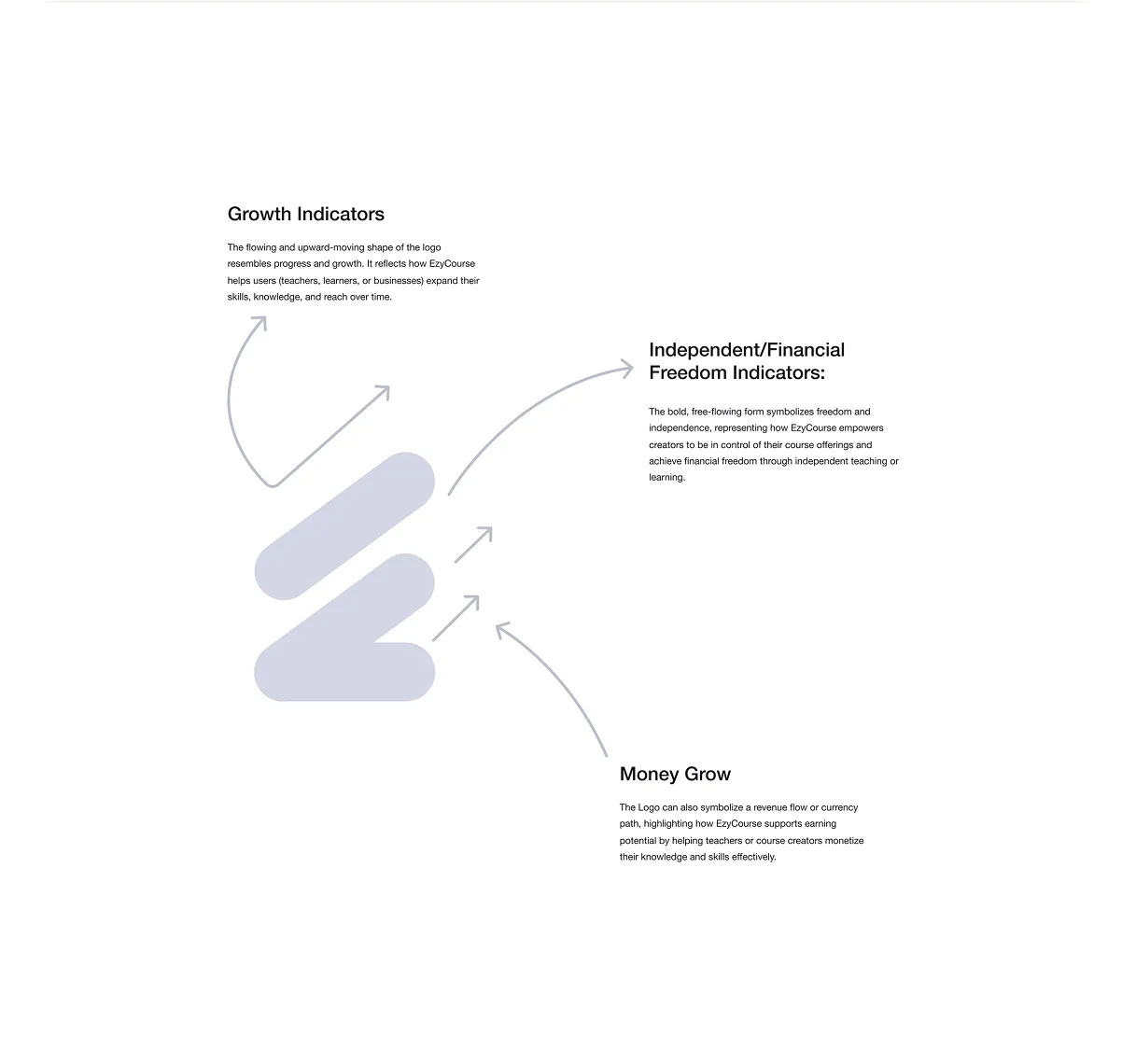
The Ezycourse logo mark is a combination of E and C, the two letters that form the name EzyCourse. But the construction goes deeper than initials. The clean, minimal form was designed to carry three distinct meanings at once.
The upward flowing shape represents progress and growth. It reflects how EzyCourse helps teachers, learners, and businesses expand their skills, knowledge, and reach over time.
The bold, free flowing form symbolises freedom and independence, representing how EzyCourse empowers creators to be in control of their course offerings and achieve financial freedom through independent teaching and learning.
At a third layer, the mark reads as a revenue flow or currency path, a quiet nod to the earning potential the platform unlocks for course creators and educators.
By combining simplicity and purpose in a single mark, the logo ensures the brand communicates both innovation and educational support at every scale and in every context.




Typography & Colour
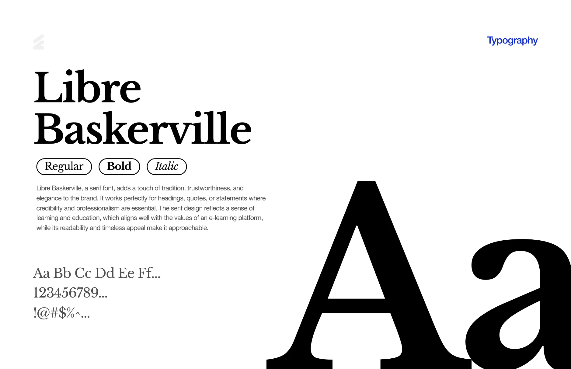
Libre Baskerville is the brand headline font. A serif with tradition, trustworthiness, and elegance, it works perfectly for headings, quotes, and statements where credibility and professionalism are essential. The serif design reflects a sense of learning and education, while its timeless appeal keeps it approachable. Available in Regular, Bold, and Italic.
Helvetica Neue handles the functional layer. A clean and modern sans-serif ideal for body text, captions, and UI elements where clarity is crucial. Its minimalist and neutral design ensures the platform feels sleek and contemporary while keeping the focus on the content. Available in Light, Regular, Medium, Bold, Medium Italic, and Bold Italic.
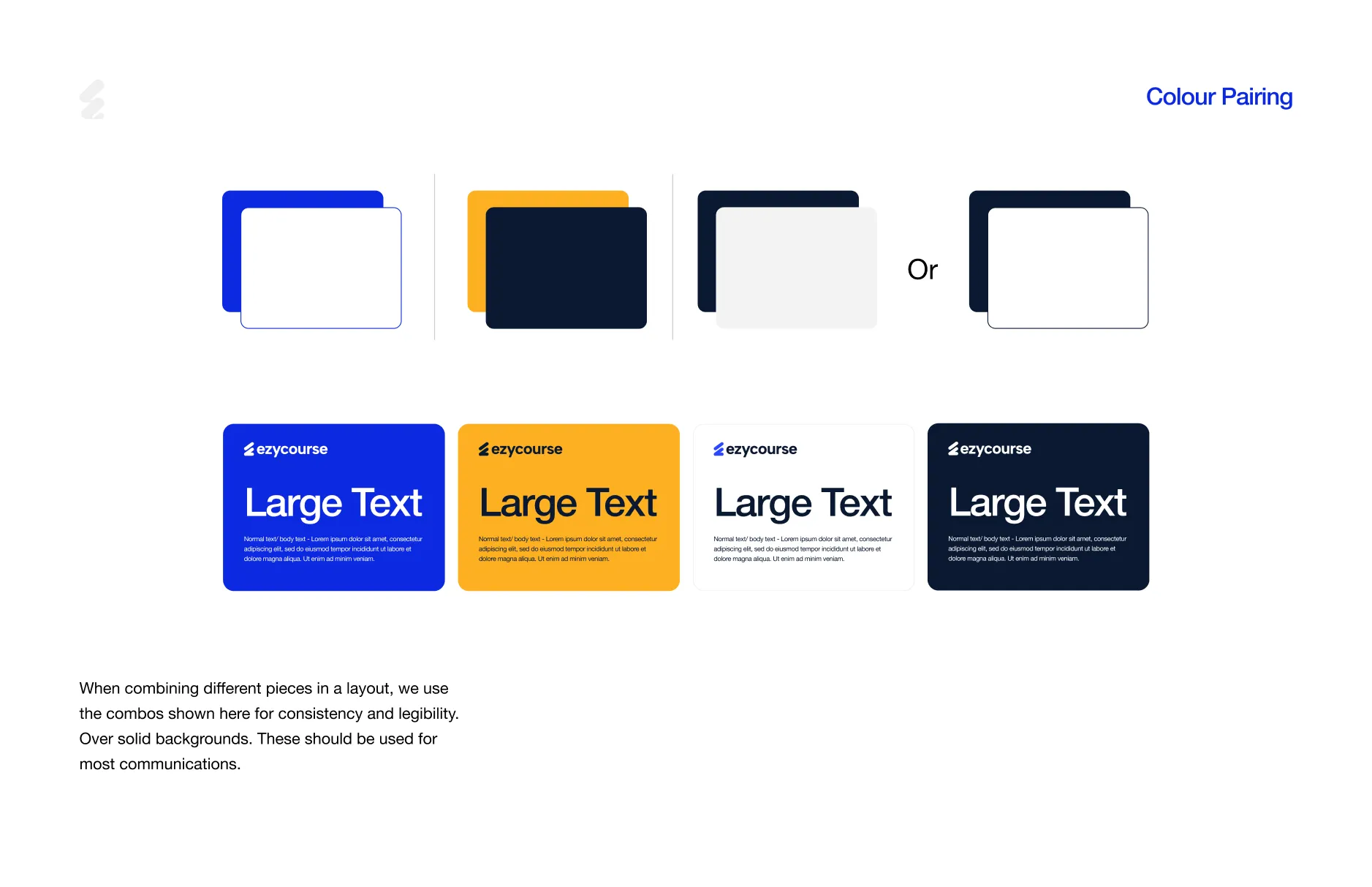
The colour palette is built around four colours that are most instantly recognisable as EzyCourse.
EzyBlue #0D29E1 — the anchor brand colour. Bold, electric, and immediately ownable. The dominant force across the logo, UI, and every core brand moment.
EzyBY #FDB022 — Bold Yellow. Brings warmth and energy to the identity. Where EzyBlue commands authority, EzyBY injects optimism and momentum.
EzyDark #0A1931 — a deep navy that grounds the palette. Used for text, dark backgrounds, and surfaces that need weight and seriousness.
EzyLight #F2F3F3 — a clean off-white that provides breathing room across interfaces and printed materials.
When combining pieces in a layout, the colour pairings are used for consistency and legibility. Over solid backgrounds, these combinations should be used for most communications.


Conclusion
Ezycourse launched with an identity that does exactly what a brand should do. Creators see something worth building on. Learners see something worth trusting.
The logo scales from app icon to office wall. The colours work across every surface. The typography holds the voice together from a landing page to a course description.
As the platform grows, the foundation holds. That is what good branding is built for.


Remarkable success story of Lionstep
We are thrilled to share the incredible success story of Dorik. One of Dorik’s most significant achievements has been empowering small businesses and individual creators to establish their online presence with ease. Since its launch, Dorik has achieved remarkable milestones, transforming the lives of countless people around the world.
The platform’s subscription-based model and additional premium features generated substantial revenue. The company has successfully entered international markets, translating the platform into multiple languages and adapting it to meet diverse user needs worldwide.