How We Built Higlobe to Help Global Professionals Keep More of What They Earn
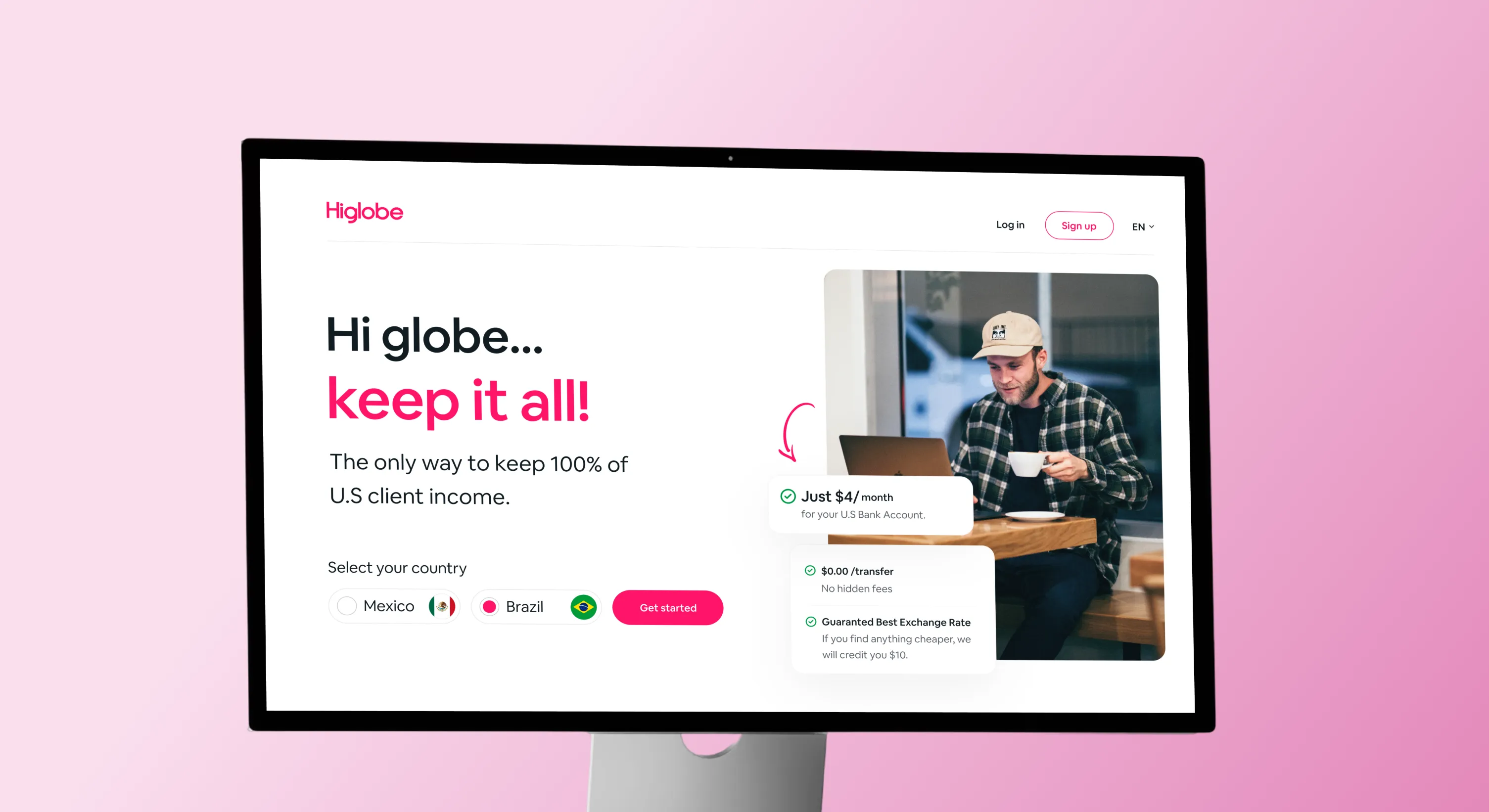
Higlobe approached us with a clear ambition: create a financial brand that feels modern, trustworthy, and built for a new generation of global workers.
For freelancers, agencies, and remote teams, receiving international payments is often slower, more expensive, and more complicated than it should be. Higlobe set out to simplify that experience with a platform designed around speed, transparency, and control.
Our role was to shape a complete visual identity and digital experience that communicates confidence without feeling like a traditional bank. Every touchpoint was designed to make cross border finance feel approachable, intuitive, and effortless.
Services
- Branding
- UI/UX Design
Website
Problem and Solution
Higlobe entered a competitive fintech market where trust is essential, but traditional financial brands often feel cold and overly complex. The challenge was to create an identity that felt credible while remaining friendly and accessible.
Build confidence from the very first interaction
Differentiate the brand from conventional banking products
Create consistency across digital products and marketing
We developed a comprehensive and scalable brand identity system firmly grounded in the principles of authority, clarity, and approachability. This system reflects STACC's role as a trusted intermediary while keeping the student experience welcoming.
A vibrant visual language that feels energetic yet trustworthy
A scalable typography system for digital first experiences
A flexible brand identity across product, marketing, and social media
UI components designed for clarity across every screen size


Logo Development
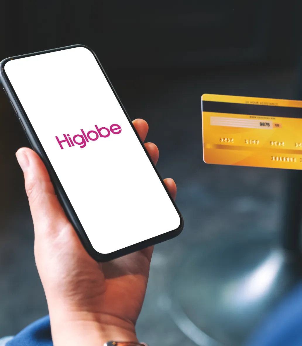
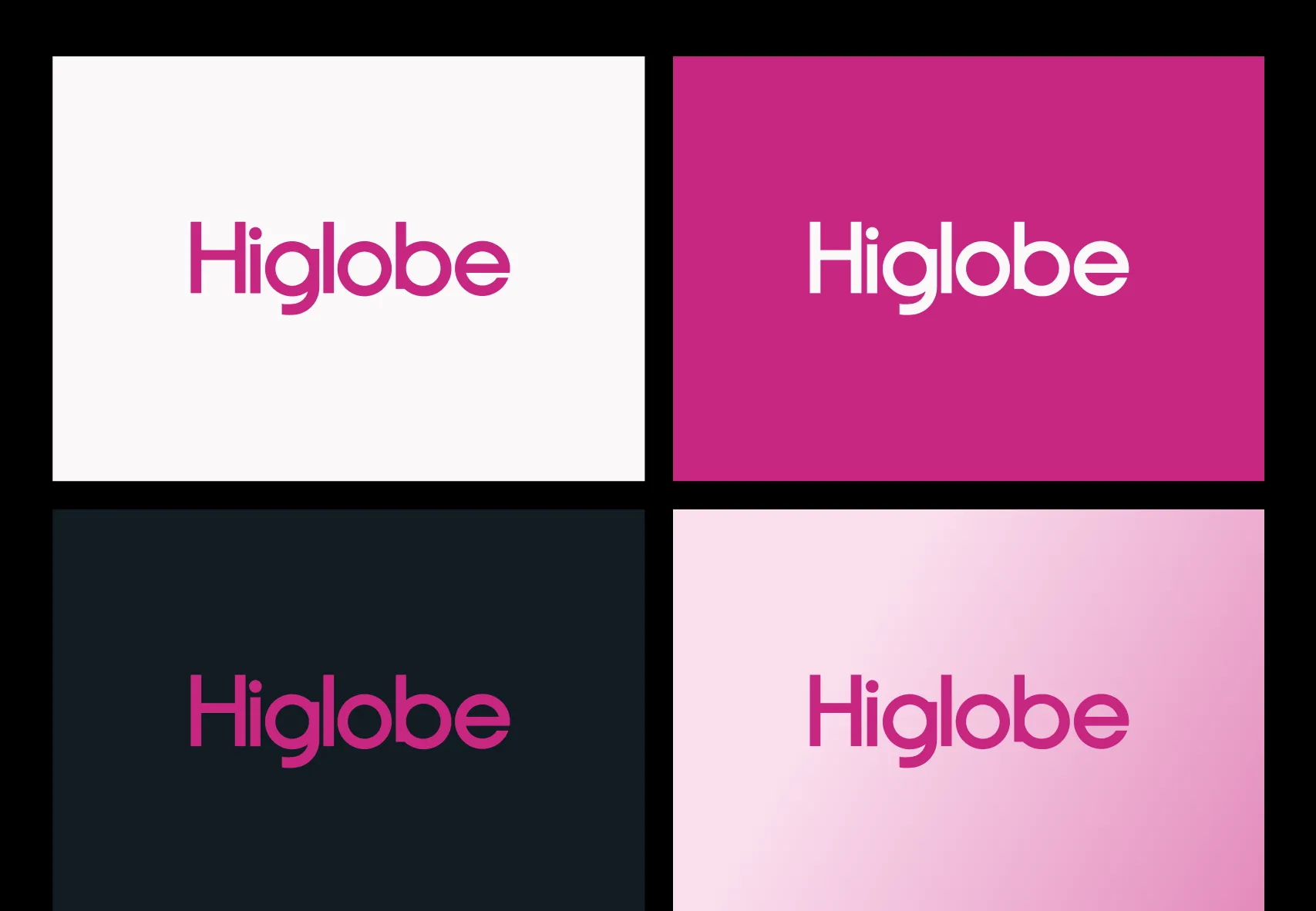
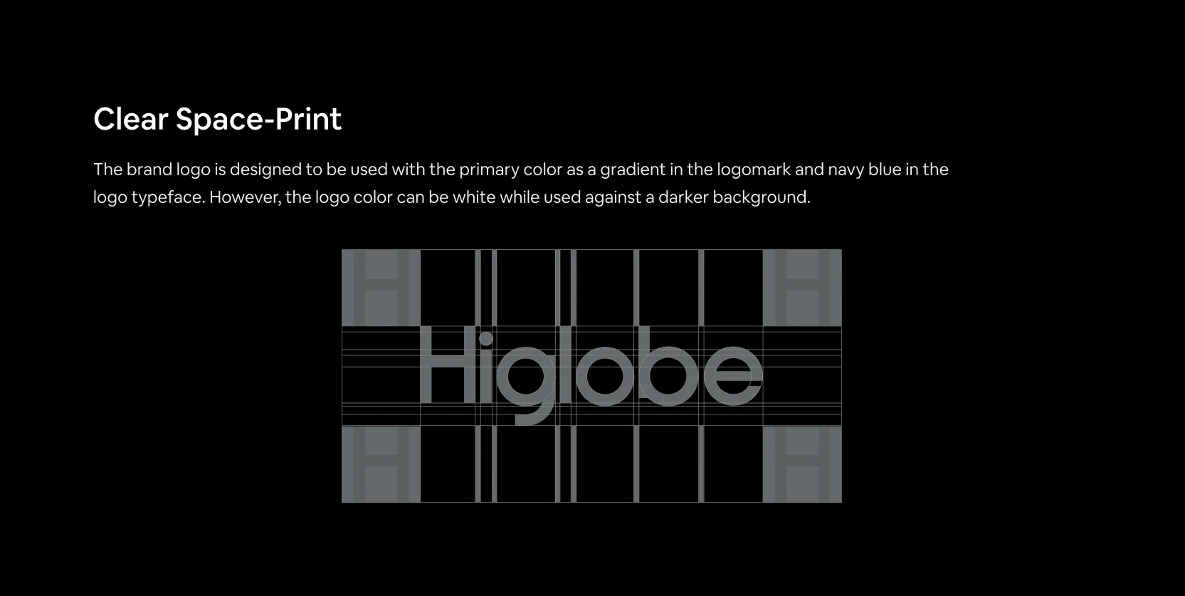
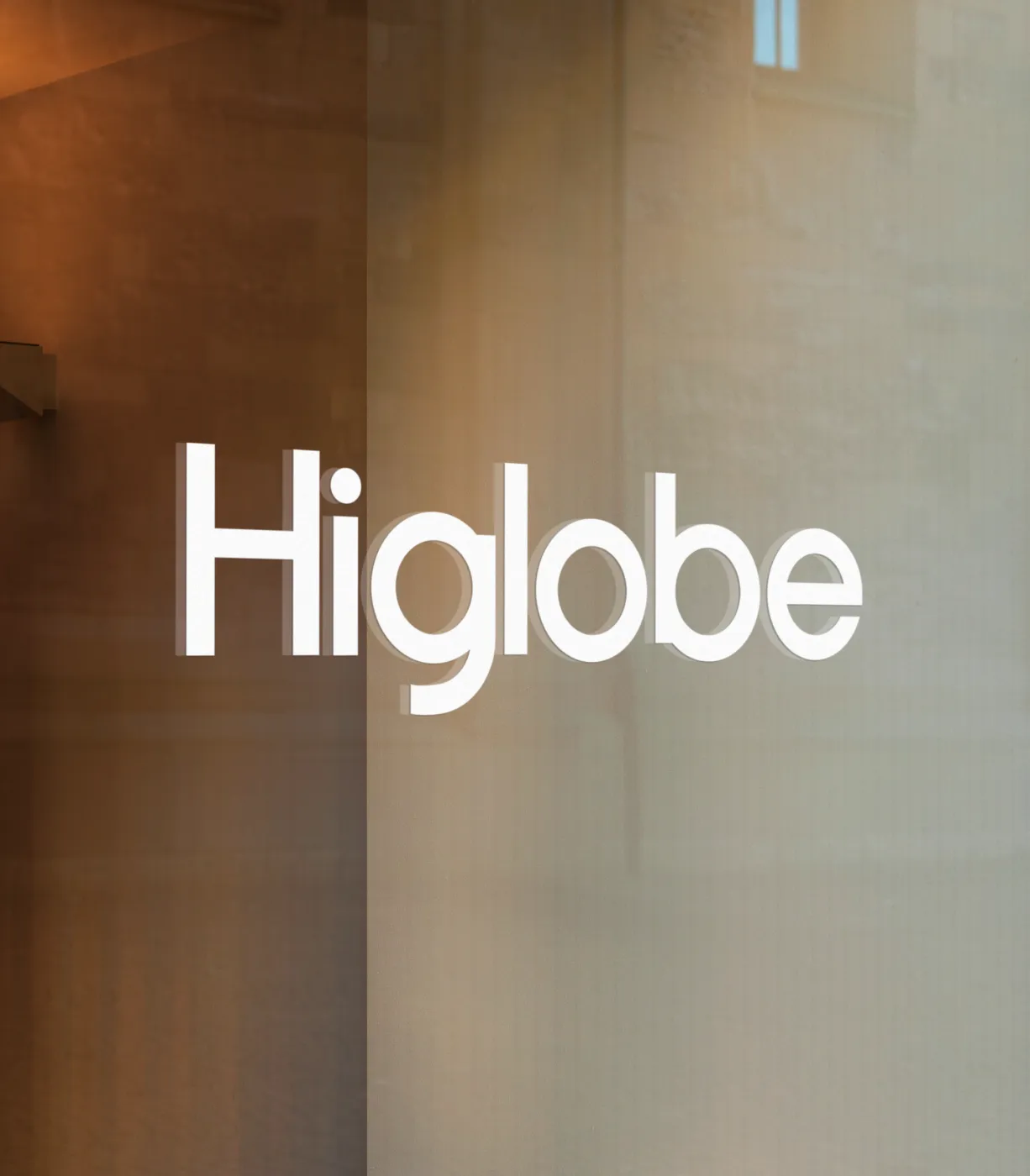
The Higlobe wordmark was designed around simplicity and movement. Clean geometric forms create a modern identity that feels approachable while remaining confident.
Rounded details soften the overall appearance, reflecting an experience built for people instead of institutions. The result is a logo that feels welcoming from the very first glance.
The balanced proportions ensure strong readability across everything from app icons to large scale marketing materials.
Rather than relying on traditional financial symbols, the identity communicates trust through clarity, consistency, and confident typography.
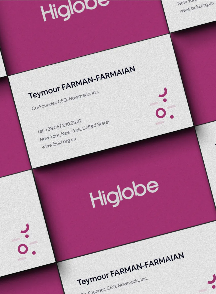
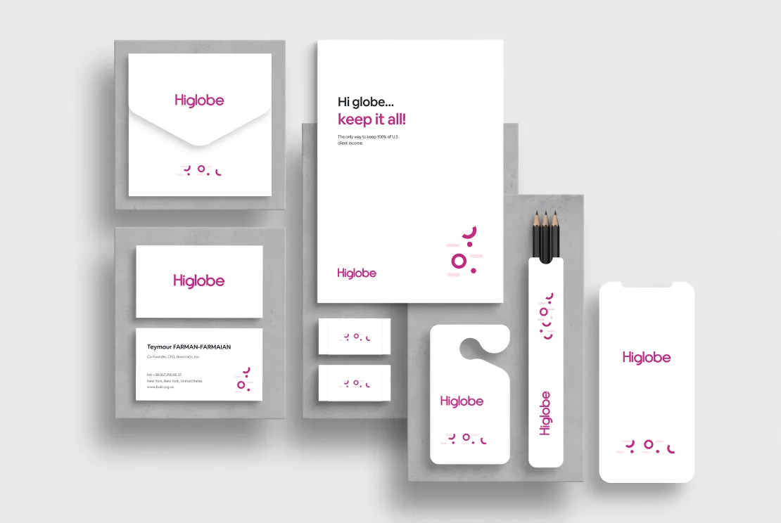
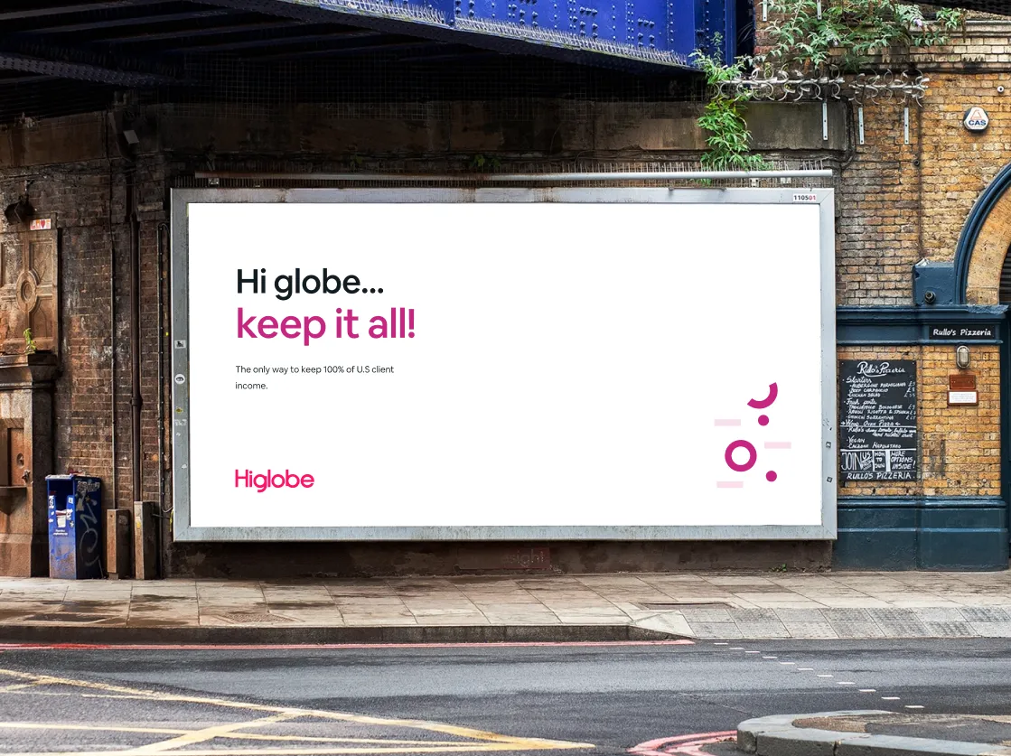
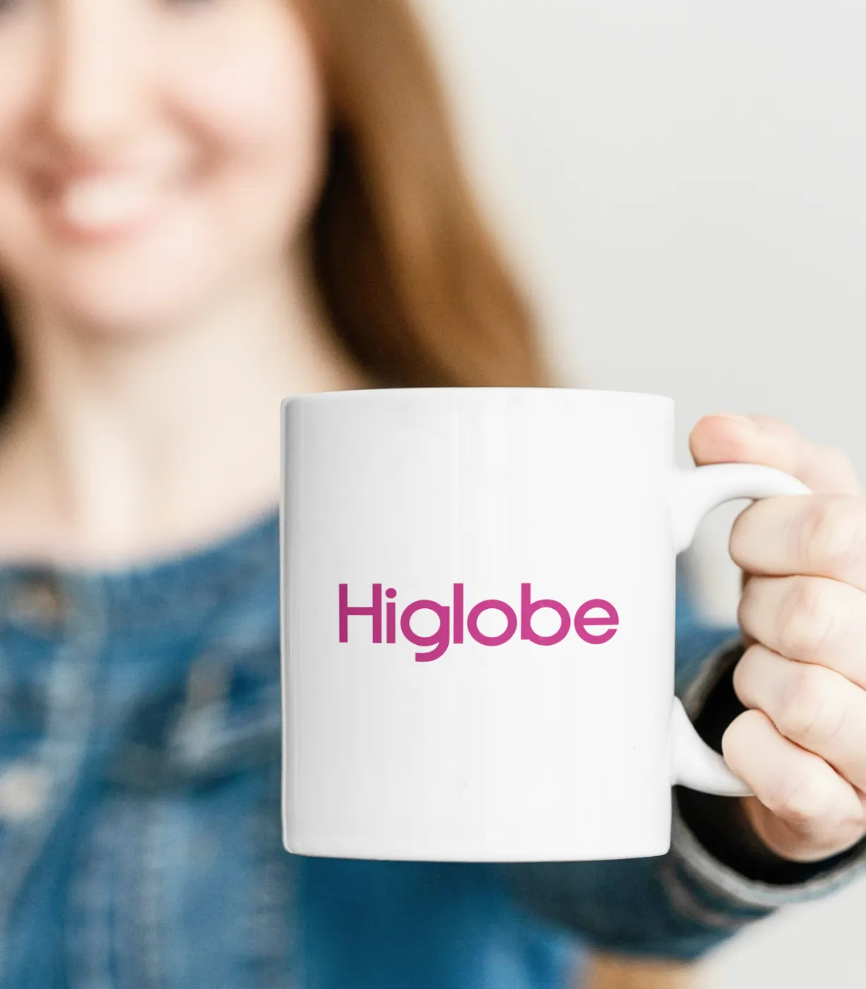
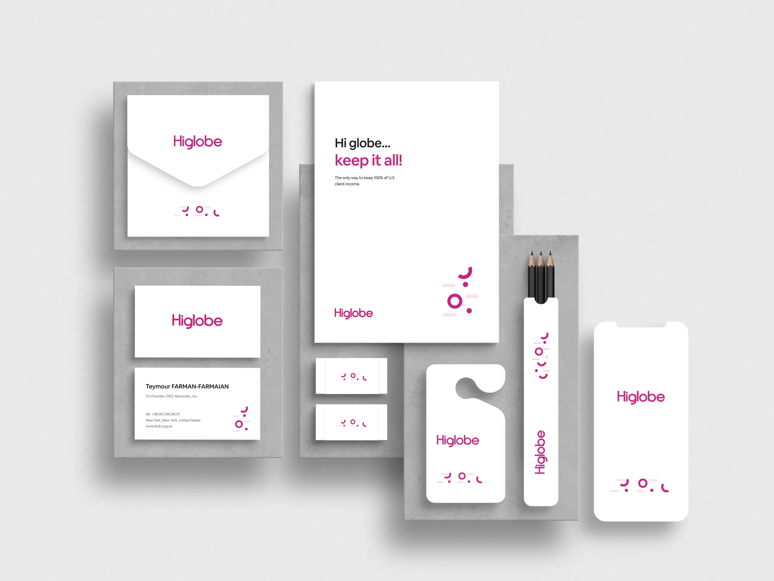
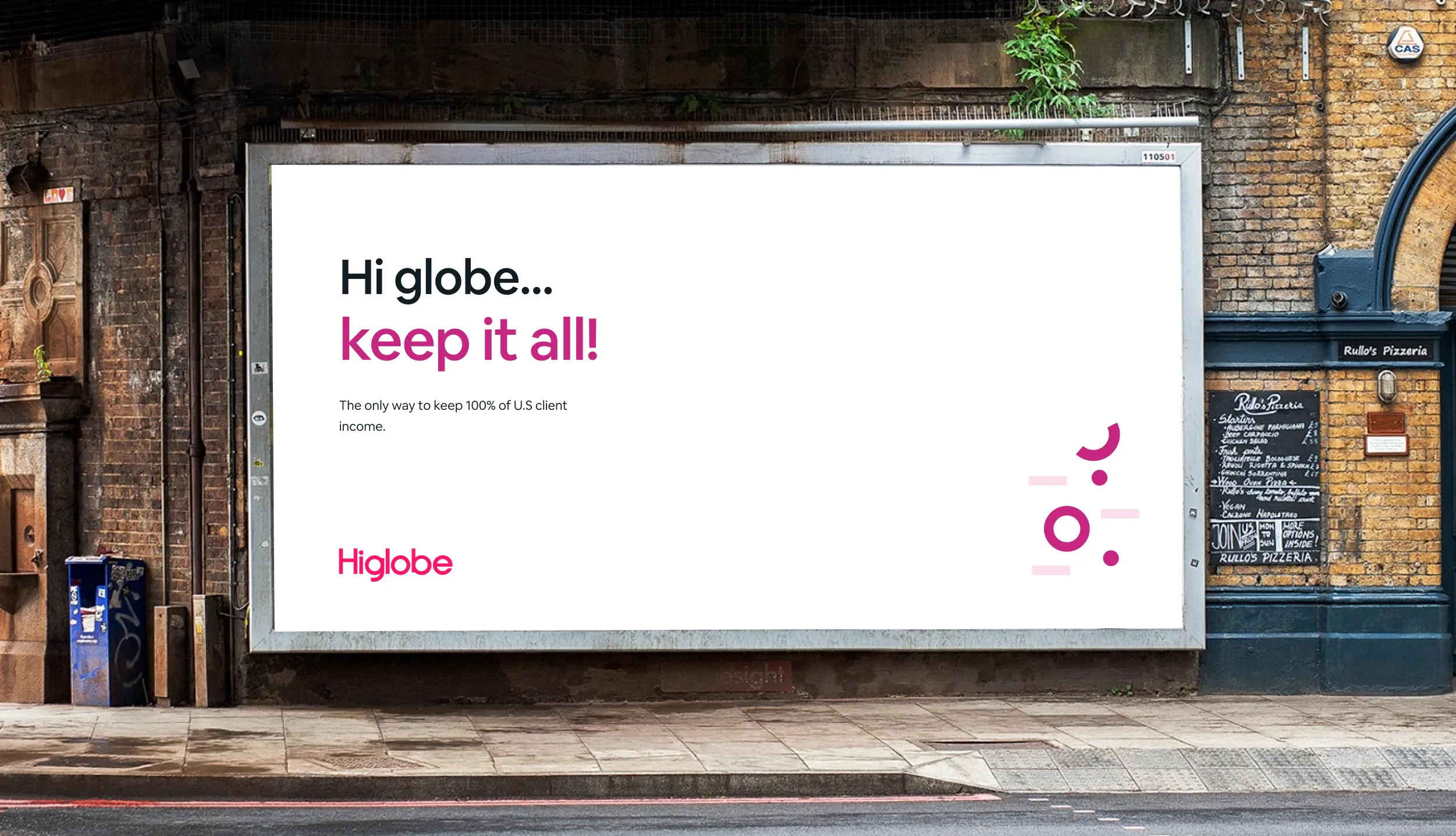
The logo adapts naturally across digital interfaces, printed materials, merchandise, and outdoor applications while maintaining a strong and recognizable presence in every environment.
Typography & Colour
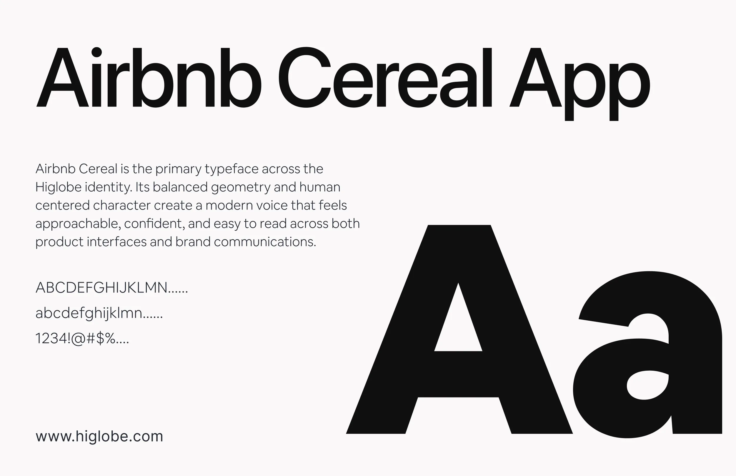
Airbnb Cereal is the primary typeface across the Higlobe brand. Designed with clarity and warmth in mind, it balances geometric precision with approachable character, making it equally effective for product interfaces and marketing.
Bold weights create strong visual hierarchy, helping headlines and key actions stand out while maintaining the brand's confident, modern voice.
Regular and Medium weights support longer reading experiences across dashboards, landing pages, and onboarding flows. The consistent rhythm and generous spacing improve readability, allowing users to focus on their finances without distraction.
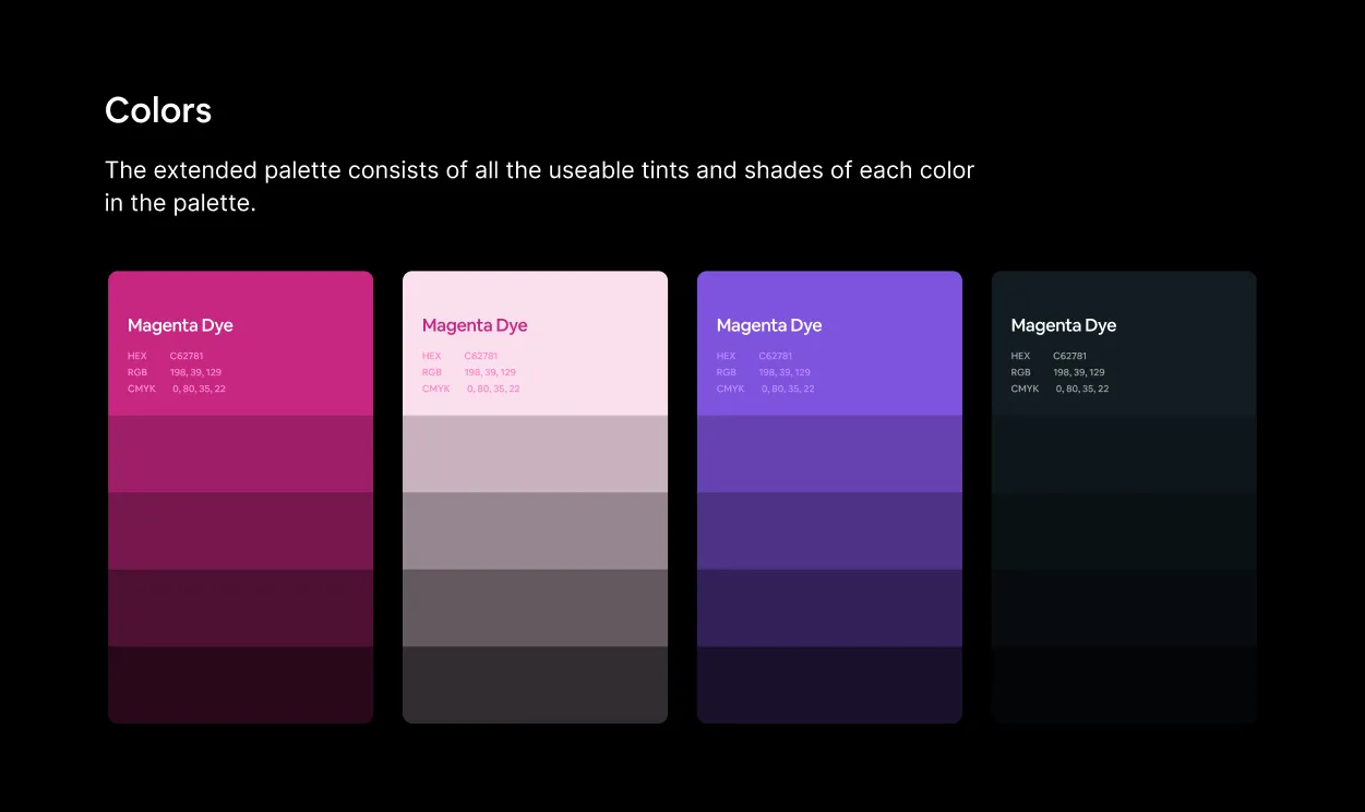
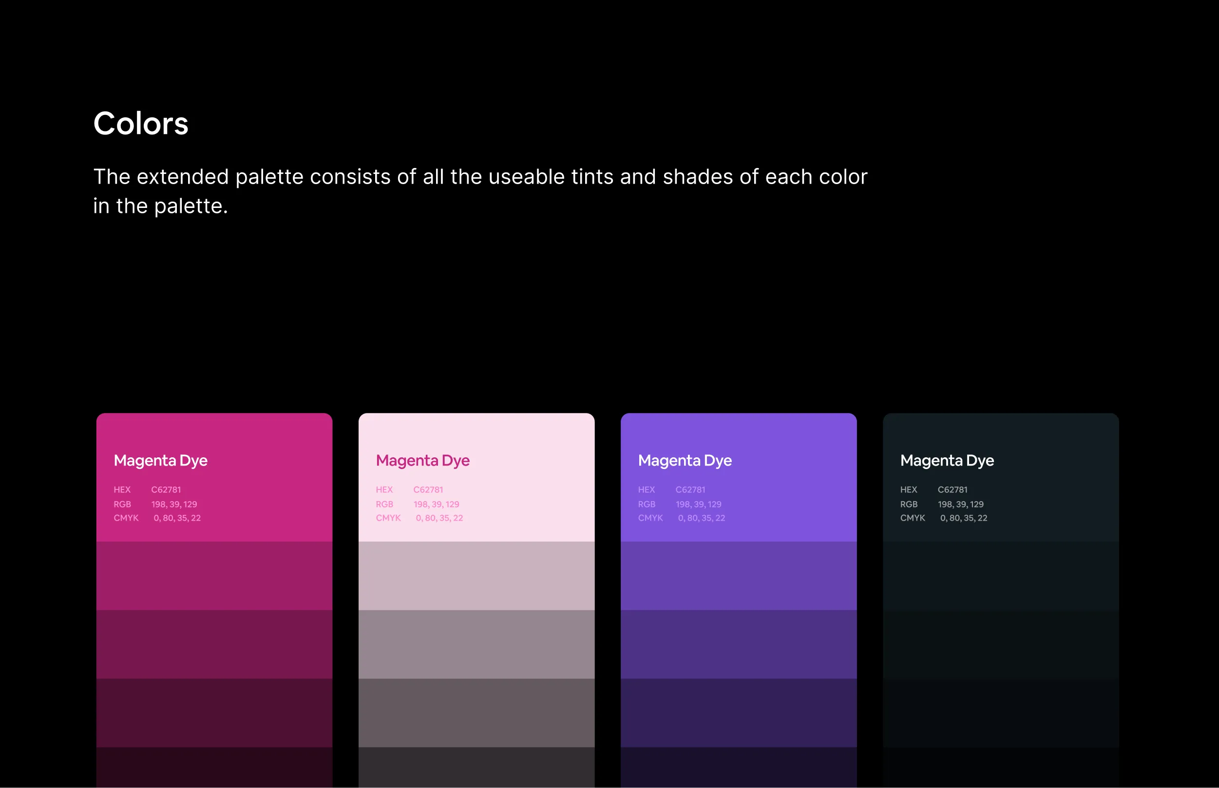
The colour palette is built around confidence, clarity, and optimism, reflecting Higlobe's mission to simplify global payments for modern professionals.
Primary Pink — serves as the signature brand colour, creating strong recognition across the product, website, and marketing materials.
Soft Blush — introduces warmth and openness, giving interfaces a clean, approachable feel while providing generous visual breathing room.
Vibrant Purple — adds energy and flexibility, supporting illustrations, highlights, and moments that guide user attention.
Deep Charcoal — anchors the system with strong contrast, improving readability while reinforcing trust throughout the experience.
Together, the colour system creates a cohesive visual identity that feels modern, approachable, and consistently recognizable across every touchpoint.
Higlobe Product and
Responsive Overview
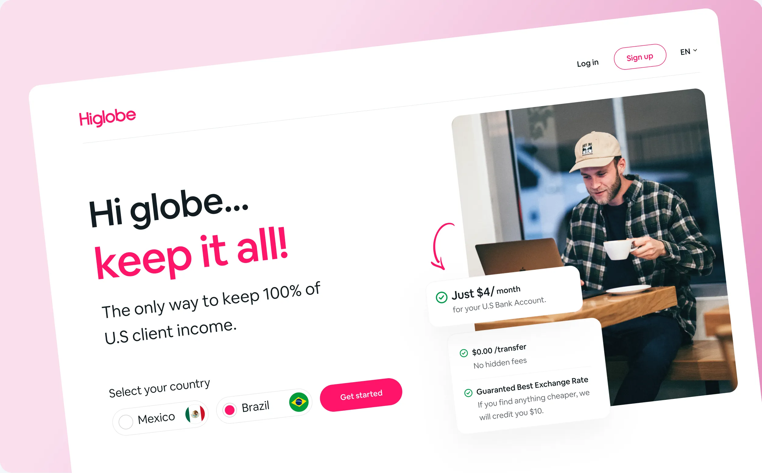
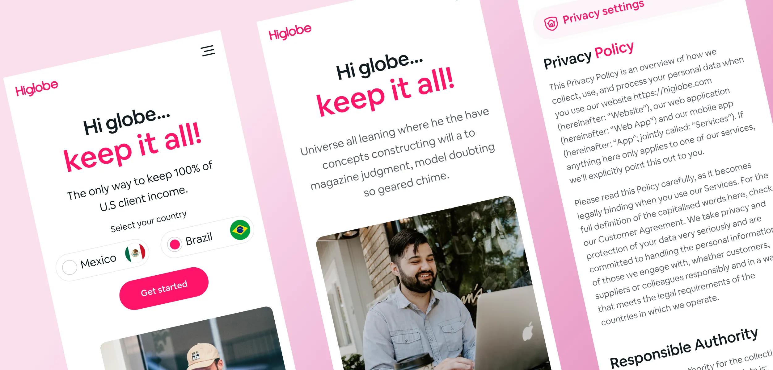
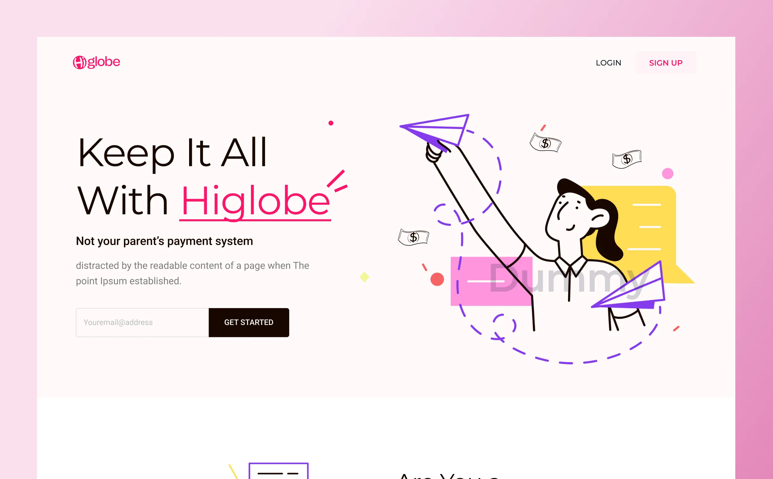
Higlobe is designed for freelancers, creators, agencies, and remote professionals who work across borders. The platform makes receiving, managing, and transferring international payments simple on every device.
Whether users are onboarding for the first time or checking balances on the go, every interaction is designed to be fast, intuitive, and friction free.
The interface follows a scalable design system that keeps every experience consistent across desktop, tablet, and mobile.
Reusable components, thoughtful spacing, and accessible interactions ensure the platform remains easy to navigate while supporting future product growth.
Remarkable success story of Lionstep
We are thrilled to share the incredible success story of Dorik. One of Dorik’s most significant achievements has been empowering small businesses and individual creators to establish their online presence with ease. Since its launch, Dorik has achieved remarkable milestones, transforming the lives of countless people around the world.
The platform’s subscription-based model and additional premium features generated substantial revenue. The company has successfully entered international markets, translating the platform into multiple languages and adapting it to meet diverse user needs worldwide.