How We Designed Kwando to Make Social Planning Feel Effortless
Kwando is a social planning app that helps people discover activities, organise their time, and make plans with others. The experience brings events, availability, invitations, and personal schedules into one clear space.
We designed the product to feel useful without becoming another complicated calendar. Every screen was shaped around a simple goal: helping people spend less time arranging plans and more time enjoying them.
Services
- Product Design
- Prototype
- Mobile App
Appstore
Post Project
About the Project
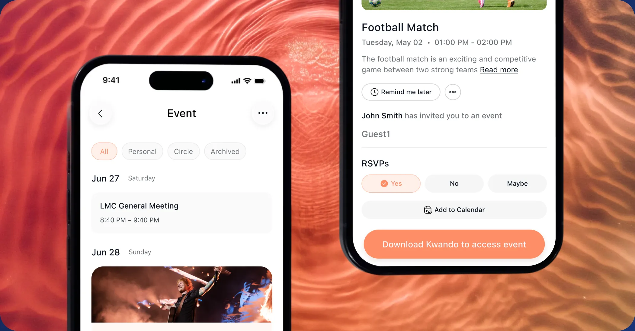
Kwando was created to make finding and organising activities feel more natural. Users can explore what is happening, view important event information, check their schedule, connect with other people, and manage upcoming plans without moving between several different apps.
The product combines social discovery with practical planning. Rather than treating a calendar as a static list of commitments, Kwando turns it into an active space where users can find inspiration, invite friends, join activities, and see how their free time could be spent.




The Challenge
Making plans often involves switching between group chats, calendars, social platforms, and event pages. Important details become scattered, responses are delayed, and a simple idea can quickly become difficult to organise. Kwando needed to bring these actions together without making the experience feel crowded.
The product also had to balance two different behaviours. Users needed freedom to explore activities while still being able to manage dates, people, locations, and availability. The challenge was creating a system that felt social and spontaneous while remaining clear enough for everyday planning.

Our Approach
We approached Kwando as a personal planning companion rather than a traditional calendar. The experience was organised around the moments that matter most: discovering something interesting, understanding the details, checking availability, involving other people, and confirming a plan. This gave every feature a clear purpose and helped us create a product that feels light, direct, and easy to return to throughout the day.

Product structure and flow
We began by looking at the way people naturally make decisions with friends. Most plans start with a loose suggestion before details such as time, location, and attendance are confirmed. The experience needed to support this flexible process instead of forcing users through a rigid sequence.
This insight helped us prioritise quick actions, visible availability, simple invitations, and clear event information.
Designing Around the Decision
Each screen was designed to answer the questions users have before committing to an activity. What is happening, when is it happening, where is it, who is involved, and does it fit my schedule?
By placing these details where they are needed, users can understand an activity quickly and decide what to do without searching through several screens.


One Place for Every Plan
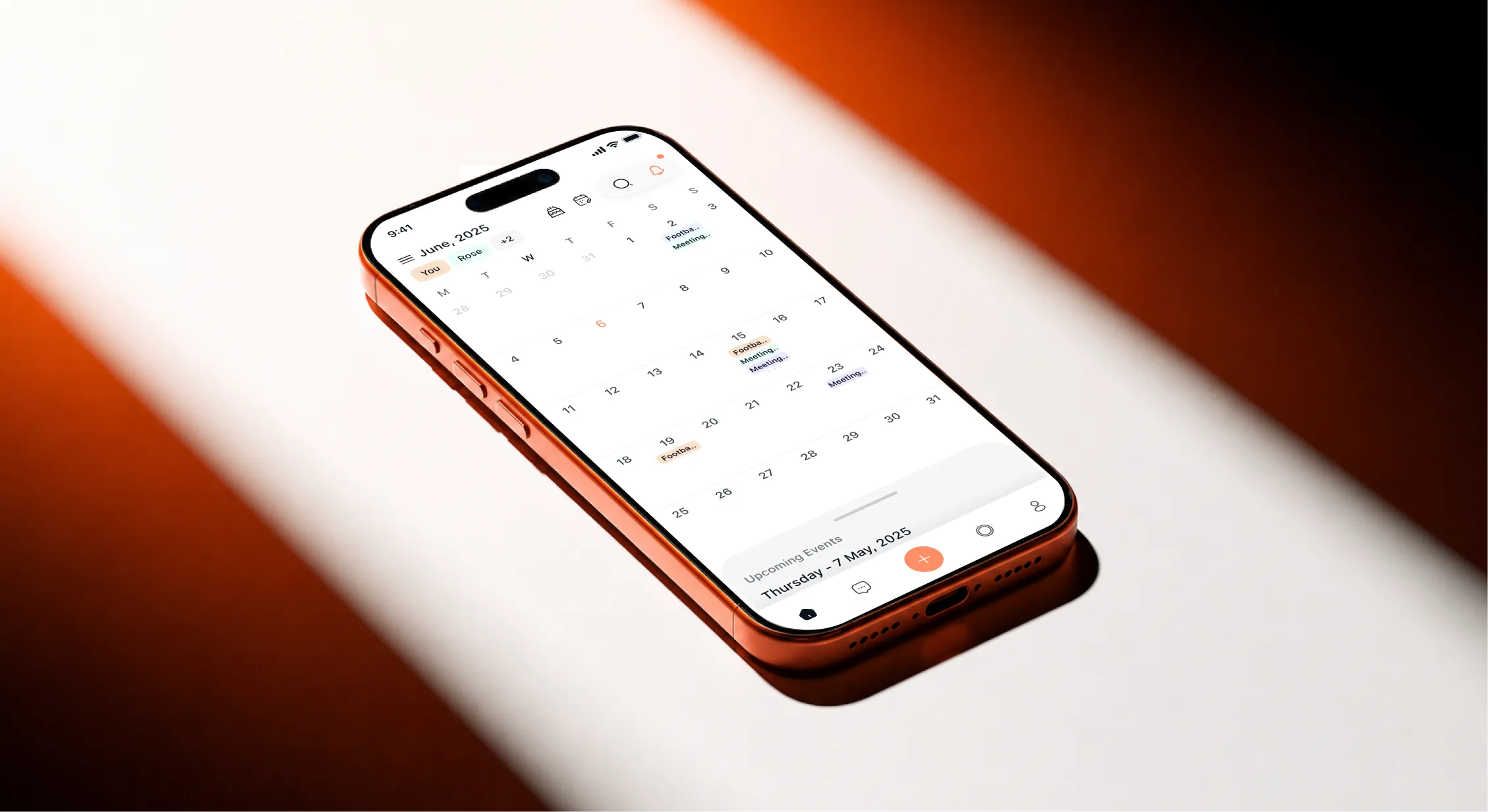
The calendar became the centre of the Kwando experience. It gives users a clear view of upcoming activities while connecting directly to event details, invitations, profiles, and availability.
Different types of plans remain visually distinct, allowing users to understand their schedule at a glance without being overwhelmed by unnecessary information.
User Flows and Interface System
The wider interface system was built to support both quick interactions and more detailed planning. Reusable components created consistency across calendars, event pages, profiles, invitations, groups, and discovery screens.
Mapping the complete experience also helped us identify repeated steps and remove unnecessary decisions. The result is a more connected journey where each screen feels like part of the same product rather than a separate feature.

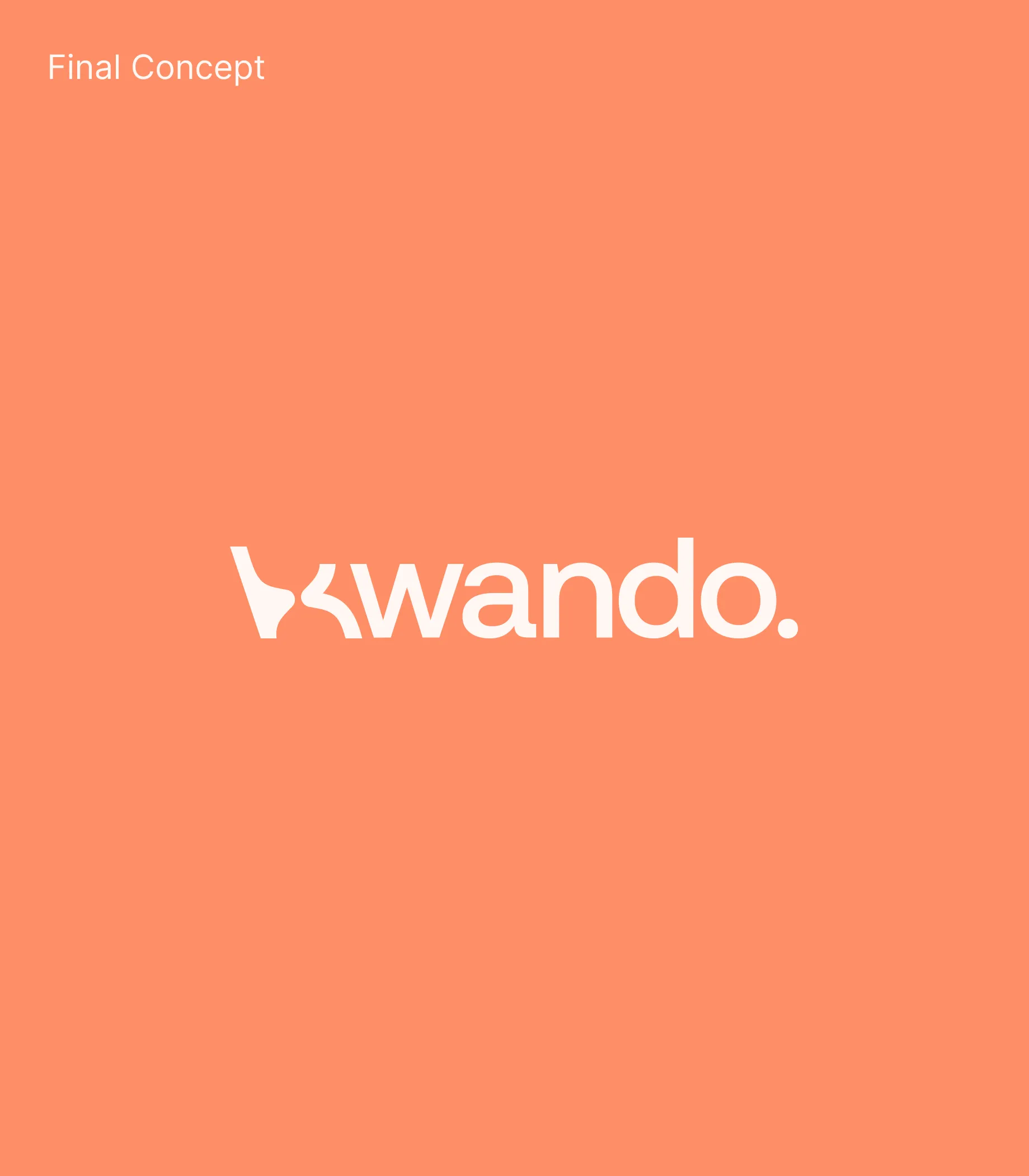
A wordmark that’s always
on the move
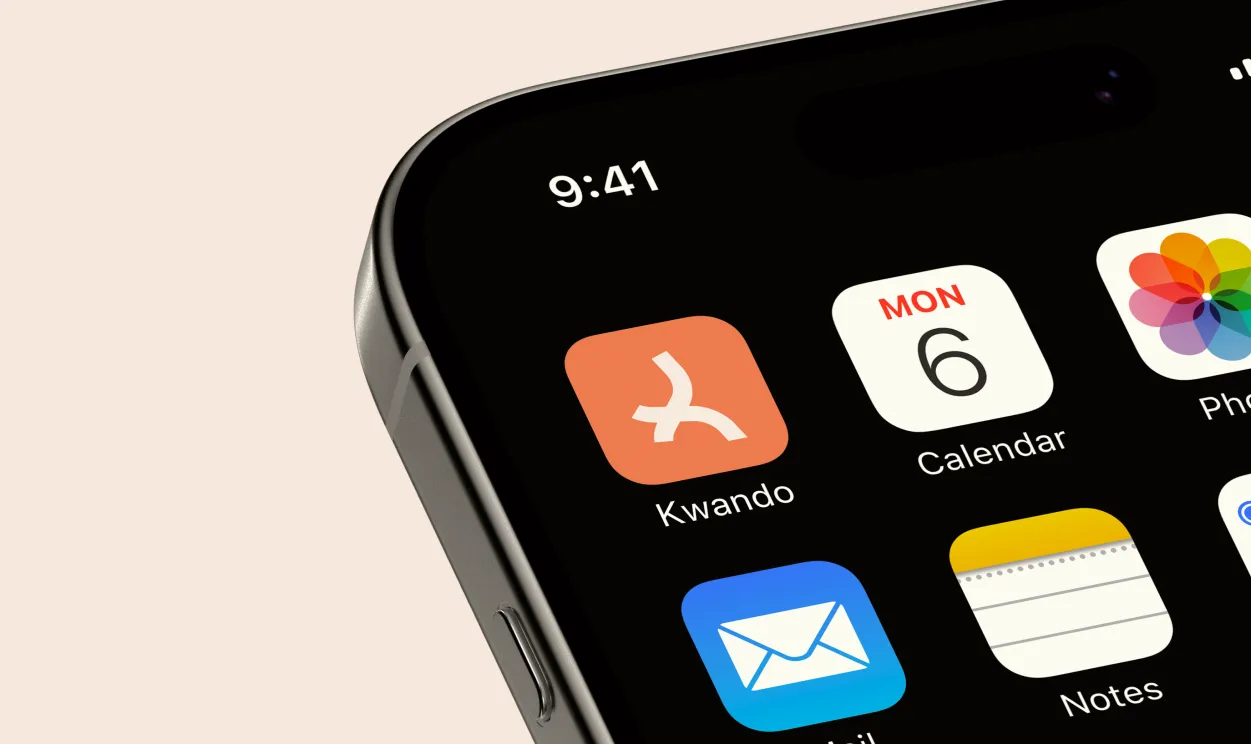
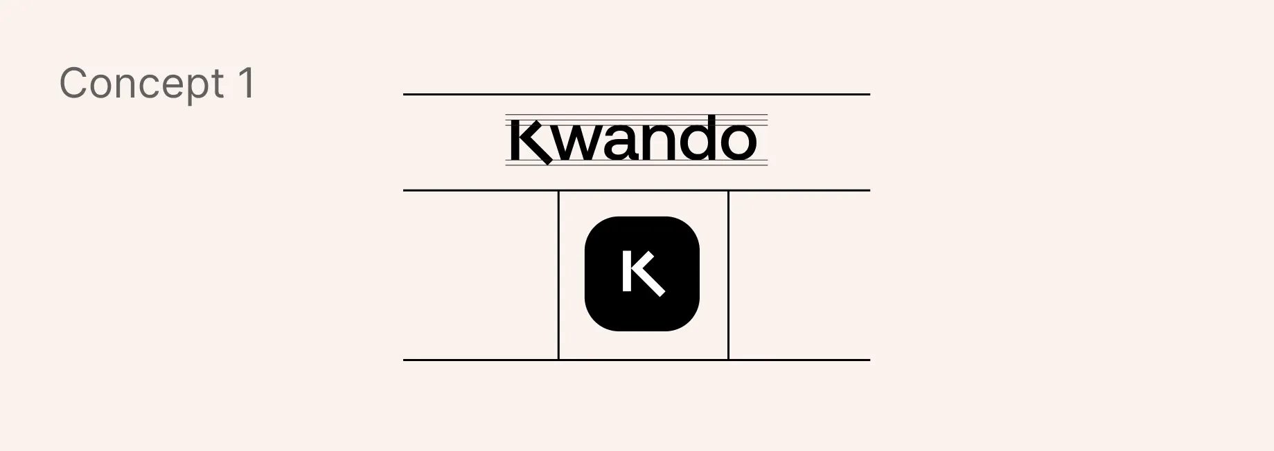
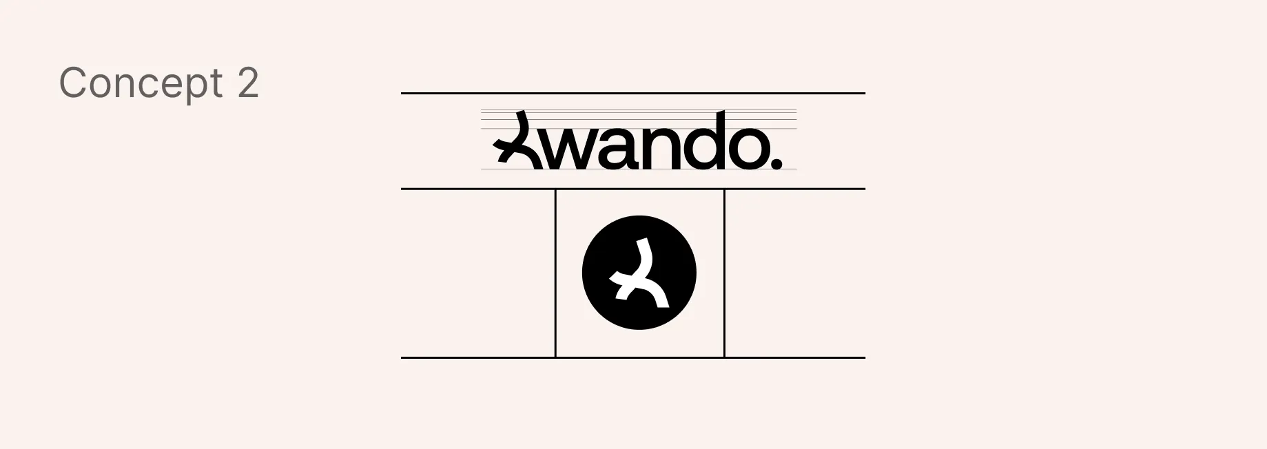
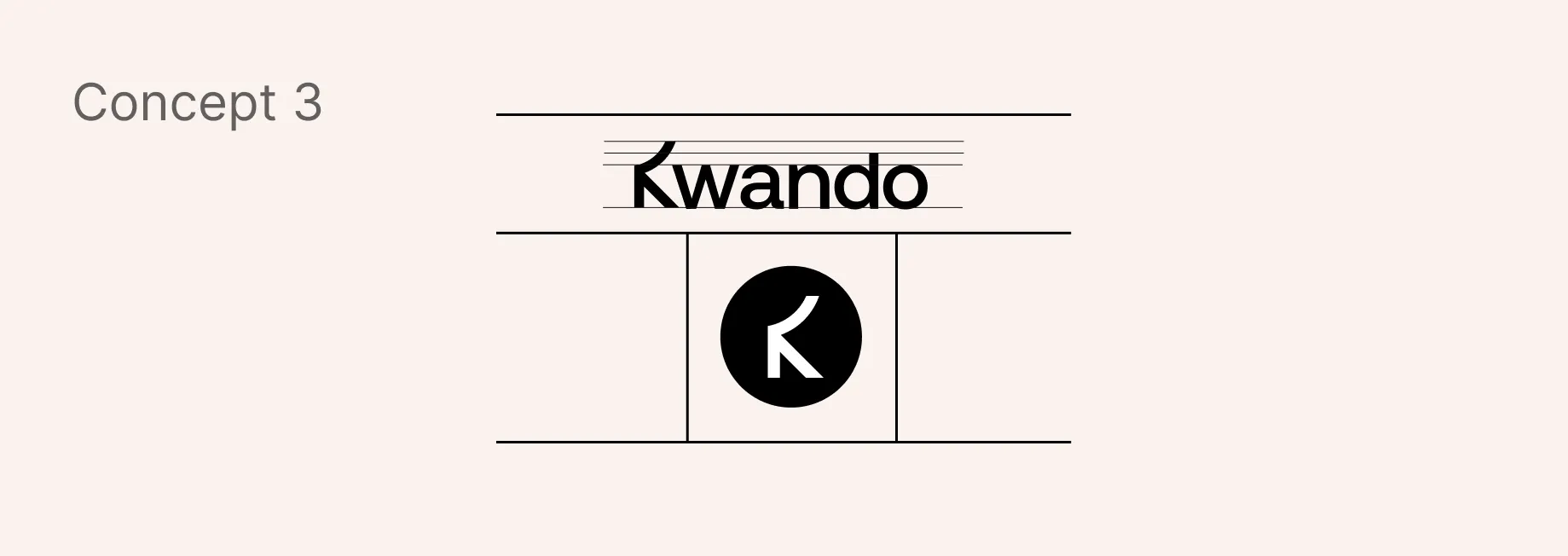
Kwando is centred around movement, connection, and the question of what happens next. The identity needed to express that energy while remaining simple enough to work across a mobile interface, application icon, marketing material, and social content.
We developed a wordmark with a friendly sense of motion, giving the brand a recognisable personality without making it feel overly playful or distracting.
Typography & Colour
The type system uses SF Pro for its clarity, neutrality, and modern feel. It carries dense financial information without ornament and stays legible across small UI elements, dashboards, and large headlines on the marketing site.
The type system uses SF Pro for its clarity, neutrality, and modern feel. It carries dense financial information without ornament and stays legible across small UI elements, dashboards, and large headlines on the marketing site.
The main orange gives Kwando an energetic and social personality. It draws attention to important actions while helping the product feel warm and active. Soft mint, blue, cream, and lavender tones support different activities and calendar states. A deep navy provides contrast for text and key interface elements, keeping the overall system balanced and accessible.


The Result
The final design gives Kwando a clear product structure that connects discovery, planning, and participation. Users can move from finding an activity to managing it within one consistent experience, reducing the effort normally required to organise plans across different platforms.
The visual identity and interface now feel like parts of the same system. The energetic colour palette, recognisable wordmark, simple navigation, and flexible components give Kwando a strong foundation that can grow as new social and planning features are introduced.
What This Project Reinforced
Social planning works best when the product supports natural behaviour instead of trying to control it. People often make decisions gradually, so the experience must provide enough structure to be useful while leaving room for plans to change.
It also reinforced the importance of designing the brand and product together. When the visual identity, interface, interactions, and product purpose share the same character, the experience becomes easier to understand and more memorable.