

Leading Ads provides scalable advertising solutions for business growth.
Leading Ads is a global ad infrastructure company that provides premium agency ad accounts for businesses looking to scale their advertising without limits. They empower brands and media buyers with unrestricted access, reliability, and long-term stability across major platforms like Meta, TikTok, Google, and Snapchat.Their mission is simple —
To help businesses scale beyond restrictions by offering the tools, systems, and trust needed to run ads freely and efficiently.
With a focus on performance, consistency, and partnership, Leading Ads bridges the gap between ad technology and growth — becoming the backbone for agencies and advertisers worldwide.
Services
Website
Post Project


Problem and Solution
Leading Ads needed more than just a logo. They required a complete identity system to position themselves as a trusted, premium partner in advertising. The challenge was to:
Build trust and authority in a competitive space
Reflect their mission of growth and scalability
Ensure consistency across digital and physical platforms
We developed a comprehensive and scalable brand identity system that is firmly grounded in the principles of clarity, boldness, and trust. This system not only reflects our core values but also ensures that our brand resonates with our audience in a meaningful way.
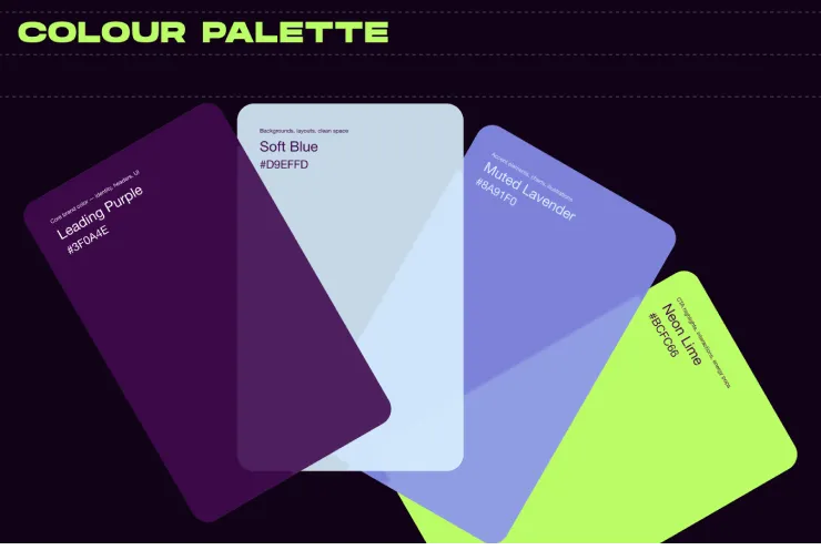
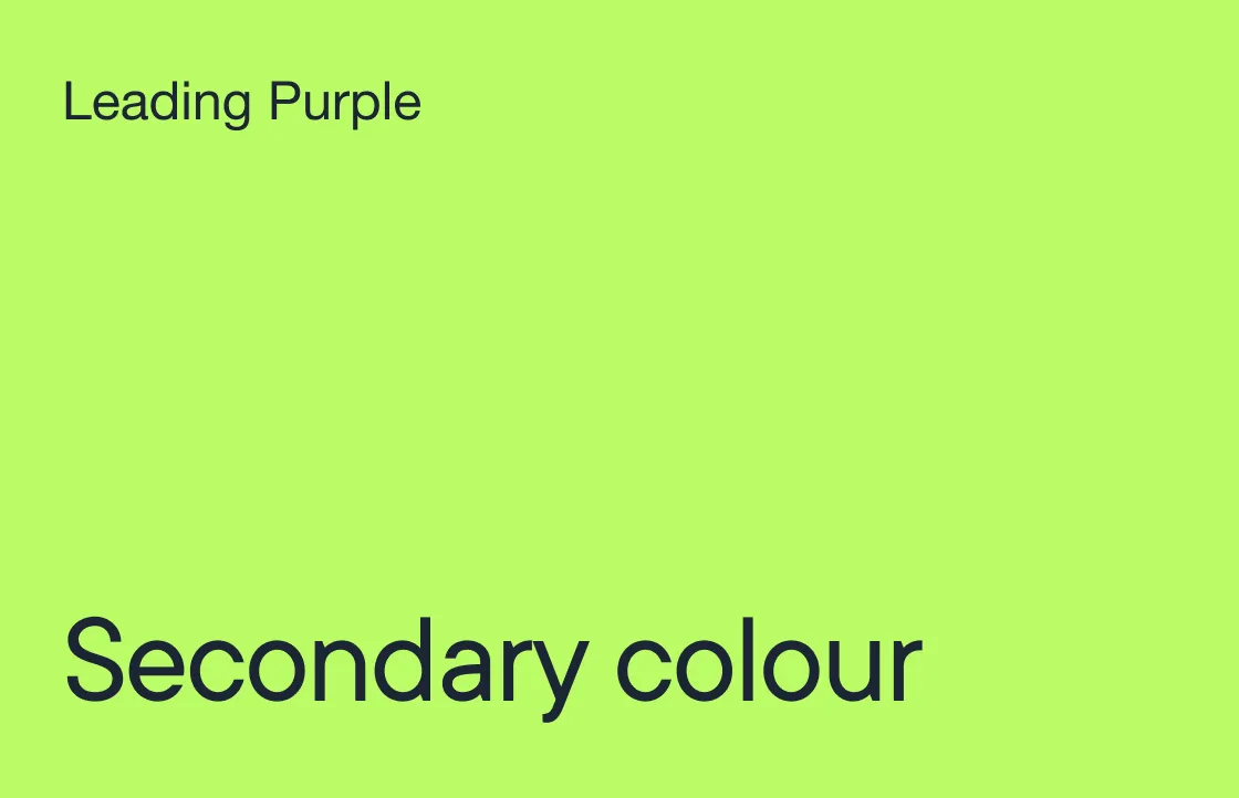
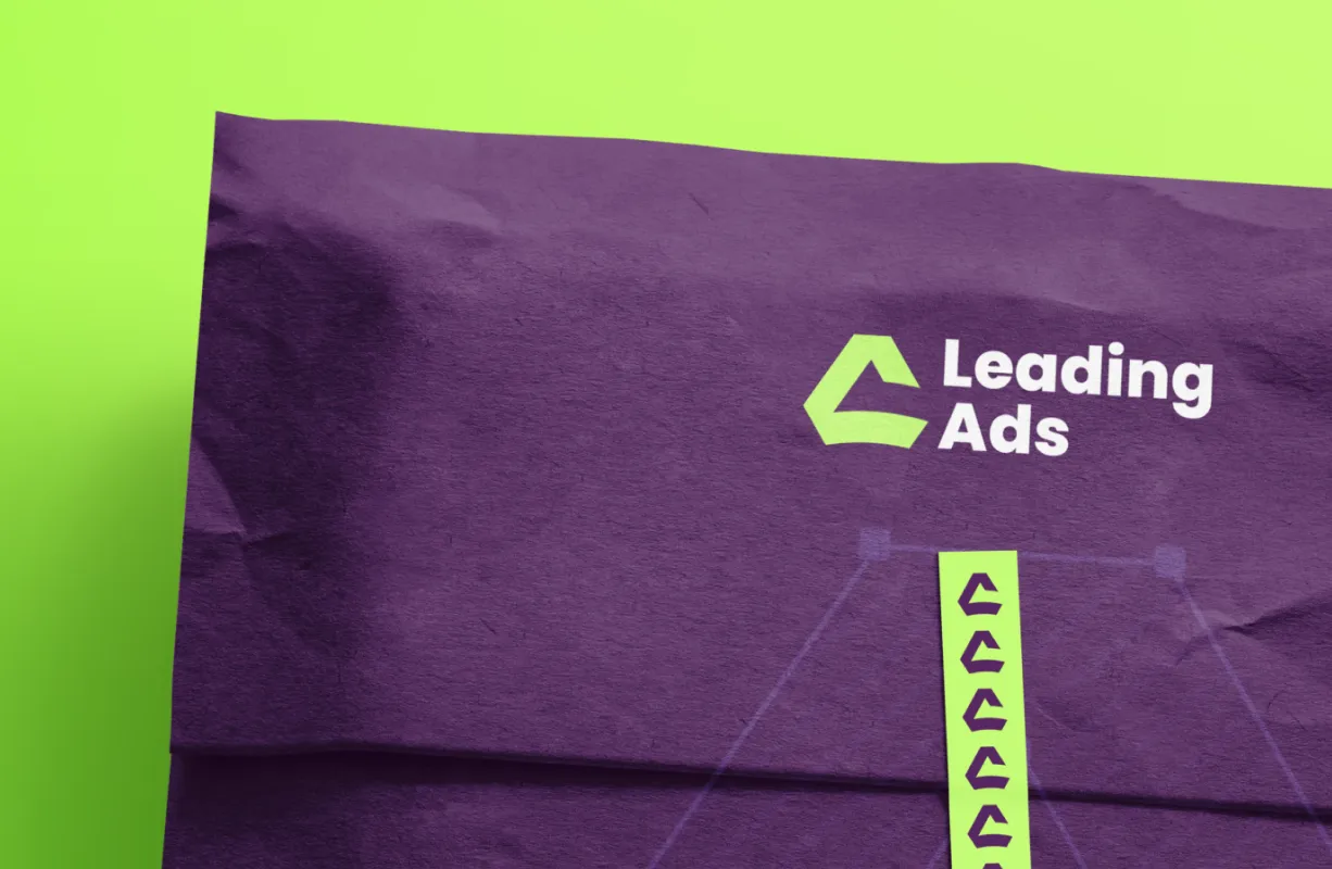
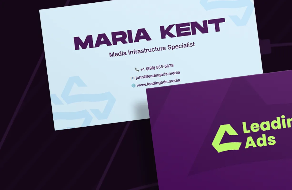
A colour palette blending premium purple tones with an energetic green accent.
A typography system balancing bold headlines with clean body text
A geometric logo symbolizing upward growth and leadership.
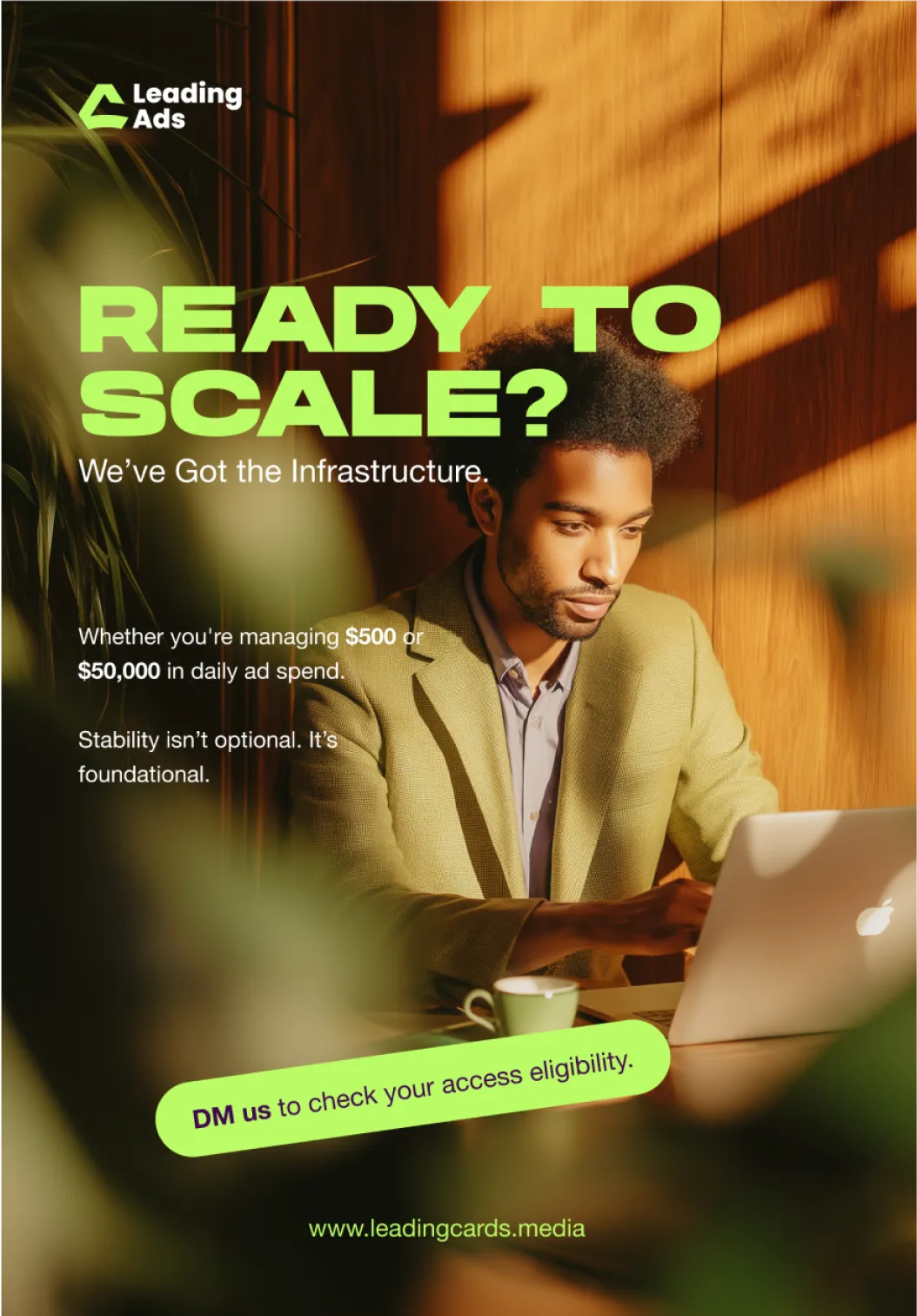
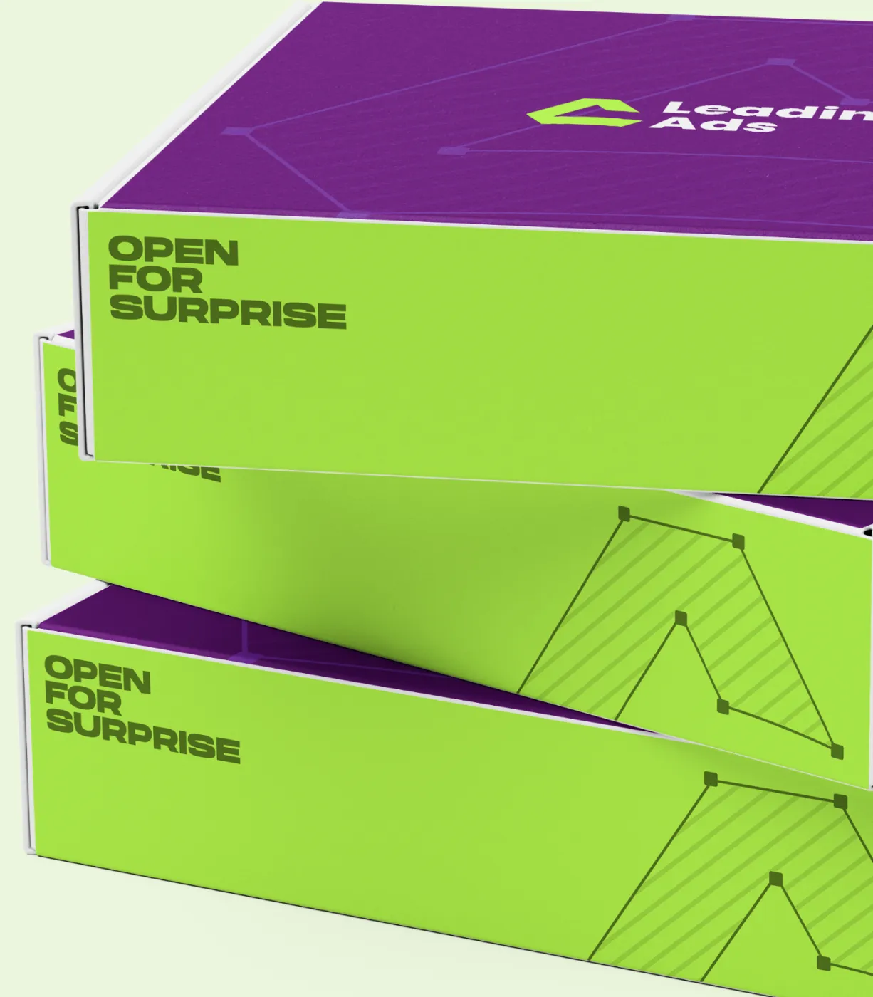
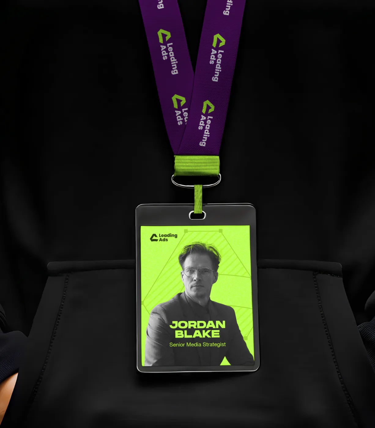
Applications spanning social media, merchandise, print, and outdoor ads


Logo Development
The logo exploration began with sketches based on the initials “L” and “A”, combined with upward arrows to symbolize growth and leadership. The focus was on creating a mark that is minimal, scalable, and memorable.
Through iterations, we refined the shapes into a geometric symbol that feels bold yet balanced.
The final logo not only captures the idea of progress and scalability but also ensures versatility. Working seamlessly across digital, print, and merchandise.


Typography & Colour
Hanson Bold is used for headlines and impactful statements. Its bold, geometric form creates a strong presence, perfectly aligning with Leading Ads’ values of authority, confidence, and scalability.
Helvetica Neue is applied for body copy, descriptions, and UI elements. Its clean, modern, and versatile design makes content highly readable and professional, balancing Hanson’s boldness with clarity.
The colour palette balances professional trust and energetic growth. Deep Purple signifies authority and professionalism. Lavender & Violet tones add approachability and modernity. Bright Green Accent infuses energy and innovation, making the brand stand out.
Together, these colours create a bold visual identity for digital and physical applications.


Conclusion
Leading Ads isn’t just a service — it’s a scaling partner built for brands that want to grow without limits. Through a bold identity system, strategic brand language, and a modern visual ecosystem, we’ve created a foundation that communicates trust, performance, and upward momentum in every touchpoint.
This rebrand equips Leading Ads with the clarity, confidence, and distinction needed to stand out in a competitive landscape — and scale stronger than ever.

Remarkable success story of Lionstep
We are thrilled to share the incredible success story of Dorik. One of Dorik’s most significant achievements has been empowering small businesses and individual creators to establish their online presence with ease. Since its launch, Dorik has achieved remarkable milestones, transforming the lives of countless people around the world.
The platform’s subscription-based model and additional premium features generated substantial revenue. The company has successfully entered international markets, translating the platform into multiple languages and adapting it to meet diverse user needs worldwide.


