
How We Built LeadingCards From Scratch for Media Buyers Who Scale Fast
LeadingCards came to us with a clear idea and a real problem to solve.Media buyers and advertisers needed a better way to manage ad spend using virtual cards. Existing solutions felt either too rigid, too complex, or not built for people running campaigns at scale.
The product vision was strong, but there was no brand, no website, and no clear way to communicate trust in a space where security matters.We were brought in to design and build everything from the ground up. Branding, website design, and development.
Website
Post Project
About the Project
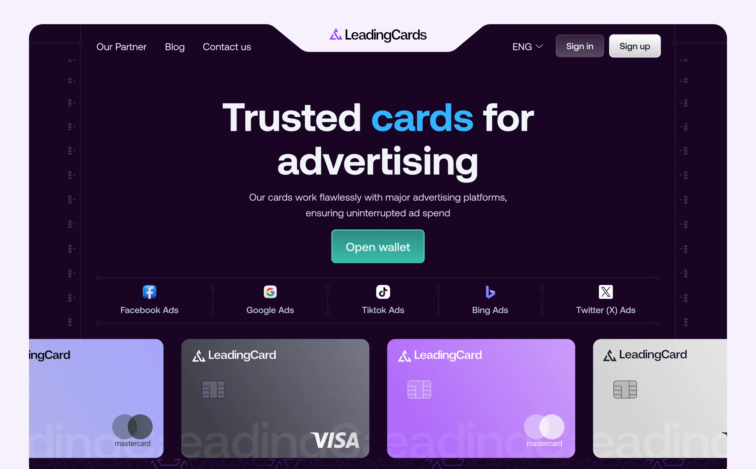
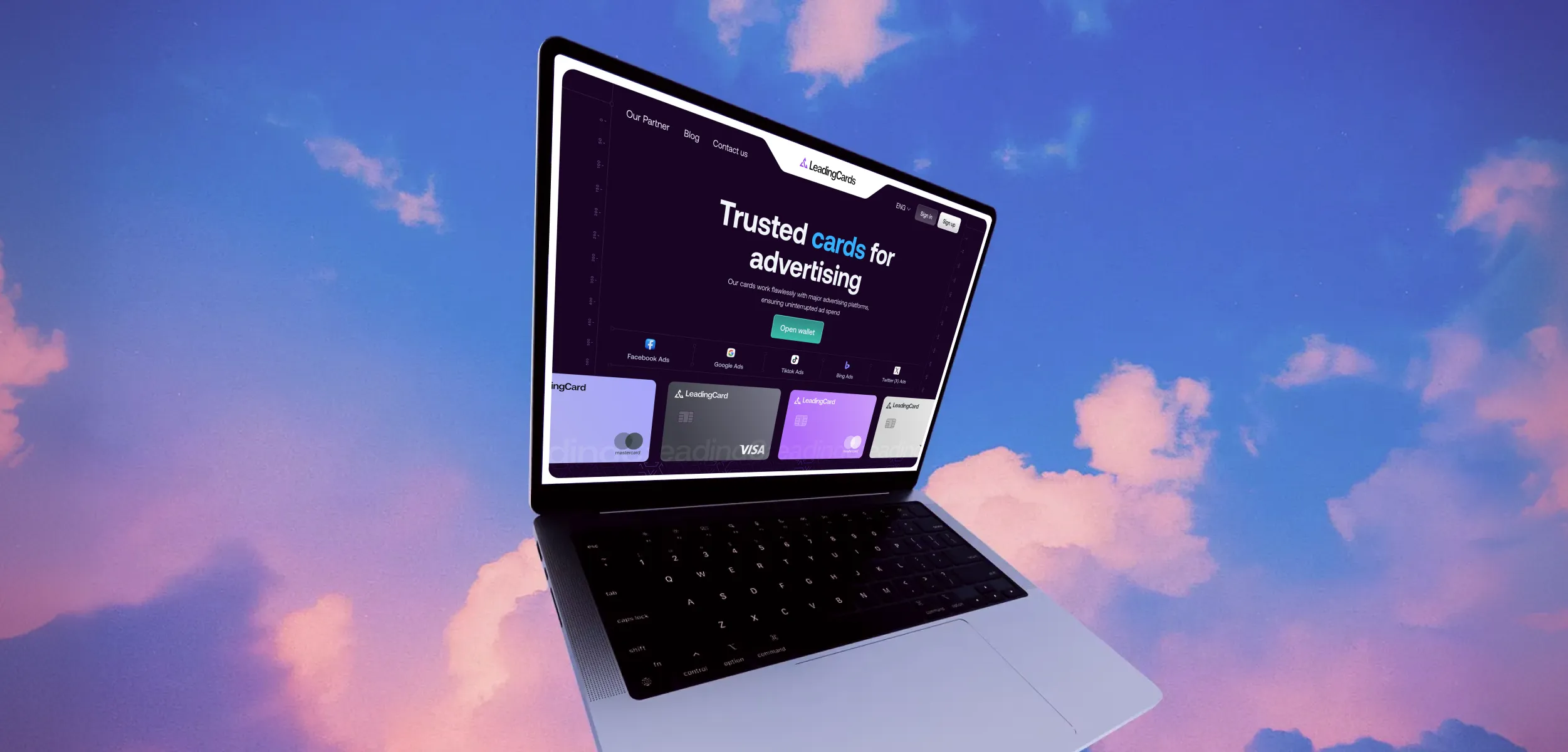
LeadingCards is a virtual card platform built for media buyers and advertisers who manage ad spend at scale. The product allows users to instantly issue virtual cards, control budgets, and run campaigns with more flexibility and security.
We worked with the LeadingCards team from day one. There was no existing brand, no website, and no visual system in place.
Our role was to design and build the foundation from scratch, including branding, website design, and front-end development.
The goal was simple but high-stakes. Create a brand and website that clearly explain the product, feel trustworthy from the first interaction, and speak directly to media buyers who move fast and expect control.


The Challenge
The main challenge was trust.LeadingCards operates in a space where users deal with money, ad platforms, and sensitive data. Media buyers make quick decisions, but they do not experiment with tools that feel unclear or unfinished.
We needed to communicate three things immediately. What the product does. Who it is for. Why it is safe to use. At the same time, the website had to stay simple. Media buyers do not read long explanations. They scan, decide, and move on. The experience had to respect that behavior.


Our Approach
We started by understanding how media buyers actually work. Their priorities are speed, visibility into spend, flexibility across platforms, and confidence that nothing will break mid-campaign.
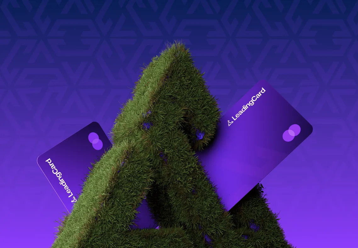
Brand foundation
Before designing screens, we defined the brand direction. LeadingCards needed to feel secure, professional, and operationally reliable. Not experimental and not decorative.
We built a visual language that supports trust. Calm colors, strong typography, and a clear hierarchy were used to make the product feel stable and credible from the first glance.
Website UX and structure
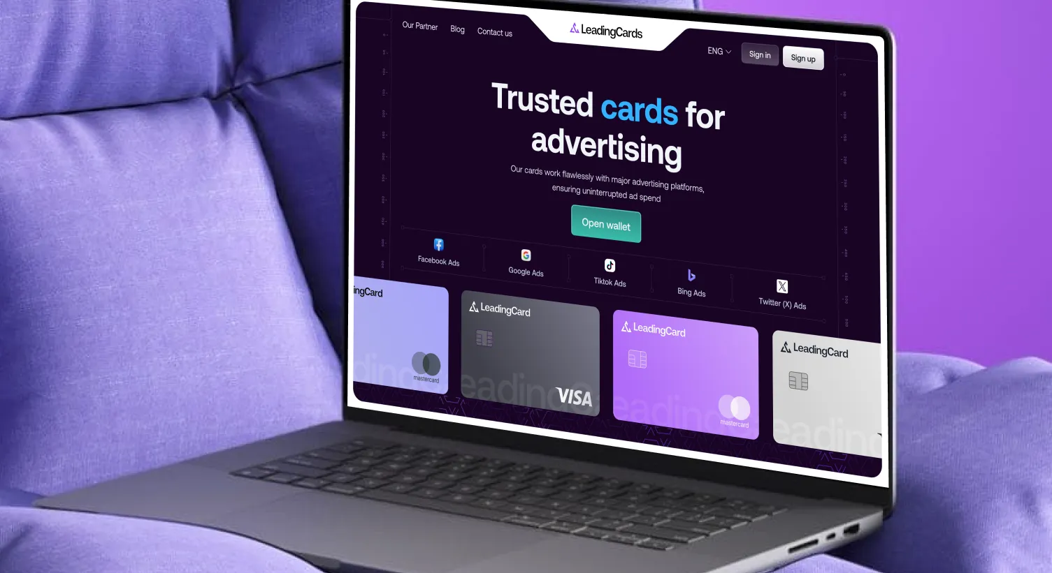
The website was designed around clarity. Every section answers a real question a media buyer would ask. The hero section clearly states the value. Secure virtual cards for media buyers and advertisers, with instant issuance and spend control.
From there, the flow explains how the product works, how it helps manage ad spend, and why it can be trusted. We avoided unnecessary marketing language and focused on straightforward explanations.


Design for conversion
Visual design supported understanding, not decoration. Layouts were clean, spacing was intentional, and calls to action were clear.
Key features such as instant card creation, budget control, and scalability were presented in a way that maps directly to how media buyers operate day to day.
Development and performance
We built the website to be fast, responsive, and easy to maintain. Performance and reliability were treated as part of the brand experience.The site works smoothly across devices, with special attention to mobile, since many users manage campaigns on the go.
The structure allows the product and marketing pages to scale without needing redesigns later.
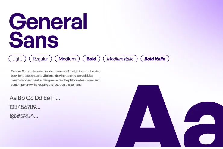
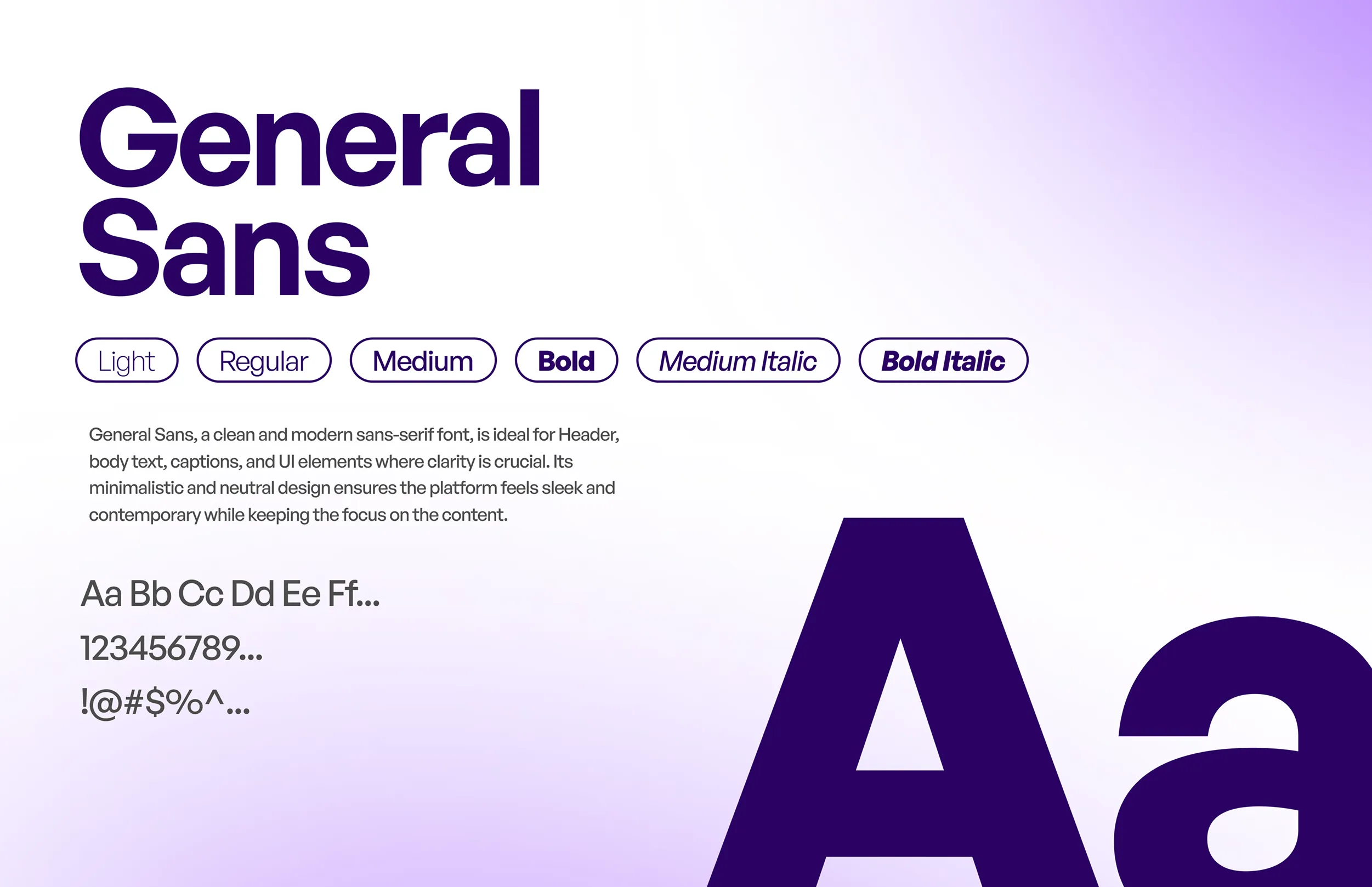
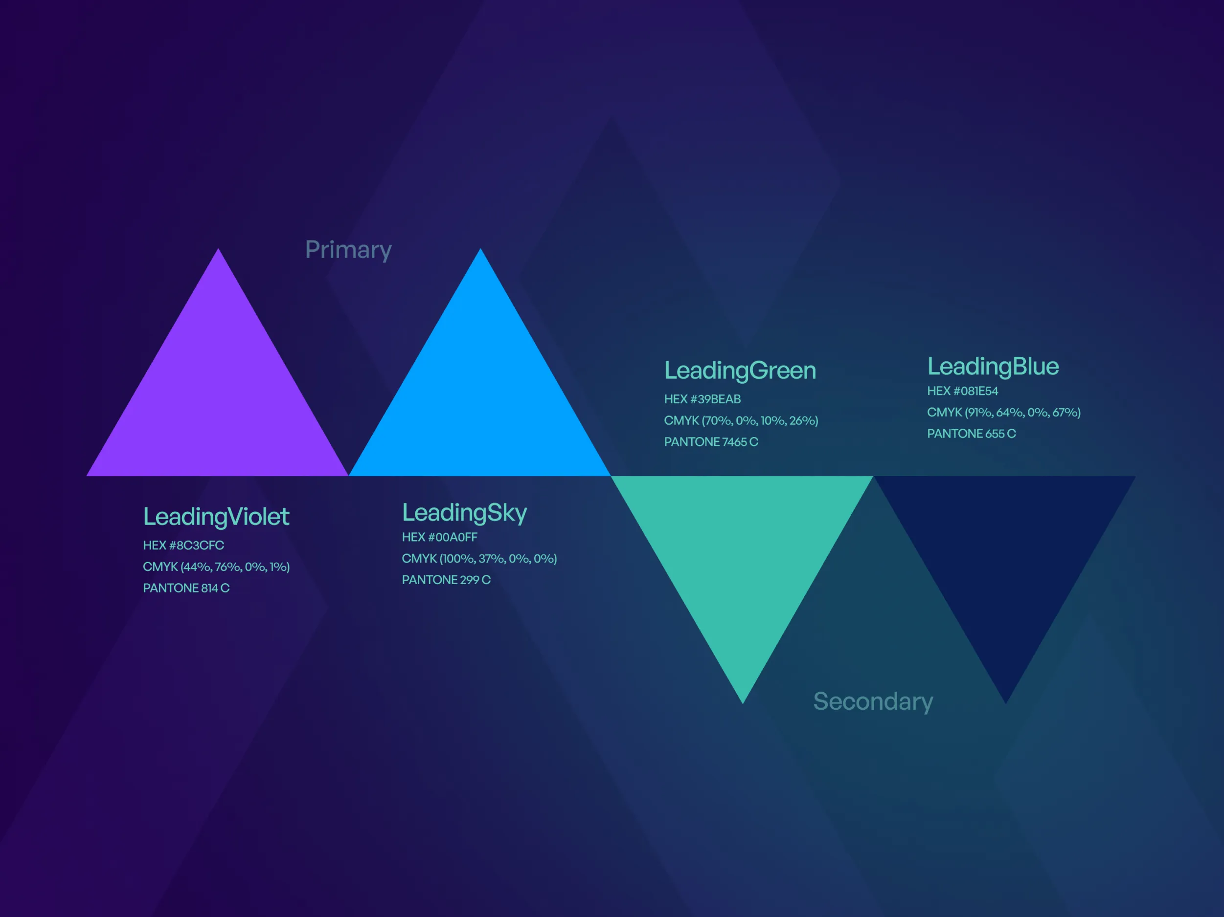
Typography & Colour
General Sans was chosen for its clarity and neutrality. It brings a calm, modern tone to every interface and keeps the brand’s communication clean and readable at all sizes.
The colours are intentionally restrained — deep purples for authority, bright accents for energy, and a gradient system that brings depth without distraction. The palette reinforces the feeling of moving from complexity toward focus.
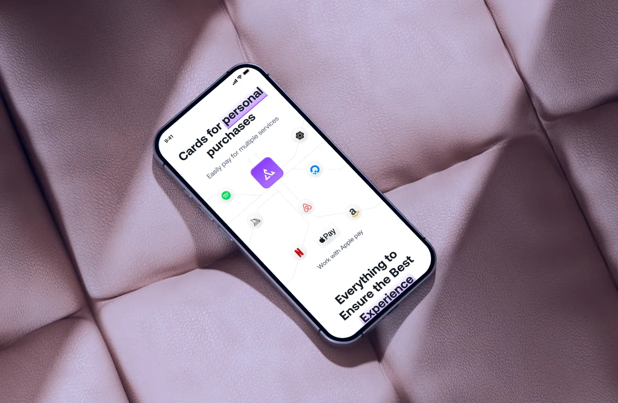
LeardingCard App and Mobile
Responsive Overview
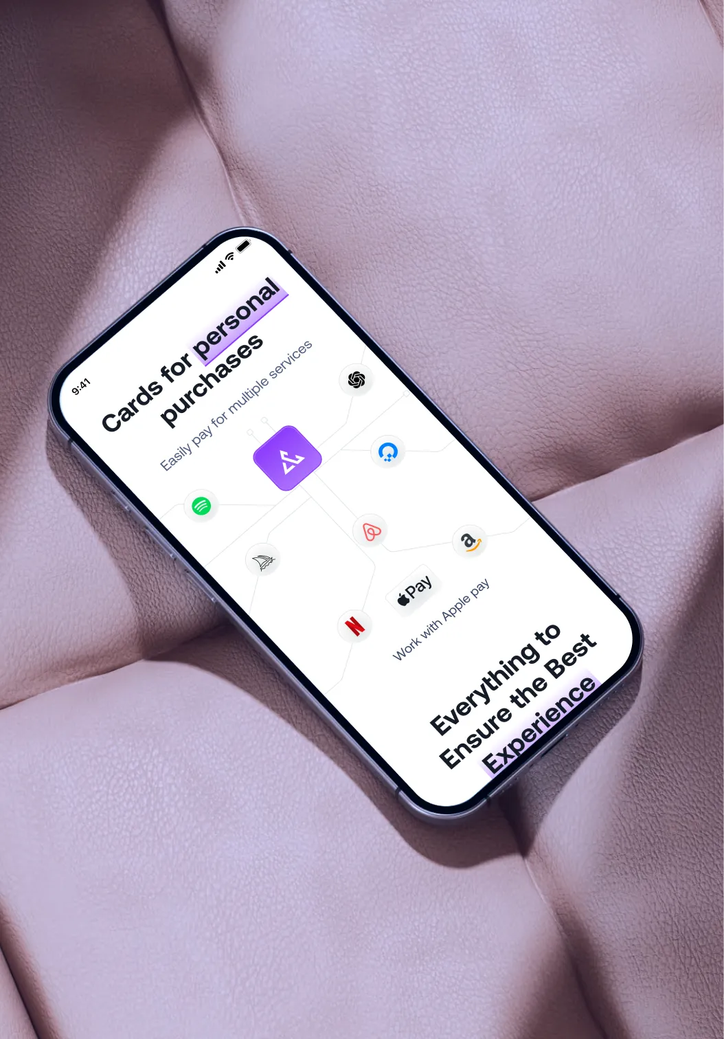
LeardingCard was designed to work seamlessly across web and mobile, ensuring users could access key features anytime, anywhere. We focused on creating a consistent experience across devices, with layouts that adapt smoothly to different screen sizes without losing clarity or usability.
On mobile, the interface prioritizes speed and simplicity, making core actions easy to find and complete. On larger screens, the design scales thoughtfully to present more information without overwhelming users. Every interaction was optimized for touch, readability, and flow, resulting in a responsive product that feels intuitive, fast, and reliable across all platforms.

The Result
LeadingCards launched with a clear brand identity and a website that communicates trust immediately.
Visitors understand the product within seconds. The experience feels professional and focused. The website supports conversion instead of distracting from it.
Most importantly, LeadingCards now has a solid foundation. As the product grows and new features are added, the brand and website are ready to scale without losing clarity or credibility.
What This Project Reinforced
This project reinforced a simple truth. In fintech and adtech products, clarity builds trust. When users are dealing with money and ad spend, design decisions must reduce doubt, not add complexity.
Most importantly, LeadingCards now has a solid foundation. As the product grows and new features are added, the brand and website are ready to scale without losing clarity or credibility.


