

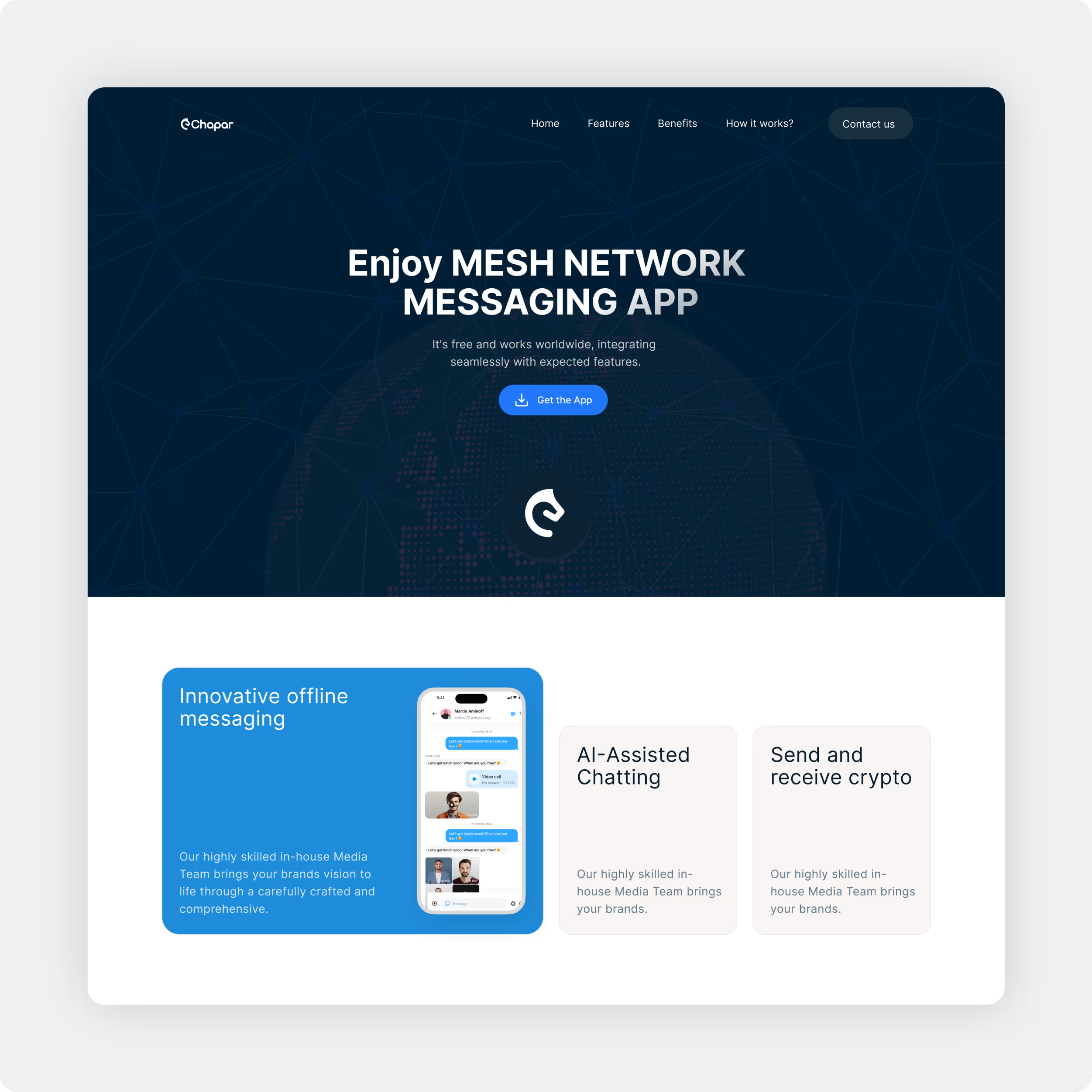
Chaper is an app where users can communicate offline from anywhere, anytime.
Chaper is an app that lets people talk to each other without needing the internet. You can use Chaper to send messages even if you're not online. The app works within a 10 km range, so you can chat with friends and family who are nearby without any internet connection. It's perfect for staying in touch anywhere, anytime.
This feature makes Chaper incredibly useful in situations where internet access is unavailable or unreliable, such as during outdoor adventures, in remote locations, or in emergencies. By providing a reliable offline communication solution, Chaper ensures that you can stay connected anytime and anywhere, making it an essential tool for maintaining contact in various scenarios.
Website
Post Project


Building the brand & symbol for Chaper.
We designed Chaper's logo to be modern and professional to show that it's a reliable and up-to-date app. The logo and branding is important because it's the first thing people see and helps them recognise Chaper easily. We chose this design to make sure that Chaper looks trustworthy and easy to use, so users feel confident when they use the app.


User-friendly interface with
professional visual appeal.
We designed Chaper's UI (user interface) to be clear and easy to use. This includes the buttons, colours, and how information is shown. We chose colours such as a soothing blue and other supportive colours to create a welcoming and relaxed feel. Our goal was to make sure Chaper looks modern and feels comfortable to use.
We also used clear icons and layouts to make navigating Chaper straightforward for everyone. This design approach ensures that using Chaper is not only practical but also enjoyable for our users.


Palette and typography.
In Chaper, we used user-friendly typography, which means the letters and text are easy to read. This makes Chaper simple to use for everyone. The main color we chose for Chaper is blue because it is calming and easy on the eyes. Along with blue, we used other colors to support and highlight important parts of Chaper. These colors help make Chaper look attractive and help users find what they need quickly.


Easy-to-understand graphics in Chaper.
Chaper includes simple and clear graphics to guide users. These graphics help users quickly grasp how to use different features of Chaper, making the app more user-friendly. In Chaper, we used a lot of illustrations to make things super easy to understand. These illustrations help users quickly get how to use Chaper without having to read through long instructions.
Whether you're new to Chaper or have been using it for a while, the illustrations make everything clear and simple. With these visuals, navigating Chaper feels intuitive and straightforward, so you can focus on staying connected.


