This site uses cookies

We and selected third parties use cookies (or similar technologies) for technical purposes, to enhance and analyze site usage, to support our marketing efforts, and for other purposes described in our Cookies policy.

priyopay header

PriyoPay is a platform that makes managing finances easy for users worldwide.

PriyoPay is a simple and easy-to-use platform that helps people manage their money. With PriyoPay, users can send and receive money from anywhere in the world quickly and without any problems, no matter where they are in the world. Whether you're paying for something, sending a gift, or receiving a payment, PriyoPay makes it all very easy and convenient.

Users can use the PriyoPay app to pay their regular bills, like rent, electricity, water, and phone bills. No need to visit any office or stand in line. Just a few taps on your phone and your bills are paid. The PriyoPay app allows users to see how much money you have in your account at any time. This helps you keep track of your spending and savings so you always know where you stand financially.

priyopay bran presentation
Image-sending-icon-priyopay
Image-priyopay-logo-priyopay
Image-priyopay-bill-board-branding-priyopay
Image-mobile-device-mockup-priyopay
Image-scan-priyopay-qr-code-priyopay
Image-bank-card-mockup-priyopay
Image-pepole-using-app-priyopay
graph dorik
dorik color pallet
ai
dorik logo
mackbook mockup
website safari

The logo and brand-mark

The logo and brandmark create a strong and cohesive brand identity for PriyoPay. This combination helps PriyoPay stand out in the fintech market and makes it appealing to users looking for an easy and effective way to manage their finances. The logo has a clean and polished look, which gives it a professional appearance. This helps to build trust with users and conveys that PriyoPay is a reliable and serious financial service.

The use of vibrant colours makes the logo stand out and be memorable. The brand-mark features a unique and distinctive symbol that is easily identifiable. This symbol can become a powerful representation of the brand, recognised even without the company name. The brand-mark of PriyoPay is a key visual symbol that represents the brand.

Image-sketch-branding-priyopay
Image-men-with-phone-priyopay
Image-sketch-logo-branding-priyopay
Image-branding-2nd-logo-priyopay
Image-t-shirt-branding-priyopay
Image-tote-bag-on-the-ground-mockup-priyopay
Image-3D-coin-priyopay
Image-packet-mockup-priyopay
Image-posters-on-fence-Mockup-priyopay
Image-bank-card-3d-branding-priyopay

The way PriyoPay looks, designed
for easy use and visual appeal.

The visual design of PriyoPay is all about making the platform look good and easy to use. The PriyoPay made sure the design looks clean and polished. This helps users trust that PriyoPay is a reliable and serious financial service. The layout is straightforward and easy to understand. Users can find what they need without any confusion. Simple icons and easy-to-read text make navigation smooth and user-friendly.

We designed PriyoPay to be easy for everyone to use. Buttons and links are clearly marked, and instructions are simple. Whether you’re sending money, checking your balance, or paying a bill, everything is easy to find and use. PriyoPay looks good on all devices, whether you’re using a computer, tablet, or smartphone.

Image-tablet-mockup-priyopay
Image-mobile-device-presentation-priyopay
Image-amount-sending-card-priyopay
Image-blanched-screen-tablet-presentaion-priyopay
good for your financ
Image-20-UI-UX-redesign-ofspace
Image-invite-friend-design-screen-priyopay
Image-home-page-tablet-priyopay
Image-get-started-mobile-device-priyopay
Image-bank-card-presentation-priyopay

Photos & colours brighten
up the entire site

We used colourful images and vibrant colours throughout PriyoPay to make it appealing and engaging. By combining colourful images with vibrant colours, PriyoPay becomes visually attractive and pleasant to navigate. Images and colours make PriyoPay visually attractive to users, creating a welcoming and modern look.

image-scan-card-prioypay
Image-typeface-reader-bold-priyopay
Image-yankees-blue-priyopay
Image-paint-the-sky-priyopay
Image-sunflower-dandelion-priyopay
Image-men-withdraw-money
Image-typeface-bold-2-priyopay

Creating a modern look with
detailed graphics

We used 3D illustrations on PriyoPay to attract attention, enhance visual appeal, simplify information, create a modern feel, and improve the overall user experience. The detailed and vibrant 3D images make browsing the PriyoPay more enjoyable. This keeps users engaged and encourages them to spend more time exploring PriyoPay. 3D illustrations help explain complex information in a simple and easy-to-understand way.

Using 3D illustrations gives PriyoPay a cutting-edge and up-to-date appearance. It shows that the platform is innovative and forward-thinking. 3D illustrations grab the user's attention more effectively than flat images. They look modern and interesting, making users want to explore the PriyoPay more

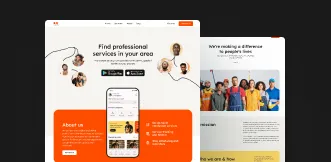
Image-creating-a-modern-look-with-detailed-graphics-priyopay

What clients love to Tell about us

Answer to your questions

How do I request a UI/UX design project?

To request designs, simply Submit a Project Request and provide your required information for clearity. Or get your unlimited design subscription With Ofspace. Submit your design request today and finish it with us the next day. No hiring, no contract, unlimited requests. To know more details book a 15 min free call.

Why choose Ofspace over other UI/UX design agencies?

At Ofspace, we don’t just design interfaces—we design for growth. As a global UI/UX design agency, we focus on user retention, reducing churn, and optimizing conversions to deliver measurable outcomes. Our process is fast, transparent, and built for startups and enterprises that need to scale quickly.

What industries does your UI/UX agency specialize in?

We specialize in SaaS, fintech, AI, and emerging technologies. With deep expertise in startup UX design and digital product design, our team creates tailored solutions that solve industry-specific challenges while enhancing usability, engagement, and growth.

How do we handle project scope changes or unexpected challenges during the design process?

We use Agile methodologies to adapt quickly to scope changes and unexpected challenges. This approach ensures clear communication, flexibility, and consistent focus on quality—allowing us to deliver high-performing user experiences for startups and enterprises.

What design tools and technologies do we use to stay ahead in product design?

Our team leverages leading design tools like Figma and Sketch, along with prototyping platforms such as Framer and Webflow. As a digital product design agency, we adopt modern technologies that ensure every product we design is efficient, scalable, and user-friendly.

How do we guarantee quality and usability in every product design project?

Quality is built into our workflow. Through usability testing, performance checks, and design integrity reviews, we ensure each product meets industry standards and delivers intuitive user experiences. For startups, this means faster adoption and long-term retention.

Do we offer end-to-end product design services from concept to post-launch support?

Yes. We provide complete product design services—from concept development, UX/UI design, and prototyping to developer handoff, user testing, and post-launch optimization. Our startup-focused approach ensures products not only launch successfully but also evolve to meet user needs.

What makes Ofspace different from other UI/UX design agencies?

Most agencies focus on making things look good. We focus on making them work. As a global UI/UX agency, our process prioritizes clarity, usability, and execution speed. We’re built for founders under pressure—delivering designs that ship fast, scale easily, and drive measurable growth.