
How We Designed SimplePin to Bring Clarity to Insurance Payments
SimplePin came to us with an ambitious mission and a complex problem to solve.Insurance providers, brokers, and agencies were buried under fragmented payment workflows. Capturing invoices, posting checks, reconciling statements, and managing direct bill commissions involved multiple disconnected tools, manual data entry, and constant back-and-forth between systems.
What they needed was a product experience and a visual language that could communicate that capability clearly, without overwhelming users in an industry already known for complexity. We were brought in to lead product design and motion design across the platform and marketing surface.
Services
- Product Design
- Web App
- Prototype
Website
Post Project
About the Project
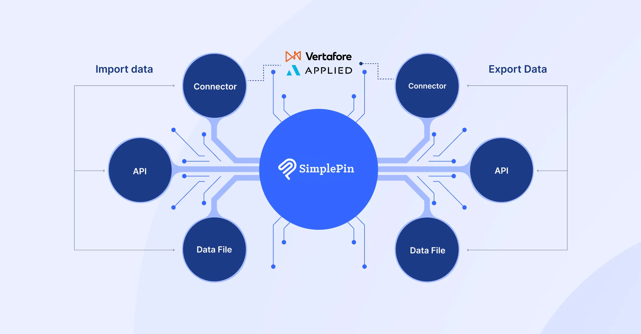
SimplePin is a financial automation platform built for insurance providers. It captures, matches, posts, and reconciles every inbound payment, whether it comes through online invoicing, eCommerce checkout, ACH, wire, check, or carrier statement, and pushes it back into the agency management system in real time.
We partnered with the SimplePin team to shape the product experience end to end. Our role focused on designing the interfaces customers interact with daily, the flows that move money and data through the system, and the motion language that brings the product to life across web and in-product moments.



The Challenge
Insurance is one of the most documentation-heavy industries in the world. Every payment carries context: policies, carriers, commissions, premiums, taxes, and reconciliation rules. Designing for this audience meant balancing two opposing forces.
We also had to design for trust. SimplePin handles regulated financial flows and PCI Level 1 compliance. Every screen had to look credible to a CFO, while remaining usable for a front-foffice staff member processing payments between calls.


Our Approach
We began by mapping how insurance teams actually work. We looked at the daily reality of agency operations, where payments come in through five or six different channels, where reconciliation often happens at the end of the month under pressure, and where one mistake can ripple through the books.

Product structure and flow
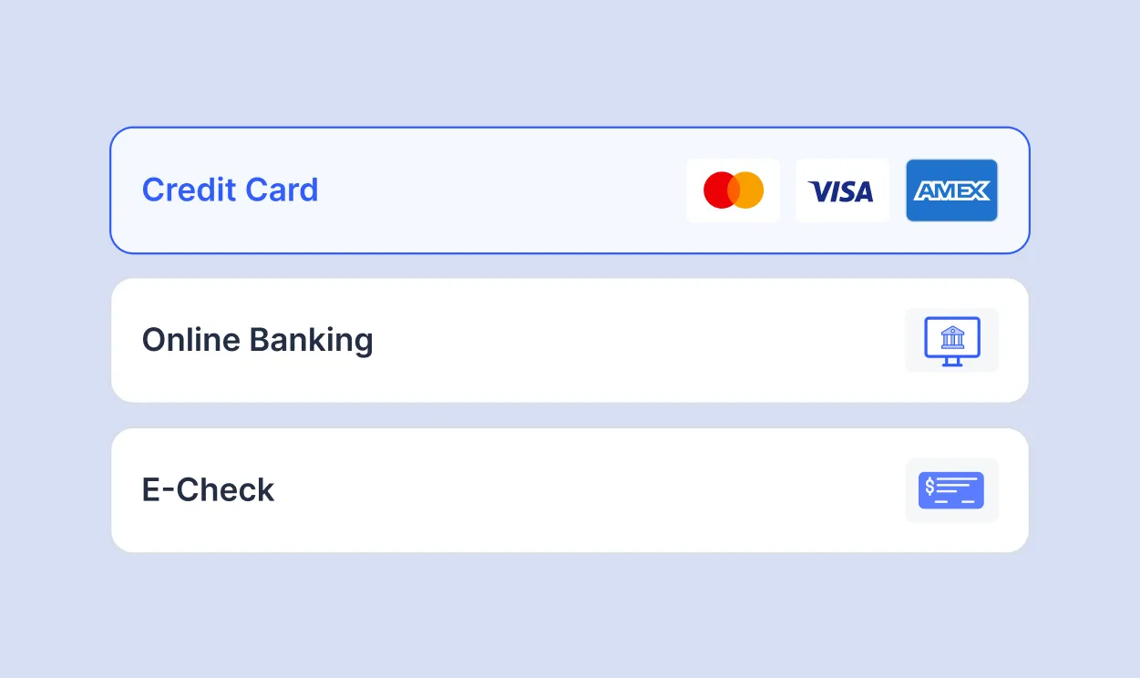
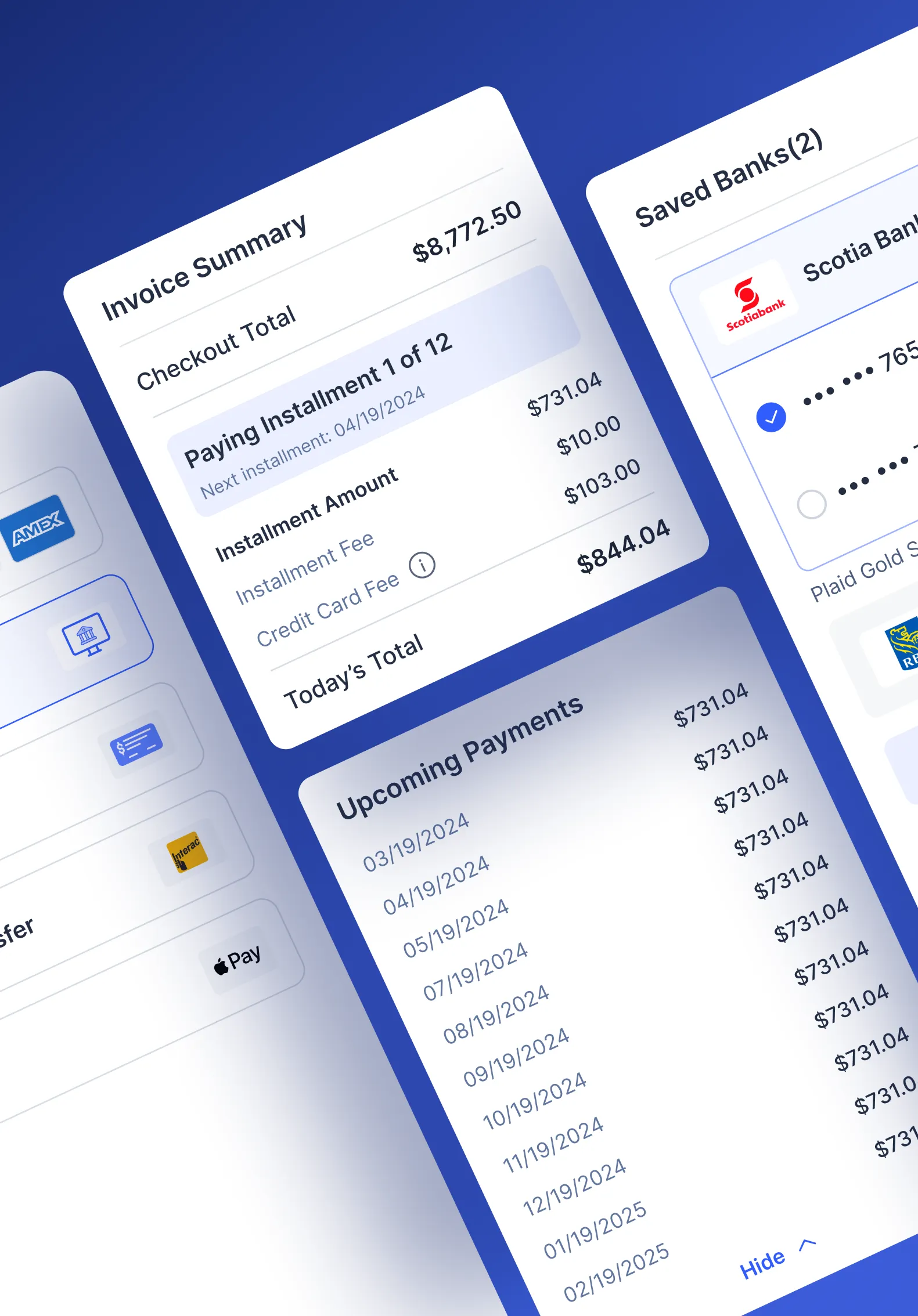
We organized the platform around the five core workflows that matter most to insurance teams: invoicing and digital payments, eCommerce checkout, check and statement capture, direct bill commissions, and AR posting and reconciliation. Each module was designed to stand on its own, but feel connected to the others through a shared visual system.
Hierarchies were built around the question every user asks first. What needs my attention right now. Dashboards lead with status, exceptions, and unmatched items, not vanity metrics.
Designing for clarity, not decoration
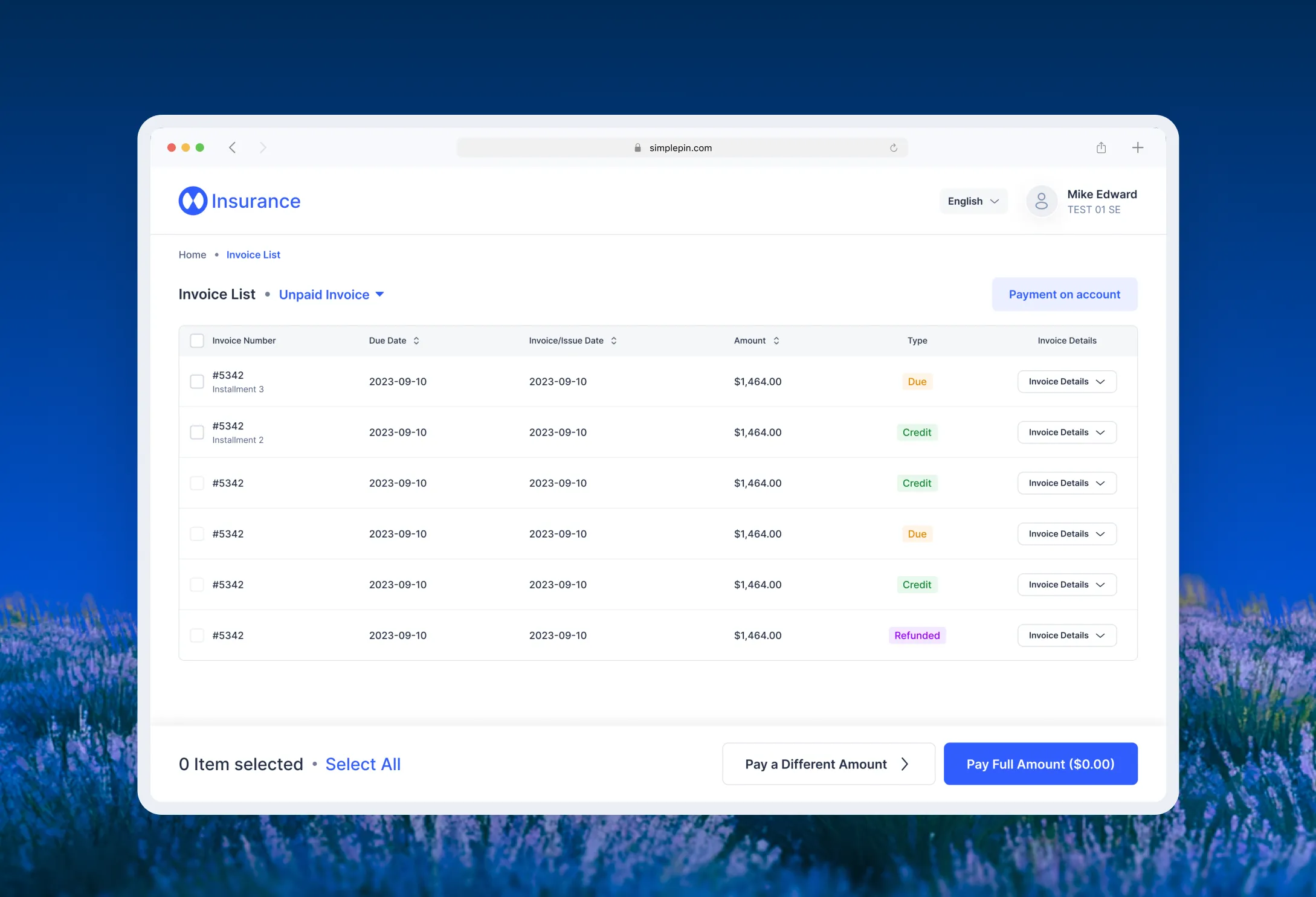
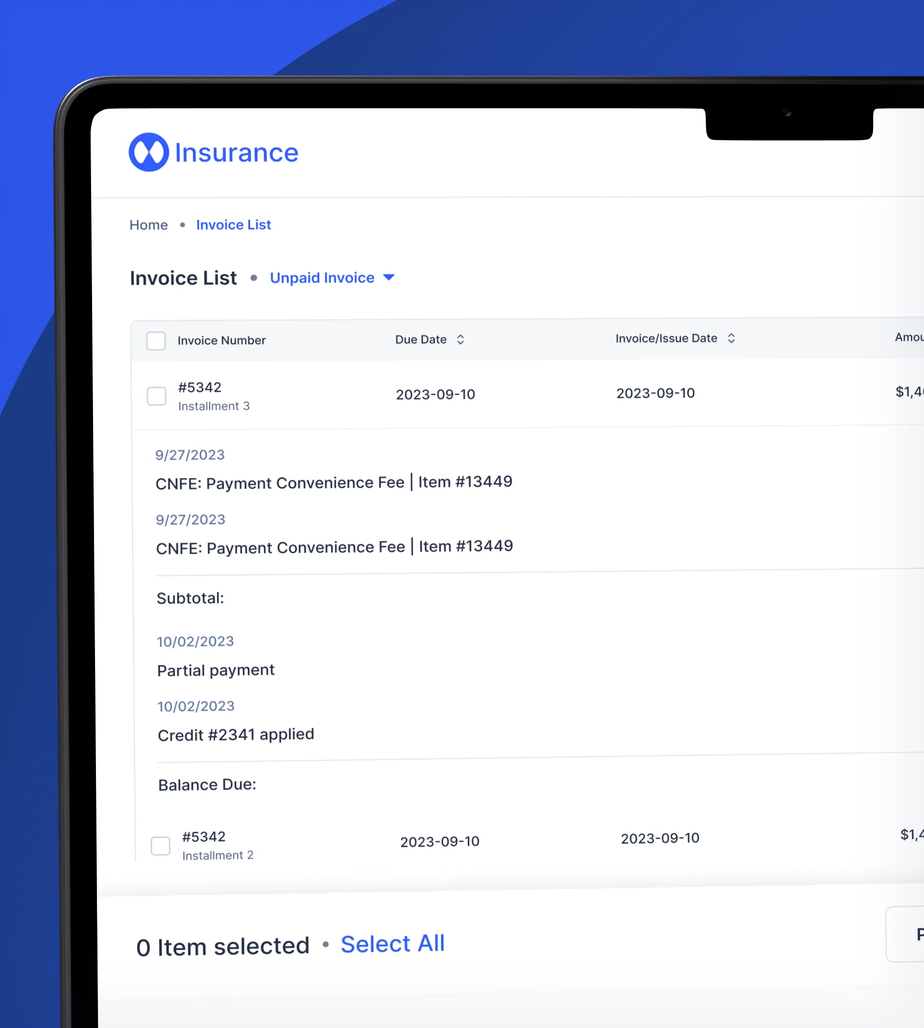
The interface was kept restrained on purpose. Generous spacing, strong typography, and a calm tealish blue palette let the data speak. Tables, statements, and reconciliation views were treated as the hero of the experience, not the chrome around them.
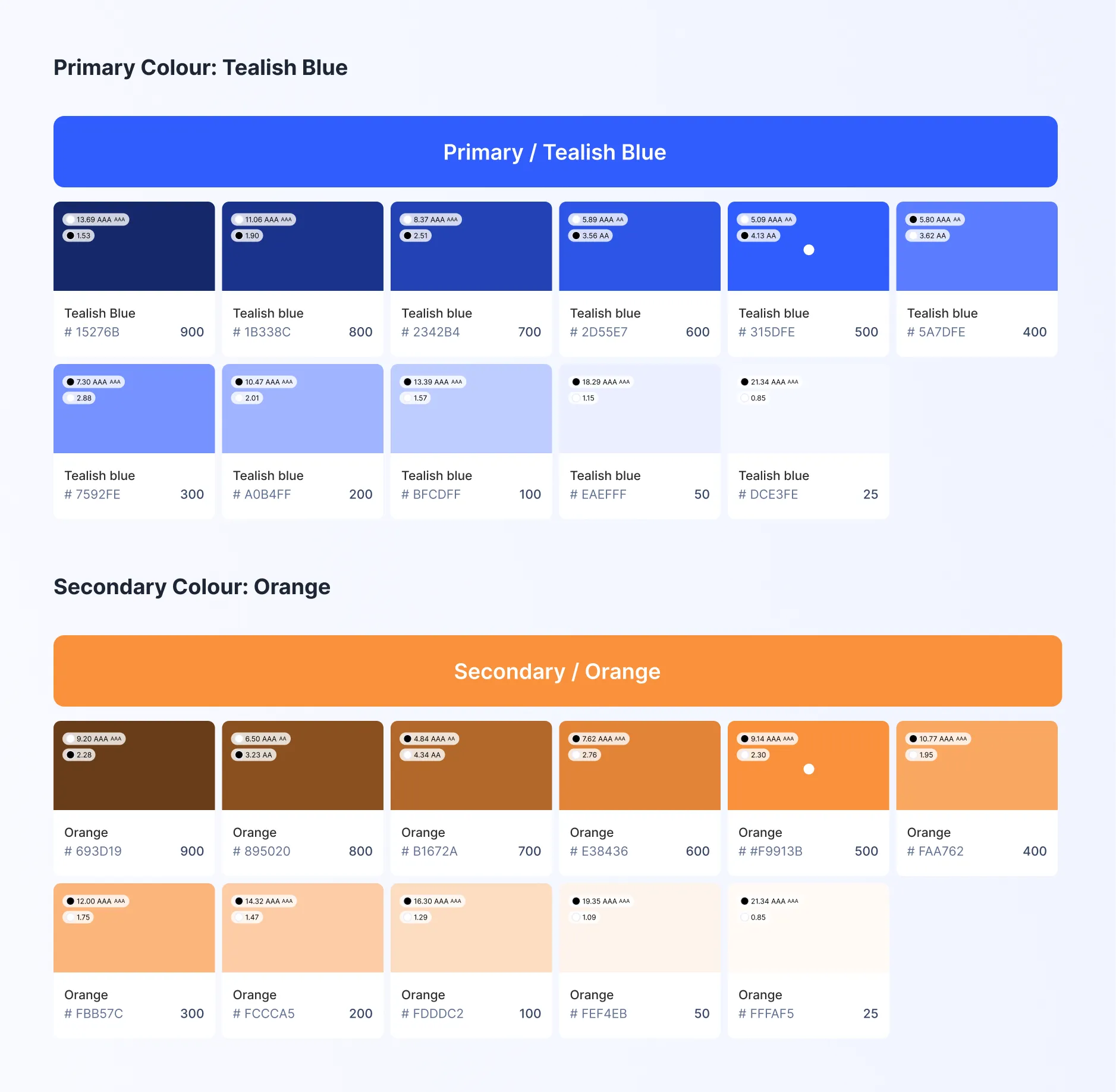
Color was used functionally. Blue carries authority and product identity. Orange flags action and exceptions. Neutral grays carry the heavy lifting of dense financial data without fatiguing the eye.

Motion as a layer of confidence
This is where motion design carried real weight. In financial software, motion is not decoration, it is feedback. We designed micro-interactions and transitions to make automation legible. When a check is captured, the user sees it parsed. When a payment is matched, the match is animated. When reconciliation completes, the system visibly closes the loop.
Responsive and accessible
The platform was designed to scale across desktop and tablet, with mobile-friendly flows for users who approve payments or check status on the go. Every component was built with accessibility in mind, since insurance teams span a wide range of users and environments.

Typography & Colour
The type system uses SF Pro for its clarity, neutrality, and modern feel. It carries dense financial information without ornament and stays legible across small UI elements, dashboards, and large headlines on the marketing site.
The color palette is built around a primary tealish blue that signals trust, technology, and precision. A warm orange accent is used sparingly to draw attention to actions and statuses. Together they create a tone that feels professional without feeling cold.

SimplePin Product and
Responsive Overview
SimplePin is designed for insurance teams. The desktop-first platform handles reconciliation, posting, and reporting. eCommerce and invoice payments are responsive for policyholders on phones, tablets, and desktops.
Components are built to scale. The design system powers the dashboard, payment pages, checkout, and marketing site, reducing cognitive load and reinforcing SimplePin as a dependable platform.


The Result
SimplePin launched with a product experience that matches the ambition of the platform underneath it. Insurance teams can see, in one place, what is paid, what is pending, and what needs their attention. Customers paying invoices are met with a checkout that feels modern and trustworthy. Motion makes automation feel real rather than abstract.
The brand and product now stand confidently in a category that has long been served by legacy software. SimplePin is trusted by leading insurance organizations across North America, including Towne Insurance, Amwins, Acera, Insurica, Cowan, and many others.
What This Project Reinforced
Designing for financial automation is not about making things look impressive. It is about making complexity feel manageable. In insurance, users are not looking for novelty. They are looking for a system that respects their time, surfaces what matters, and quietly handles the rest. Good design in this category disappears into the work.
SimplePin reinforced something we believe across every fintech and enterprise project we take on at Ofspace. Trust is built in the small moments. The way a number aligns. The way a confirmation animates. The way a dense table breathes. Get those right, and the product earns the user's confidence long before they read a single marketing claim.