
How We Designed STACC to Make High-Stakes Testing Feel Trusted in Every School
STACC came to us with a serious mandate and a real perception problem to solve. Public safety certification is high-stakes work. Schools, proctors, and testing administrators were choosing between exam platforms that felt either clinical and intimidating or generic enough to raise doubts about security. A credential that opens the door to a 9-1-1 dispatch or detention officer career should feel official. Most testing tools just felt cold.
STACC had built a platform to deliver partner-issued public safety certifications inside schools, secure online testing, FERPA-compliant reporting, auditing, and invoicing in one place. What they needed was a visual identity and brand language that could communicate that credibility immediately, without intimidating the sixteen-year-old sitting the exam.
We were brought in to lead branding, visual identity, and design across the platform and marketing surface.
Services
- Branding
- UI/UX Design
- Motion Design
Website







Problem and Solution
STACC needed more than just a logo. They required a complete identity system to position themselves as a trusted certification partner for school districts. The challenge was to:
Build trust and credibility with schools, districts, and certifying bodies
Reflect their mission of secure, accessible testing for every student
Ensure consistency across digital, print, and on-site testing environments
We developed a comprehensive and scalable brand identity system firmly grounded in the principles of authority, clarity, and approachability. This system reflects STACC's role as a trusted intermediary while keeping the student experience welcoming.
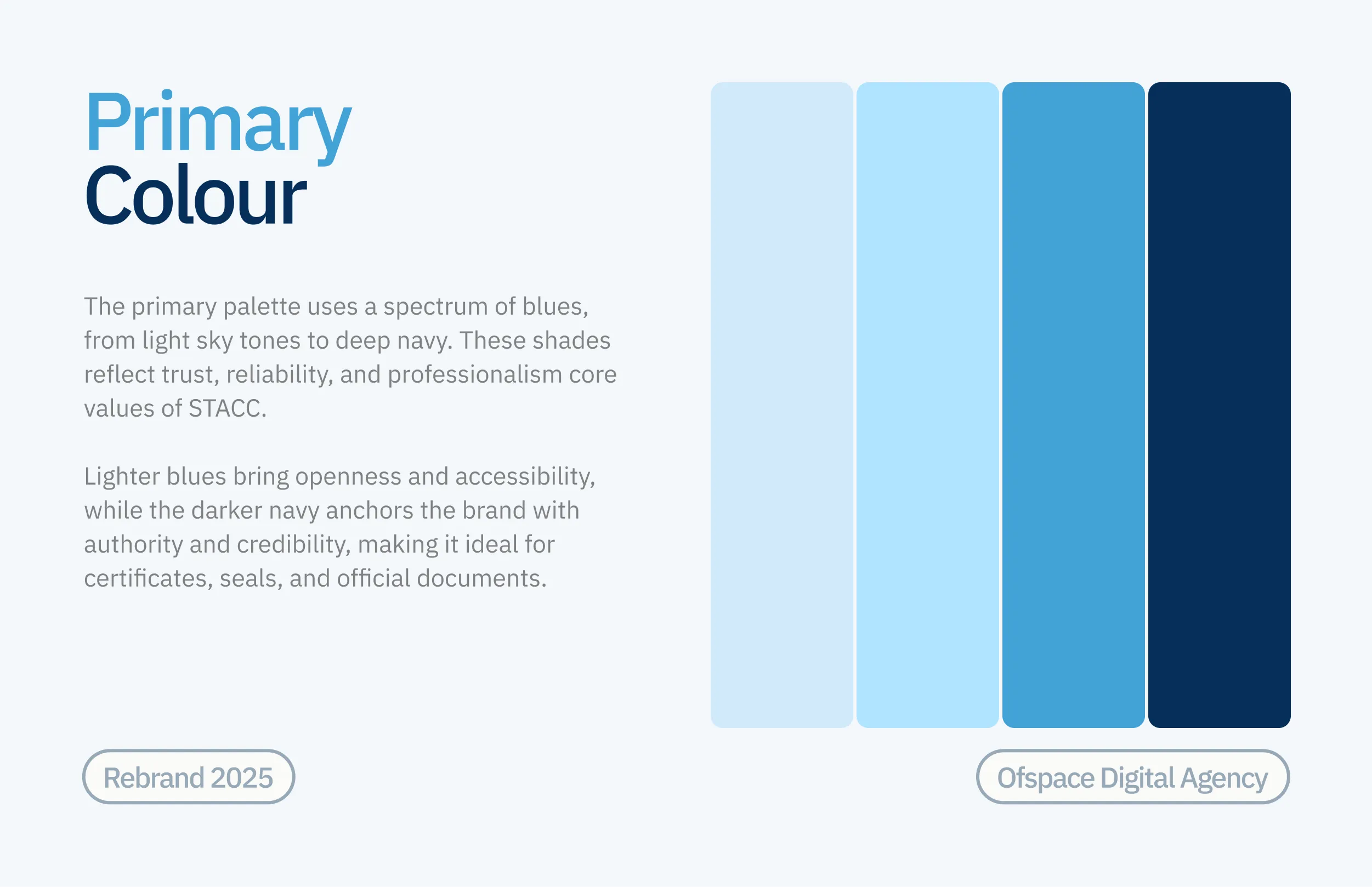
A colour palette anchored in deep STACC Navy with a spectrum of accessible blues
A typography system balancing editorial authority with clean functional clarity
A logo mark symbolising knowledge, public service, and protection
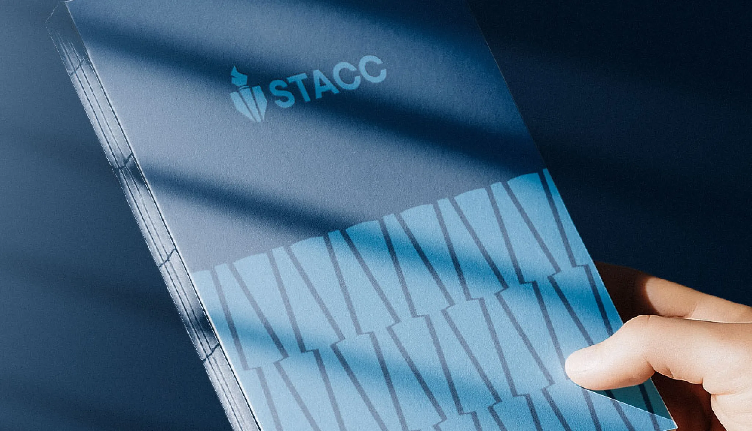
Applications spanning the platform, apparel, print, credentials, and signage


Logo Development
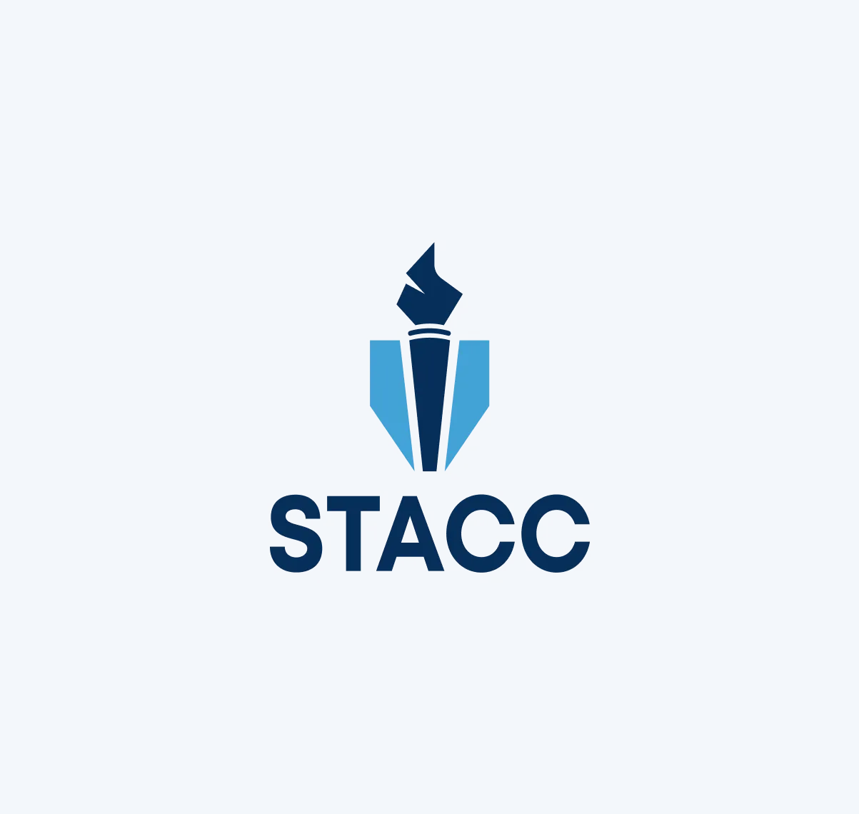
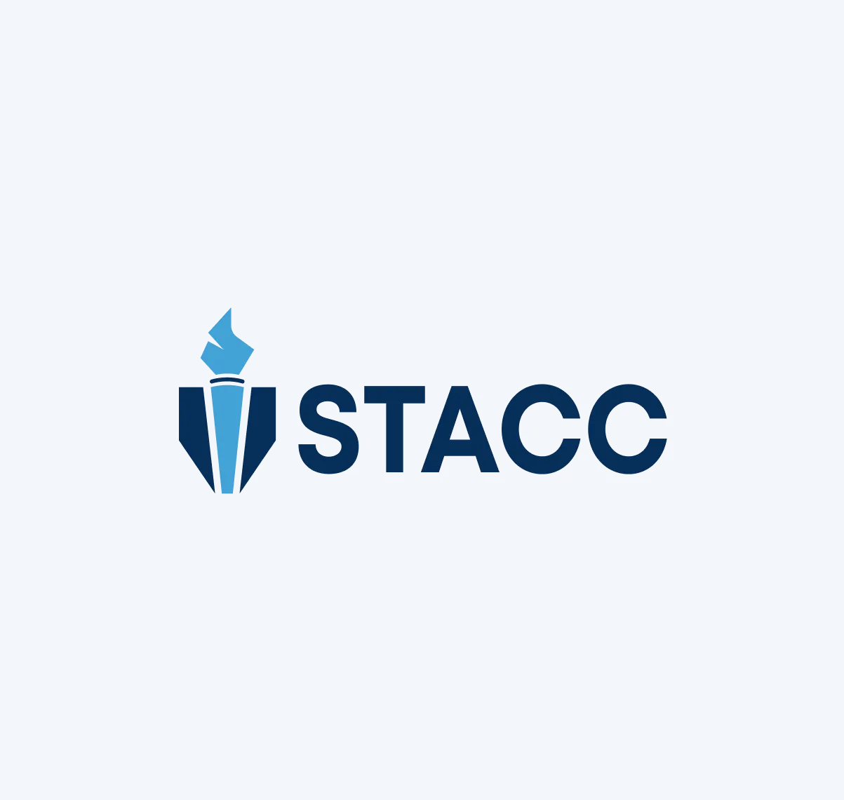
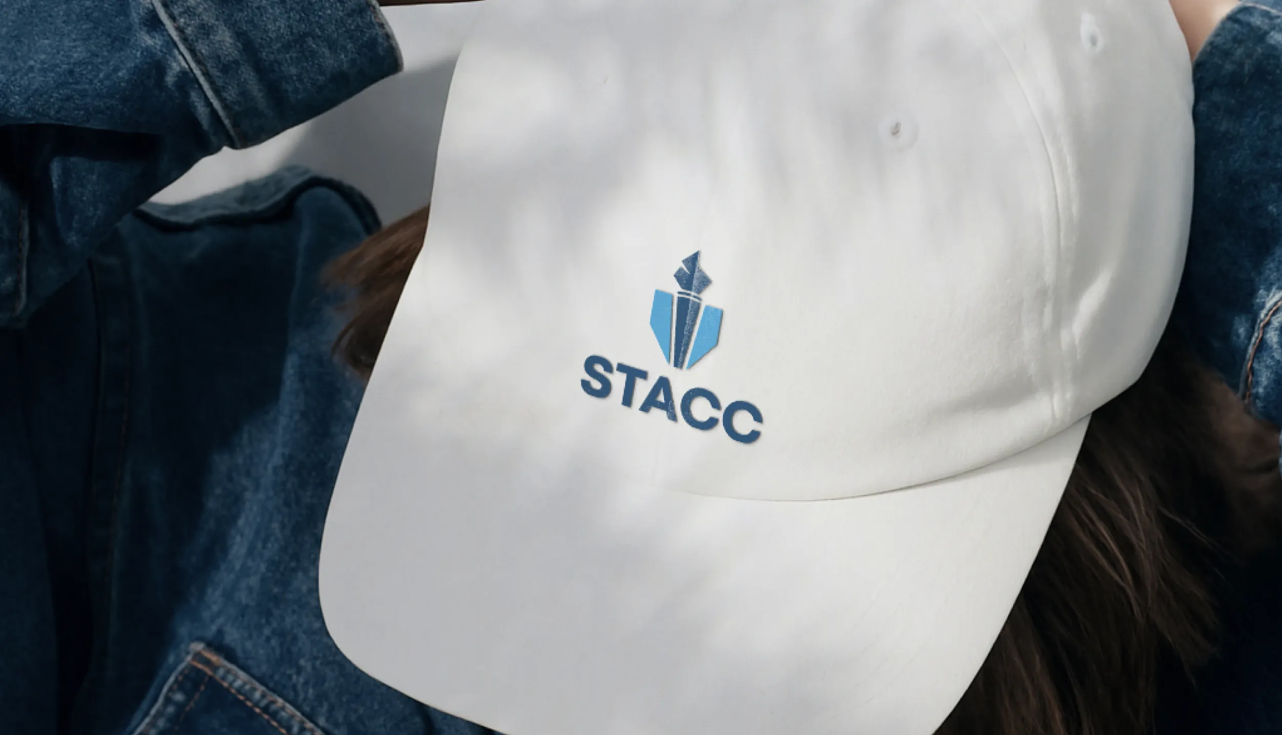
The STACC mark is a torch, built from a single set of angular facets. The clean, minimal form was designed to carry three distinct meanings at once.
The rising flame represents knowledge and readiness. It reflects how STACC helps students, proctors, and schools turn coursework into recognized, career-ready credentials.
The fluted shaft beneath it reads as a classical column and a nod to the institutions STACC works alongside, where standards, accountability, and due process genuinely matter.
At a third layer, the full silhouette resolves into a shield, a quiet reference to the protection and public service careers these certifications lead into.
By combining simplicity and purpose in a single mark, the logo communicates both authority and encouragement at every scale and in every context — from a favicon to an embroidered cap.






Typography & Colour
Helvetica Neue is the entire type system. One family, two registers. We tested a serif for headlines and rejected it, in a testing environment, a decorative headline reads as marketing, and marketing is the last thing a school district wants to see attached to an exam.
Helvetica Neue Bold carries the display layer. Set large with tight tracking, it gives headlines weight and authority without ornament, closer to the tone of an official notice than an advertisement. Used for hero statements, section headings, and certification names.
Helvetica Neue Light to Medium handles the functional layer. Clean, neutral, and built for body text, captions, and UI where clarity is critical. In an exam interface, neutrality is a safety feature: nothing in the letterform competes with the question on screen.
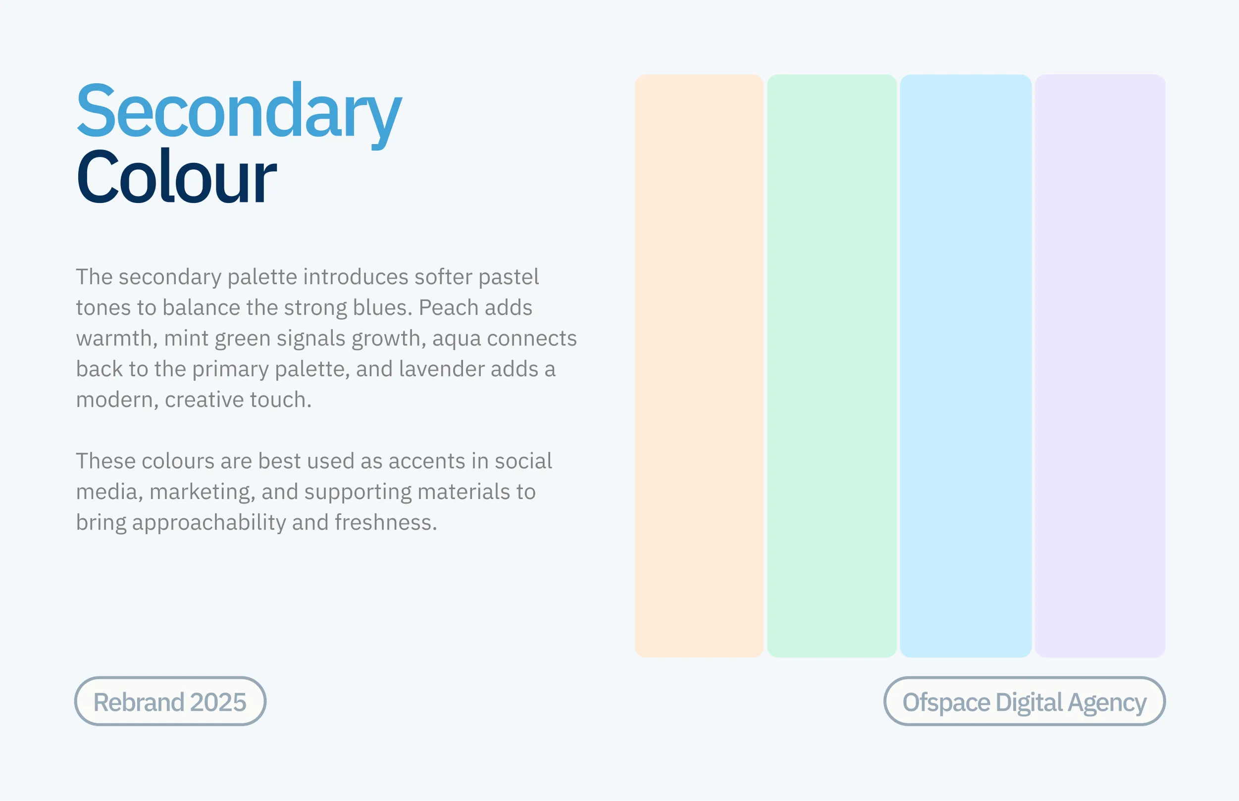
The colour palette is built around four colours that are most instantly recognisable as STACC.
STACC Navy #193358 — the anchor that grounds the palette. Used for text, certificates, seals, and every surface that needs weight and seriousness.
STACC Blue #5C9FD0 — the primary signal colour. Carries the logo, buttons, and every core brand moment.
STACC Sky #B8E1FC — brings openness and accessibility to cards, interfaces, and testing screens.
STACC Mist #D4E8F9 — a soft tint that provides breathing room across interfaces and printed materials.
When combining pieces in a layout, the colour pairings are used for consistency and legibility. Over solid backgrounds, these combinations should be used for most communications.

STACC Product and
Responsive Overview
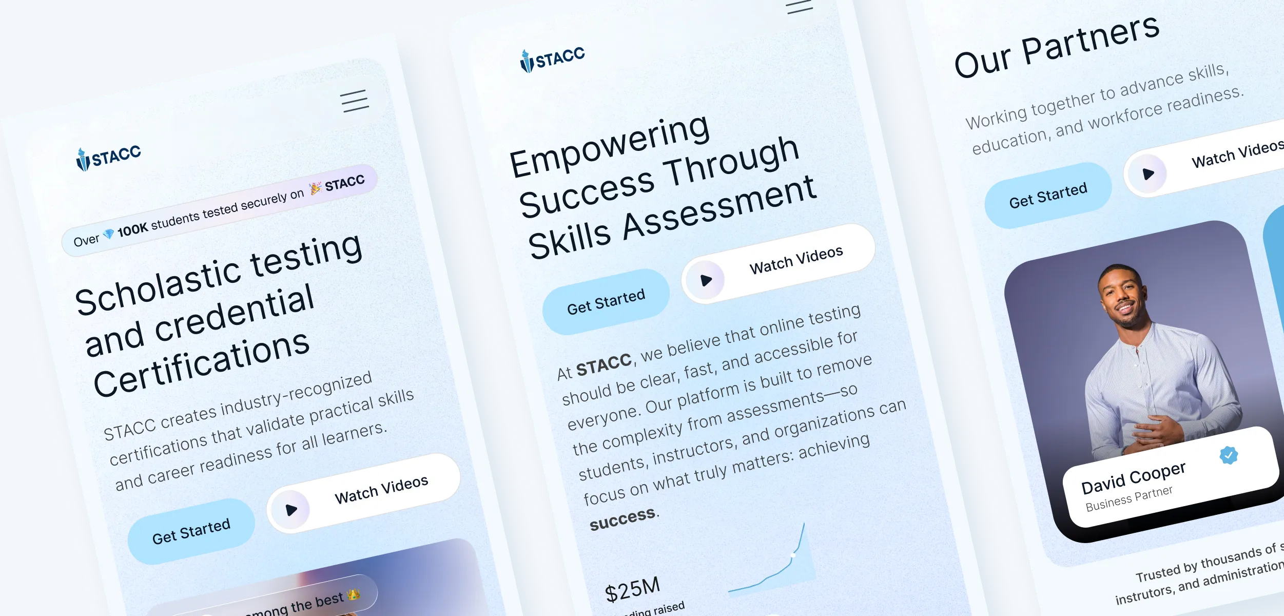
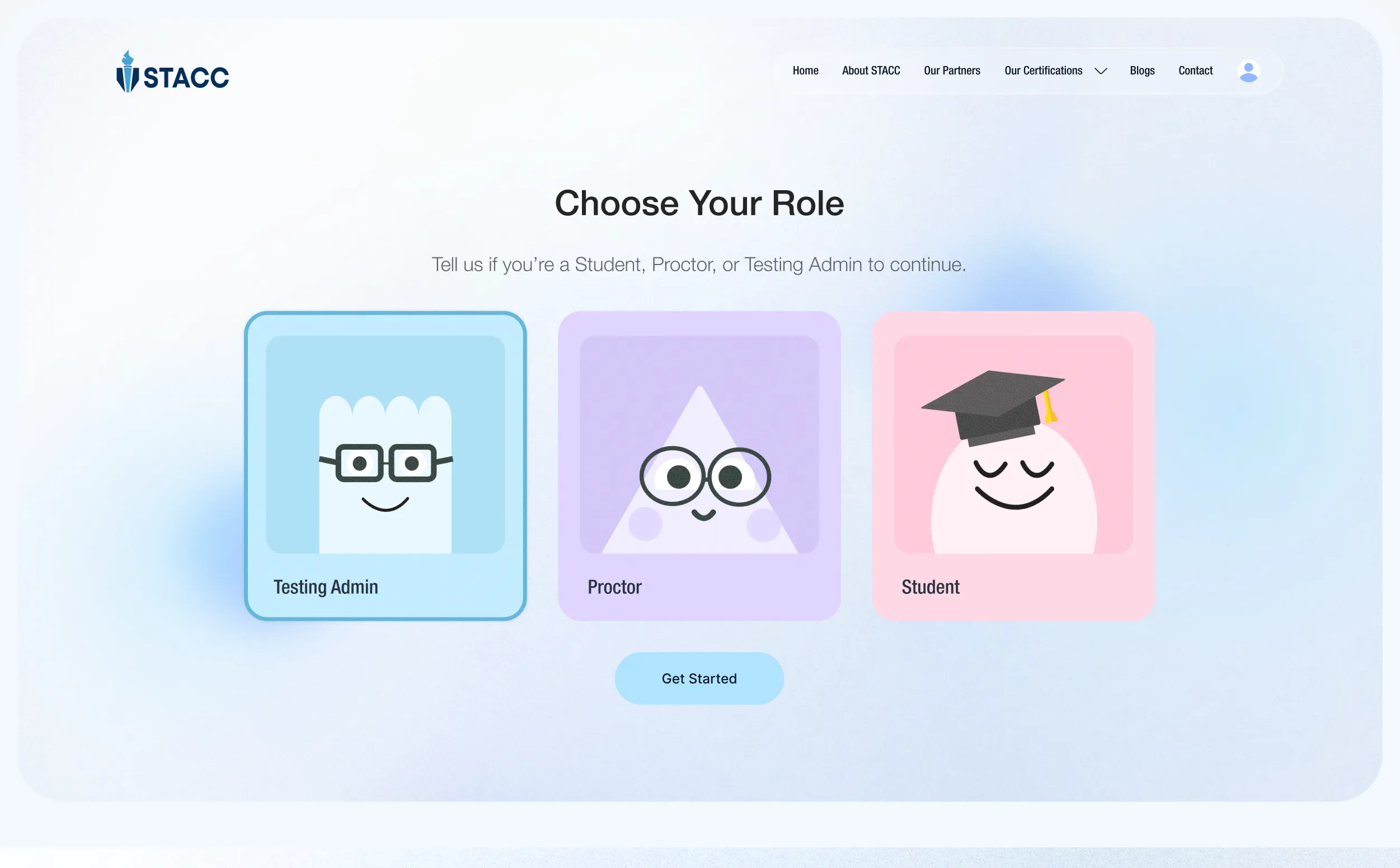
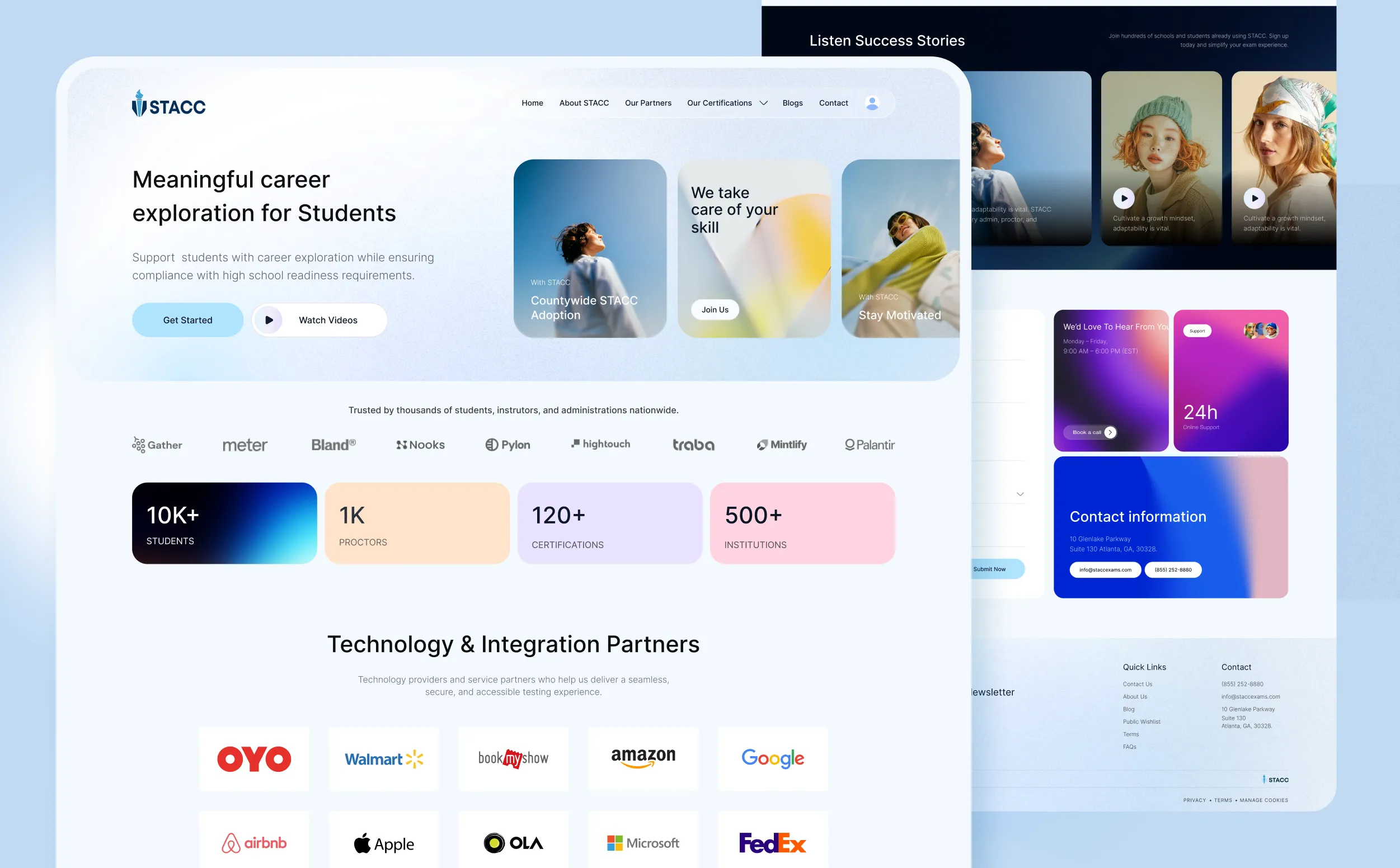
STACC is designed for schools. The desktop-first platform handles role-based onboarding, exam delivery, proctoring, and reporting. Certification pages, partner directories, and student resources stay fully responsive for learners on phones, tablets, and desktops.
The colour palette is built around four colours that are most instantly recognisable as STACC.

Remarkable success story of Lionstep
We are thrilled to share the incredible success story of Dorik. One of Dorik’s most significant achievements has been empowering small businesses and individual creators to establish their online presence with ease. Since its launch, Dorik has achieved remarkable milestones, transforming the lives of countless people around the world.
The platform’s subscription-based model and additional premium features generated substantial revenue. The company has successfully entered international markets, translating the platform into multiple languages and adapting it to meet diverse user needs worldwide.