How We Designed WinWinX to Make Buy Now, Pay Later Feel More Human
WinWinX came to us with a bold idea: make Buy Now, Pay Later work directly between people. Instead of relying on traditional lenders, WinWinX lets buyers and sellers connect, negotiate payment terms, and complete purchases over time.
Our role was to turn that idea into a product experience that felt simple, trustworthy, and approachable—from discovering a product and making an offer to managing payments and building trust.
Services
- Product Design
- UI/UX Design
- Web App
- Mobile App
- Motion Design
Website
Post Project
About the Project
WinWinX is a person-to-person Buy Now, Pay Later marketplace that gives people more flexibility in how they buy and sell. Buyers can purchase products with a down payment and continue paying over time, while sellers can define payment terms and choose which offers to accept.
We partnered with the WinWinX team to shape the product experience across marketplace, payment, trust, and account flows. Our focus was to make a relatively unfamiliar financial model feel intuitive while creating a visual system that could work consistently across web and mobile.
The Challenge
Buy Now, Pay Later is familiar, but WinWinX approached it from a fundamentally different direction. Instead of placing a bank or lender between the buyer and seller, the platform creates a direct relationship between real people. That meant the product had to make payment plans, offers, verification, and transactions easy to understand.
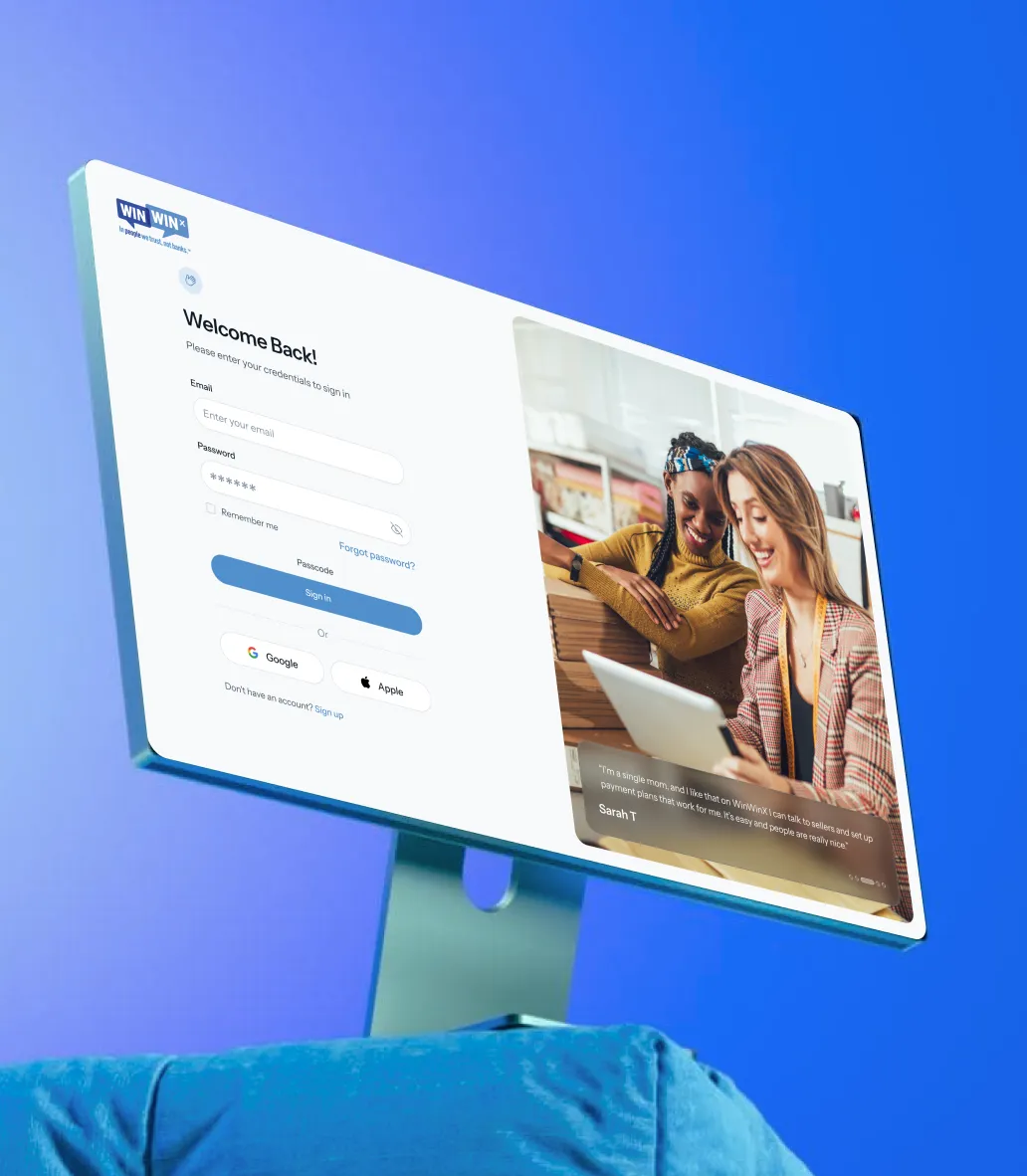
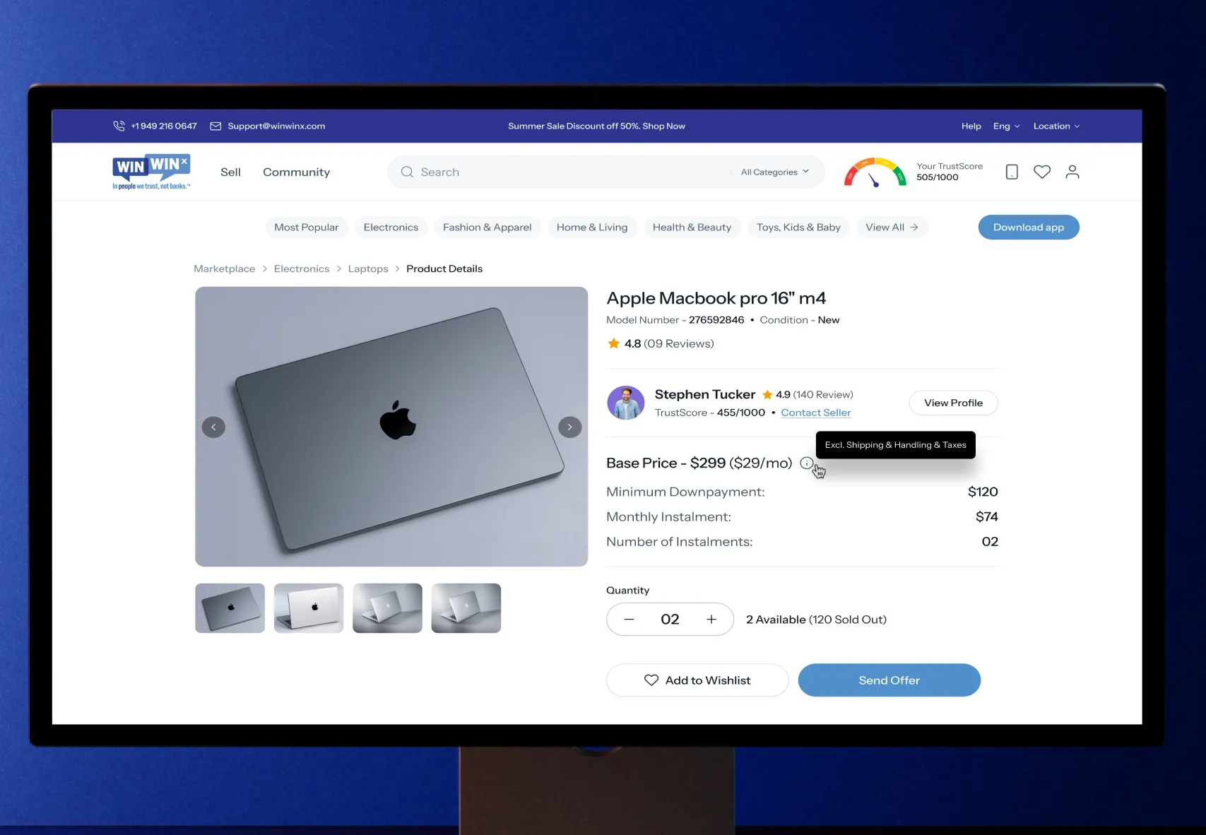
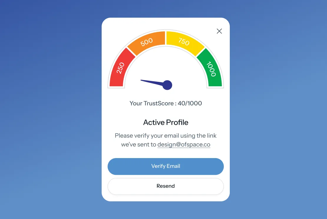
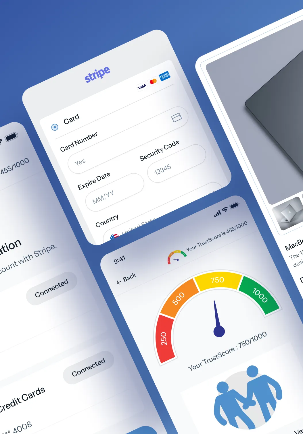
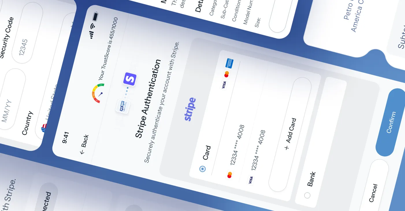
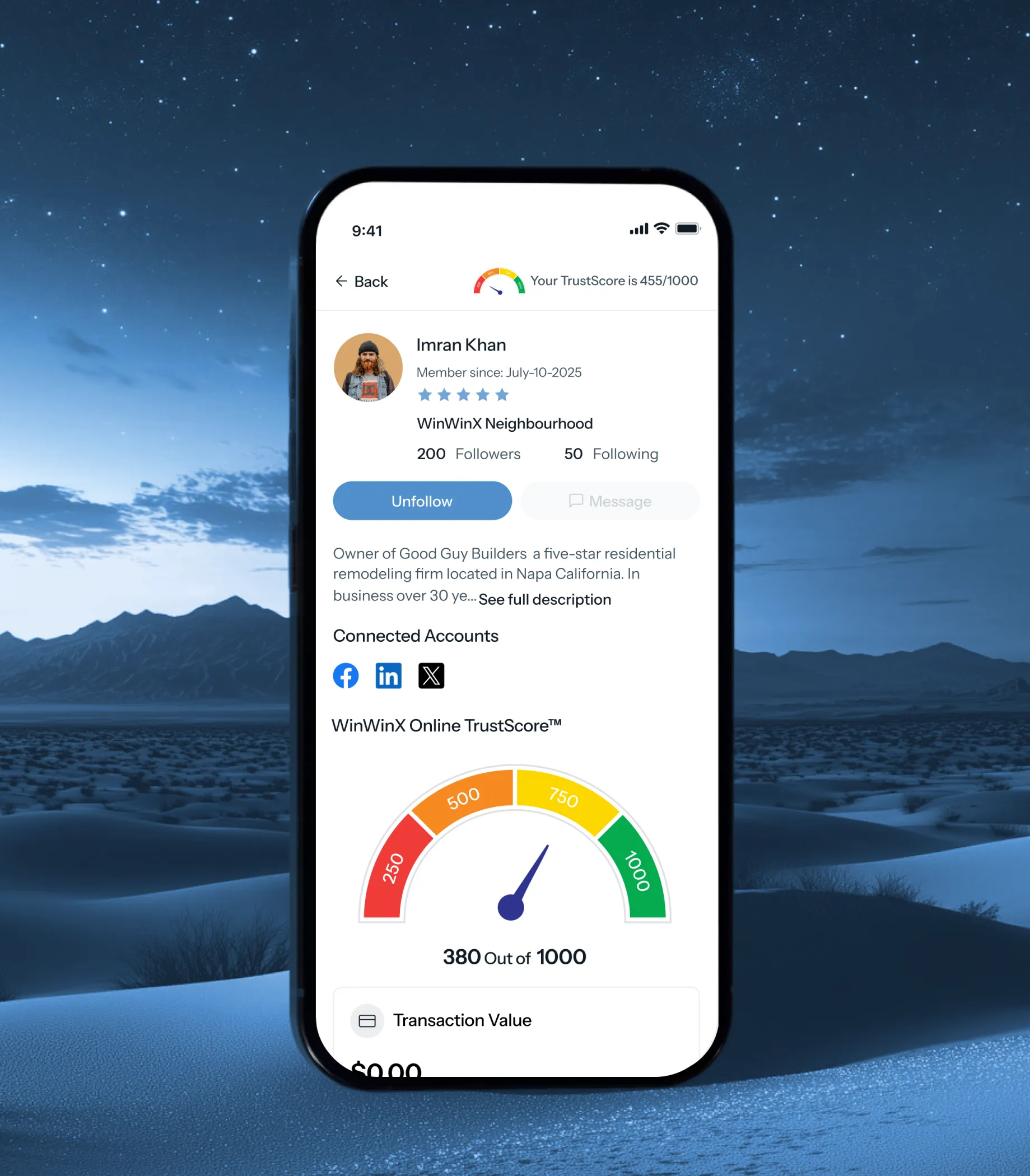
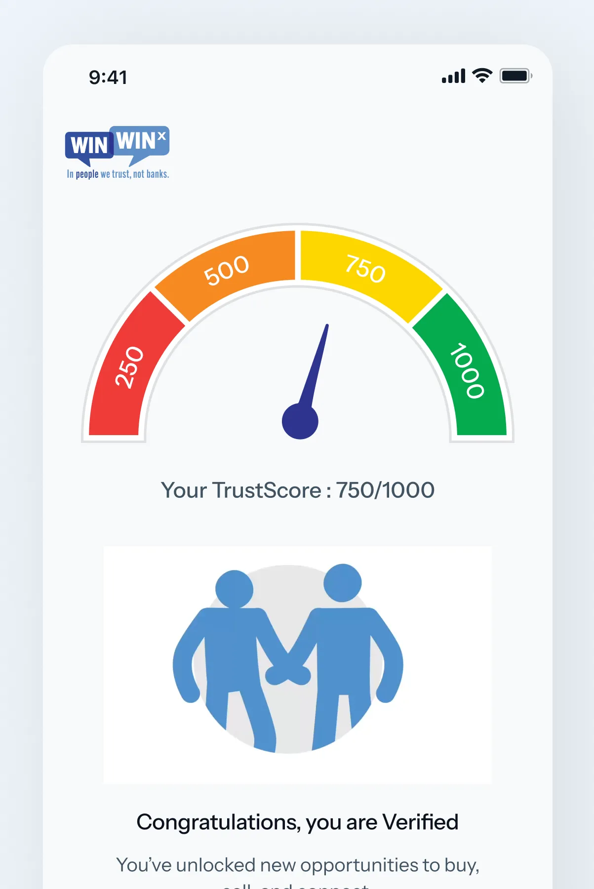
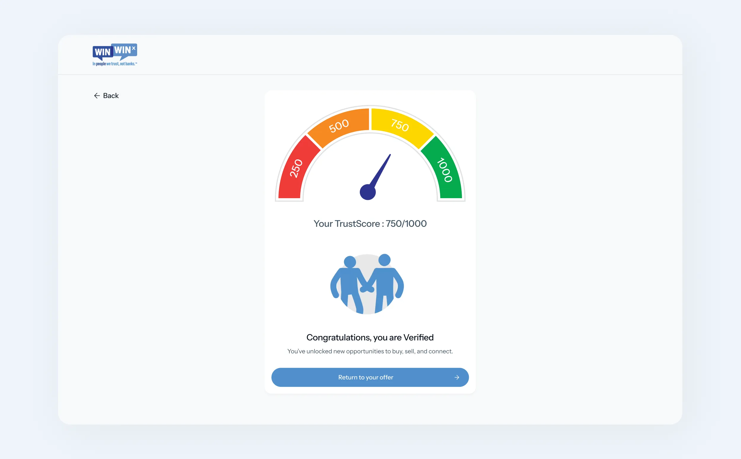
We also had to design for trust. Users needed confidence before purchasing from someone they had never met, while sellers needed enough information to make informed decisions about offers. The TrustScore became an important part of that experience, turning identity and transaction history into a visible layer of credibility.
Our Approach
product, make an offer, agree on a payment schedule, submit a down payment, receive the product, and continue with automatic payments. A seller moves through a different but connected journey: listing a product, reviewing offers, checking buyer trust, accepting terms, and receiving payments.
The challenge was to make these different journeys feel like one coherent product.
Product structure and flow
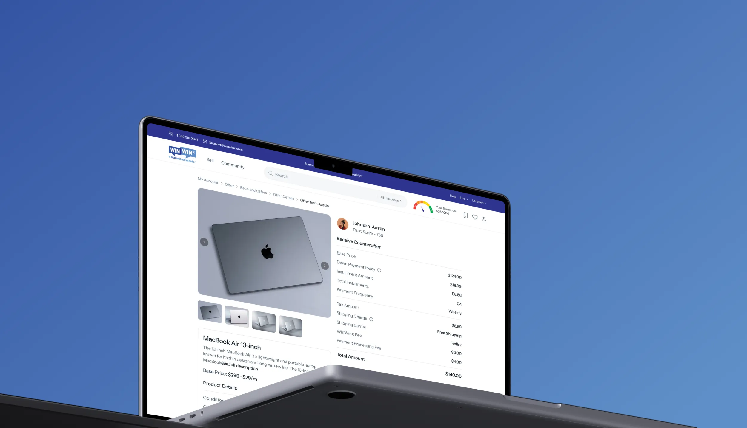
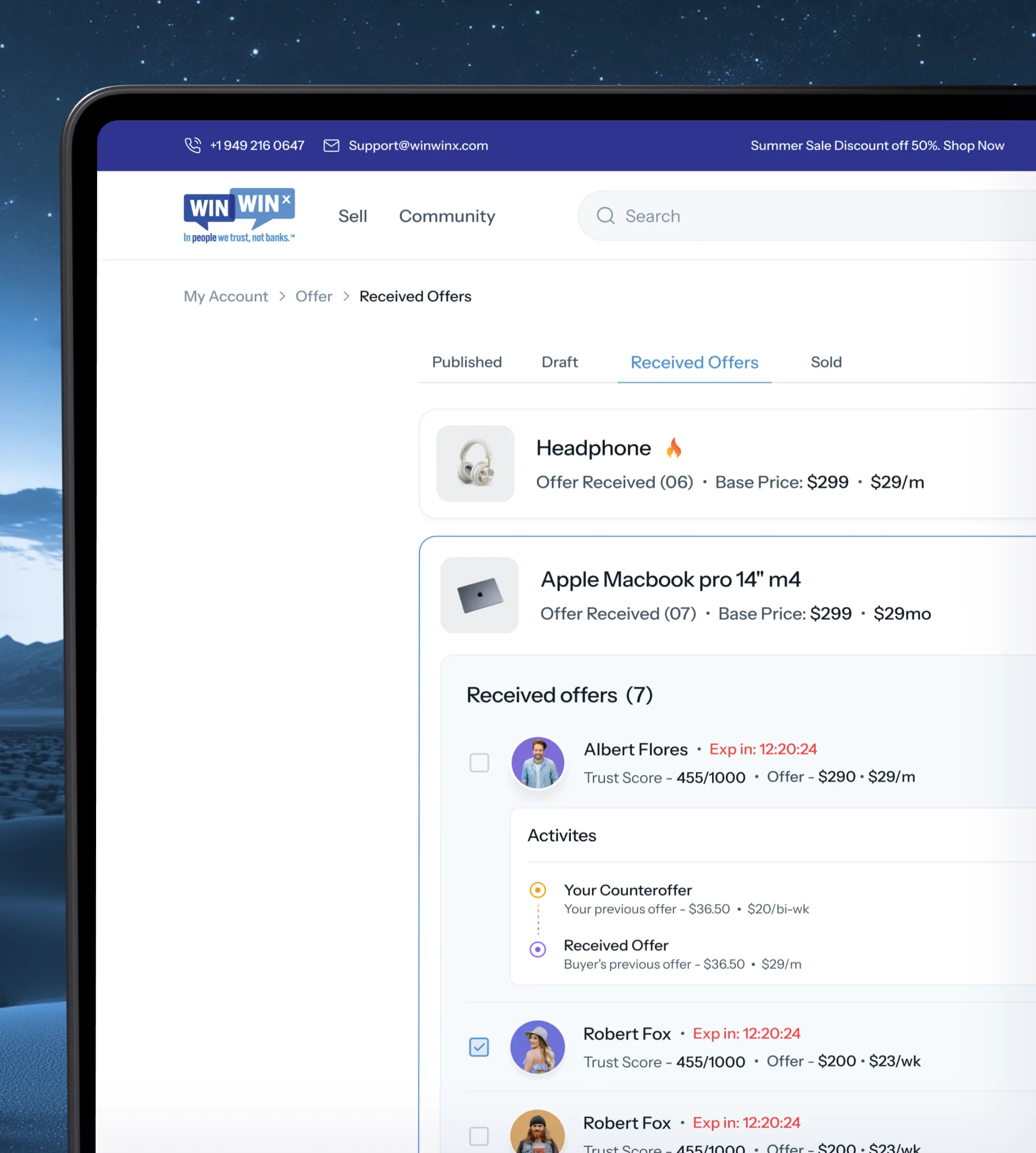
We organized the experience around the moments that matter most: discovering products, making offers, agreeing on payment terms, completing a transaction, and building a trusted profile.Each workflow was designed to stand on its own while remaining connected through a shared navigation system, reusable components, and consistent interaction patterns.
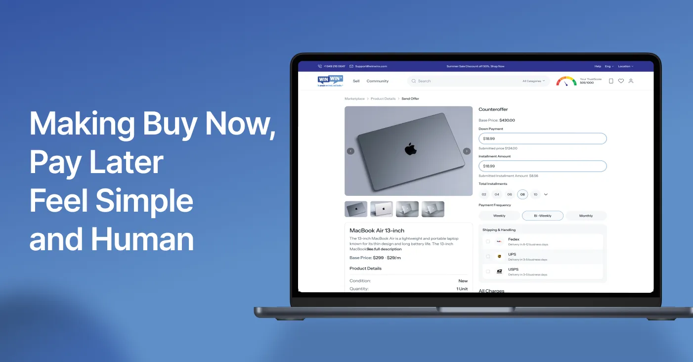
The hierarchy was built around the user's next decision. Instead of overwhelming people with financial information, we surfaced the details they needed at each step—price, down payment, installment amount, payment frequency, seller or buyer information, and TrustScore.
Designing for clarity, not decoration
WinWinX needed to feel different from both traditional financial products and conventional marketplaces. We kept the interface clean and approachable, using generous spacing, simple cards, clear typography, and focused calls to action.
Color became functional rather than decorative. Blue established the product's identity and sense of confidence, while the TrustScore introduced a more visual way to communicate reliability. The result was a system that could support complex financial interactions without making the product feel complicated.
Motion as a layer of confidence
For WinWinX, motion wasn't added simply to make the interface feel polished. It helped explain what was happening during important moments in the transaction.Transitions helped users understand when an offer changed, when a payment action was completed, or when a verification step moved forward. Small moments of feedback made the system feel more responsive and helped reduce uncertainty around financial actions.
Responsive and accessible
The platform needed to work across the environments where buyers and sellers actually use it. We designed the core experience for desktop and mobile while keeping the same information hierarchy and interaction logic across screen sizes.Marketplace discovery, product details, offers, TrustScore, and account experiences were structured so users could move between devices without having to relearn the product.
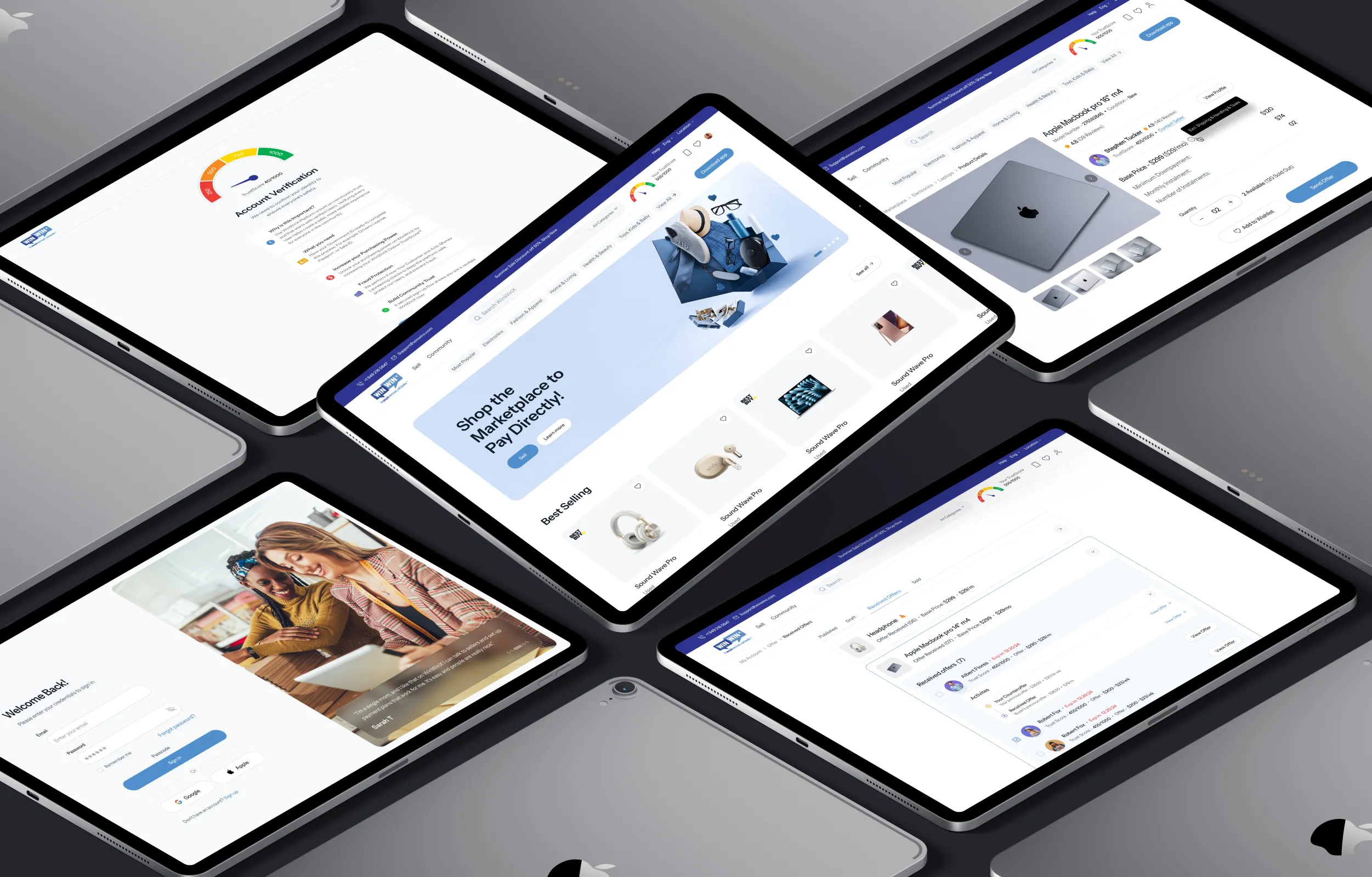
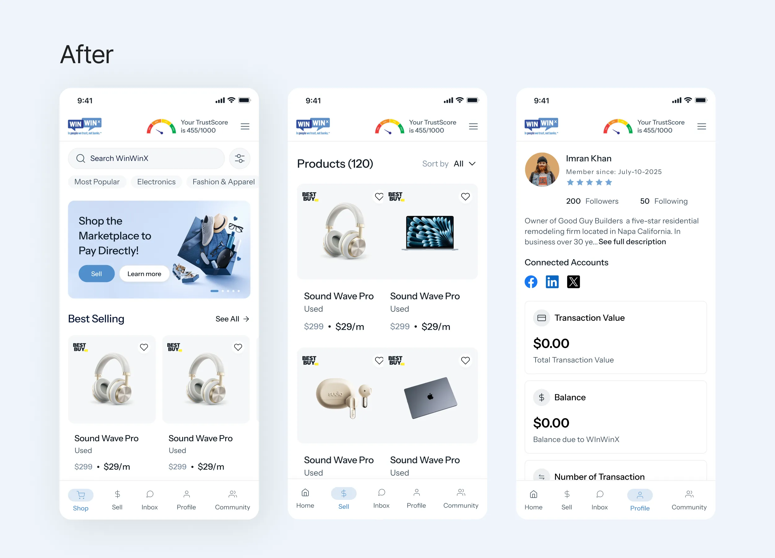
Before & After Mobile app
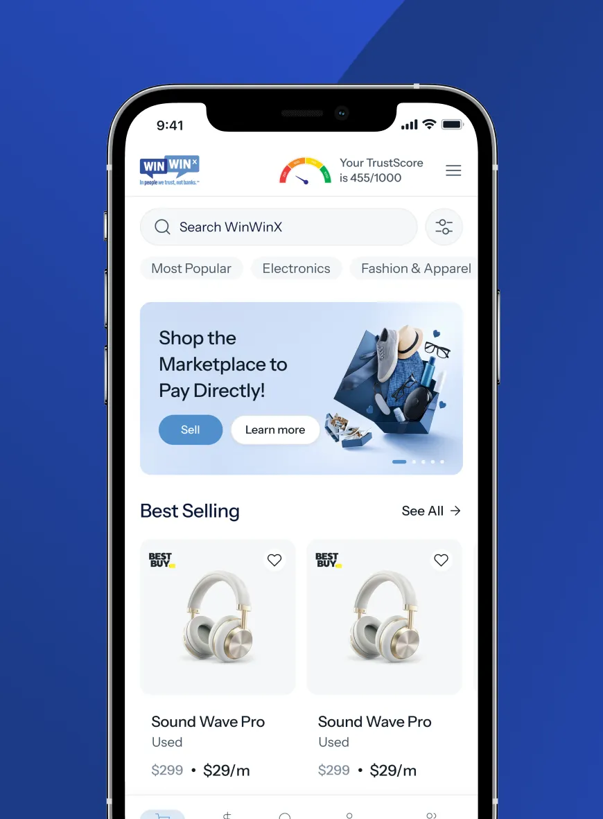
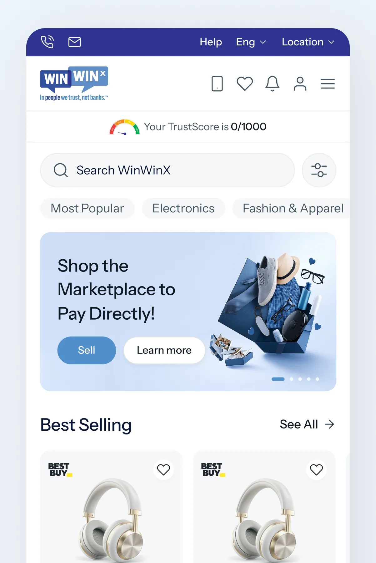
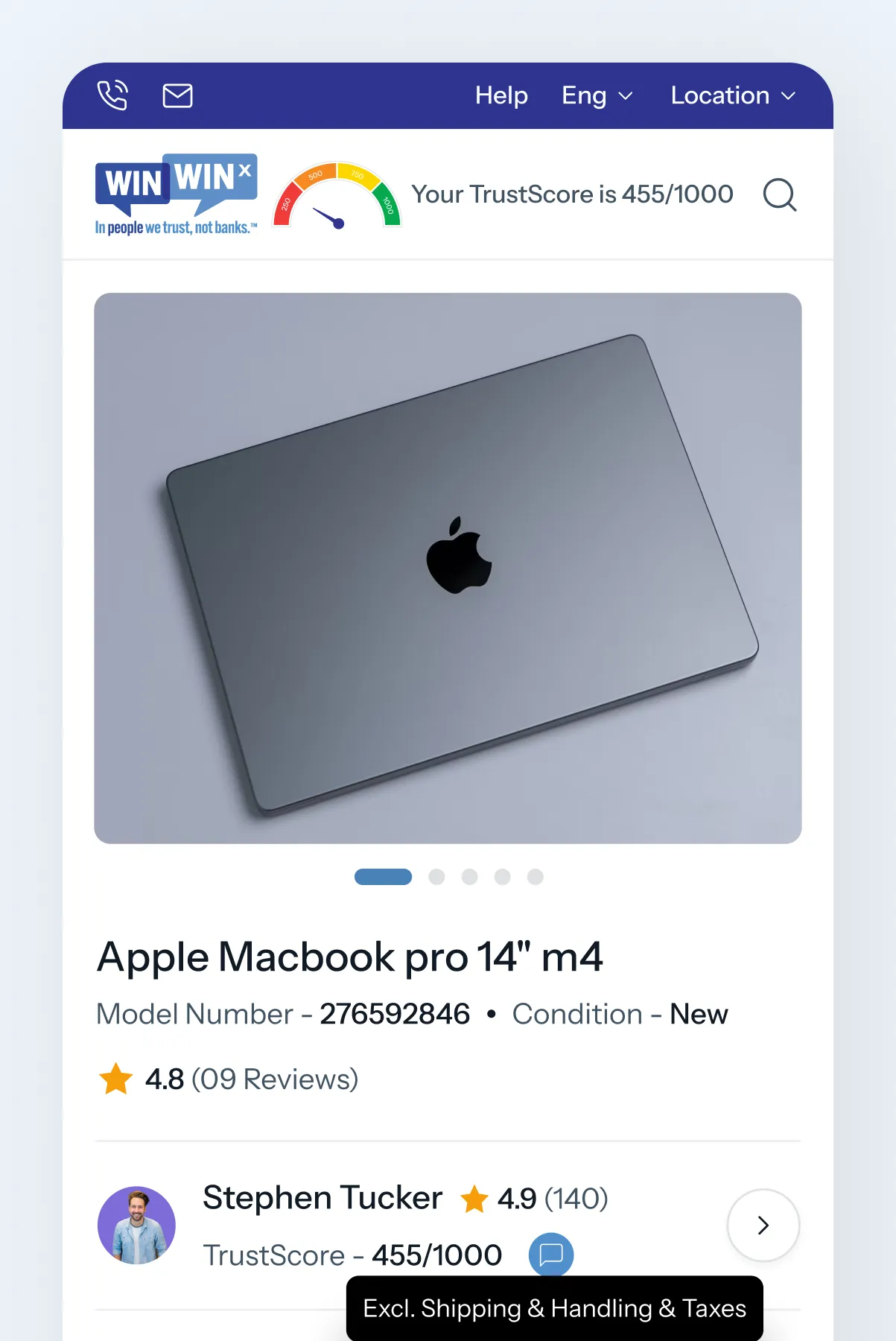
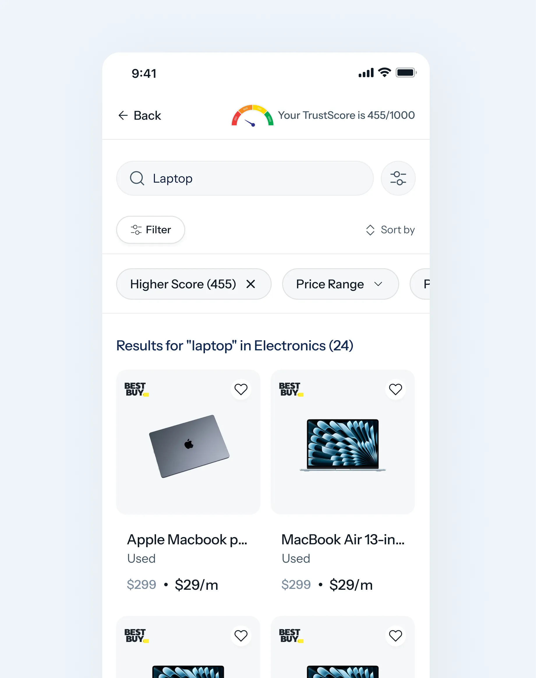
The mobile experience brought the WinWinX marketplace closer to the moment of purchase. We focused on simplifying product discovery, making payment information easier to scan, and giving TrustScore a clear presence without letting it dominate the shopping experience.
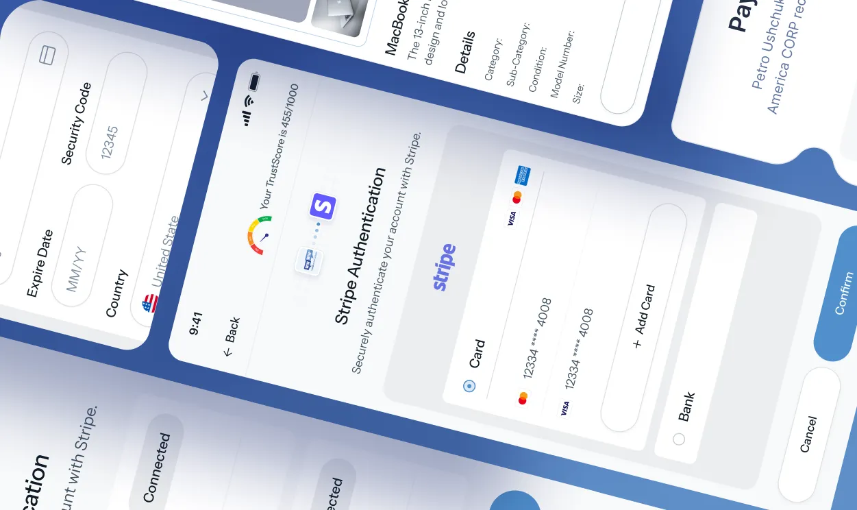
The same design language was extended across marketplace browsing, product details, offers, profiles, verification, and payment-related flows so the mobile product felt like part of the same ecosystem as the web platform.
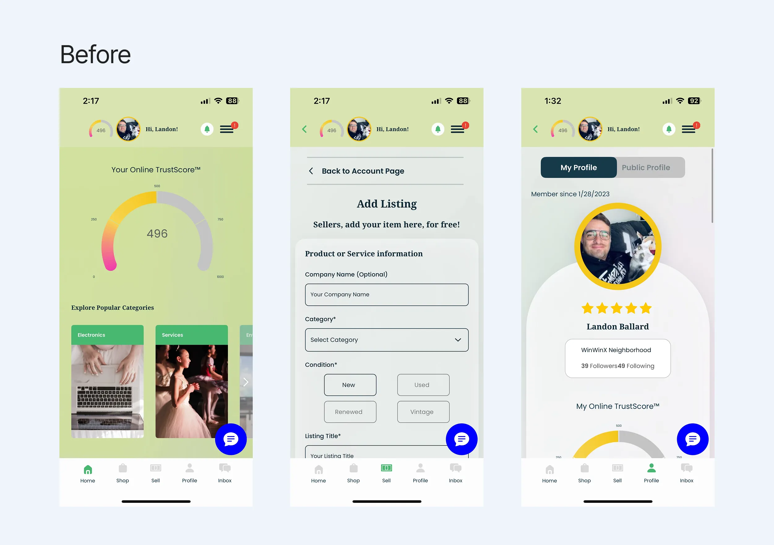
WinWinX Product and
Responsive Overview
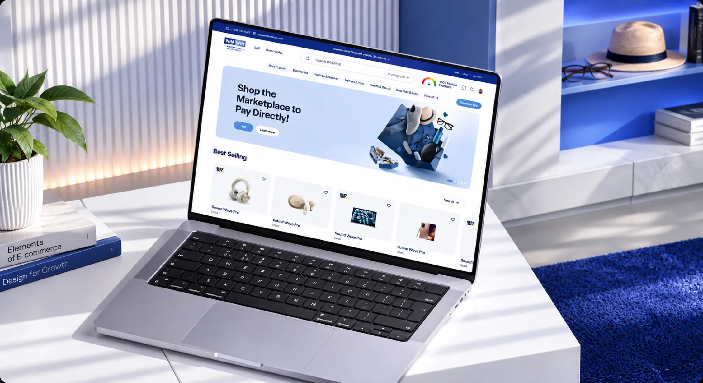
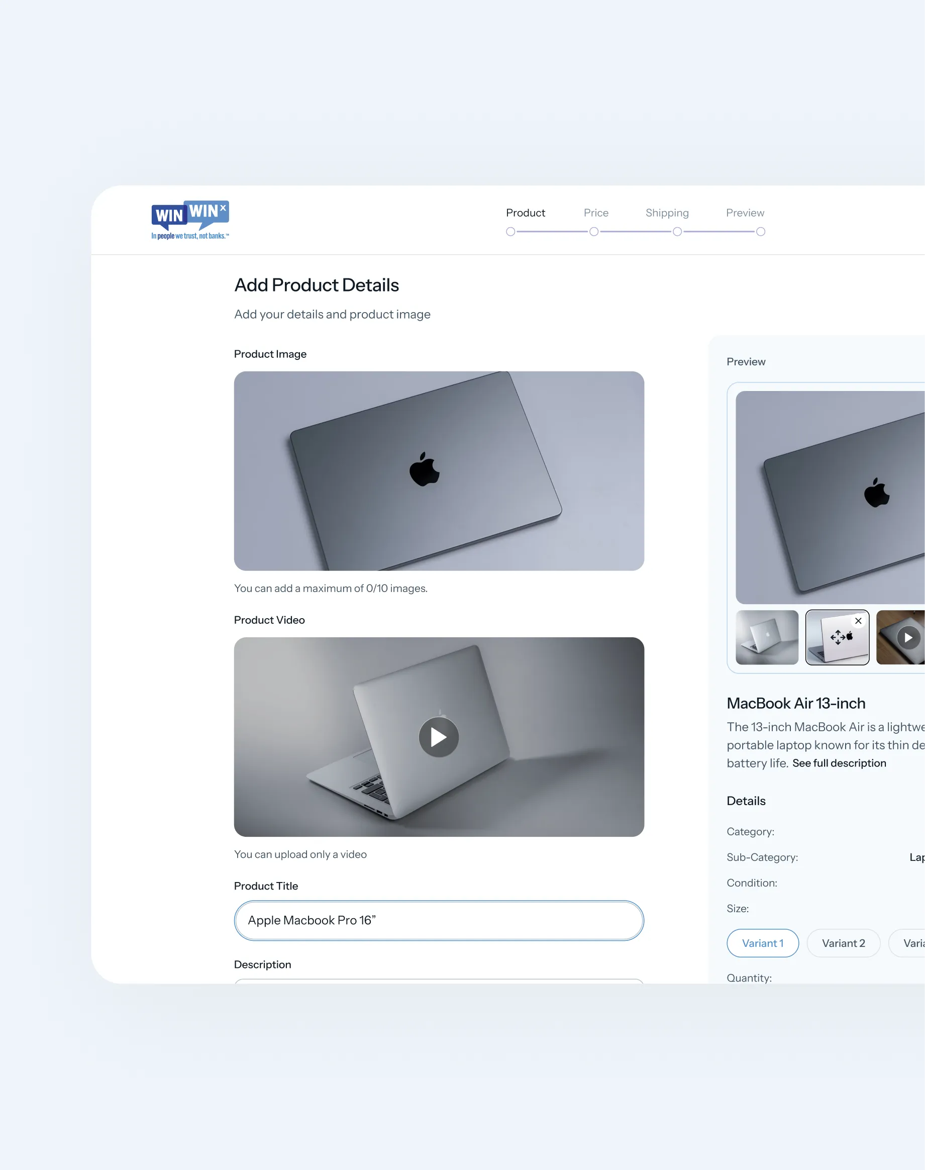
WinWinX is designed around a simple promise: buy what you need today and pay over time. The product brings together marketplace discovery, flexible payment plans, person-to-person offers, seller controls, and a trust layer within one connected experience.
We built the interface system to scale across marketplace pages, product details, user profiles, offers, verification, and responsive experiences. This allowed the product to stay visually consistent while supporting very different user journeys.

The Result
WinWinX now has a product experience built around its most important differentiator: person-to-person Buy Now, Pay Later. The marketplace connects discovery, negotiation, trust, and payments into a single journey rather than treating each as a separate financial process.
The experience makes a new model of online commerce easier to understand—users can find something they need, agree on terms, make a down payment, receive the product, and continue paying according to the agreed plan.
What This Project Reinforced
Designing WinWinX reinforced something we believe across fintech and marketplace products: complexity doesn't have to be visible to the user.
When money, trust, and unfamiliar workflows come together, every interaction matters. A clear payment breakdown, an understandable offer, a visible TrustScore, or a well-timed confirmation can make the difference between uncertainty and confidence.
For us at Ofspace, the project was about more than designing screens. It was about taking a new approach to Buy Now, Pay Later and giving it an experience that feels human, transparent, and easy to use.