Resource
85% of AI Agent Pages Show What the Product Can Do. 22% Show Who's in Control.

June 28, 2026
June 28, 2026

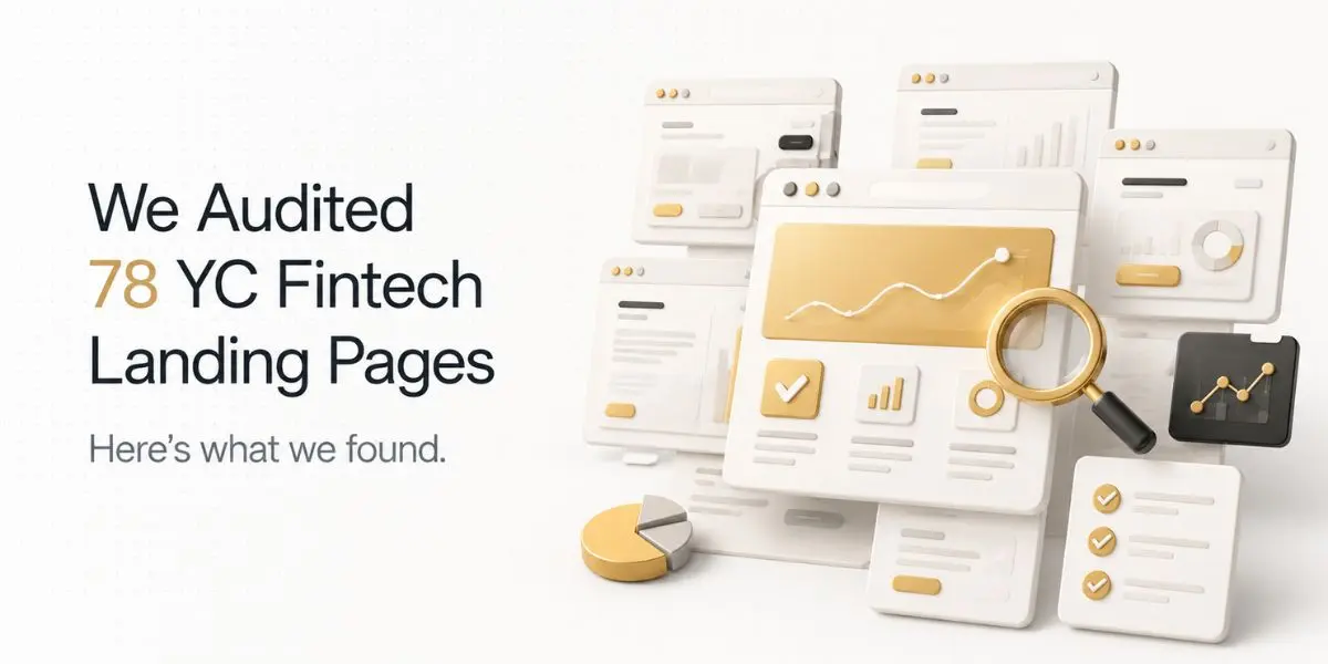
We reviewed 60 AI agent landing pages across SaaS, dev tools, and workflow automation - seed to growth stage.
Every page communicates capability well. 85% lead with autonomous capability claims.
72% use abstract AI visuals. The category has agreed on how to look intelligent.
It has not agreed on how to show control.
22% show human oversight. 12% define what the agent cannot do. 7% show system-level trust that goes beyond logos and badges.
The gap between what these pages claim and what they explain is not a copy problem. It is a design problem.
What 60 pages told us.
85% Claim High Autonomy. 22% Show Who Is in Control. That Gap Is a Design Problem.
51 of 60 pages lead with the same structural claim.
The language varies -AI employee, autonomous agent, works while you sleep, but the claim is identical: this system acts on your behalf without you having to watch it.
That claim raises one question most pages never answer: what happens when it acts wrong?
13 of 60 pages show any human oversight mechanism. 7 define what the agent cannot do.
Most pages omit control not because it was considered and rejected - but because it was never identified as a design question.
A visitor arriving without context isn't asking to be impressed. They're asking to be reassured.
Those are different design problems. Most pages are solving only the first one.
72% Use Abstract Visuals to Represent Intelligence. Most Make the Product Harder to Understand.
Pages could use more than one visual treatment. Percentages do not sum to 100%.
72% of pages use abstract AI visuals in place of real workflow explanation. Gradients, particle systems, node networks.
They make the product feel intelligent. They do not explain what it does.
A node network communicates that the product is connected.
It does not communicate what the agent does when a trigger fires, what it chooses between, or what lands in the user's inbox.
That is the information a visitor needs. The visual answers a different question.
Only 9 of 60 pages show a concrete workflow: a specific input, a visible agent action, a legible output.
Those 9 answer the question most visitors actually arrive with. The other 51 answer a question the visitor was not asking.
Intelligence is a mood on most of these pages. It is a mechanism on very few.
The category has learned to represent AI. It has not learned to explain it.
60% Outsource Trust to Logos. 7% Build It Into the System.
Logo strips. YC badges. Product Hunt awards. Customer counts with no denominator.
That works in most SaaS categories. For AI agent products, it answers the wrong question.
A visitor being asked to hand over email access, CRM records, or outreach sequences is not asking "is this company credible?"
They are asking something harder: what happens when the agent does something I did not intend?
A logo strip does not answer that. An approval flow diagram does. An audit log preview does.
A visible mechanism that shows what the agent does before it acts does.
9 of 60 pages show any form of system-level trust. The other 51 show reputation instead of explanation.
Credibility instead of verification. Social proof instead of system proof.
Trust is not the problem in this category. The design of trust is.
57% Cannot Define Who Does What. That Is the Most Expensive Ambiguity on the Page.
AI agents introduce a design problem traditional SaaS does not have. Users do not operate the product directly.
They configure a system and step back while it acts.
That handoff is the product. Most pages never show it.
A visitor needs to understand three things before they trust an autonomous system with real work. What they set up.
What the agent handles without asking. When they regain control.
2 of 60 pages answered all three. 34 answered none.
Most teams did not weigh this question and decide it belonged in documentation. They did not identify it as a design question at all.
They categorized it as product complexity. Documentation will handle it. The FAQ will handle it. The demo call will handle it.
The responsibility split is not a documentation problem. A visitor who cannot picture their own role in the product cannot commit to the next step.
The page left them out of the story entirely.
73% Show What the Agent Does. 88% Hide What It Cannot.
73% show the agent acting. 67% show what triggers it. 12% show where it stops.
The category has learned to show movement. It has not learned to show edges.
40 pages show the trigger - the condition that causes the agent to start. What the agent will not do, cannot do, or requires approval to do appears on 7 pages.
For most SaaS products, a wrong action is low-risk. A user can undo it. An autonomous agent touching email, CRM records, or financial workflows is different.
A wrong action is not always undoable. The absence of visible constraints does not make the product look more capable. It makes it look less considered.
One page animated three agent actions in sequence - draft email, schedule follow-up, update CRM, without showing how to pause the sequence.
Review actions before they fire, or correct a wrong contact.
Nobody decided the approval flow belonged on the page. That is the whole problem.
Limitation design is not a weakness signal. Showing what an agent cannot do without approval is the only way to make what it can do feel safe.
7 pages understood that. The other 53 left it to the sales call.
75% Use the Same Five Design Defaults. The Category Already Has a Template Problem.
45 of 60 pages use three or more of these together.
The AI agent category is less than three years old at meaningful scale. It already has a visual template.
Gradient background. Autonomous capability claim. Logo strip. Demo CTA. Feature grid.
That sequence appears across sales agents, research agents, and customer support tools. Different products. Same first viewport.
The brand changes. The structure does not.
Only 4 of 60 pages avoid the template entirely. Those 4 are the pages most likely to be remembered after the visitor closes the tab.
Not because they look more expensive. Because they look like a specific product rather than a category member.
The template did not spread because it converts well. It spread because it was already there.
One cohort shipped pages that looked this way. The next cohort treated it as the standard.
A baseline communicates one thing: we belong here.
It does not communicate why a visitor should choose this product over the one that looks identical three tabs over.
Four AI Agent Landing Page Archetypes
Across 60 pages, four visual patterns emerged - Abstract Intelligence, Workflow Simulation, Execution Agent, and Outcome Engine.
Each communicates capability differently.
All four share the same gap: visitors can understand what the agent does. They cannot understand what remains under human control.
Four Pages Did It Differently. Here Is What They Decided.
Across 60 pages, 4 took a meaningfully different approach. Not more polished.
More honest about what the product does and what it requires from the user.
1. Limitation as feature.
One page put what the agent would not do without approval directly in the hero - not in documentation, not in fine print.
The constraint was framed as a design decision. It was the only page in the dataset where a visitor could answer "what happens when it makes a mistake" without scrolling.
2. Responsibility made visual.
One page showed a three-step diagram: what the user configures, what the agent handles autonomously, what requires human review.
The diagram answered the question most visitors are silently carrying but most pages never address.
3. Trigger before output.
One page led with what causes the agent to act, not what the agent produces.
That single reversal of the standard AI page structure immediately communicates that the user controls when and whether the agent runs.
4. Specific task, specific user.
One page named a single use case, a single user type, and a single outcome.
The specificity made the page feel more trustworthy, not less capable.
The visitor could immediately picture themselves using it.
None of these required more design budget. They required decisions about what the page is actually trying to communicate.
Run This Check on Your AI Agent Page in 10 Minutes
You do not need a design agency to find these problems. You need ten minutes and someone who has never seen your product before.
1. Cover the headline and the logo strip.
What remains? If the visual alone cannot communicate what the agent does and what triggers it, your hero is communicating brand, not product.
85% of the pages we reviewed would struggle with this test.
2. Find your control mechanism.
Scroll your entire page. Where does it explain what requires human approval, what the agent cannot do, or how a user corrects a wrong action?
If it is not there, you have not designed for the visitor's most important question. 78% of pages in this dataset have not.
3. Count your responsibility signals.
Show your hero to someone unfamiliar with the product. Ask them to explain what they do versus what the agent does.
If they cannot separate the two roles, the page has not answered a question every potential buyer is carrying.
4. Name what the agent cannot do.
Find one thing your agent will not do, should not do, or requires explicit approval to do. Is it visible on the page?
If not, your limitation design is absent. Absence does not make the product seem more capable. It makes it seem less considered.
5. Remove the abstract visual.
Replace your hero visual mentally with a concrete workflow: a specific input, a visible agent action, a legible output.
If that workflow would communicate more than your current visual, your current visual is aesthetic, not operational.
85% of pages in this dataset use the former.
If you find problems on more than two of them, the issues are structural. Rewriting the headline will not fix them.
What This Data Cannot Tell Us.
This is a structural audit, not a performance study. Three limits to flag.
No causation
Pages with stronger structural clarity may belong to better-run companies overall. The design score may reflect that, not direct conversion impact.
Sample scope
60 pages, mid-2026. The category moves fast.
No user data
Every observation is direct visual analysis. No heatmaps, session recordings, or A/B test data.
What the rubric answers: for a visitor arriving without prior context, does the page help them understand what the agent does, what they control, and what could go wrong? That question is answerable from observation alone.
How We Ran This Study.
We reviewed 60 AI agent SaaS products across workflow automation, sales, customer support, research, and developer tools.
Each product's primary landing page was assessed across six dimensions in mid-2026.
Criteria were defined before review began. Company names are not published.
What This Means for Your AI Agent Landing Page
Most AI agent landing pages are built to prove capability. Very few explain control.
If your page makes it easy for a visitor to answer these four questions, you're already ahead of most of the category:
- What does the agent actually do?
- What triggers it to act?
- What stays under human control?
- What happens if something goes wrong?
Those answers don't require more copy. They require better design decisions.
At Ofspace, we help AI companies design landing pages that explain products as clearly as they showcase them.
If you'd like an objective review of yours, we'd be happy to help.