Design
Why Users Don’t Understand Your SaaS Product and How to Fix It

August 10, 2026
August 9, 2026
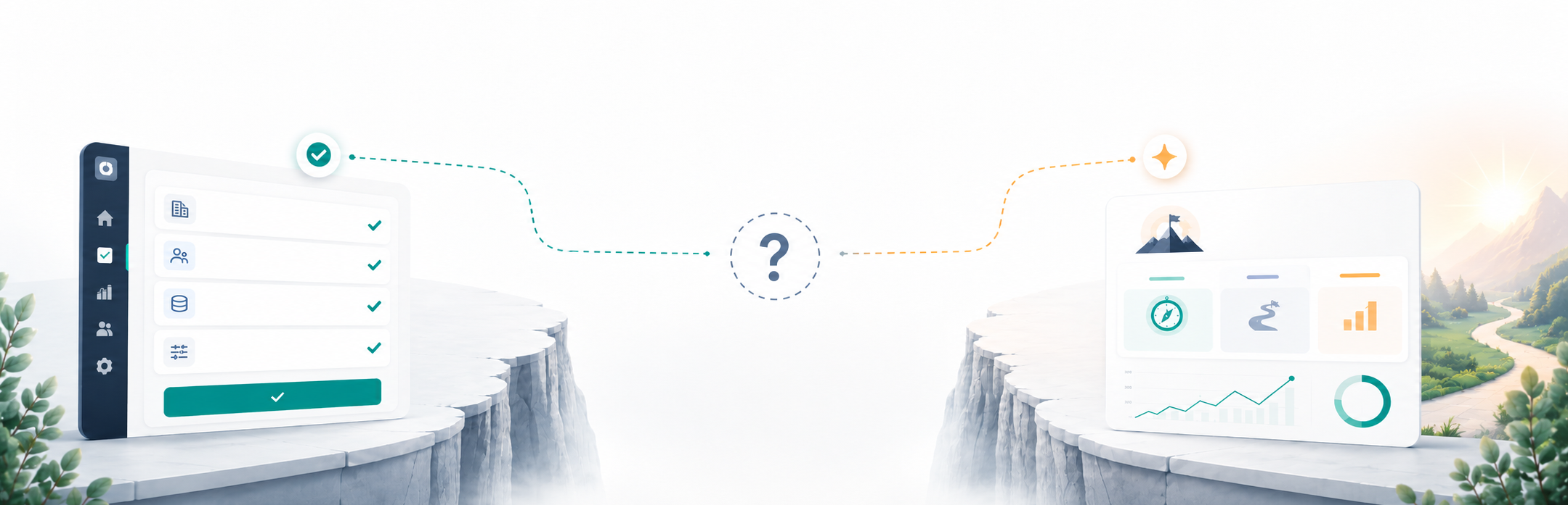
Users can complete every flow and still not understand what they are working toward.
Ask them to explain what the product is helping them achieve, and the answer gets vague. They understood the interface.
They understood the actions. They did not connect those actions to a result that felt like progress.
We see the consequences later: trials that stall, demos that need more explanation, and customers who struggle to describe the product to someone else.
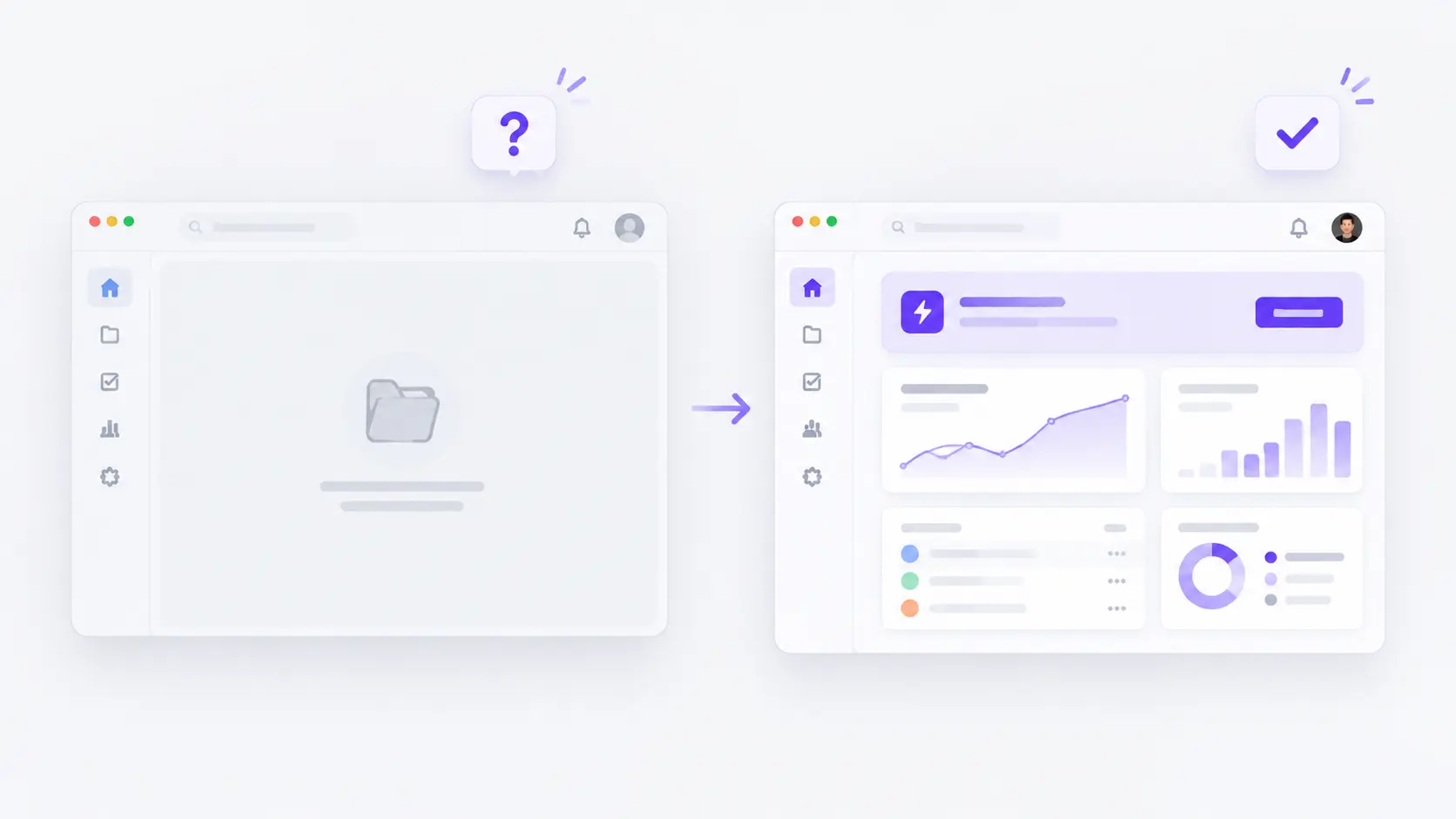
That is the Understanding Gap. And it does not show up in your usability scores.
The Difference Between Completion and Understanding
Task-completion metrics can tell you whether users finished the flow.
They do not automatically tell you whether users understood why it mattered or what to do next.
Those are different questions. Treating good completion rates as evidence of product understanding is where most product teams get stuck.
Pricing can work and still leave the decision unresolved
In our review of 49 SaaS pricing pages, 55% had no stated recommendation.
Nothing was broken. Users could read the plans, compare features, and reach the CTA.
But the hardest question on the page was still unanswered: which plan is actually for me?
The page was usable. The decision was still entirely on the visitor.
Dashboards can inform without directing
We saw the same pattern in dashboard design. Across 53 SaaS dashboards, 48 displayed information clearly enough for users to understand their situation.
But only 31 connected that information to an action the user could take without leaving the screen or switching contexts.
Users could understand what the dashboard was showing them, but the interface stopped short of helping them decide what to do next.
This is the Understanding Gap: the distance between a user being able to operate a product and a user understanding what they are operating toward.
Why the Product Feels Clearer to You Than to Users
Founders built the product. They know what it is for, which workflow it supports, and what doing well inside it feels like.
When they watch a user navigate it, they fill in the gaps without realizing they are doing it.
A founder who watches a session and says "they got through it fine" is usually right about navigation and often wrong about comprehension.
The user found the button. The founder did not notice that the user was answering questions the product never actually asked.
This is why task-completion metrics alone can miss it. They measure the right thing for the wrong question.
The Three Layers of Product Understanding
Product understanding comes down to three things.
1. Purpose: Why is this useful to me?
Does the user connect the product to a problem they care about solving?
That connection should be clear inside the product, not only on the homepage.
2. Path: What should I do next?
Can the user identify the workflow that leads to value?
If they have to work out the right sequence themselves, the product is handing that complexity back to them.
3. Progress: How do I know it is working?
Can the user tell what success looks like and whether they are moving toward it?
If value takes several sessions to appear, the product needs to show users that they are moving toward it.
Most products explain purpose on the homepage, path during onboarding, and leave progress unclear.
The result is a product users can operate without clearly understanding what they are working toward.
Where Product Understanding Becomes a Business Problem
The Understanding Gap rarely stays inside the interface.
It starts showing up in how prospects buy, how users continue, and how customers talk about the product.
In the demo
A prospect follows the walkthrough and still cannot connect what they are seeing to their own workflow.
They ask "what would this look like for us?" rather than already knowing.
That may look like a sales problem, but often the sales team is compensating for a purpose-clarity problem in the product or its surrounding experience.
The bridging work that should happen in the interface ends up happening manually in every call instead.
During the trial
Users who cannot answer "what should I do next" after a few sessions do not usually reach out for help. They close the tab.
In our onboarding review, every flow we studied directed users toward a clear first task, but only 59% maintained visible guidance after users reached the dashboard.
The first step was defined. What came after it was left to the user to figure out.
That uncertainty is a warning sign for return usage.
In word of mouth
A product users love but cannot explain has a broken growth loop.
A satisfied user who cannot describe the product simply to a colleague is not a referral channel, regardless of how much they value it.
Too many referrals still require someone from the company to explain the product again, because the product itself cannot do it.
How to Test for the Understanding Gap
These tests do not require analytics access. They require finding someone willing to be honest.
1. The explanation test
Ask a user who has been in the product for two weeks to explain it to an imaginary colleague in two sentences.
Do not fill in gaps or correct them.
If they cannot, or if different users give meaningfully different answers, the product does not have a clear enough identity to spread through conversation.
2. The next-session test
Ask a new user, after their first session, what they plan to do when they log in next time.
A specific answer means the product gave them one. A vague or uncertain answer means it did not.
3. The lost-demo test
After a demo that did not close, ask your sales team what the prospect's specific concern was.
If the answer is "they need to think about it" without a named objection, the prospect understood the product well enough to see it working and not well enough to know whether it mattered for them.
That is worth examining in the product experience, not just the sales process.
How to Close the Understanding Gap
Simplifying is not always the answer.
Some products are complex because their domain is complex, and reducing surface complexity would reduce the value.
The Understanding Gap is not about having too much. It is about making explicit what the product currently assumes users already know.
Make the product’s fit clear
That means making a specific decision about who the product is for and surfacing that decision inside the interface, not just in the marketing copy.
A user who lands on your dashboard should feel immediately that this product is built for their situation.
Make the path to value visible
It means showing users the path that leads to their outcome rather than presenting an open interface and expecting them to find the right workflow.
Define the path. Make it visible early.
Make progress easy to recognize
It means making progress legible before users reach it.
Users who know what success looks like inside the product can recognize it when they get there.
Users who do not will keep using the product without ever feeling like it is working.
Good usability helps users move through a product.
Good product understanding helps them know why they are there, what matters next, and whether it is working for them.
You need both.
Audit Your Product in 10 Minutes
Pick three screens: your first-use experience, main workspace, and one important decision screen such as pricing or reporting.
For each screen, ask:
Why does this matter? (Purpose)
Can the user connect this screen to the problem they came to solve?
What should I do next? (Path)
Is the next meaningful action clear, or does the user have to decide where to go?
Is this working? (Progress)
Can the user see whether they are moving closer to the outcome they came for?
Mark each one as clear, partial, or missing.
Then look for the pattern.
If Purpose is repeatedly missing, the product is not making its relevance clear.
If Path is repeatedly missing, users are being asked to find the workflow themselves.
If Progress is repeatedly missing, users may be getting value without being able to see it.
Do not redesign yet. Find the repeated gap first.
Ofspace helps SaaS teams find where users lose direction, then redesign the product around clearer purpose, paths, and progress.
Methodology Overview
The findings referenced (49 pricing pages, 53 dashboards, 59% onboarding guidance) come from Ofspace's internal product reviews evaluating clarity of decision-making, action guidance, and directional continuity across SaaS products.