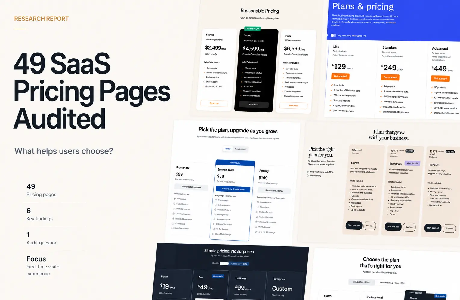
Resource
We Reviewed 37 B2B SaaS Onboarding Flows. Here's What Modern Onboarding Has in Common.

July 2, 2026
July 2, 2026

We expected to find a familiar onboarding formula: a welcome screen, a checklist, a progress bar, then a tour.
The data told a different story. Across 37 B2B SaaS flows, every product helped users reach a clear first task, but only 41% used explicit progress feedback.
That gap changed how we read the rest of the sample.
The strongest pattern was not a single interface element. It was a sequence: create access, prepare the workspace, remove the blank-state problem, and guide one meaningful action.
This article breaks down what was essential, what was conditional, and what designers can leave out.
Four Findings That Challenge Common Onboarding Advice
These findings challenge common onboarding assumptions.
1. The universal pattern was scaffolding, not sample data
37 of 37 flows prevented an unscaffolded first workspace. Only 22 of 37 used explicitly labelled sample or demo content.
Designers often reach for sample data as the default solution to the blank-state problem. But sample data is one method, not the requirement.
The designer question is not "should we add sample data." It is "what does a first-time user need to see before they can understand what this product is for."
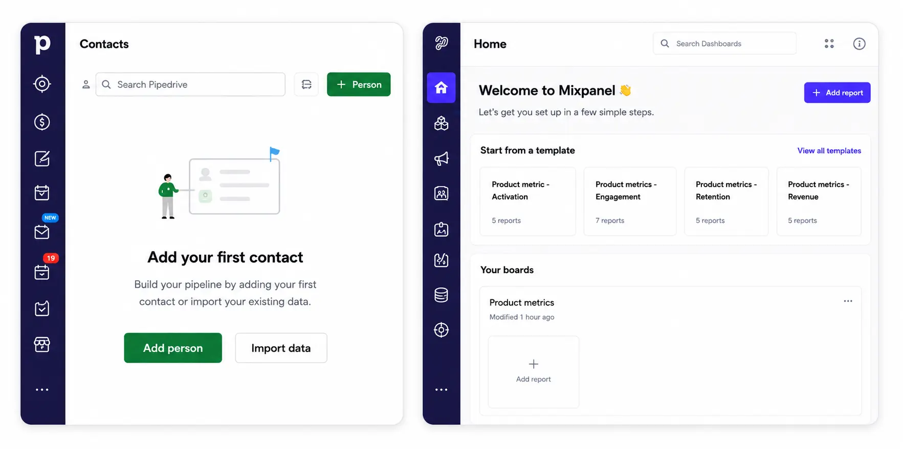
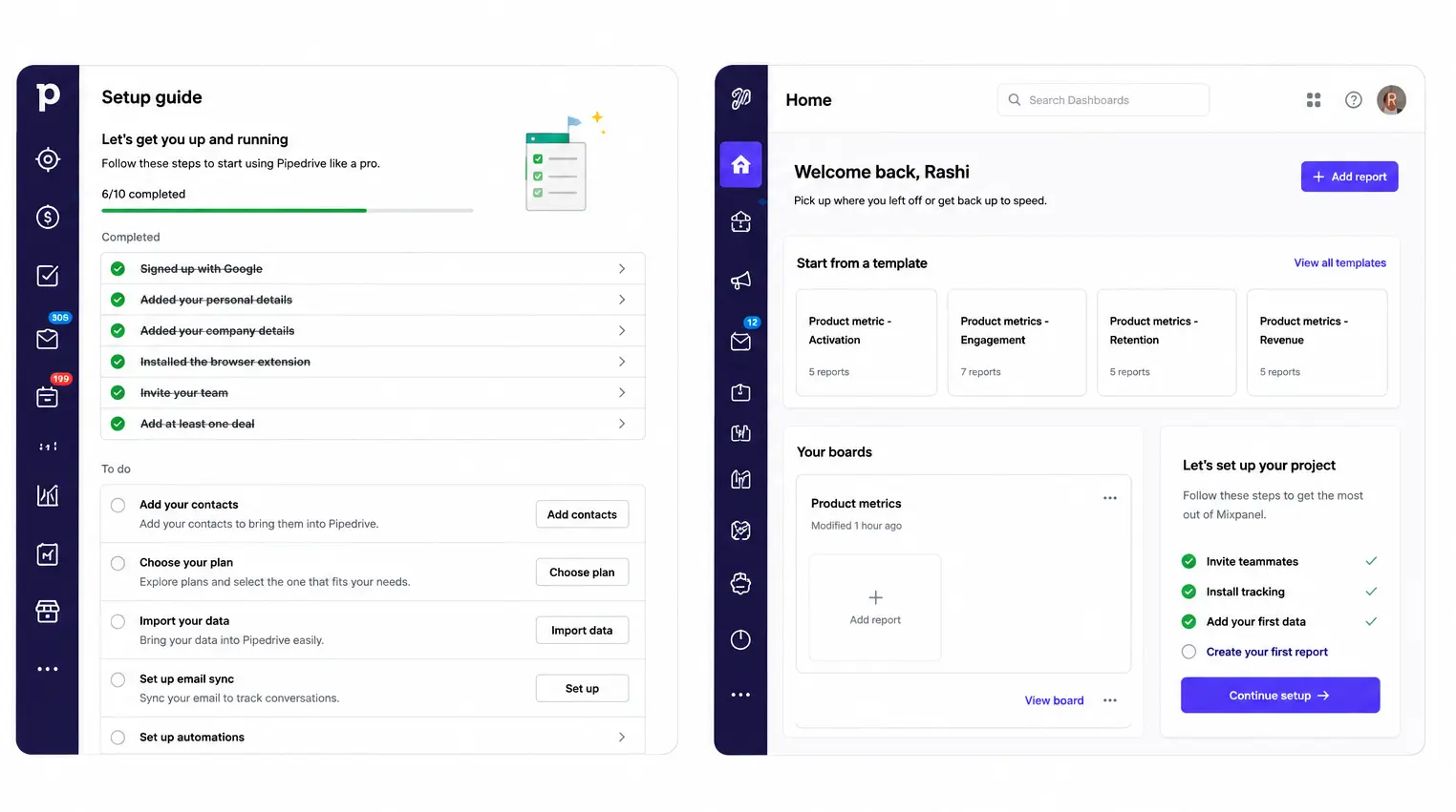
Sample content did more than fill empty space. It showed users what completed work looks like. Pipedrive connected contacts, activities, and deals.
Maze showed how a study becomes evidence. Dovetail showed how responses become research.
2. Every Flow Showed a Next Action. Only 41% Showed Progress.
37 of 37 flows directed users toward a clear first meaningful task.
Only 15 of 37 showed a visible progress indicator.
22 products directed users toward a first task without a dedicated progress system at all.
Direction was the consistent pattern. Progress UI was one way to support it, not the only way.
Pipedrive's contact, activity, and deal sequence gives users a clear workflow path without requiring a numbered stepper.
Maze's create, recruit, analyze, and share sequence follows the user's real job rather than the product's navigation structure.
Design the first meaningful action before designing any progress UI.
3. Continued onboarding was more common than persistent checklists
30 of 37 flows continued onboarding inside the product.
Only 22 of 37 kept a persistent checklist or guide visible.
Not every product used a persistent checklist. Some used contextual prompts after dashboard entry.
Others used setup choices or suggested next actions shown after initial product entry. The mechanism changed. The goal did not.
Zoho surfaced setup choices after dashboard entry.
Mixpanel showed a Continue Setup prompt inside the product environment.
Pipedrive's setup guide showed completed and remaining tasks and remained visible inside the product.
A checklist is not the same as ongoing activation support.
4. User autonomy appeared more often than early team invitation
22 of 37 flows offered a visible skip, defer, or independent exploration route. Only 15 of 37 introduced team invitation early.
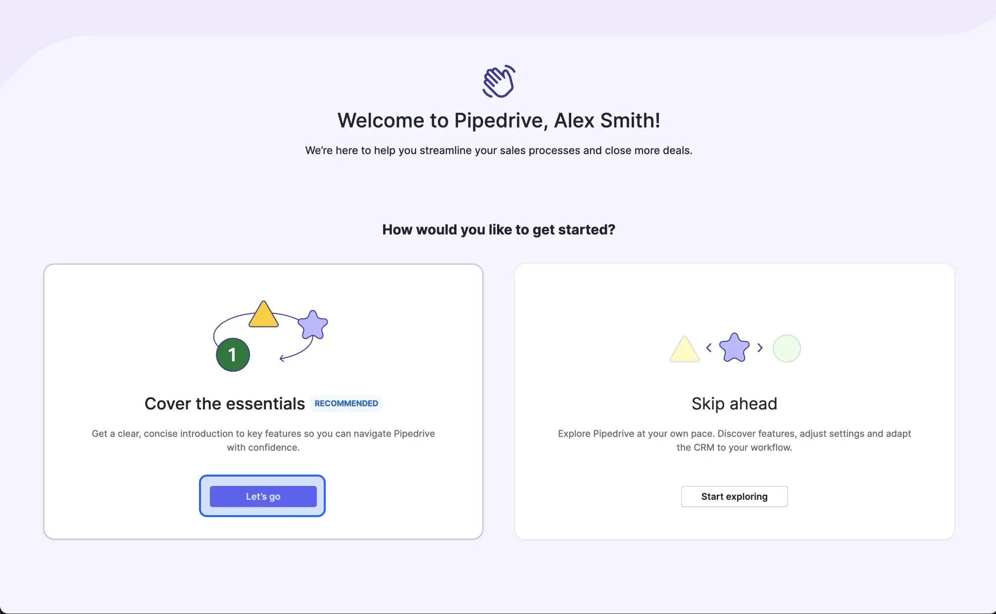
Zoho offered Skip. Maze offered Just Browsing and I'll Do This Later. Pipedrive offered Skip Ahead and Cover the Essentials as distinct paths.
In this sample, individual user autonomy appeared more often than early collaboration prompts as a first-session design decision.
Whether that reflects product type, audience maturity, or deliberate activation strategy would require further analysis.
The Design Patterns Behind the Numbers
Access and verification
Third-party sign-in appeared in every reviewed flow. Identity verification appeared in all 37 flows.
These are entry infrastructure, not activation design.
Their presence does not differentiate an onboarding flow. How they handle errors and recovery does.
Progressive disclosure
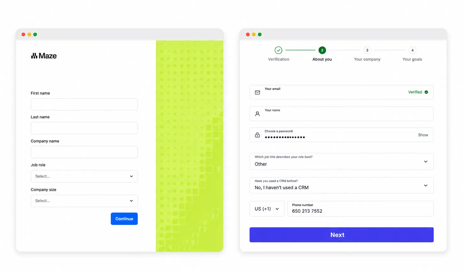
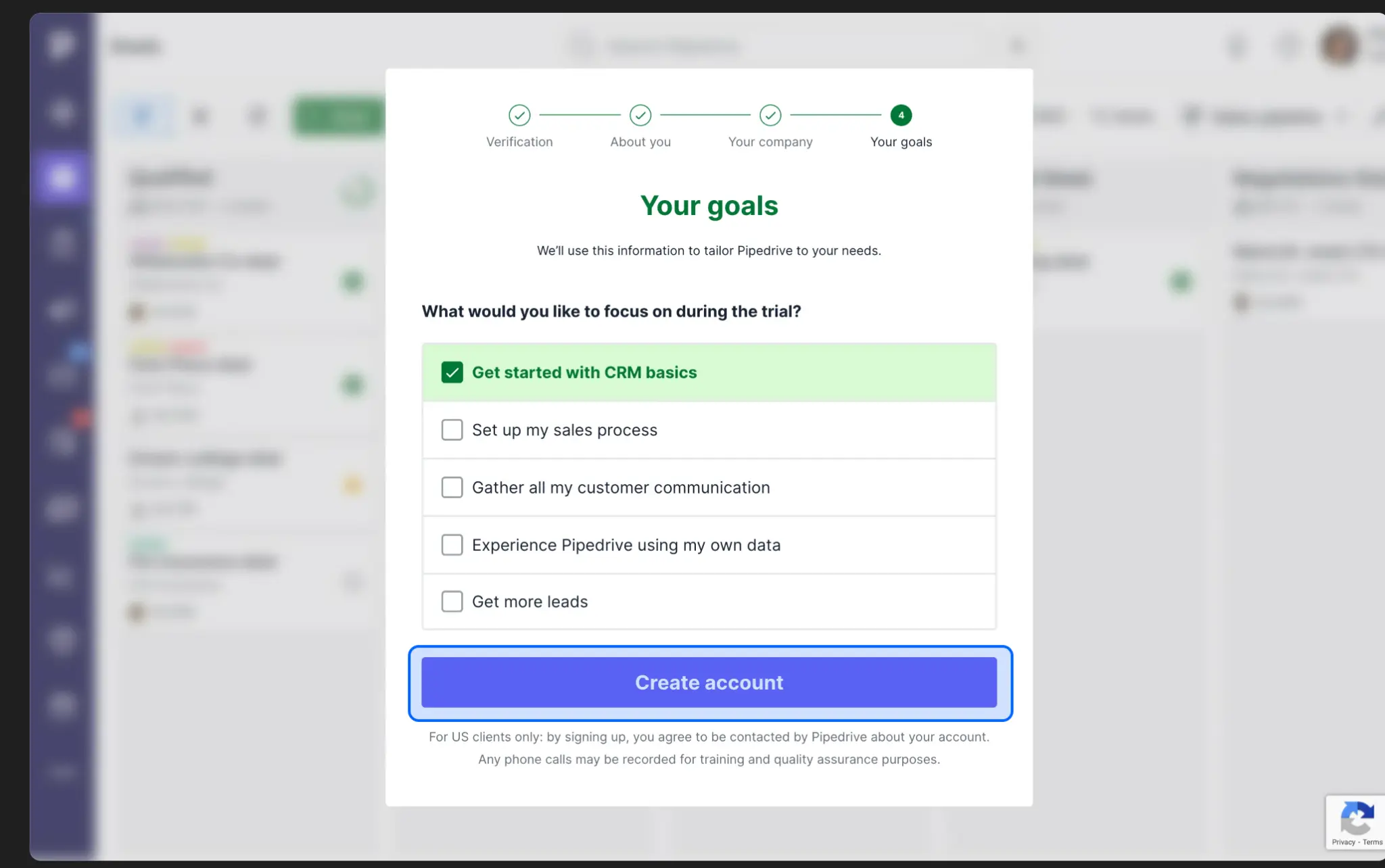
37 of 37 flows collected context after account creation, not before. The flows that handled this well separated questions into stages: one category per screen.
Mixpanel separates work type, role, organization, company size, industry, and data center across distinct screens.
Pipedrive separates verification, personal details, company setup, and goals.
Maze separates account creation, profile, use-case selection, email confirmation, and team setup.
Combining all personalization questions into a single long form treats context collection as a checkbox rather than a design decision.
Personalization
37 of 37 flows asked users about role, company size, industry, or goals.
The audit confirms that products ask for this context.
It does not show whether those answers changed the workspace, recommendations, or activation path afterward.
That is the most important question for a future version of this research.
Empty-state strategy
All 37 flows prevented an unscaffolded first workspace. Two approaches appeared:
Explicitly labelled sample or demo content appeared in 22 of 37 flows.
This teaches the product's object model through recognition before users have created real records.
Guided empty states, structural placeholders, starter templates, and contextual callouts appeared in the remaining 15 flows.
These explain what each area is for without adding data users did not create.
The study does not establish which approach is more effective. Both solved the same problem through different methods.
Activation path
Every reviewed flow directed users toward a first task that resembled real work rather than a navigation tutorial.
Pipedrive sequences: add a contact, schedule an activity, create a deal. Maze sequences: create a study, recruit participants, analyze results, share insights.
Both follow the user's actual job, in order.
The user does not need to understand every feature before the product becomes useful. They need to complete one version of their real work.
Contextual guidance
30 of 37 flows continued onboarding support inside the product. 22 of 37 kept a persistent setup guide or checklist visible.
The 8 flows that continued onboarding without a persistent checklist used contextual prompts, next-action suggestions shown after dashboard entry, or environment-level callouts.
Trust signals
59% surfaced data-region or storage-location information during setup.
This was the most consistently appearing trust signal in the sample.
Other trust signals appeared across the reviewed flows: verification recovery options, no-credit-card reassurance, marketing opt-in control, and support access during setup.
These were not counted across the full sample and are noted as observations only.
Trust appeared in small, specific moments: why a phone number is needed, where data will live, whether the trial requires a card.
These are not footer links. They are answers to questions users have at the moment of commitment.
Patterns to Use Only When the Product Needs Them
Three patterns appeared in only 15 of 37 flows: explicit progress feedback, early team invitation, and optional video guidance. They solve different problems and should not be treated as one category.
Explicit progress feedback is useful when the path to activation is long and users need to see how far they have come.
It is not a substitute for knowing what the activation event is.
Early team invitation is not a universal first-session pattern in this sample.
The study does not establish whether its presence or absence correlates with product type, collaboration requirements, or audience maturity.
Optional video guidance appeared in 15 of 37 flows. The study did not code the placement of video content in sufficient detail to make claims about positioning relative to tasks.
Add any of these three only when you can answer: what specific problem does this solve for this user at this point in the flow.
10 Lessons From 37 Onboarding Flows
1. Separate account creation from company and workflow setup.
Collect credentials first. Move role, goals, and configuration into the next stage.
2. Ask for context only when it can shape the experience.
Role, company size, and goals should influence setup, recommendations, or starter content.
3. Do not open with an unexplained empty workspace.
Use sample data, templates, guided prompts, or structural callouts to explain what belongs there.
4. Use sample data when it teaches the product structure clearly.
It is especially useful when users need to understand relationships between records, workflows, or teams.
5. Define the first meaningful action before adding progress UI.
The action should match real work, not a product-navigation task.
6. Make the first task a small version of the user’s job.
Adding a contact or importing data is more useful than touring a settings menu.
7. Continue activation support after dashboard entry.
Use task cards, setup guides, contextual prompts, or next-action suggestions.
8. Treat checklists as one support mechanism, not the default.
Contextual prompts and next-action cards can guide users without creating a permanent list.
9. Give experienced users a visible way to skip or defer generalized setup.
A skip route lets users move directly toward the task they already came to complete.
10. Introduce team invitation only when collaboration supports the next action.
Otherwise, let an individual user reach an initial useful state first.
What This Study Does Not Prove
This study identifies structural patterns. It does not measure outcomes.
It cannot show whether these patterns improve conversion, activation, retention, or churn.
It also cannot show what users prefer. We did not test behavior, attitudes, or completion rates.
For example, this audit cannot prove that sample data speeds activation. It cannot prove that progress indicators increase completion.
It also cannot prove that skipping guidance harms outcomes. Nor can it show that removing checklists causes users to leave after one session.
This review maps what products visibly do. It does not establish why those choices work or what they cause.