Design
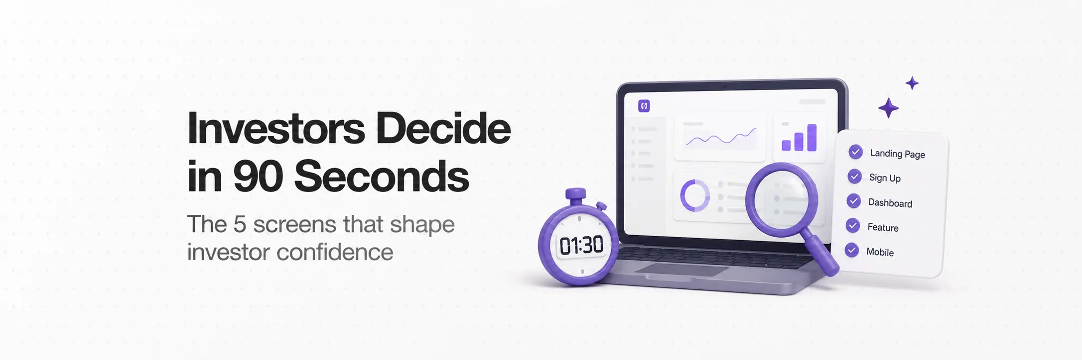
Is Your Product Investor-Ready? Most Founders Find Out Too Late.

June 4, 2026
June 3, 2026
Most founders prepare for investor meetings by refining their pitch deck. Very few prepare for what happens when the investor opens a second tab.
Before your meeting, during it, or right after, an investor will open your product URL. Not to evaluate features.
To answer one question: does this team know how to build?
That answer takes about 90 seconds.
Here is what they are reading when they form it.
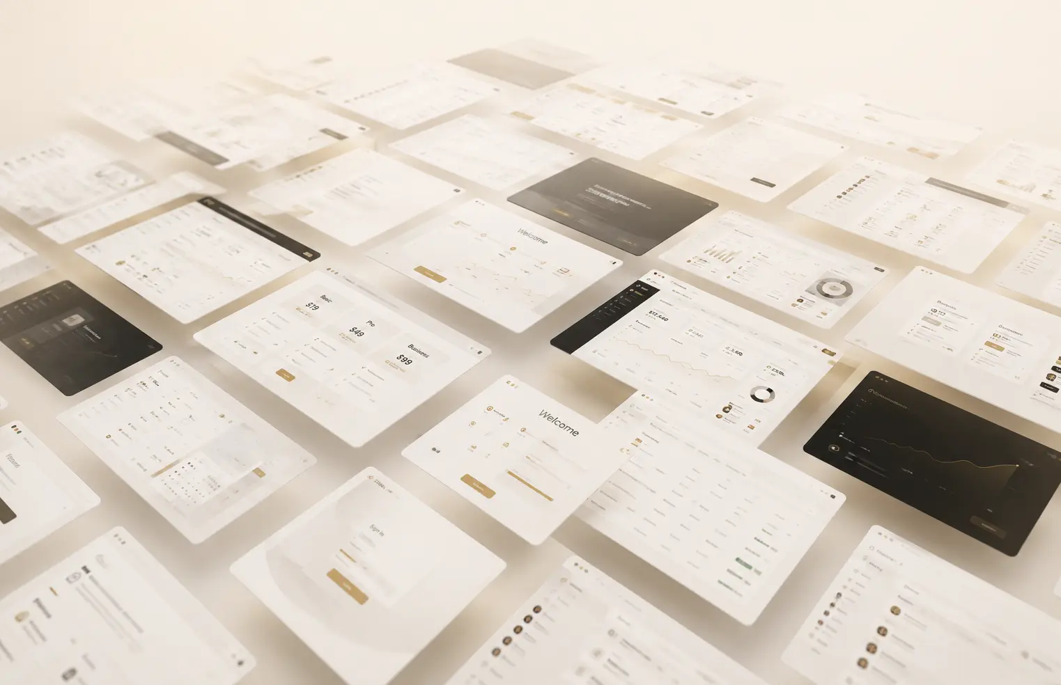
The Five Screens Investors Look at Most
Not every screen carries equal weight. Investors move through a predictable path when they open an unfamiliar product.
These are the five surfaces that shape most of the impression.
What Investors Are Actually Evaluating
Investors are not designers. They are not judging your font choices or color palette.
They are using design as a proxy for how your team thinks and operates.
Two signals carry the most weight.
1. Visual hierarchy.
A screen where everything competes for attention tells an investor the team has not made hard decisions yet.
Product judgment shows up in what you chose not to show, not just what you built.
2. Empty states.
What does a user see before they have done anything in the product? Most teams ignore this until late in development.
An investor who opens a blank screen with no guidance reads it as a team that ships features and stops there.
After those two, consistency matters most.
- Do buttons behave the same way across screens?
- Do similar actions follow the same pattern?
Inconsistency is not an aesthetic problem. It raises a question about how the team operates internally.
Error handling and loading states matter too, but they are secondary.
If hierarchy, empty states, and consistency are solid, minor rough edges in edge-case states will not cost you the meeting.
What to Fix in 30 Days Before a Fundraise
A fundraising sprint is not a redesign. It is targeted repair on the specific surfaces that get evaluated.
In 30 days, a focused team can address the following.
Ranked by investor impact:
1. Landing page headline and subheadline
One sentence that tells an investor who this is for and what problem it solves.
If it takes more than five seconds to understand, rewrite it.
This is the highest-leverage fix on the list.
2. Onboarding entry point
Reduce the first step to its minimum viable ask. If you can remove a field, remove it.
If you can delay a step without breaking the flow, delay it.
3. Core dashboard empty state
Design what a new user sees before they have done anything. Give them one clear next action.
This single screen does more work for investor perception than most teams realize.
4. Mobile responsiveness on the landing page
Not the full app. Just the marketing page and sign-up flow. This is days of work, not weeks, and it closes one of the fastest negative reads investors form.
5. Consistency pass on the core user path
Audit the five screens above. Standardize button labels, spacing, and interaction patterns where they diverge.
This does not require new design. It requires editing what already exists.
These five fixes address the majority of what loses investor confidence on the design side.
None of them require a new design system or a full rebuild.

What Not to Touch Before a Raise
This matters as much as the fix list.
A full rebrand.
If your brand is functional and recognizable, leave it alone. A new logo and color system four weeks before a raise is a distraction.
Investors are not evaluating brand identity. They are evaluating whether your team executes.
New feature builds.
Building features to impress investors before a raise almost always backfires.
A polished version of what exists converts better than a rough version of something new.
Investors have seen too many "coming soon" labels to be moved by them.
A complete UI overhaul.
If your product works and users are in it, do not rebuild the interface before a raise.
The risk of breaking something live outweighs the upside of looking newer.
Fix the surfaces investors see. Leave the rest alone.
Anything outside the investor path.
Settings pages, admin panels, billing flows, secondary features. Investors do not open these first.
Do not spend time there while the five core screens still need work.
For some products, the honest answer is: two screens need work and the rest is fine. Knowing which two is the actual problem.
Before Your Next Investor Meeting
You will know within the first screen whether your product is helping or hurting your raise.
If you are not sure which it is, book a free 15-minute review with Ofspace before your next investor meeting.
We will look at your product the way an investor does and tell you the three things they will notice first.