Ofspace Research
We Reviewed 328 SaaS Product Surfaces. The Biggest Failures Were Not on Any Screen.

July 13, 2026
July 13, 2026

After seven independent audits across 328 SaaS product surfaces, one pattern appeared repeatedly.
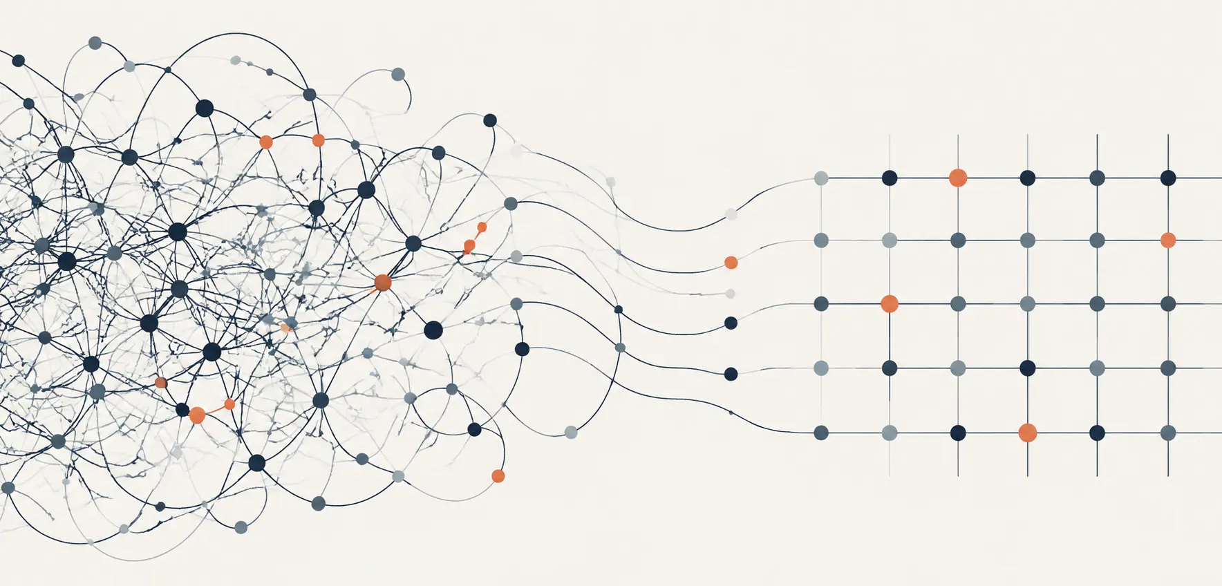
The biggest experience problems rarely existed inside individual screens. They appeared in the transitions between them.
A homepage creates interest but onboarding fails to continue the story. A dashboard explains what happened but not what to do next.
A pricing page introduces choices without enough confidence behind them.
Each of those failures looks like a design problem when you examine the screen alone. When you step back and examine the journey, the problem is the handoff.
This report combines findings from audits across SaaS homepages, AI agent landing pages, fintech landing pages, onboarding flows, dashboards, and pricing pages.
It asks one question across all of them: how do SaaS products carry clarity from the first interaction to the final decision?
How This Report Was Built
This report draws on six independent Ofspace audits, each focused on one stage of the SaaS product journey.
Each audit examined a different set of products independently. This report identifies recurring patterns across them.
It does not track the same products end to end and does not measure conversion, retention, or user behavior.
To evaluate where experience breaks down between stages, we looked at five questions for each transition:
- Expectation. What did the previous stage make users expect?
- Promise. What outcome is the product communicating at this stage?
- Action. What does the user need to do next?
- Proof. How does the experience demonstrate progress or value?
- Next step. How does this stage prepare users for what comes after?
These questions appear throughout the report. They are not a design framework for making screens look better.
They are a diagnostic for finding where a product journey stops carrying meaning forward.
The First Gap: When Visitors Cannot Place Themselves in the Product
Across 50 SaaS homepages and 78 YC fintech landing pages, most products explained their category clearly.
The harder problem was deciding what visitors needed to understand first.
64% of reviewed fintech landing pages led with category-first messaging. 36% led with outcome-first messaging.
Category-first messaging defines the market, names the product type, and positions against competitors.
It assumes the visitor already understands why that category matters to them.
For a visitor arriving without that context, the page answers a question they have not yet asked.
Outcome-first messaging starts somewhere else. It connects the product to a situation or result the visitor already recognizes before asking them to evaluate what the product is.
The same split appeared in product visuals. A complete interface screenshot shows what the software looks like.
A focused workflow shows what someone can accomplish with it.
The pages that led with focused visuals did not need to explain the product before giving visitors something to assess.
Category positioning is not wrong. For a visitor arriving through a referral or a sales conversation, a clear category signal can earn trust quickly.
The problem is the cold visit, where the page assumes context the visitor does not yet have.
The audit cannot show which approach converts better.
It shows that 64% of reviewed fintech pages asked visitors to accept a category before connecting it to a problem they recognized.
The Second Gap: When Users Trust the Product but Not the System
As SaaS products take on more responsibility, trust shifts. It moves from what companies claim to what the product makes understandable.
Across 60 AI agent landing pages, 85% led with autonomous capability claims.
Only 22% showed how users stay in control when the system acts.
A customer logo, a security badge, or a user count answers one question: who already trusts this company.
It cannot answer what follows immediately after: what happens when I rely on this system and something goes wrong.
Most AI products in this sample used social proof to communicate trust. Fewer showed trust through controls, limitations, approval flows, or audit trails.
The pages that showed oversight did not look weaker for it. They looked more considered.
A visitor could see not just what the system would do, but where they remained responsible for what happened next.
That distinction matters more as products take on higher-stakes work.
Sending emails, updating records, making recommendations, processing payments: each of these is an action a user needs to understand before they hand it off, not after.
The question most AI product pages are answering is: can this product do the task?
The question most visitors are actually asking is: can I understand and manage how this product does the task?
Those are different questions. In this sample, 85% of pages answered the first one. Only 22% answered the second.
The Third Gap: When Signups Do Not Become Activation
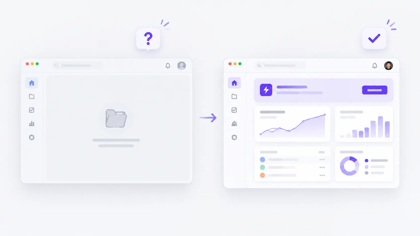
Signup gives users access. It does not mean they have reached value.
Across 37 B2B SaaS onboarding flows, every reviewed product separated account creation from deeper workspace setup.
Every product prevented a blank first experience. Every product directed users toward a clear first task.
The foundations were consistent. The gap appeared one step later.
80% of reviewed flows continued onboarding after the dashboard appeared, through setup guides, task sequences, or contextual prompts.
Only 59% kept a persistent checklist or guide visible during early product use.
A checklist shows completion. It does not show whether the user has done anything meaningful yet.
A user can finish an onboarding sequence, close the tab, and never return. The sequence was complete. Activation did not happen.
The stronger flows were built around completing work, not completing steps.
Pipedrive sequenced: add a contact, schedule an activity, create a deal.
That is not a product tour. It is the first version of the user's actual job, done inside the product.
The onboarding was finished when the user had done something real, not when they had seen everything the product contained.
Activation begins when users reach the outcome they came for. Getting them through signup is only the entry point.
The Fourth Gap: When Dashboards Show Information but Not What to Do With It
A dashboard can make the user's situation clear and still leave them unsure about what to do next.
Across 53 SaaS and fintech dashboard views, 48 scored 4 or 5 out of 5 on decision support. Only 31 scored 4 or 5 on actionability.
Only 31 showed a visible decision spine: state, explanation, and next action connected in one flow.
The missing step was rarely a button. It was proximity. A screen might show that spend is above plan, then route the user to a separate page to act on it.
It might flag overdue invoices, then send them through a different workflow to find the affected records.
The information was present. The connection between understanding and response was not.
The counterintuitive finding came from comparing first-metric choices. 22 of 53 reviewed dashboards led with value or performance.
Those had the lowest average actionability score in the sample: 3.18 out of 5. Only 9 of 22 showed a complete decision spine.
4 of 53 led with exceptions or queues. All 4 passed the decision spine test. Average actionability: 4.71.
The reason is structural. A queue built around overdue invoices or blocked approvals already knows what the user needs to do.
The exception is the state. The record is the explanation. The resolution is the action. The spine is built into the format.
A value-led dashboard faces a harder problem. Showing that revenue is up 4% tells the user something changed.
It does not tell them what that means for a decision they need to make right now. That connection has to be designed in. In 13 of 22 value-led views, it was not.
The useful question is whether the dashboard connects what the user understands to something they can do without losing that context.
The Fifth Gap: When Buyers Have Options but Not Enough Confidence to Choose
Pricing is where product value becomes a commitment. It is also where most SaaS products stop helping users decide.
Across 49 SaaS pricing pages, 42 created medium or high decision friction.
Multiple plans, billing toggles, usage tiers, credits, add-ons, and enterprise routes, sometimes stacked together before a visitor could act.
Only 9 of 49 gave visitors a comparison table to work through that friction.
The gap is between the comparison a page asks visitors to make and the support it gives them for making it.
That finding sharpens further. Every one of those 9 comparison-table pages still required noticeable effort to compare plans.
Adding a table did not remove the friction. It documented the complexity without resolving it.
Tables placed before visitors had oriented themselves to the basic plan structure became the first obstacle rather than a verification tool.
Most pricing pages treat complexity as a display problem. They show the options clearly.
They leave the reasoning behind those options for the visitor to reconstruct alone.
42 of 49 pages asked visitors to carry the comparison in their heads while scrolling past card after card.
Why Experience Continuity Is Difficult
Experience fragmentation rarely happens because teams ignore users. It happens because different teams own different parts of the journey and measure success differently.
Marketing measures interest. Growth measures signups. Product measures activation and feature adoption. Revenue measures plan selection and conversion.
Each measure is reasonable on its own. Users do not experience these as separate team goals.
They experience one journey. When each stage defines value differently, the handoff between them carries less of the meaning the previous stage created.
A homepage optimized for interest can create expectations the onboarding flow was not designed to continue.
An onboarding flow optimized for completion can move users through setup without connecting them to the outcome that made them sign up.
A dashboard optimized for data visibility can explain what happened without helping users decide what to do next.
A pricing page optimized for plan display can show every option without helping buyers understand which one fits.
None of those screens are broken. The connection between them is.
Each screen can score well in isolation. The failure only becomes visible when you ask what the previous stage made users expect, and whether this stage delivers on it.
The research behind this report did not track the same products across every stage.
What it found, across 328 reviewed surfaces, is that the same structural failure appeared at every transition: clarity created in one stage did not automatically carry into the next.
A Diagnostic for Finding Where the Experience Breaks
A confusing product experience does not always start with the interface. It can start with a homepage that creates expectations the onboarding was not designed to continue.
It can start with onboarding that moves users through setup without connecting them to the outcome they signed up for.
It can start with a dashboard that explains what happened without helping users decide what to do next.
To find where it is happening in your product, ask five questions at each transition:
1. Expectation.
What did the previous stage make users expect? A homepage that leads with autonomous AI capability creates an expectation that the product will act reliably.
If onboarding does not show where users stay in control, that expectation becomes anxiety.
2. Promise.
What outcome is this stage communicating? A pricing page that displays three plans without explaining what changes between them is promising options, not clarity.
The user leaves with more to weigh.
3. Action.
What does the user need to do next, and is it connected to what they just understood? In 22 of 53 reviewed dashboards, the user could understand their situation but could not act on it without leaving that context.
The action existed. The connection did not.
4. Proof.
How does the experience show the user they are moving in the right direction? 80% of reviewed onboarding flows continued guidance after the dashboard appeared.
The products that stopped at dashboard entry left users with a completed sequence and no evidence they had reached anything meaningful.
5. Next step.
How does this stage prepare users for what comes after? A pricing page that leaves users uncertain about what happens after they click does not just create friction at purchase.
It creates doubt that carries into the first product session.
These questions do not require a full research audit.
They require one honest walk through your own product from the perspective of a user who arrived without prior context.
The Gap Is Not the Screen. It Is What Happens Between Them.
The homepages in this sample were usually clear. The onboarding flows were usually structured. The dashboards were usually legible.
The pricing pages usually displayed their options correctly. Taken individually, most of these products would pass a standard design review.
The gap appeared when you asked a different question: does what this stage creates survive the handoff to the next one?
A homepage that positions around autonomous AI capability creates an expectation.
If the product never shows where users stay in control, that expectation does not disappear.
It becomes the source of hesitation that shows up later: in the onboarding question nobody asks out loud, in the dashboard nobody trusts enough to act on, in the pricing page nobody commits to.
That is the experience gap. A broken assumption carried silently from one moment to the next.
The products that avoided this did not necessarily have better individual screens.
They had a more consistent answer to one question across every stage: what does the user need to understand here, and what does that understanding prepare them to do next.