Resource
How Do SaaS Pricing Pages Help Users Choose a Plan? We Analyzed 49 Pages.

June 30, 2026
June 30, 2026
We looked at 49 SaaS pricing pages across one-time, subscription, usage-based, and sales-led models.
42 of them made choosing a plan harder than it should be.
You had to deal with multiple plans, billing toggles, usage tiers, credits, add-ons, or “contact sales” paths before you could decide.
Only 9 had a proper feature comparison table.
That’s the big takeaway. Most pages show options. Few make it easy to compare them.
We saw this across plan recommendations, feature lists, and what’s shown next to the price and CTA.
This isn’t a conversion study. No A/B tests or user data.
Just a look at what a first-time visitor sees: which plan might fit, what changes between tiers, and what happens after you click.
Here’s what we found.
What This Audit Does Not Measure
This is a structural audit of 49 SaaS pricing pages, not a conversion study.
It does not show which pricing patterns convert best or cause users to choose a plan.
We did not use heatmaps, session recordings, interviews, A/B tests, or conversion data.
The findings come from direct visual and structural analysis of each page.
The results reflect this sample only. They are not universal rules for every SaaS category.
The audit answers one question:
Can a first-time visitor identify a suitable plan, understand the differences between tiers, and know what happens after clicking?
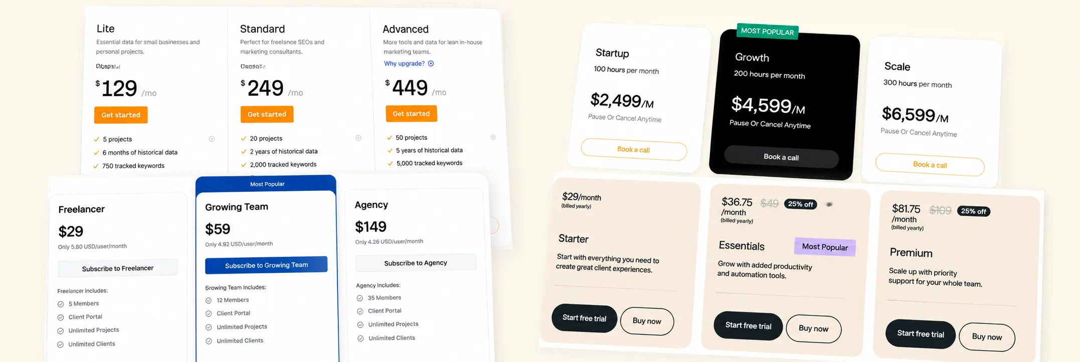
86% Create Decision Friction. Only 18% Use a Comparison Table.
Forty-two of 49 pricing pages create medium or high decision friction.
Multiple tiers, billing toggles, usage limits, credits, add-ons, enterprise routes, sometimes stacked four deep before a visitor can act.
Only 9 of 49 give them a comparison table to work through it.
That's the gap. It isn't that pricing pages have too many options. Three or more plans is normal for SaaS, and most categories genuinely need that many.
The gap is between the friction a page creates and the support it gives for resolving it.
This pattern holds even where it shouldn't. Among the 22 pages that visually feature a recommended plan, 16 still required noticeable effort to compare it against the alternatives.
A featured card tells someone where to look. It doesn't tell them why that plan is right for them, and most pages stop at the first part.
The fix isn't fewer plans or fewer features. It's matching the comparison tool to the comparison being asked for.
A page with three simple tiers may not need a table at all. A page with six usage tiers and an add-on matrix needs one and usually doesn't have it.
55% Give No Recommendation. Another 10% Steer Users Without Saying So.
27 of 49 pricing pages don't state which plan they recommend.
17 use an explicit label like "Most Popular" or "Recommended."
Another 5 push one tier forward with no label at all, a darker card, a stronger border, a brighter CTA, design doing the steering that copy never names.
Those 5 pages don't show up in any badge count, which means a fast scan for "does this page recommend something" would miss them entirely.
We can't tell from the page alone whether the 27 unrecommended pages chose neutrality deliberately or just never made the decision.
What we can say is what's measurable: half the sample gives no stated default, and another 10% created a visual default without an explicit label.
The more useful split in the data isn't recommended vs. not. It's labeled vs. unlabeled steering. A badge is auditable, you can count it.
Visual-only steering isn't, and it still shapes the decision just as much.
That's the actual finding here: 5 of 22 visible recommendation treatments, or 23%, relied on visual hierarchy without an explicit label..
For designers reviewing their own pricing page, the test isn't "do we have a Most Popular badge."
It's "would someone screenshotting this page and hiding all text still know which plan we want them to pick." If yes, that's steering, whether or not it's labeled.
A Featured Plan Helps Attention, Not Comparison
Among the 22 pages that visually feature a plan, half place it in the literal middle. The other half don't, some push the recommended tier second-from-right, a few feature the rightmost plan outright, usually on pages selling scale rather than entry.
The "anchor the middle tier" rule, treated as near-universal in pricing advice, holds for only about half of the pages that feature a tier at all.
But featuring a tier and explaining it are different jobs, and most pages only do the first.
16 of those 22 featured-plan pages still required noticeable effort to compare against the alternatives.
A darker card and a bigger button tell a visitor where to look. They don't tell them what changes if they pick it, what problem the lower tier can't solve, or whether the added cost is relevant to their actual usage.
That gap shows up in the design, not just the copy. A featured plan with no stated reason functions as a sales prompt: attention without justification.
The few pages that close that gap pair the visual treatment with a specific reason tied to a use case, not a generic label, which turns a highlighted card into an actual decision rule instead of a nudge.
Comparison Tables Don't Remove Comparison Effort
Only 9 of 49 pages include a feature comparison table. And every one of those 9 still required noticeable effort to compare plans, the same friction level as pages with no table at all.
That's the finding worth sitting with. In this sample, every page with a comparison table still required noticeable effort to compare.
They show up after a plan structure is already too complex to compare through cards alone, six usage tiers, an add-on matrix, overlapping permissions, and end up documenting that complexity rather than resolving it.
Which means a table's job isn't to simplify a decision. It's to verify one a visitor has mostly already made.
Used earlier than that, it just becomes the next thing to parse before the first one.
The split that actually works: cards carry who each plan is for, the main reason to upgrade, and the price.
The table carries the second-order questions, does this include SSO, how many seats, what support level, the ones a visitor only asks once they've already picked a likely plan and want to confirm it.
A visitor shouldn't need the table to understand the main difference between tiers.
If visitors need the table to understand the core difference between tiers, the card layer may not be doing enough orientation work..
Lower Commitment Is Common. Reassurance Near Price Is Not.
46 of 49 pages offer a lower-commitment route, a free plan, a trial, a demo, a sales call.
Only 17 place any reassurance near the price itself. Only 3 include social proof inside the pricing section at all.
A free trial answers "can I try this first."
It doesn't answer the questions that actually surface at the moment someone's about to commit: is a card required, can I cancel easily, what happens when the trial ends, will usage growth trigger extra charges.
A lower-commitment route does not automatically make those details visible at the moment of commitment.
They just move to wherever the visitor goes looking next, an FAQ, a terms page, or away from the site entirely.
The fix isn't more reassurance everywhere. It's the right reassurance at the specific point of doubt. For a self-serve plan, that's usually short and concrete: no credit card required, cancel anytime.
For an enterprise route, it's a different kind of proof entirely, security, onboarding, scale, since the doubt being addressed is different.
A logo strip on the homepage builds general credibility. It doesn't answer what happens after someone clicks the pricing page's CTA.
That answer needs to live where the doubt actually occurs, next to the price, not one page removed from it.
47% Include a Sales-Led Route. Sales-Led Pricing Does Not Have to Mean Opaque Pricing.
Twenty-three of 49 pages included a sales-led or enterprise route.
That did not automatically mean the rest of the pricing model was hidden.
Thirty-nine pages still showed enough pricing information for a first-time visitor to understand the model.
Only 11 pages explicitly offered a demo.
That does not prove the remaining sales-led pages were unclear. It shows that the next step was not always named as a demo.
The clearer enterprise routes explained the boundary between self-serve and sales-led pricing.
They made it visible when a buyer might need custom security, onboarding, contract terms, higher usage limits, or dedicated support.
The goal is not to publish a public enterprise price for every product.
It is to make the route understandable: what requires a conversation, and what that conversation is likely to cover.
Only 61% of CTAs Explain What Happens Next
30 of 49 pages make the primary CTA's next step clear.
The other 19 use broad labels like "Get Started," "Choose Plan," or "Try Now," familiar, and vague.
On a pricing page, a single click can lead to very different actions: creating an account, starting a trial, entering payment details, booking a demo, requesting a quote, talking to sales.
A vague CTA leaves the next step less visible before the visitor clicks.
The fix is specificity tied to the actual commitment. "Start 14-day free trial" instead of "Get Started."
"Create your free workspace" instead of "Try Now."
"Book an enterprise demo" instead of "Contact Sales."
Each version tells the visitor what they're agreeing to before they agree to it.
This matters most on pages mixing self-serve and sales-led options, where the same visual button style can route to a trial signup or a sales conversation depending on which card it sits under.
A visitor shouldn't need to click through to find out which one they're getting.
The CTA is part of the pricing information, not just the mechanism for moving past it.
A page can get the plans, the recommendation, and the comparison right, and still lose someone at the last unclear button.
What Better Pricing Pages Do Differently.
The clearer pages in the sample did not necessarily have fewer plans or shorter feature lists.
They made the decision easier to follow.
One four-tier subscription page showed this sequence clearly. Each card explained who the plan was for before listing features.
The middle tier used both a badge and a one-line reason, rather than relying only on a darker background.
The detailed comparison table appeared below the cards. It covered seat counts and integrations after the visitor had already seen the main plan differences.
The page also placed trial and cancellation details directly below the CTA.
The CTA named the next step: “Start 14-day trial,” rather than a generic label such as “Get Started.”
The page did not contain less information than other pages in the sample.
It presented the information in a clearer order:
The pattern was not more content. It was clearer sequencing.
Check Your Pricing Page in 10 Minutes.
You do not need a full redesign to find the main problems.
Ask someone who has never used the product to look at the pricing page. Then check five things.
1. Hide the recommendation badge.
Can they still tell which plan is likely right for them, and why?
2. Count the decisions.
Before clicking, do they need to choose a plan, billing period, seats, usage, add-ons, and a sales route? Too many decisions in one view create friction.
3. Find the comparison layer.
Can they verify the difference between plans without relying on memory from cards they have already scrolled past?
4. Look beside the price.
Are cancellation terms, card requirements, trial details, support, or overage rules visible near the CTA?
5. Read the CTA out loud.
Does it explain what happens next, or does it only say “Get Started”?
If more than two of these are unclear, the issue is probably structural.
A new badge, brighter CTA, or shorter feature list may improve the surface.
It will not fix a pricing page that still makes visitors do the decision-making alone.