Design
What Your Pricing Page Is Costing You in Trial Conversions (And Why It Is Probably Not the Price)

July 19, 2026
July 19, 2026
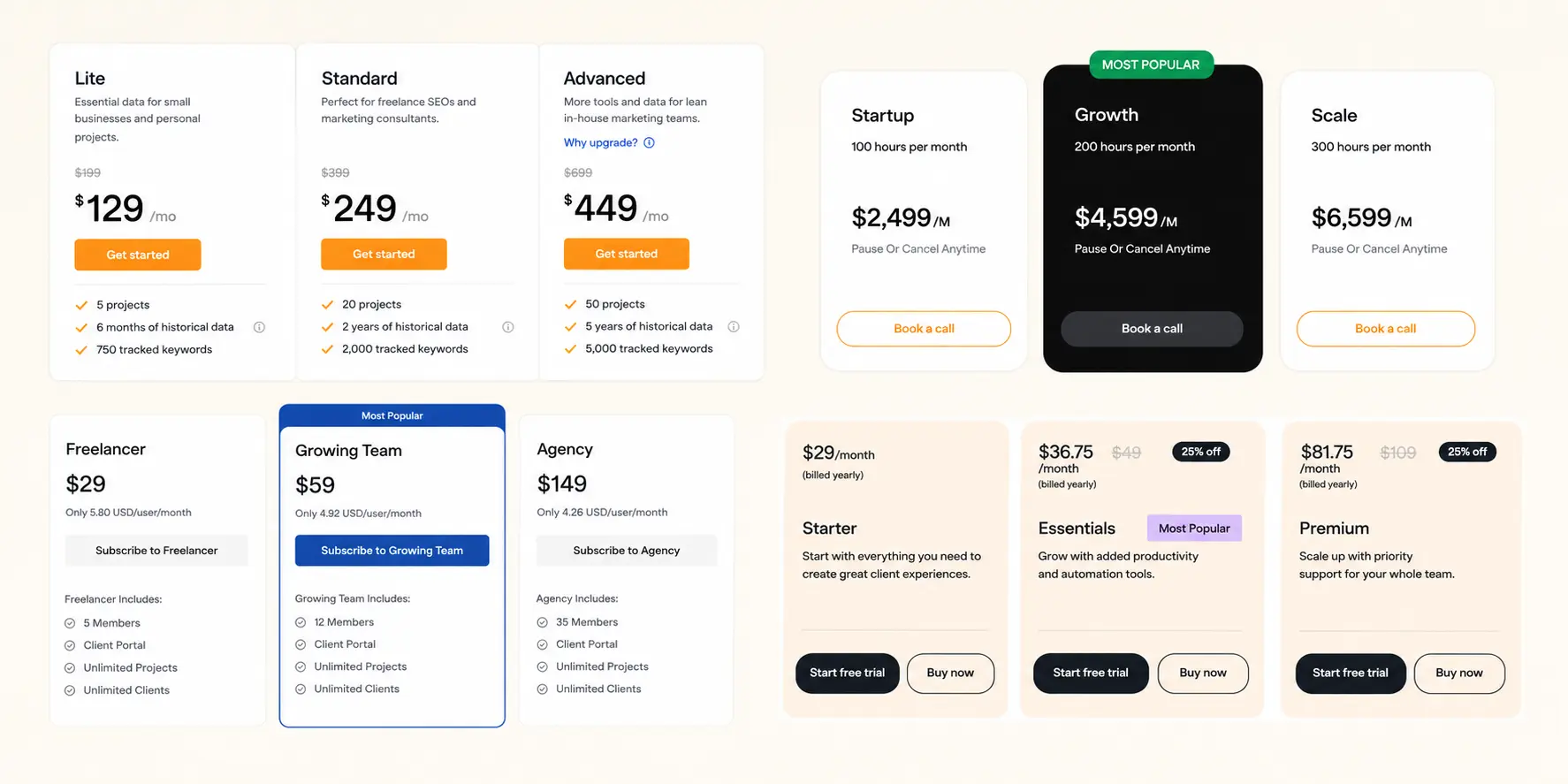
Most founders with a trial conversion problem have already tried the obvious fixes.
They have adjusted the price, shortened the trial, improved onboarding, added a follow-up email sequence. The conversion rate moved a little or not at all.
The pricing page is rarely on the list. It should be.
86% of SaaS pricing pages we audited create medium or high decision friction.
That friction does not show up in your analytics as a pricing page problem. It shows up as trial users who explore for two weeks and never upgrade.
Why Your Analytics Will Not Show You This
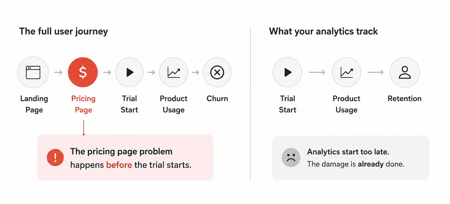
Trial conversion analytics tell you what happens inside the product: which features users adopt, where they drop off, how many complete onboarding.
That data is useful. It is also looking in the wrong place.
A founder whose trial converts at 2% when the category average is 5% usually assumes the product is the problem. Sometimes it is.
Often the user arrived at the trial already uncertain about which plan they needed, what changed between tiers, and what they were committing to when the trial ended.
That uncertainty does not create a support ticket.
It creates a user who explores, never upgrades, and churns at day 30.
The pricing page problem is invisible in most dashboards because it happens before the trial starts.
By the time a user is inside your product, the confusion they carried in from the pricing page has already shaped how they engage.
A user who is not sure which plan fits is a user who will not upgrade to any of them.
The Four Pricing Page Failures That Kill Trial Conversion
These are the patterns that appeared most consistently across 49 SaaS pricing pages we reviewed.
Each one has a recognizable symptom on your dashboard even if the cause is not immediately obvious.
1. No stated recommendation
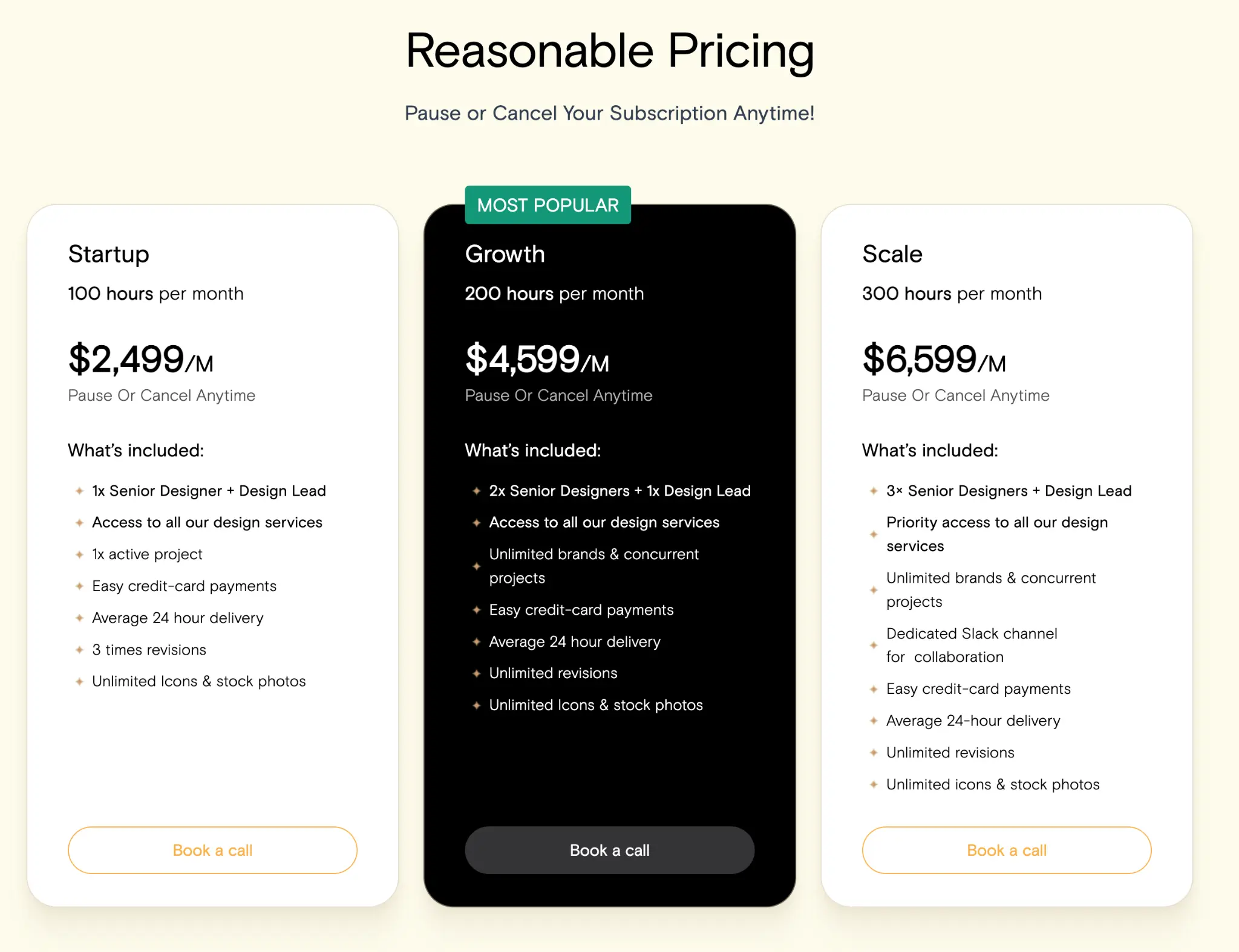
55% of pricing pages give no stated recommendation at all. Another 10% steer visitors toward a plan visually, with a darker card or a brighter button, but never say why.
When a visitor cannot tell which plan is for them, they do the only rational thing: they pick the cheapest one.
They underuse the product, never reach the features that justify upgrading, and churn at the end of the trial without understanding what they missed.
Symptom to look for: high free plan or starter tier adoption, low movement to paid plans, users who use the product regularly but never upgrade despite having an obvious need for higher-tier features.
2. Comparison friction with no comparison tool
86% of pricing pages create medium or high decision friction. Only 18% give visitors a comparison table to work through it.
Most visitors are being asked to hold the differences between three or more plans in memory while scrolling past card after card.
When the plan differences are not clear, visitors default to the safest decision, which is usually the cheapest plan or no decision at all.
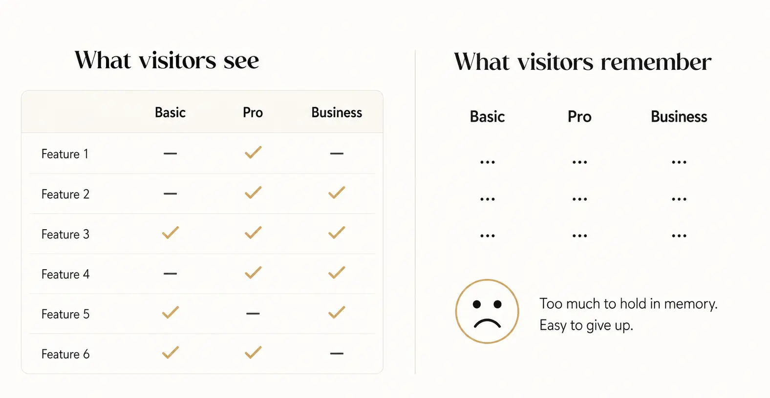
The finding that sharpens this further: every one of the nine comparison-table pages in our audit still required noticeable effort to compare plans.
A table placed before visitors understand the basic plan structure becomes another obstacle rather than a tool.
The table's job is to verify a decision, not start one.
Symptom to look for: support tickets asking "what is the difference between Pro and Business," users who sign up for a trial and go quiet after the first session, low engagement with higher-tier features even among users who would benefit from them.
3. Reassurance missing at the point of commitment
94% of pricing pages offer a lower-commitment route: a free trial, a free plan, a demo.
SaaS companies are good at giving people a way out. Only 35% place any reassurance near the price itself.
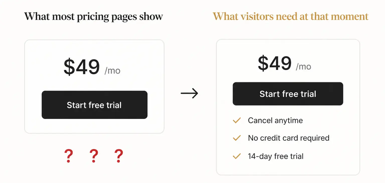
A free trial answers one question: can I try this before I pay. It does not answer the questions that surface at the moment someone is about to enter payment details.
Can I cancel easily. Is a card required now. What happens automatically when the trial ends.
Will my usage create extra charges. Those questions do not disappear because a trial exists.
They move to wherever the visitor goes looking next, which is often away from the page entirely.
Symptom to look for: high trial start rate but low trial completion, users who begin a trial without entering payment details and never return, drop-off at the moment the trial expiry email arrives.
4. A CTA that does not say what happens next
Only 61% of pricing pages clearly explain what happens after the primary CTA.
"Get started" can mean creating an account, starting a trial, entering payment details, or booking a demo call.
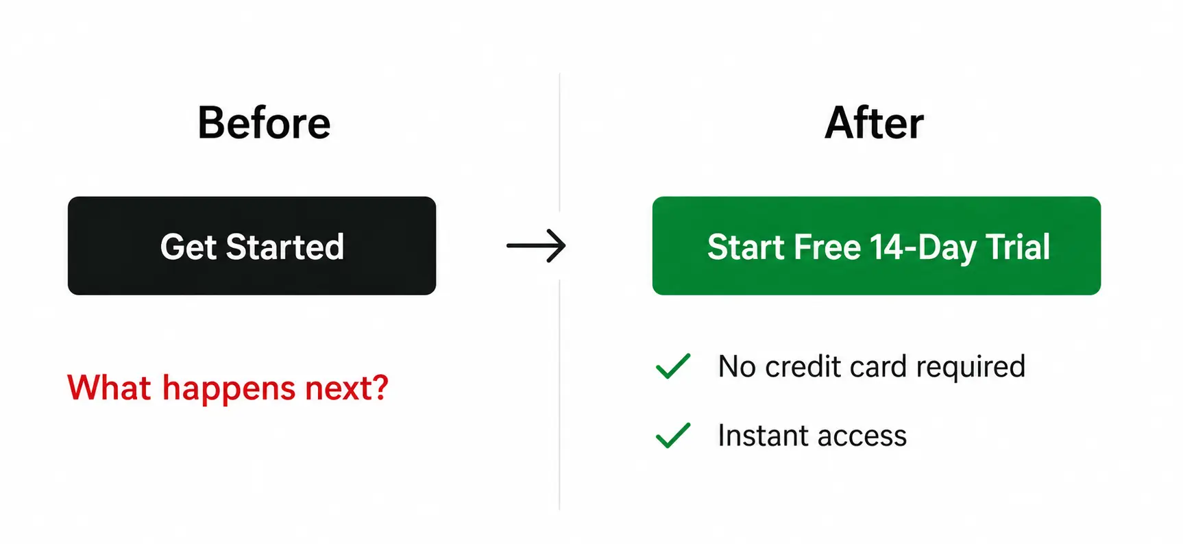
A visitor who is not sure what they are agreeing to often does not click at all.
This matters most on pages that mix self-serve and sales-led options.
When the same button style appears under a self-serve plan and an enterprise plan, a visitor cannot tell whether clicking will start a trial or begin a sales conversation.
That ambiguity is a conversion problem, not a copy problem.
Symptom to look for: low CTA click rate despite reasonable traffic to the pricing page, visitors who land on the pricing page and return to the homepage or leave the site entirely.
Run This Check on Your Own Page Today
You don't need analytics access for this. You need five minutes and a page you're willing to look at critically.
1. Cover the badge.
Hide "Most Popular" with your hand. If you can't tell which plan you'd pick without it, your page isn't recommending, it's decorating.
2. Count what's decided before the click.
Plan, billing period, seats, usage, add-ons. Past three, most visitors bail.
3. Try to compare from memory.
Scroll past the cards, then ask what actually changes between tiers. If you can't answer without scrolling back, neither can they.
4. Check next to the price, not the FAQ.
Cancellation terms, card requirements, trial conditions. If they're not sitting next to the CTA, they're not answering the doubt at the moment it happens.
5. Say the CTA out loud.
If it's "Get Started" and nothing more specific, a visitor doesn't know what they're agreeing to.
Two or more failing: your pricing page is a live suspect in your conversion number, not a bystander.
What Fixing This Actually Requires
Most pricing page conversion problems are not price problems. They are hierarchy problems, recommendation problems, and comparison problems.
Fixing them does not require repricing the product.
It requires making the page do the job it is supposed to do: helping a visitor eliminate the wrong plans and commit to the right one with enough confidence to enter payment details.
The changes that move trial conversion are structural, not cosmetic.
A new color on the CTA button does not fix a page where no plan is recommended.
A shorter feature list does not fix a page where visitors cannot compare what they are being asked to choose between.
A lower price does not fix a page where visitors do not know what happens after they click.
Ofspace audited 49 SaaS pricing pages to understand where these structural failures appear and how often.
The full findings, including which patterns are common, which are counterintuitive, and what the pages that work actually have in common.
If Three of Those Symptoms Sound Familiar
The fastest way to know whether your pricing page is contributing to your conversion gap is to look at it the way a first-time visitor does.
No prior context, no product knowledge, three competing plans, and a decision to make before the trial even starts.
If you want an objective view of where your pricing page is creating friction and which changes are worth making first, we offer a free 30-minute pricing page audit call.
No proposal, no commitment. You will leave knowing exactly where the page is losing visitors and what a first-time visitor currently experiences before they start your trial.