Resource
We Audited 78 YC Fintech Landing Pages. The Same Layout Showed Up Everywhere.

June 25, 2026
June 25, 2026

We reviewed 78 YC-backed fintech landing pages. Payments, banking, lending, infrastructure. Seed stage and growth stage.
Most fintech founders believe they have a designed page. They chose the template carefully.
They hired someone for the logo. The typography is clean. What they have is a page that looks considered. That is not the same thing.
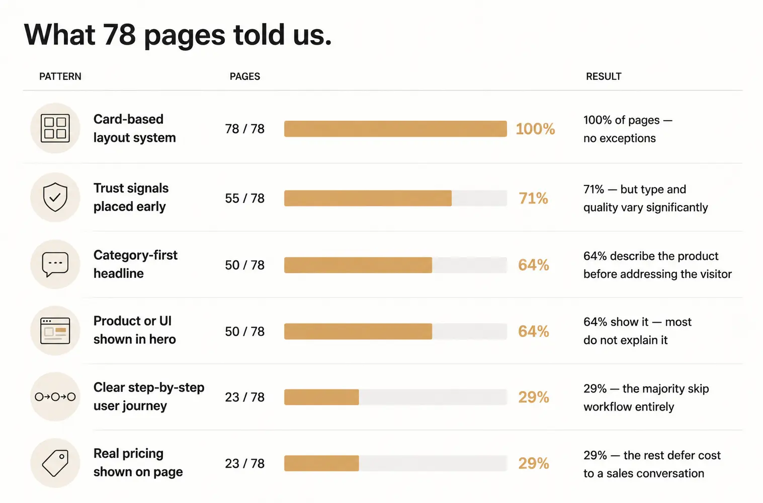
Every single page uses the same card layout. 64% open with the same category-first headline.
71% place trust signals before the visitor has seen how the product works.
And only 29% show a clear workflow or real pricing, the two things that actually move a decision.
Here is what we found.
What 78 pages told us.
Every Single Page Used the Same Layout. Not 99%. All 78.
Every single page uses a card-based content system.
Cards appear everywhere: feature groupings, use-case breakdowns, integration lists, pricing blocks, customer stories.
But cards are an organizational tool, not a narrative one.
They separate information into blocks. They do not connect those blocks into a sequence. A visitor can scan what the product offers. They cannot reconstruct how it actually works.
Only 29% of pages show a clear step-by-step user journey. Most pages list features, make a claim, and add supporting detail. None of it shows the product doing anything.
Cards reduce visual complexity. They do not reduce cognitive complexity.
The category has standardized the container. What goes inside it is still a mess.
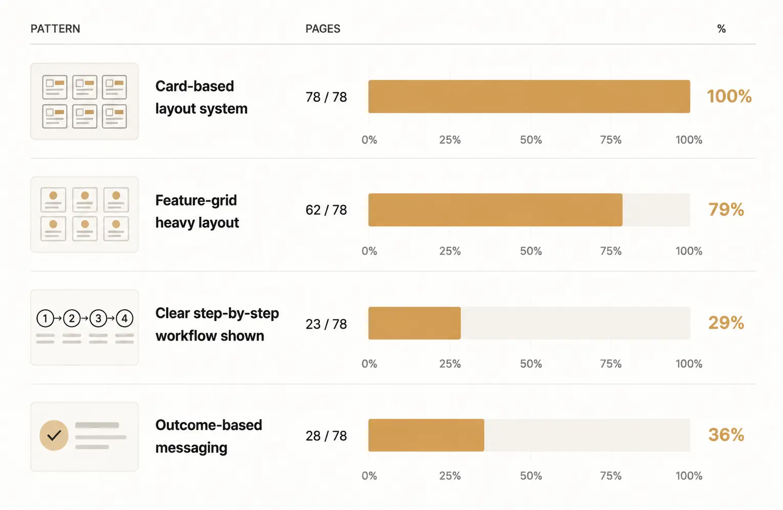
64% of Pages Describe the Product. 36% Talk to the Visitor. The Gap Shows.
Across 78 pages, the most common opening move is a category statement.
Pages could use more than one messaging style. Percentages do not sum to 100%.
Category-first headlines define what the product is.
Common examples from the dataset: financial infrastructure platform, global payments API, stablecoin settlement layer, modern payroll system, embedded finance platform.
This framing assumes the visitor already understands the space well enough to self-select. It works for positioning within a market. It delays practical clarity in the first interaction.
Outcome-first pages assume the visitor is still forming intent: faster payments, fewer failed transactions, simpler payroll across regions.
The structural difference is not tone. It is assumption.
Category-first pages front-load classification. Outcome-first pages front-load relevance.
64% of the pages we reviewed chose classification.
That is not a copy problem. It is a positioning decision made before a word is written. And it determines whether a visitor feels spoken to or looked at.
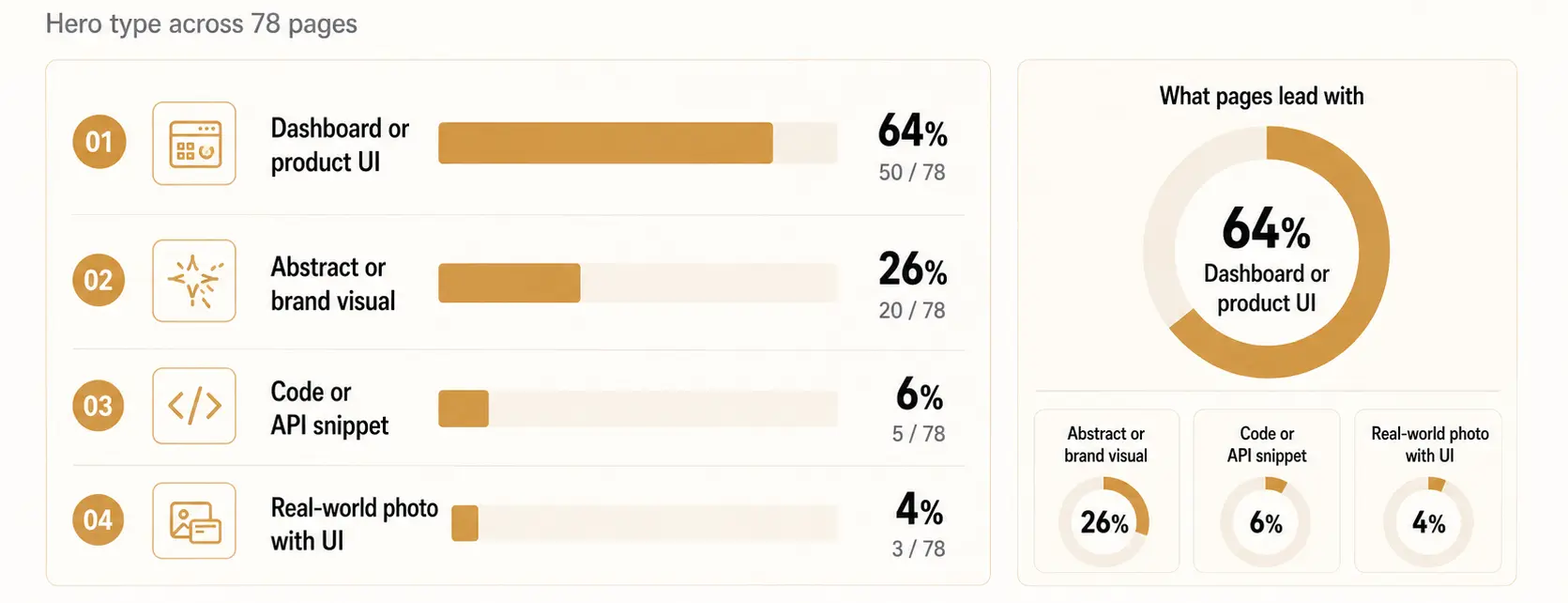
64% Show the Product in the Hero. Most Make It Impossible to Understand.
On the surface, this looks like progress. The hero is no longer abstract positioning. It is product exposure.
Static dashboards with multiple unrelated data points. System-level visuals without clear user input or outcome. Transaction or API snapshots without a visible sequence.
Those are the three patterns we found. A small number show a complete interaction loop: input, processing, output. Most do not.
A dashboard shows information density. A workflow shows product behavior. Most pages choose the first.
The product is visible. It is not understandable. There is a difference.
Showing a UI screenshot answers one question: what does this product look like? It does not answer the question visitors actually ask: what will I be able to do inside it?
That second question requires a workflow. Most hero sections do not provide one.
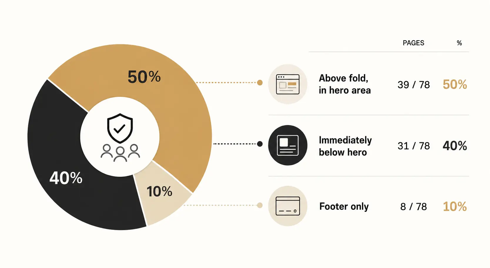
71% Place Trust Signals Early. Half of Them Are Too Generic to Work.
71% of pages surface trust elements within the first two sections.
This is one of the most consistent structural patterns in the dataset. Trust is not treated as supporting proof. It is treated as part of the first impression system.
The standard structure is clear: hero, then trust layer, then feature explanation.
But the type of trust signal varies by product category in ways that matter.
Payment products rely on transaction volume and brand recognition. Infrastructure products rely on compliance and security positioning. Consumer fintech relies on user scale and simplicity cues.
What is consistent is the ordering decision: credibility is shown before comprehension is complete.
In most pages, trust appears before the visitor has seen a clear product workflow or understood the pricing. The page is asking visitors to trust a product they have not yet been shown how to use.
That ordering makes sense when trust signals are strong enough to earn the benefit of the doubt.
It creates friction when they are generic enough to be invisible — a greyscale logo bar without labels, a user count without context, a compliance badge without explanation.
Trust placed early is a structural decision. Whether it actually reduces hesitation depends on what the trust signal is, and whether the visitor recognizes it.
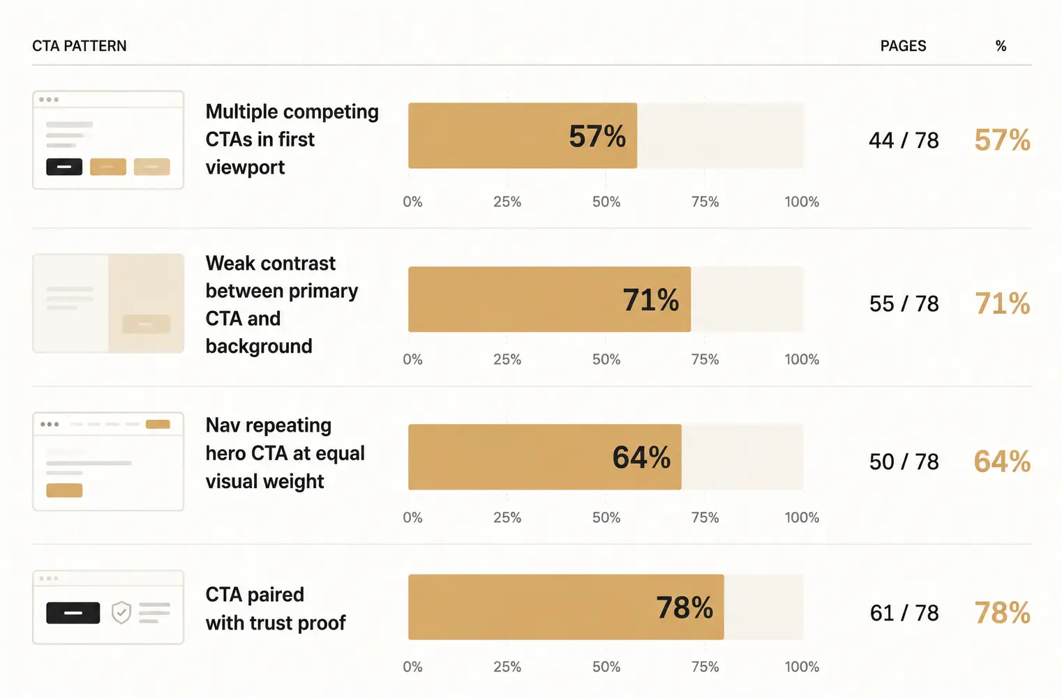
57% of Primary CTAs Fail a Basic Contrast Test. The Problem Is Not the Copy.
57% of pages show multiple competing CTAs in the first viewport.
The problem is not the absence of calls to action. Every page has them.
The problem is the absence of hierarchy between them.
Most pages present multiple actions at equal visual weight: Request demo. Get started. Talk to sales. Navigation links.
In most cases, the primary CTA does not visually dominate the secondary ones. 71% of pages showed weak contrast between the primary button and its background.
When everything is equally visible, nothing is prioritized.
The visitor is not guided toward a decision. They are presented with a set of equivalent options and left to determine which one matters.
This is a design problem, not a copy problem. Rewriting CTA text does not fix a contrast failure. Adding urgency language does not fix a hierarchy problem.
The pages that handled this well made one decision clearly: one filled button, everything else outlined or plain text. The hierarchy was immediate. You did not have to look for it.
71% Show No Pricing. That Is Either a Strategy or a Deferral. Most Cannot Tell the Difference.
Only 23 of 78 pages show any form of pricing, fee, or rate information.
When pricing appears, it takes three forms: percentage-based transaction fees, usage or volume-based models, or tiered enterprise plans with a contact sales entry point.
In most cases, pricing does not appear until the visitor has already scrolled past the hero, the features, and the social proof.
Where it is absent entirely, pages replace it with performance claims, cost advantage messaging, or general efficiency statements.
Visitors are expected to understand value and use case before they understand cost. In most cases, the page never resolves the cost question at all.
That ordering may be intentional. Enterprise fintech products often require pricing conversations that cannot be standardised on a page.
For those products, the absence of pricing is a sales strategy, not a design failure.
But the 29% of pages that show real pricing do something the others do not: they answer every question a visitor needs to decide.
What it is. What it does. Who uses it. What it costs.
The other 71% ask the visitor to carry an open question through the entire page and into a sales call.
Whether that is the right trade-off depends on the product. Across this dataset, it is the default trade-off regardless of product type.
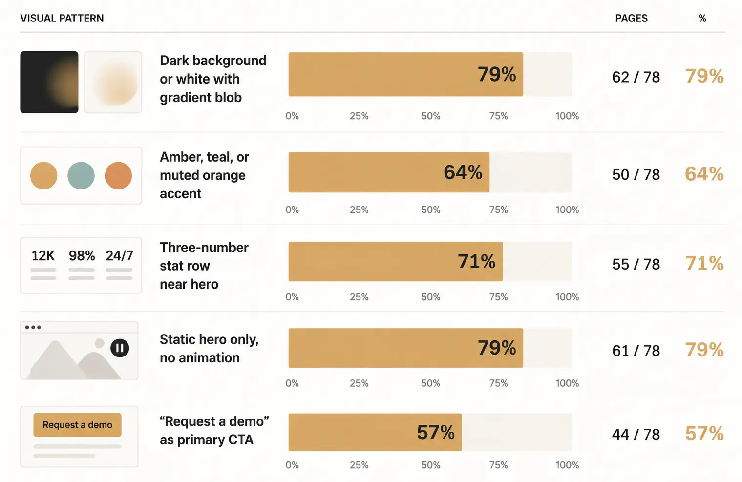
79% Use the Same Two Visual Treatments. The Category Looks Like One Company.
Across 78 pages, visual structure is narrow.
None of these decisions are wrong individually.
Together, across competing products in the same category, they produce pages a visitor cannot tell apart.
A consumer neobank, a trading infrastructure API, and an AI insurance platform — all pointing to the same action, in the same colour palette, over the same gradient backdrop.
The visual system meant to communicate "we are serious and different" now communicates "we used the same template."
This is not a critique of any single team. It is what happens when a category converges on a default fast enough that the default becomes the standard.
One batch of YC companies shipped pages that looked this way. The next batch read those pages as the standard for what a credible fintech product looks like and built toward it.
The aesthetic spread not because it performs well, but because it was already there.
The variation in this dataset exists at the brand level: logo, name, accent shade, headline copy. The structural decisions beneath the brand are shared.
A wallet, a payments API, and a financial infrastructure platform often appear structurally identical in the first viewport.
One Page Scored Differently From the Rest. It Made Four Decisions the Others Skipped.
Across 78 pages, one stood out. Not because it was more ambitious.
Because it made four decisions the others deferred.
We are not naming the company. The decisions are replicable without knowing which page they came from.
1. Proof before assertion.
The credibility signal appeared above the headline. Not mid-page. Not in the footer. Before the value proposition.
2. A workflow, not a dashboard.
One decision flow. Input, system action, output. You could understand what the product did without reading a word.
That is the job of a hero visual. Not showing everything. Making one thing unmissable.
3. Contrast as hierarchy.
One CTA visually dominant through contrast, not size. Primary action: filled button. Everything else: outlined or plain text.
The hierarchy was immediate. You did not have to look for it.
4. A number specific enough to feel researched.
Not "1,000+ users." A figure that named the exact outcome the product is built to improve.
None of these required more design budget. They required decisions.
Your Page Probably Has Three of These Problems. Here Is How to Find Them in 10 Minutes.
You do not need a design agency to find these problems. You need ten minutes and someone who has never seen your product before.
Check 1: Cover your headline.
Cover your headline with your hand. Does the visual beneath it still explain what your product does? If not, your hero is decorating, not communicating.
64% of the pages we reviewed would struggle with this test.
Check 2: Count everything clickable in your first viewport.
Count every clickable element visible before the first scroll. Include navigation links. If the number is above two, you do not have a CTA problem.
You have a hierarchy problem. Most founders try to fix this by rewriting button copy. That is the wrong variable.
Check 3: Read your headline without the product name.
Remove your product name from your headline. Does what remains still tell a visitor what changes for them? If not, you have a category-first headline.
64% of the pages in this dataset do.
Check 4: Find your first pricing signal.
Scroll your page and mark where cost first appears. If it never appears, confirm that is deliberate rather than deferred.
If it appears after three or four sections, ask whether a visitor would have left before reaching it.
Check 5: Ask someone to describe your product after five seconds.
Find someone who has never seen your product. Show them your hero for five seconds. Ask what the product does and what they should do next.
If their answers are vague or inconsistent, the structure is failing before the copy gets a chance to work.
These five checks will not tell you whether your page converts. Nothing short of live traffic data will tell you that.
They will tell you whether your page is structurally capable of converting. That is a different and more answerable question.
If you find problems on more than two of them, the issues are structural, not cosmetic. Rewriting headlines will not fix them.
What this data cannot tell us.
How we ran this study.
We identified 78 YC-backed fintech companies across recent cohorts.
Each company's primary landing page was accessed and reviewed in June 2026.
Each page was scored across five dimensions:
Criteria were defined before scoring began. No automated tools. No heatmap data. No user testing. Direct observation only.
Company names are not published. We are describing patterns, not ranking businesses.
What this means for your page.
The convergence we observed is not a design failure by any individual team.
It is the output of shared pressures: speed, limited resources, template defaults, and the natural tendency to look at what credible companies have built and replicate the visible surface of it.
Replicating the visual surface of a category leader does not transfer their credibility.
It transfers their aesthetic. Across a category, that aesthetic becomes wallpaper.
The pages that stood out in our dataset did not stand out by being more polished.
They stood out because someone made an actual decision about what the hero visual needs to prove before the visitor reads a word, where the trust signal goes relative to the ask, and which button wins.
Those are not copy decisions. They are not strategy decisions.
They are design decisions. And right now, most fintech teams are leaving them to a template built for nobody specific.
If your landing page was built under deadline and never structurally revisited, it probably reflects the same patterns we documented here.
Not because your team lacks taste. Because the template made the decisions before you did.
That is the problem we work on at Ofspace.
If you want a structural review of your landing page, get in touch.