UI/UX Design
10 Bad UI Examples That Hurt UX (and How to Fix Them)
January 4, 2026
February 16, 2025

Ever clicked a button that didn't work? Or struggled with a confusing menu that made no sense?
You’re not alone! These bad UI drive users away and hurt business growth.
A poor interface creates confusion, while a great UI ensures a smooth, intuitive experience.
Whether you’re a designer, developer, or business owner, understanding bad and good user interface design examples mistakes is crucial.
In this guide, we’ll explore 10 real-life bad UI examples and mistakes and how to fix these issues to create better, more user-friendly designs.
Let’s fix these disasters before they wreck your UX!
Real-Life Bad UI Design Examples (🔥Must-See Cases)

Bad User Interface Design on Websites
Some websites bombard users with excessive information, making it difficult to identify key actions.
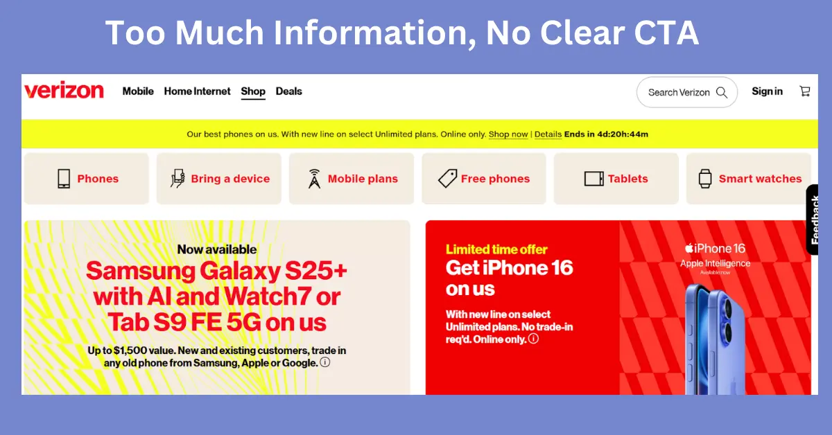
Example 1: Overloaded Homepage (Too Much Information, No Clear CTA)

Real-Life Example
Verizon's website has been criticized for inconsistent fonts and requiring numerous clicks to navigate, overwhelming users with information.
How to Avoid It
Simplify content, prioritize CTA buttons, and maintain a clear visual hierarchy.
Example 2: Poor Contrast and Readability (Dark Mode Fails, Low Contrast Text)
Poor color contrast makes text unreadable, affecting accessibility.
.webp)
Real-Life Example
HBO Max faced criticism for low-contrast design, making it challenging for users with visual impairments.
How to Avoid It
Use tools like WCAG contrast checkers and maintain sufficient contrast between text and background.
Example 3: Forms That Frustrate Users (Confusing Input Fields, Missing Labels)
Poorly designed forms with unclear labels, unnecessary fields, and bad error messages lead to high form abandonment rates.
.webp)
Real-Life Example
Workday's job application process requires applicants to fill in extensive information manually, even after uploading a resume, leading to frustration.
How to Avoid It
Keep forms simple, clearly label fields, and provide helpful error messages.
Example 4: Prime Video and Amazon’s UI Issues
Amazon and Prime Video are often criticized for inconsistent interfaces, overwhelming product pages, and difficulty in navigation.
.webp)
Real-Life Example
Amazon’s cluttered UI design confuses users with excessive information, multiple call-to-actions, and inconsistent layouts across devices.
How to Avoid It
Improve navigation consistency, streamline product displays, and enhance search functionality.
Bad UI Examples in Mobile Apps
Some mobile apps fail to maintain consistency in gestures, making it hard for users to navigate.
Example 5: Inconsistent Gestures and Controls
For irregular gestures and controls, apps have got hard on the users.
.webp)
Real-Life Example
Microsoft Teams has been noted for inconsistent UI elements across different sections, disrupting user workflows.
How to Avoid It
Follow platform-specific UI guidelines (iOS & Android) for a consistent experience.
Example 6: Pop-ups and Notifications Overload
Apps that spam users with excessive notifications and pop-ups often lead to frustration.
.webp)
Real-Life Example
Netflix's autoplay feature automatically plays trailers when users hover over titles, which can be intrusive.
How to Avoid It
Use non-intrusive alerts and allow users to control notification preferences.
Bad UI in Software & Enterprise Tools
A "bad UI" in software and enterprise tools refers to a user interface design that is confusing, cluttered, unresponsive, or poorly organized.
Example 7: Microsoft - Windows 10 UI Issues
Windows 10 has been criticized for an inconsistent user interface, with mismatched design styles between modern and legacy components.
.webp)
Real-Life Example
Windows 10 settings and control panel coexist in an unintuitive manner, often leading to user confusion when changing system preferences.
How to Avoid It
Maintain visual consistency, simplify settings navigation, and reduce reliance on outdated UI components.
Example 8: Overcomplicated Dashboards
Enterprise software often packs too much information into dashboards, overwhelming users.
.webp)
Real-Life Example
Salesforce has been criticized for its complex interface, which can be daunting for new users.
How to Avoid It
Prioritize important data, provide filters, and use whitespace effectively.
Bad UI in Everyday Devices (Unexpected UX Fails)
Bad UI design can be fatal to the overall customer experience. Here are some of the worst fails to avoid when building your product!
Example 9: ATM & Payment Kiosk Nightmares
Poor UI in ATMs and payment kiosks often confuses users with unclear instructions.
.webp)
Real-Life Example
Some ATMs have interfaces that are not intuitive, leading to user errors and frustration.
How to Avoid It
Use simple prompts, intuitive touch screens, and clear navigation.
Example 10: Car Infotainment Systems Gone Wrong
Some car infotainment systems force users to go through multiple steps just to adjust the AC.
.webp)
Real-Life Example
Certain vehicles have complex infotainment systems that require multiple interactions for simple tasks, diverting driver attention.
How to Avoid It
Ensure essential functions are accessible in 1-2 taps.
Common Mistakes & Avoid Bad UI Design? (Practical Fixes)
5 Major UI mistakes that drive users away:
- Cluttered Layouts: Too many elements lead to cognitive overload.
- Unintuitive Navigation: Hard-to-find menus frustrate users.
- Poor Mobile Optimization: Non-responsive UI ruins UX.
- Too Many Clicks to Perform an Action: Users leave when it’s hard to achieve their goal.
- Ignoring Accessibility: Bad contrast, small text, and no alt text harm usability.
To avoid the common mistakes of bad UI and bad design, you have to keep UI elements uniform across screens.
Provide instant visual feedback on interactions. Simplify your design and reduce unnecessary complexity.
Finally, it is designed for all users, including those with disabilities and get the best UI design.
FAQs
1. What is an example of a bad UI design?
A classic example of bad UI design is cluttered navigation menus where users can’t find what they need easily.
For instance, using too many options without clear labels or grouping causes confusion and leads to a poor user experience.
2. What apps have bad UI?
While many apps improve over time, apps like Snapchat (especially for new users) have been criticized for non-intuitive interfaces, unclear icons, and a steep learning curve.
Poorly designed banking or government apps are also common examples of bad UI.
3. What is considered a poor interface?
A poor interface lacks clarity, consistency, or ease of use. It may include small touch targets, confusing layouts, low contrast text, or unresponsive elements — all of which frustrate users and hinder task completion.
4. Are there bad UI design examples in real life?
Yes! Real-life bad UI examples include confusing elevator button panels, poorly designed ATMs, or ticket kiosks with non-intuitive steps.
These interfaces cause delays and stress in everyday scenarios.
5. What are some bad UI website design examples?
Websites that auto-play music, have hard-to-read fonts, lack mobile responsiveness, or bury key information behind multiple clicks are prime examples of bad UI on the web.
These flaws drastically reduce user satisfaction.
6. What’s the difference between good and bad UI design?
Good UI design focuses on clarity, usability, and user needs. Bad UI design ignores these principles, leading to confusion, frustration, and higher bounce rates.
It's the difference between intuitive navigation and one that leaves users guessing.
7. What are bad UI examples on Reddit or other communities?
Users often share screenshots of poor UI in subreddits like r/CrappyDesign or r/UserExperience.
These include things like bad error messages, overlapping elements, or illogical form flows.
8. Is there a bad UI design competition?
While there’s no formal global competition, many design communities and blogs showcase “worst UI design” collections or awards, like “Dark Pattern Hall of Shame” — highlighting unethical or user-unfriendly design practices.
Get the Best UI Design from the Bad User Interface Design Examples
Now you've got the solution for avoiding Bad UI. Learning from bad UI mistakes helps designers and businesses create smooth and engaging digital experiences.
Make usability a priority!
If you would like to speak with a UI/UX design services expert, book a free 15-minute call to see how you can solve the common UI design mistakes that your product may have.


