Ofspace Research
We Reviewed 53 SaaS and Fintech Dashboards. Here Is What the Data Actually Shows.

July 9, 2026
July 6, 2026
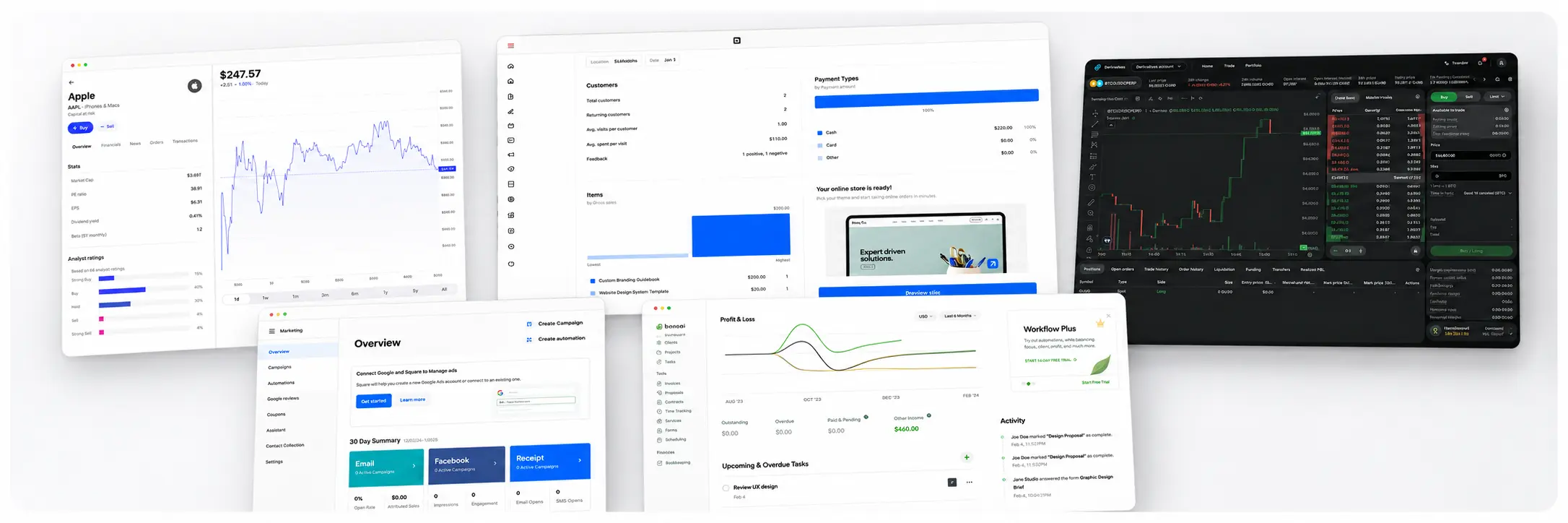
We reviewed 53 dashboard views across SaaS, fintech, and commerce products.
48 made the user's situation clear. Only 31 kept the next relevant action close enough to use.
We expected density to be the main problem. It was not. Most screens showed the right information.
The breakdown came one step later, when the screen needed to connect what the user understood to something they could do.
This is a structural audit. No session data, no heatmaps. Just 53 screens coded against a shared rubric.
Here is what we found.
41% Led With Value. They Had the Lowest Actionability Scores in the Sample.
22 of 53 reviewed dashboard views led with value or performance as the first-screen metric. That was the most common first-metric choice in the sample.
Those views also had the lowest average actionability score: 3.18 out of 5. Only 9 of 22 passed the decision-spine test.
The most common choice was also the least likely to connect a signal to a response.

The difference is directional, but worth examining: all 7 exception-led views passed the decision-spine test, compared with 9 of 22 value-led views.
A value-led first screen tells users how something performed. It does not always tell them what that performance means for the decision they need to make.
A budget user may need remaining money before a spending trend.
An accounts-payable user may need overdue items before a cash-flow chart.
A fundraiser may need the next source of momentum, not only the total raised.
The first metric is not just a visual decision. It determines which uncertainty the dashboard removes first.
Raihan’s design note:
Exception-Led Dashboards Had a 100% Decision Spine Pass Rate
7 of 7 exception and queue views passed the visible decision spine test.
Their average actionability score was 4.71, the highest of any first-metric group in the study.
That is the most counterintuitive finding in the dataset. Exception-led surfaces are often treated as secondary or specialized views.
In this sample, they were the most structurally coherent of any group.
The reason is structural, not stylistic. A queue built around overdue invoices, pending approvals, or blocked payments already knows what the user needs to do.
The first metric is the exception. The explanation is the record. The action is the resolution. The decision spine is built into the format.
Dashboards built around value and performance face a harder structural problem.
The user sees a number. The number does not tell them what it means for their next decision.
Something has to fill that gap, and in 13 of 22 value-led views in this sample, nothing did.
Raihan’s design note:
48 Could Explain the Situation. Only 31 Kept the Response in Reach.
A screen might show that spend is above plan, then require the user to navigate to a separate page to reallocate funds.
It might flag overdue invoices, then route the user through a different workflow to find the affected records. The information was present.
The connection between that information and a response was not.
Some dashboards are designed to stop at explanation. A market analysis view or a spending reflection screen exists to help users form a judgment, not trigger an immediate transaction.
Low actionability on a reflection surface is a design choice, not a design failure.
The question is whether the dashboard's job requires action, and if so, whether the response is reachable from the same context where the decision was made.
Raihan’s design note:
Business Financial Operations: 93% Decision Spine Pass. Consumer Money Planning: 45%.
The dataset splits into four clusters. The difference between the highest and lowest decision spine pass rates is the study's clearest practical finding.
Business financial operations dashboards, covering payments, invoicing, supplier management, transaction analytics, and business account management, connected state, explanation, and action in 13 of 14 reviewed views.
Consumer money planning dashboards, covering budgeting, net worth, spending tracking, and personal finance, passed in fewer than half of reviewed views.
The operational cluster's advantage is the same structural reason exception-led dashboards outperformed value-led ones.
Operational products tend to know their user's next job precisely: pay this supplier, reconcile this transaction, approve this invoice.
The interface is built around a specific work object with a specific action attached.
Consumer planning products tend to show status and trend data. The action the data implies (spend less, save more, reallocate) is not a product action.
It is a user decision that happens outside the interface.
That structural difference makes decision spine design harder for that category, and the pass rates reflect it.
Raihan’s design note:
Density Was Not the Main Problem. 45 of 53 Views Fit Their Task.
Dense interfaces in expert trading and financial operations contexts are dense because their users need parallel context.
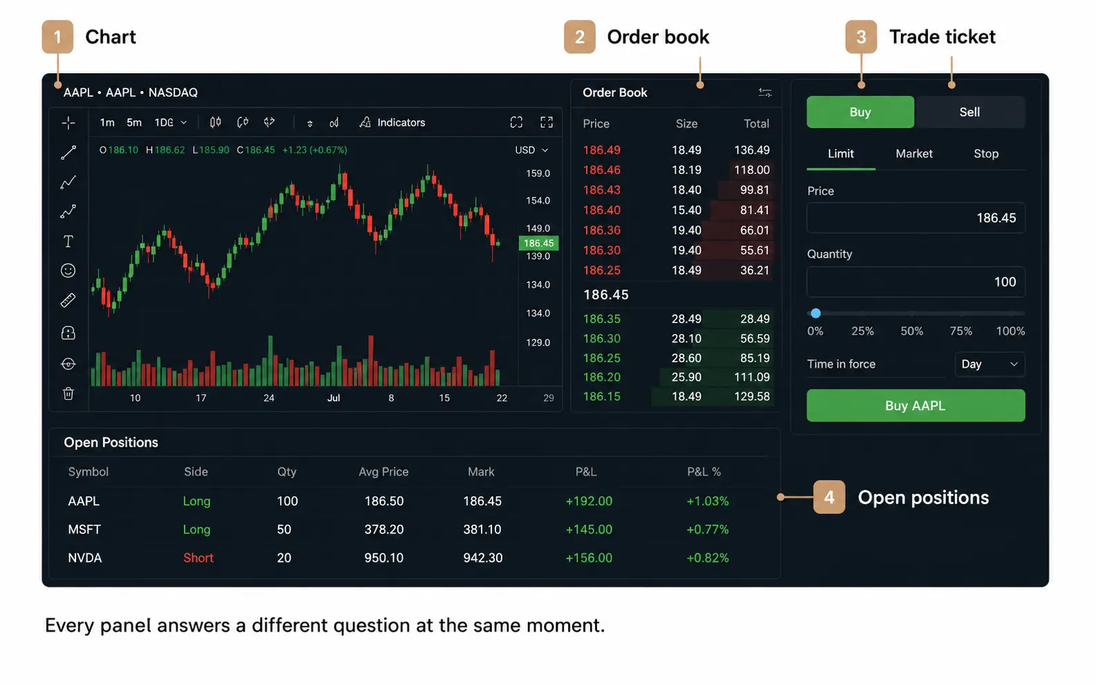
A trading screen showing a chart beside an order book, a trade ticket, and open positions is giving a user four answers to four different questions before a single order is placed.
Removing panels would make the screen look calmer and make the user remember more while navigating between views.
Density becomes a problem when elements repeat information, give secondary detail equal visual weight, or ask a beginner to process expert-level context.
The bigger issue in this audit sat downstream: after users understood the situation, the response was often not reachable from where they were standing.
Raihan’s design note:
Only 17 of 27 Visible Empty States Explained What Happens Next
The stronger empty states did not fill space with an illustration and a generic call to action.
One payment dashboard turned a blank account into setup work: create an invoice, connect checkout, send money, or create a donation link.
No history yet, but the page still had a job. Another invoice dashboard kept empty status tabs visible.
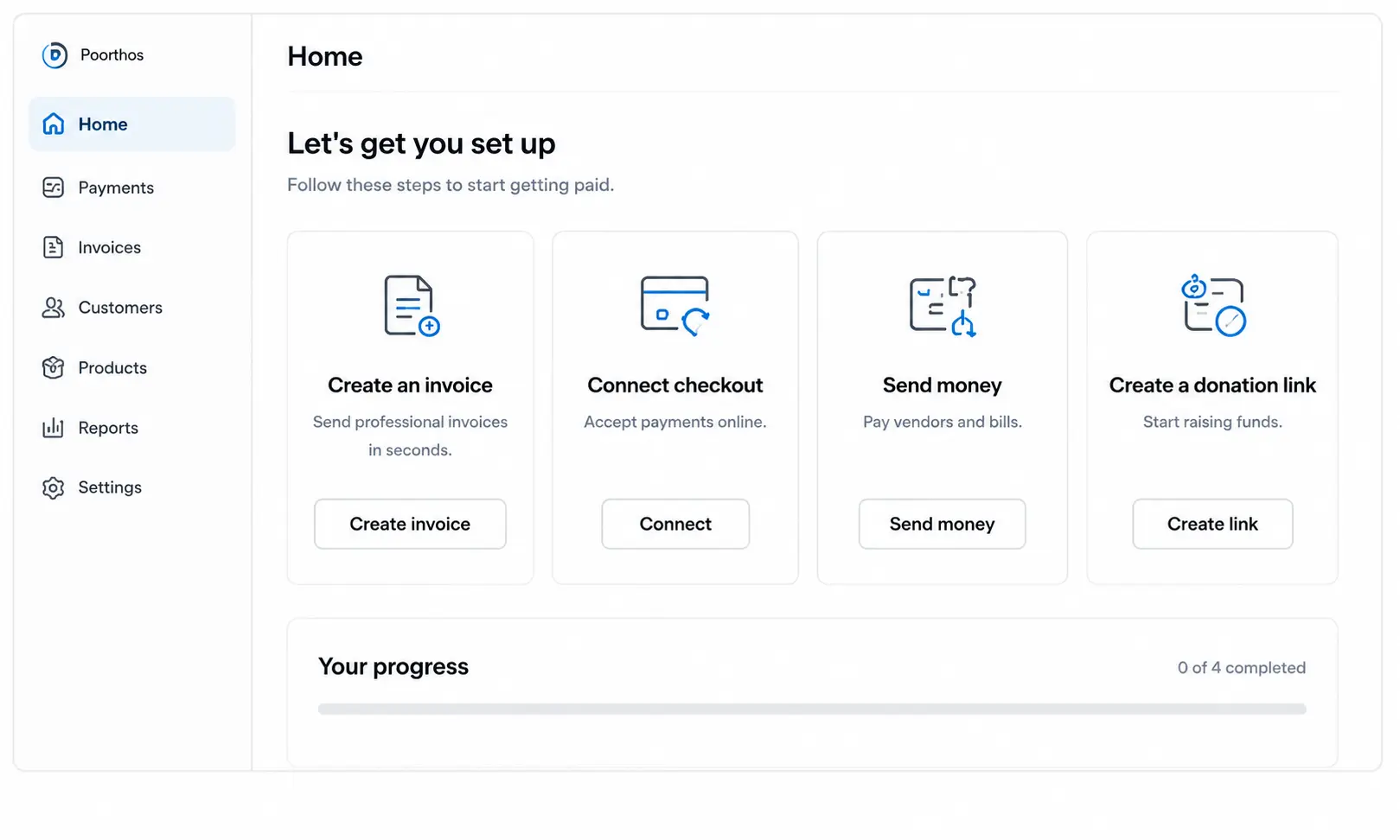
No overdue bills did not mean no interface. It showed users where overdue work would appear and what action would be available when it arrived.
Raihan’s design note:
4 of 53 Views Showed Promotional Content Competing With the User's Primary Task
44 of 53 views showed no promotional interference. 5 showed mild interference.
4 showed material interference, where commercial or upgrade content received visual priority equal to or stronger than the user's primary job.
4 of 53 is not a widespread pattern. But when it happened, the effect was consistent: the user had to determine what deserved attention before the interface had decided.
Visual prominence is a promise.
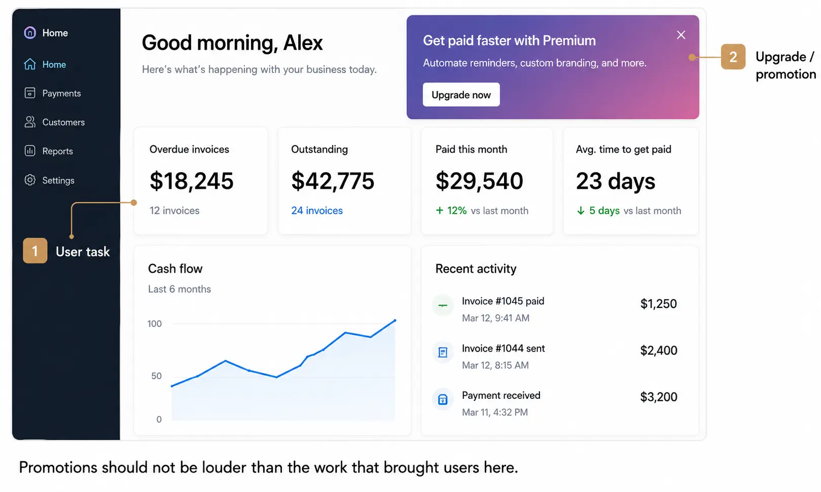
The largest number, strongest contrast, and most persistent action on a screen tell the user what the product believes deserves their attention first.
When that signal points at a commercial prompt rather than the user's active task, the promise is broken before the user has done any work.
Raihan’s design note:
What Designers Should Check Before Adding Another Component
These are structural questions, not style questions. They apply before choosing cards, charts, or tables.
1. What is the user's first uncertainty?
Value (what is this worth), capacity (what remains available), exception (what needs attention), state (where am I), or outcome (what did I produce).
The first metric should answer that question, not report a company KPI.
2. Does visual weight match the user's first job?
Remove labels and read the page by contrast, size, and position alone. The dominant element should point at the same unresolved user problem as the first metric.
In 13 of 53 reviewed views, it did not fully align.
3. Can the user follow the headline to the record behind it?
15 of 53 views left that route incomplete. A summary number without a traceable evidence path asks users to act on trust rather than understanding.
4. Is the relevant action reachable from the decision context?
31 of 53 views kept the next step in reach. 22 did not.
A user who understands the problem and then has to remember it while navigating to the resolution has already lost context.
5. Does the empty state teach the future dashboard?
Remove all data. If the product cannot explain its own job before data arrives, the populated screen is carrying more explanatory weight than the structure supports.
One Payments Screen Put the Risk Between the Summary and the Ledger.
The screen did not open with a chart. It opened with the available balance.
Below that, it showed recent movement. Before the transaction table, it placed a scheduled-payment alert.
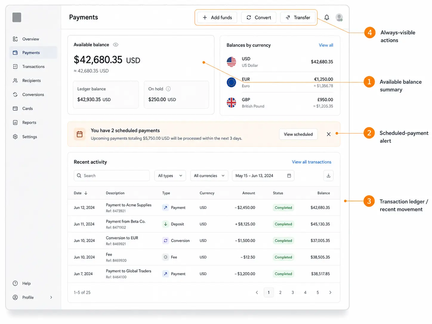
Add funds, convert, and transfer actions stayed visible in the header.
That order did the work:
1. Available balance
What is true now?
2. Scheduled payment alert
What could change next?
3. Transaction record
What explains the position?
4. Add funds / transfer
What can I do from here?
The alert sat between the balance summary and the ledger.
The screen kept current position, upcoming risk, supporting record, and response in one place.
A Dashboard Is Finished When the Next Move Is Obvious.
The audit did not find that dashboards mainly failed because of clutter. In 48 of 53 views, users could understand the situation.
Only 31 kept the next response close enough to use.
The gap appeared most often when a screen led with performance, then asked users to work out what that number meant for a decision.
Exception-led and operational views performed differently.
They named the issue, showed the record behind it, and attached a response.
That is the standard worth using.
A dashboard earns its space when it shortens the distance between “Something changed” and “Here is what I can do.”