Ofspace Research
What 50 SaaS Homepages Taught Us About Making Software Easier to Buy

July 9, 2026
July 7, 2026

What 50 SaaS Homepages Reveal About Making Complex Software Easier to Evaluate
After reviewing 50+ SaaS homepages, the clearest pages were not the sparsest. Granola opens with a meeting note worth keeping.
Formula opens with an image a brand could publish. Solidroad opens with the quality decisions a support leader needs to inspect.
Each begins by making one consequence visible before asking visitors to understand the system behind it.
A page can be easy to scan and still give buyers little to assess.
Complex software becomes easier to evaluate when the homepage decides what deserves attention first, then gives the remaining detail a reason to exist.
Complex Products Need an Entry Point
We expected the more complicated products in the sample to explain more, sooner. Granola suggests the opposite can work.
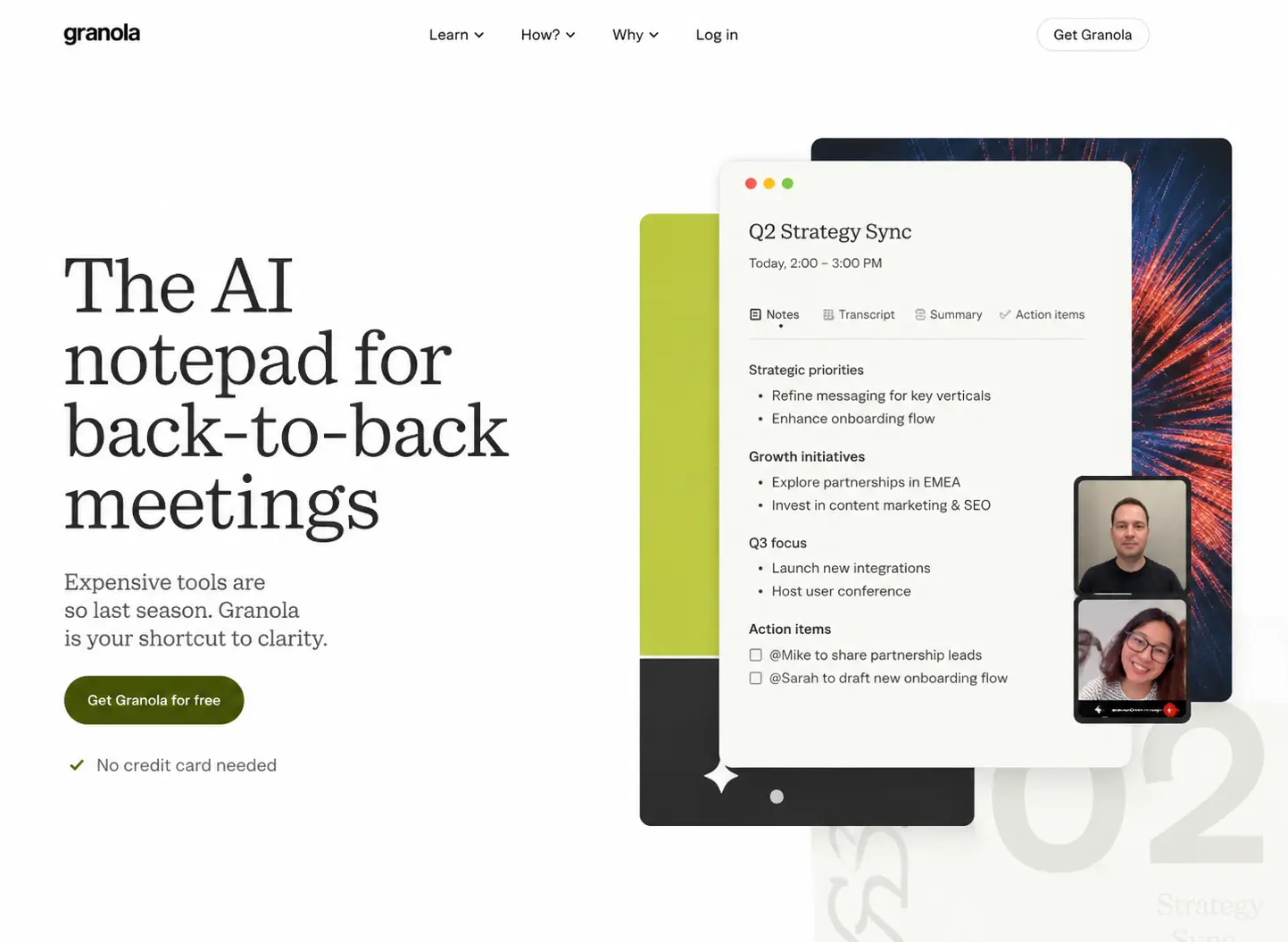
Its homepage begins with back-to-back meetings, a situation most knowledge workers recognise before they know anything about the product’s broader memory or collaboration capabilities.
That opening narrows the first task. The visitor is not asked to assess a system that captures, connects, and extends meeting knowledge.
They are asked to recognise a smaller frustration: important conversations disappear too quickly when meetings stack up.
The note view beside the headline reinforces that framing. It shows an artifact someone might want to keep, rather than a full application asking to be decoded.
Formula makes a related editorial choice by leading with an image ready for a campaign instead of its generation controls.
It is a brief supporting example, but it points to the same pattern: the page starts with a result that gives the product a place in the visitor’s existing work.
The risk is that the entry point can become the whole impression. Granola may read as a note-taking app to buyers looking for a wider knowledge system.
Formula can appear to be a narrow image tool. Neither issue is solved by adding more claims above the fold.
The later page has to widen the original story without making the opening feel incomplete.
For Granola, the meeting problem has to remain visible as the page expands. Otherwise, the visitor begins to feel they are being introduced to a different product.
The Most Persuasive Screenshot Is Usually Not a Product Tour
The screenshots carrying the argument most effectively were often incomplete.
Rather than documenting an entire interface, they framed a state of work already improved by the product.
That editing reduces the first question a visitor has to answer.
Formula is the clearest example. Its opening image gives a commerce team a finished product shot that could plausibly go into a campaign.
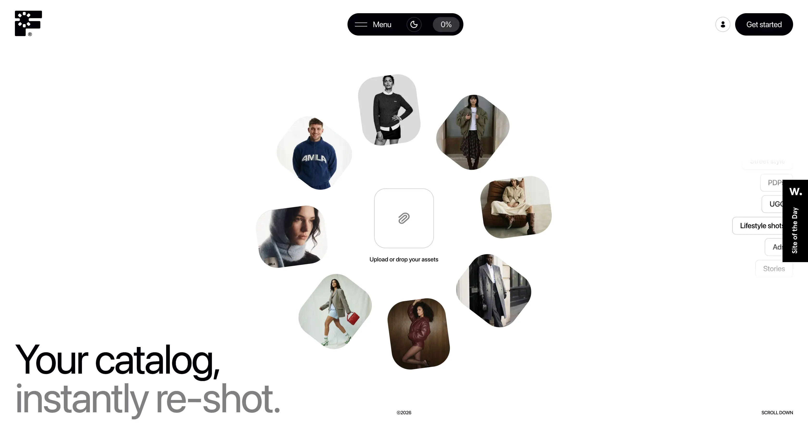
Prompts, generation settings, asset libraries, and model controls sit outside the frame.
That omission matters. Before visitors are asked to understand Formula’s process, they can ask a simpler question: would this output belong in our brand world?
If the answer is no, the underlying machinery is irrelevant. If the answer is yes, the later explanation of process has somewhere to land.
Fillout makes a quieter version of the same choice by showing a document being completed and signed instead of opening on its builder.
Understory’s calendar also works this way. It shows a business in motion, with bookings and availability visible, rather than a generic scheduling interface.
A focused crop can also conceal too much. Formula’s polished output leaves setup, review cycles, and controls offscreen. Fillout can look narrower than the platform behind it.
Used carelessly, that restraint becomes a kind of misdirection.
The opening visual earns attention by showing a result. The rest of the page still has to account for how that result is produced.
Enterprise Pages Feel Credible When You Can See What Holds the System Together
Enterprise software often borrows a familiar visual language: dark surfaces, compressed type, recognisable customer names.
Those cues can signal that a product belongs in the category.
They do not show how the product behaves when something important goes wrong.
Solidroad is more convincing because it leaves that question on the screen. Its homepage shows scored conversations, agent activity, issues requiring attention, and performance states.
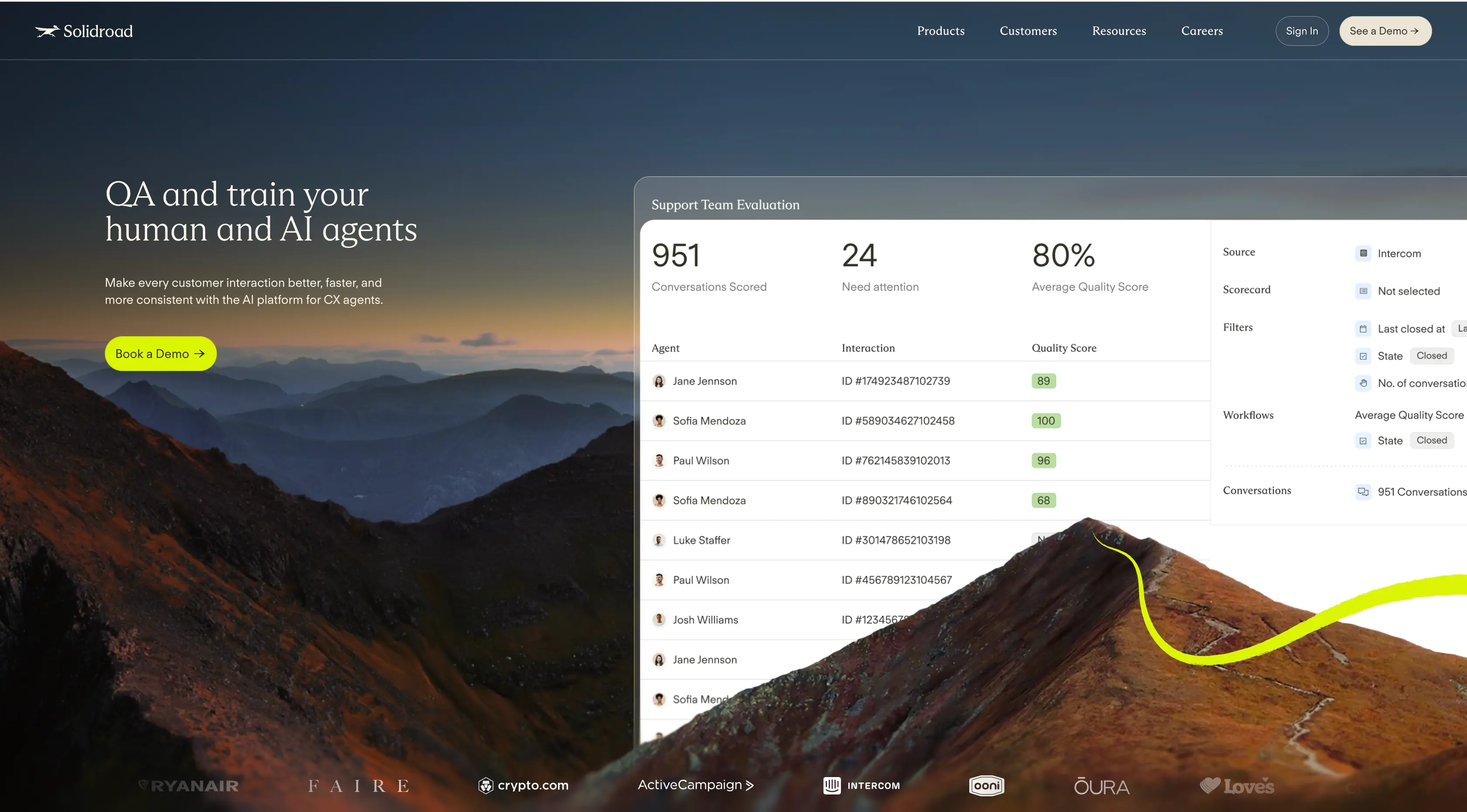
The interface is dense, but the density is doing more than signalling capability.
It suggests that quality assurance has a place to live: a poor interaction can be surfaced, reviewed, assigned, and discussed.
For a support leader, that makes the system feel less like an invisible layer of automation and more like a working environment with consequences.
Cartesia adds a different version of this evidence through model and deployment detail. Its page implies that performance depends on choices, constraints, and implementation conditions.
That is less immediately legible than Solidroad’s dashboard, but it addresses the same concern: serious software should not look like it operates by magic.
There is a real downside to putting this much operational detail on a homepage.
A first-time visitor may see a crowded interface and conclude that the product is difficult before they understand why the controls exist.
Some pages mistake visible complexity for credibility and end up showing configuration without context.
Solidroad avoids that problem because the controls are tied to a recognisable responsibility: someone still has to answer for quality.
Proof Has More Weight Once the Product Has Made a Claim
A logo strip cannot validate a claim the page has not made yet. On a cold visit, it often reads as familiar scenery: impressive names with no clear connection to the problem the product is supposed to solve.
Fun handles the sequence more carefully. It begins by locating itself in a specific world, global payments for modern fintechs, before asking the visitor to trust its scale.

The page then moves into payment rails, operational reach, and founder stories. That order gives the evidence a job.
The metrics are not there to announce that the company is substantial.
They help a fintech buyer test whether the earlier promise can hold up across the markets and infrastructure they care about.
Clarsight follows a comparable pattern. It establishes the operational stakes of travel and expense before its enterprise signals appear, so policy and programme proof read as answers rather than decorative reassurance.

Early proof still has a place. A visitor arriving through a sales conversation, partner referral, or brand search may already know the category and want immediate confirmation that serious companies use the product. In that context, a recognised customer can earn attention quickly.
But a homepage cannot borrow relevance from its customers forever. Until the reader has a proposition to test, even strong proof remains mostly background decoration.
Some Pages Make the Existing Category Harder to Accept
A homepage can make a product easier to assess by giving buyers a clearer view of what they are already settling for.
Kira does this before it explains a feature.
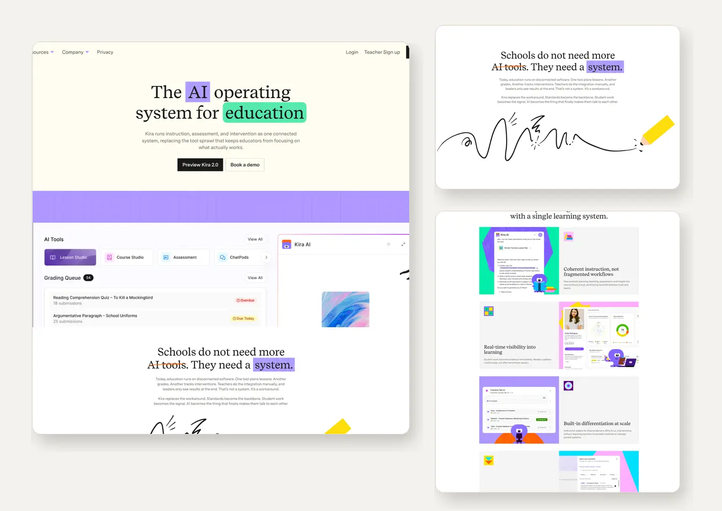
“Schools do not need more AI tools. They need a system,” turns fragmented software into the problem the page is trying to solve.
That changes the role of everything below it. Kira’s screens are no longer read as another collection of AI capabilities for teachers and administrators.
They are read as evidence that disconnected work can be coordinated: one place for visibility, workflow, and support.
The distinction matters because the page is not competing only against other education products.
It is competing against the accumulated fatigue of adding one more tool to an already crowded environment.
Framer makes a narrower version of the same argument. By placing AI inside a professional design workspace, it resists the idea that an agent must replace the designer to be useful.
The product is positioned as part of existing practice, not an alternative to it.
This can collapse into copy theatre. “Not another tool” has become a familiar claim, especially in AI software.
It carries little weight when the interface still behaves like the category it dismisses.
Kira’s argument works because the later product views continue to show coordination rather than a stack of loosely connected features.
Without that evidence, the visitor is left comparing a familiar product against a familiar product with better language.
Long Pages Fail When Every Section Demands the Same Kind of Attention
Across the pages reviewed, length itself did not seem to be the problem.
The tiring pages kept presenting every idea in the same format: a headline, a short explanation, an interface crop, then another row of cards.
After several repetitions, it becomes hard to tell which claims deserve attention.
Cartesia handles this with more discipline. It opens with a model launch and a relatively simple proposition, then moves into architecture, model capabilities, deployment choices, and technical examples.
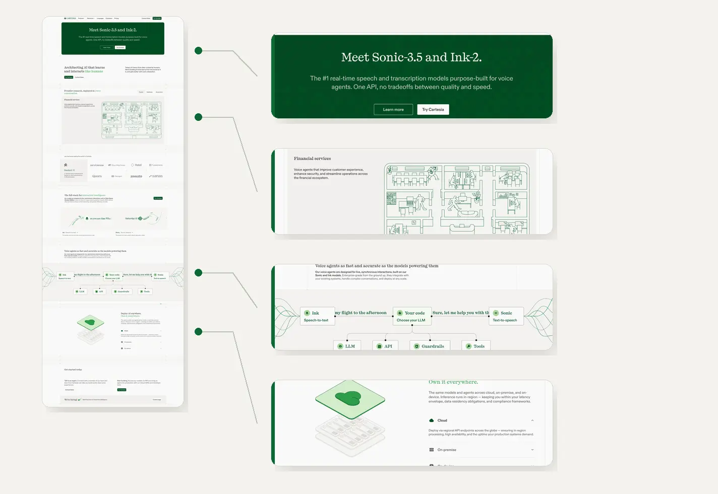
The visual language shifts with that progression.
Launch-scale typography gives way to diagrams and denser modules, which make implementation conditions visible.
A technical buyer does not need to parse deployment detail while deciding whether the category is relevant.
By the time those details appear, the page has established why latency, quality, and infrastructure choices matter.
Kira reaches for a similar effect with less technical material.
Illustration, interface fragments, and denser workflow states separate different education problems, so the page does not ask readers to process every section in the same way.
That distinction is easy to fake. Background swaps, oversized type, and cinematic transitions can give a page motion while the underlying claim remains unchanged.
Then visual variety becomes camouflage.
Cartesia works because its composition changes alongside the buyer’s concern, from “what is this?” to “could this work in our environment?”
Three Homepages Worth Studying Closely
These are not the “best” pages in the sample, and they are not ranked.
They are the three pages we returned to most often because each makes one argument in this review unusually visible.
Granola
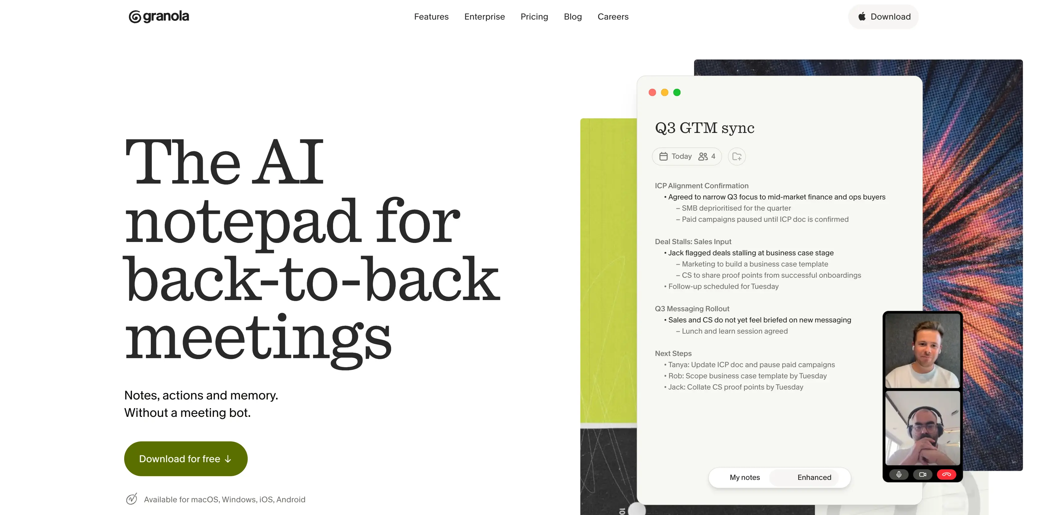
Granola shows how a complex product can begin with a small, recognisable situation. “Back-to-back meetings” gives visitors a reason to care before the page expands into meeting memory, collaboration, and knowledge retrieval.
Formula
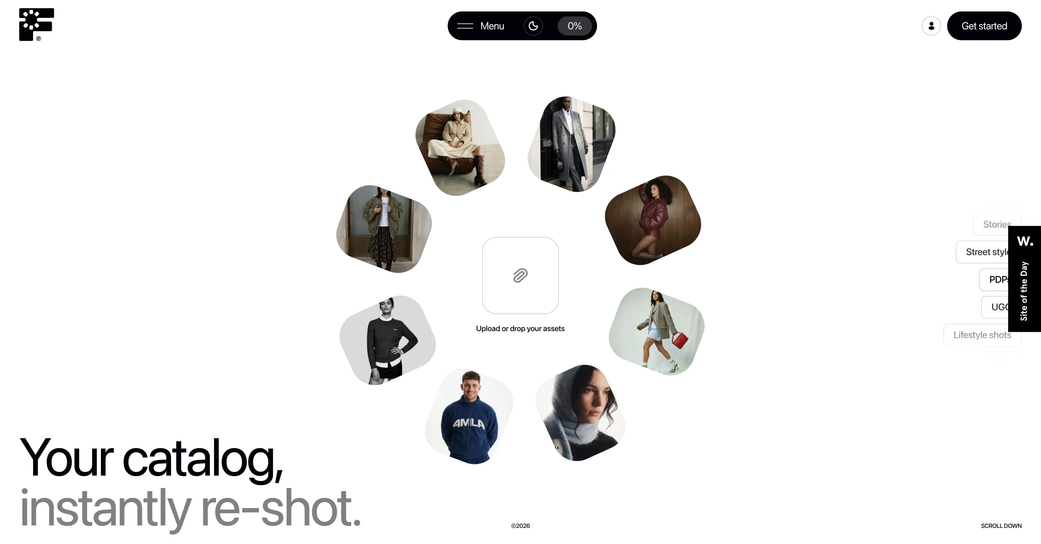
Formula shows why product visuals work better when they present an outcome, not a complete interface.
Its opening image lets a commerce team judge the result before asking them to understand prompts, controls, or generation workflows.
Solidroad
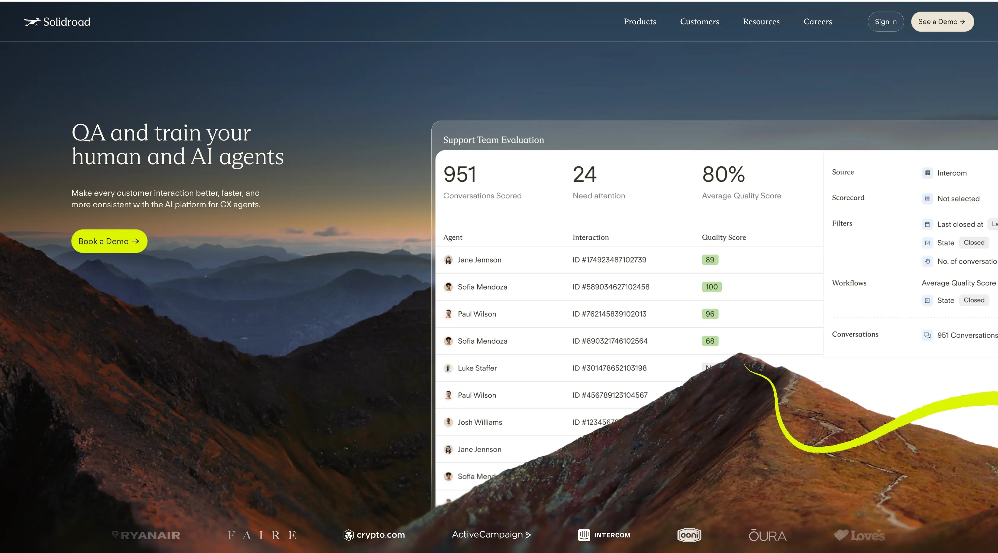
Solidroad makes enterprise complexity visible without treating it as decoration. Scores, reviews, actions, and performance states suggest that quality can be inspected and questioned, not merely automated behind the scenes.
Together, these pages are useful to study because they make different parts of the same problem visible: relevance, evidence, and accountability.
A practical note from the review
Five decisions to make before designing a SaaS homepage
During the review, we kept returning to the same decisions. They shape what the page shows before visual style takes over.
01
Give the hero one job
Start with one problem or outcome the right buyer will recognise. Do not introduce the whole platform at once.
02
Choose the screenshot for what it proves
Show a saved note, finished asset, flagged issue, or signed document. The strongest screen is rarely the most complete dashboard.
03
Put proof after the promise
Let logos, metrics, and customer stories support a claim the page has already made.
04
Show complexity when it reduces doubt
Dense product views are useful when they reveal control, review, risk, configuration, or implementation detail.
05
Change the page when the buyer’s question changes
Each major section should move the reader forward: relevance, outcome, proof, control, then rollout.