Ofspace Research
We Reviewed 40 SaaS Payment Screens. Here's What They Reveal About Business Strategy

July 9, 2026
July 9, 2026

We expected 40 payment screens to look 40 different ways. They didn't.
Card fields, expiry grouping, brand logos, nearly identical everywhere. The differences weren't visual. They were strategic.
One screen stopped us. It paid customers to avoid using a card. That's not a UX choice.
That's a company showing us its processing costs in plain sight.
Once we saw that, we couldn't unsee it elsewhere. A trust badge placed at the exact second of doubt.
A billing form that quietly reveals an enterprise sales motion.
Forty checkouts. One real question each: what is this company still afraid the buyer won't understand?
The Payment Screen Is Where Interest Becomes Commitment
We expected the hard part of payment design to be the transaction itself: card in, charge through, minimal friction.
It wasn't.
For subscription products, the harder problem is helping someone understand what they're agreeing to after the payment clears.
Most companies disclose. Few design for it.
72.5% of screens we reviewed showed some form of recurring charge or renewal date.
But disclosure and design aren't the same thing:
- Disclosure asks: did we tell them?
- Design asks: did they understand what they're agreeing to?
Most legal teams are satisfied by the first. Almost no product team should be.
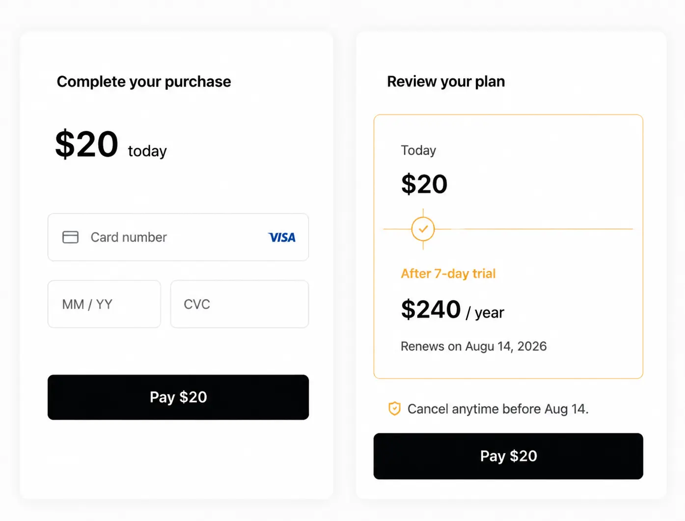
One checkout in our set broke from the norm, giving the trial-to-paid transition its own visual moment instead of burying it as a footnote near the button.
It's the exception, not the rule. That's exactly why it stood out.
The real question every subscription company is answering, whether they've discussed it or not: is our renewal date a legal requirement, or part of the actual sale?
Design takeaway:
If a future charge can change the decision, give it the same visual weight as today's charge. A disclaimer isn't transparency. A moment someone actually notices is.
Most SaaS Products Borrow Trust Before They Earn It
One of the bigger surprises: how rarely SaaS companies try to build payment trust from scratch.
Most don't. They borrow it.
Stripe. PayPal. Visa. Apple Pay. These names are trusted before the customer ever reaches checkout, so the product doesn't have to earn that trust itself.
95% of screens showed card-brand recognition near payment.
Only 32.5% included any explicit security or processing message.
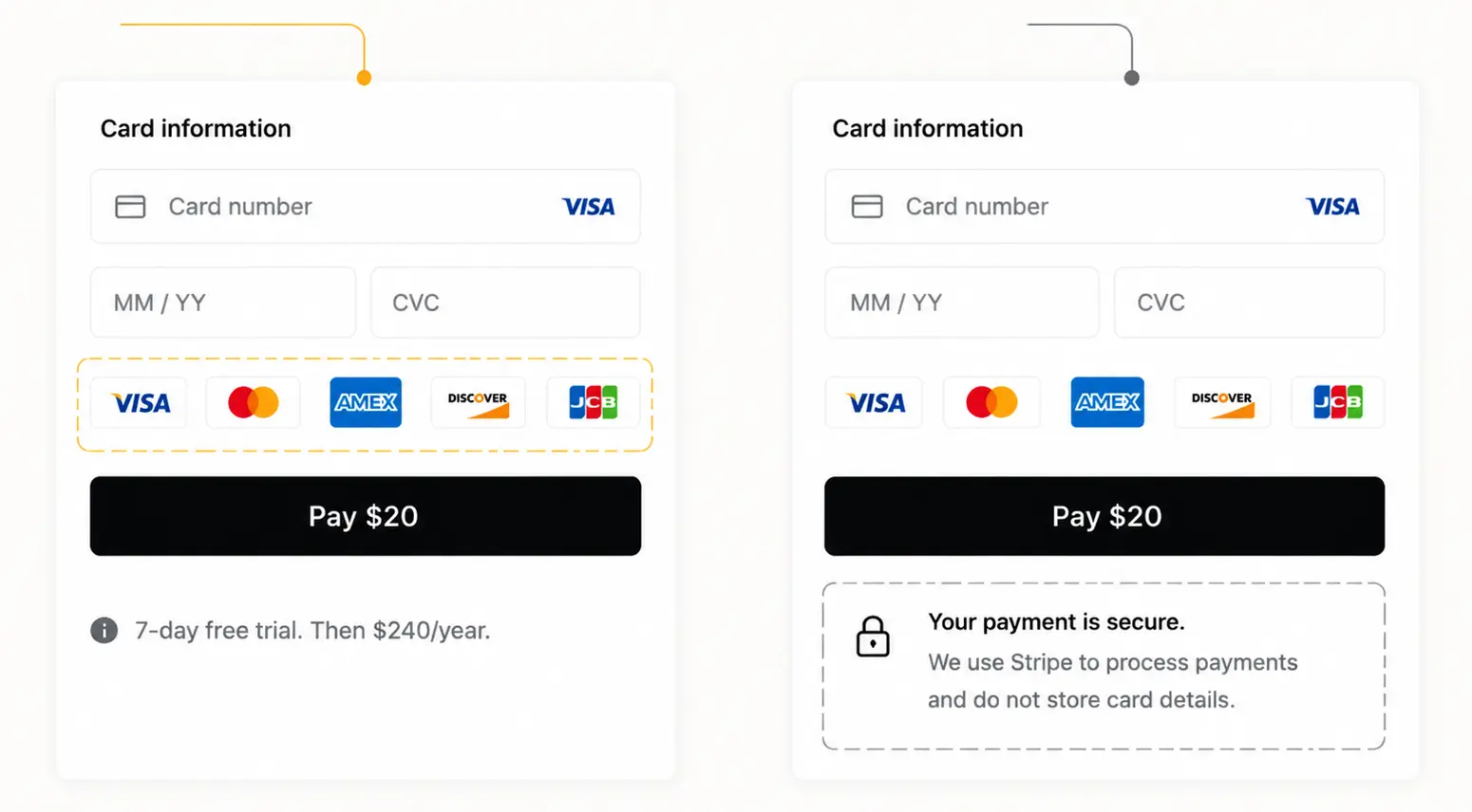
One screen in our set went further, stating outright that payments were processed securely and card details weren't stored, placed right at the moment the card field appears.
Not earlier, not in a footer. Exactly there.
We'll admit we're not fully certain what that 32.5% gap means. It could mean most companies trust a familiar logo to do the reassuring on its own.
It could also mean the companies who did write security copy were the ones still working to earn trust in the first place, not the more careful ones. The data can't tell us which.
Either way, borrowed trust has a ceiling. A Stripe badge makes the transaction feel safe. It says nothing about the company behind it.
Design takeaway:
Use trust signals to solve payment anxiety, not to substitute for product credibility. A customer can trust the transaction before they trust you.
Card-First Checkout Optimizes for Tomorrow's Payment
We expected the fastest payment method to win. Wallets skip typing, reuse an identity you've already verified elsewhere, feel almost instant.
That's not what we found. 92.5% of screens still made card payment the default.
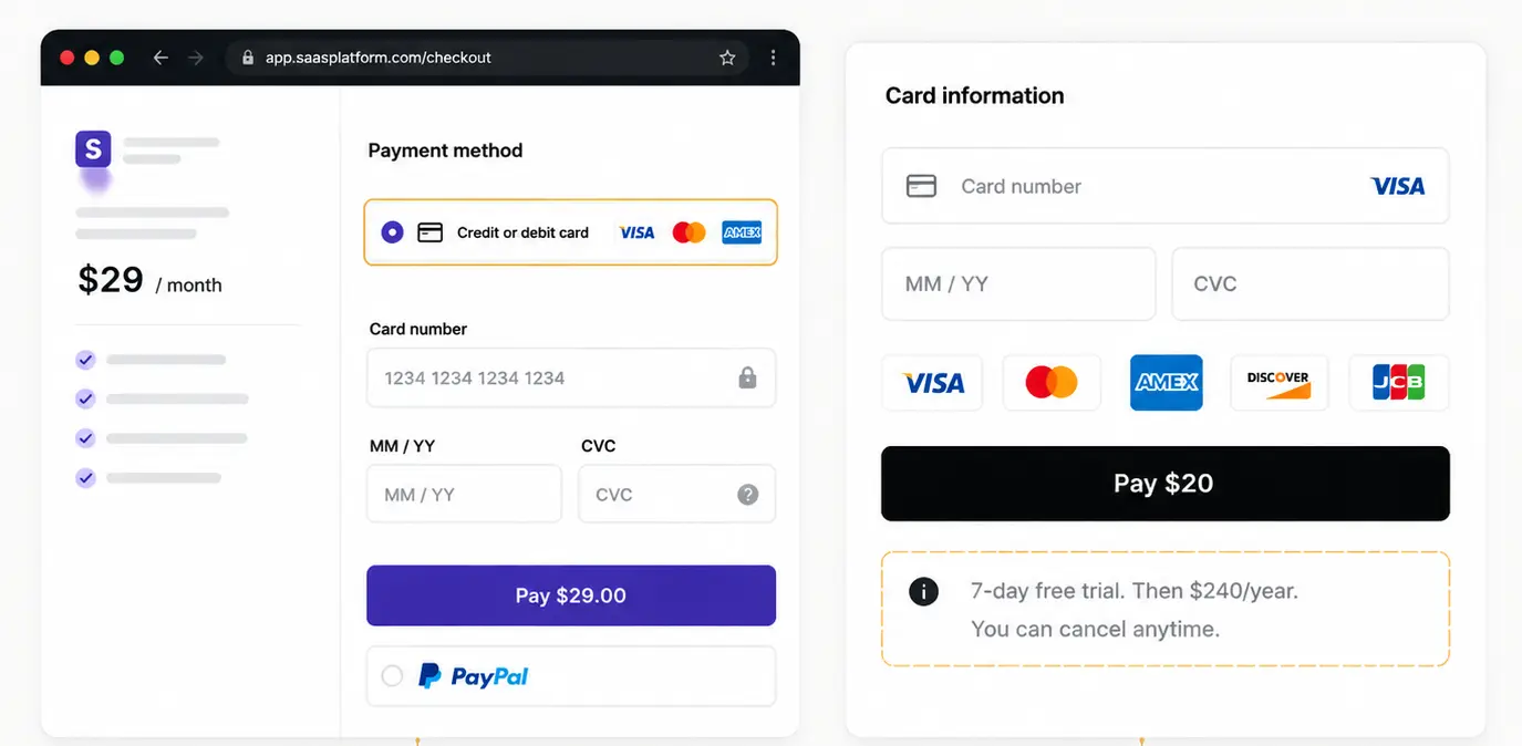
Here's the sentence that explains the whole section: the checkout isn't optimized for today's payment. It's optimized for the next twelve.
Wallets are fast at the moment of purchase.
Cards are what most subscription infrastructure is actually built around, retries on failed charges, dunning emails, plan upgrades, account continuity months later.
A company defaulting to card isn't necessarily choosing friction. It's choosing whatever its billing system already knows how to recover from.
One screen in our set made a different trade-off visible: instead of changing the payment method, it focused on making the card field itself feel more reliable, live validation as you type, rather than an error after submit. Same method, less doubt inside it.
If I were auditing this on a real project, I'd ask:
- What happens in our system when this card fails in month four?
- Have we actually tested whether our recurring billing handles wallets as well as it handles cards?
- Are we defaulting to card because it's right, or because switching would mean redoing our billing logic?
If the honest answer to that last one is "we've never checked," that's worth checking before your next redesign.
Your Billing Form Reveals Your Sales Motion
The billing fields, not the payment fields, were what changed our thinking most.
We went in watching card inputs. The real differences were sitting one field over.
One enterprise-focused product made this obvious: full company details, tax information, billing contact, the works. Not because the payment processor required it.
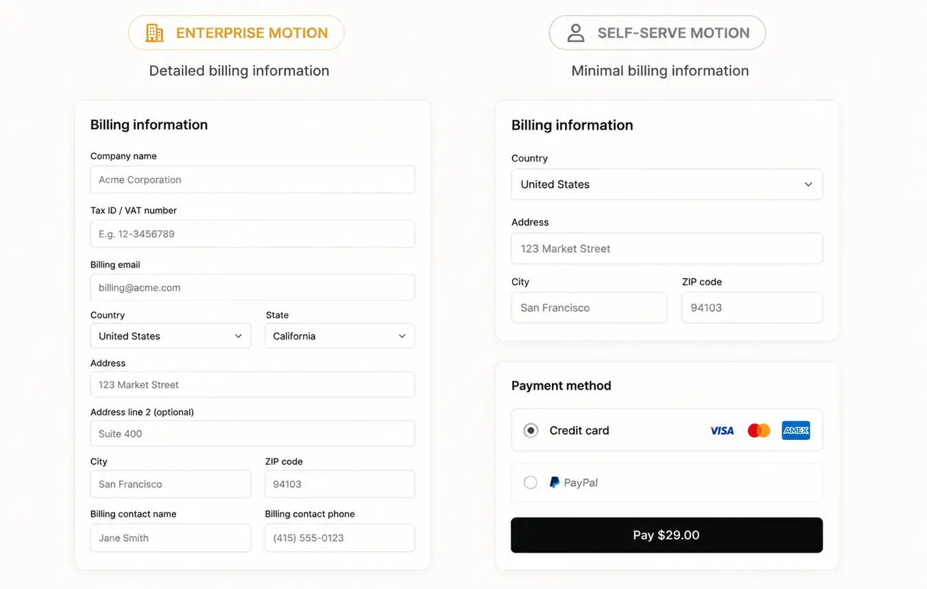
Because the business behind it runs on invoices, procurement approval, and finance teams who'll need clean records long after checkout.
Across the set, billing requirements varied far more than card fields did. Some screens asked for a country and a postal code.
Others asked for a company name and a tax ID before you'd even seen the product.
The real question isn't short form vs. long form. It's whether the form matches how the customer actually buys.
A self-serve product with an enterprise-style form adds friction before anyone's felt value.
An enterprise product with a bare-bones form is postponing a problem, not avoiding it.
Design takeaway:
Your billing form should mirror your sales motion. Every field should exist because the relationship needs it, not because the payment processor happened to include it.
Payment Options Reveal Business Priorities
Card. PayPal. Bank transfer. Wallet. It looks like a preference screen. It's not, always.
Every method on that list optimizes for something different, and rarely for the same thing:
- Cards - recurring revenue, because most billing infrastructure is built around them
- Wallets - speed, at the cost of some recurring-billing complexity
- ACH/bank transfer - lower processing fees, at the cost of a slower first payment
- PayPal - borrowed buyer confidence, at the cost of a cut of the transaction
Once you see the list this way, a payment method hierarchy stops looking like a UX decision and starts looking like a company's actual cost structure, laid out in a dropdown menu.
One screen in our set made this unusually explicit: it gave customers a real incentive to choose bank payment over card. Not a UX nudge.
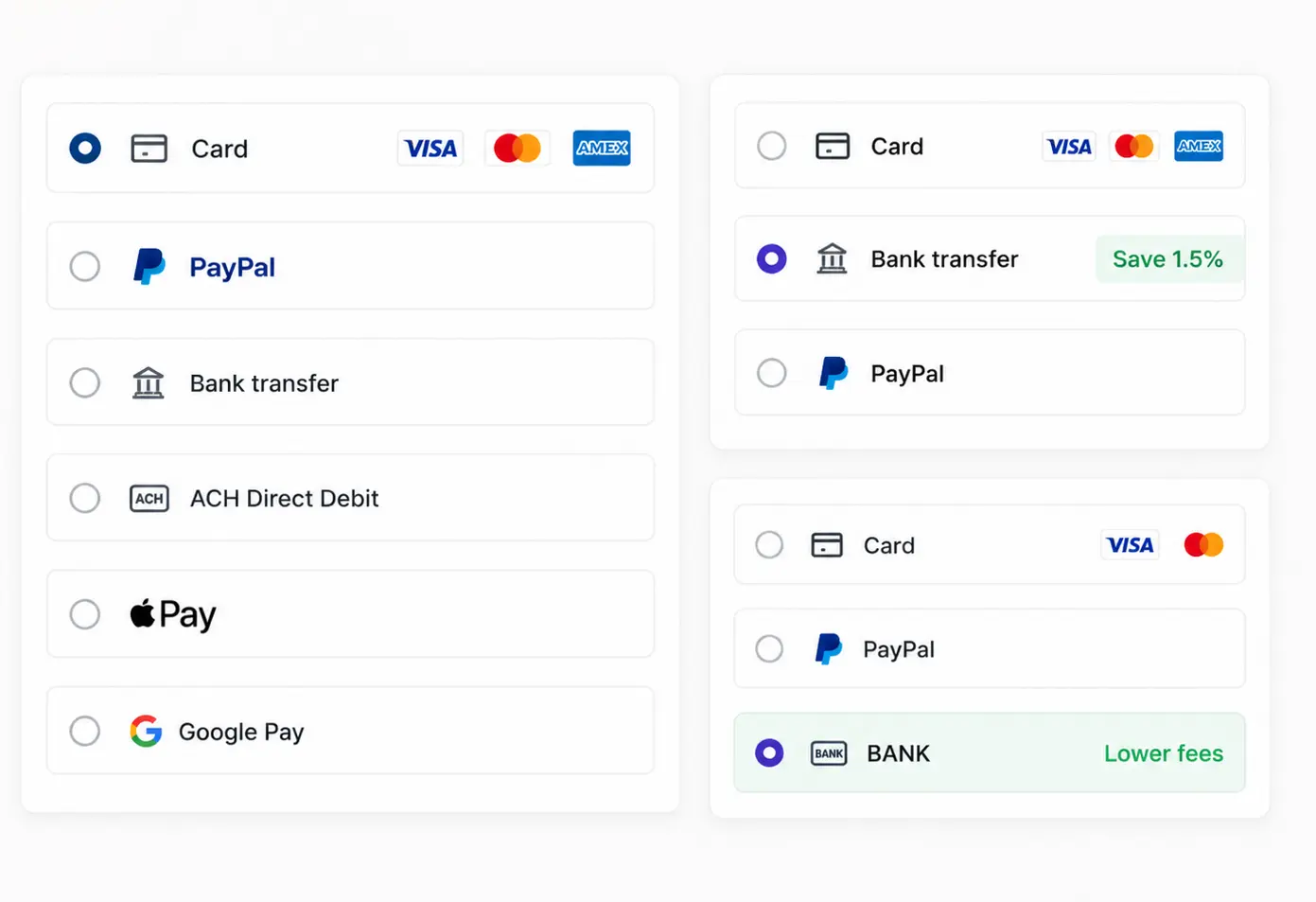
A number attached to a choice. That's a company telling you, in plain sight, which method costs it less to process.
42.5% of screens offered multiple methods. Bank/ACH showed up in 17.5%, PayPal in 20%.
More options isn't the same as more freedom. The real question is whether the checkout stays neutral, or quietly steers you toward whichever option is cheaper for them.
If I were redesigning this tomorrow, I'd ask:
- What does each payment method actually cost us to process?
- Are we willing to say that out loud to the customer, or are we hiding it and hoping no one asks?
- If one method benefits us more, are we incentivizing it honestly, or just defaulting to it and calling that neutral?
This is exactly the kind of trade-off we see teams miss during checkout redesigns: they optimize the payment method list for what's easiest to build, without ever asking what it's quietly costing them in fees.
Every Checkout Chooses One Uncertainty to Solve
After enough screens, we stopped asking which checkout looked simplest.
The better question: what uncertainty is this company actually trying to solve?
A buyer can hesitate for different reasons:
- Will I be charged later?
- Is my payment info safe?
- Did I enter this correctly?
- Am I paying the right way?
Almost no product solves all four at once. Each one we reviewed picked its battle: one made renewal timing impossible to miss.
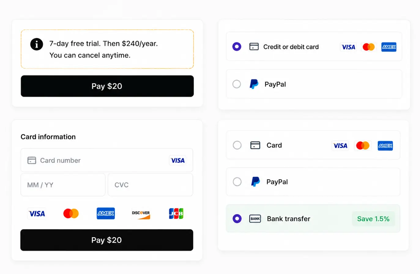
Another borrowed trust from a familiar processor. Another gave live feedback while you typed your card. Another nudged you toward a cheaper payment method.
Different fixes, same underlying move: every checkout decides which doubt gets addressed, and which ones get left for the customer to carry alone.
More explaining isn't free. Every reassurance competes for attention with the button you actually want clicked.
The best checkouts don't answer everything. They find the one question most likely to stop their customer, and build around that.
Design takeaway:
Don't start with "how do we shorten this." Start with "what's the one doubt that could stop this customer from paying." Let that answer shape the page.
What 40 SaaS Payment Screens Changed Our Minds About
We started out expecting this to be a study of interaction design. Layouts, fields, buttons, components.
That's not what 40 checkouts gave us.
The differences that actually mattered were never on the surface.
A renewal note, a trust badge, an extra billing field, a nudge toward one payment method over another, these read as small choices.
They're not. Each one is a company quietly telling you what it's still worried the customer won't understand or accept.
None of this is about finding the "right" checkout. A subscription tool worried about renewal confusion needs a different page than an enterprise platform worried about billing accuracy.
Both can be well designed. They're just solving different problems.
If there's one shift worth taking from this: stop treating your checkout as the last step of a sale.
Start treating it as the first sentence of the relationship that comes after.
Here's what we'd actually check, on our own work or anyone else's:
Five Principles From Reviewing 40 SaaS Payment Screens
1. Design commitment, not disclosure.
Telling someone isn't the same as making sure they understood.
2. Borrow trust on purpose.
A familiar logo solves payment anxiety. It's not a substitute for earning trust in your product.
3. Design for the next twelve payments, not the first one.
The checkout that looks simplest today isn't always the one that holds up over a subscription's lifetime.
4. Match checkout complexity to sales complexity.
A self-serve product with an enterprise form is friction. An enterprise product with a bare form is a problem you're postponing.
5. Pick one uncertainty and solve it well.
Not all four. The customer's specific doubt, addressed clearly, beats a page that tries to reassure everyone about everything.
You won't get all five right on the first pass. Most checkouts we reviewed didn't.
But knowing which question you're actually answering, and which ones you've left for the customer to carry alone, is the difference between a checkout that happened by default and one that was designed on purpose.