Design
Dashboard Design Examples To Get Inspiration (from Good & Bad)

January 1, 2026
March 18, 2025

Your startup lives or dies by how quickly you make the right decisions.
And that decision-making depends on your dashboard.
Startups need clear, real-time data to make fast, smart decisions.
A great dashboard should:
- Show key metrics instantly
- Provide real-time data
- Be simple & clutter-free
- Be intuitive & easy to use
- Scale with your startup
At Ofspace, we’ve been designing dashboards for startups and SMEs for over 5 years.
Our project, Wokka, proves that clear, structured data leads to smarter decisions and faster growth.
Let’s break down real dashboard design examples, what makes a good dashboard vs. a bad one, and how to build one that helps you scale.
The Best Dashboard Design Examples for Startups (Types)
First, let's learn about the types of dashboards. There are 3 main types of dashboards:
Key Features
- Operational (Track real-time KPIs for marketing, sales, and support teams).
- Strategic (Provide big-picture insights for founders and investors).
- Analytical (Use historical data for trends & forecasting).
Every startup needs a dashboard that fits its business model.
The right one will help you track growth, measure efficiency, and stay ahead of risks.
1. Business Intelligence Dashboard (For Growth Metrics & KPIs)
BI dashboards consolidate key financial and performance metrics in one place.
.webp)
Key Features
- Monthly Recurring Revenue (MRR) & revenue growth rate.
- Customer Acquisition Cost (CAC) vs. Lifetime Value (LTV).
- Burn rate & cash flow—so you know when to raise more capital.
2. SaaS Dashboard (For Subscription Startups)
For SaaS founders, a dashboard should track retention, churn, and expansion revenue.
.webp)
Key Features
- Churn rate—how many users leave vs. stay.
- Activation rate—are new users seeing value fast?
- Revenue per user (ARPU)—are customers upgrading or downgrading?
3. E-commerce Dashboard (For Sales & Customer Insights)
E-commerce founders need real-time tracking of revenue, inventory, and customer behavior.
.webp)
Key Features
- Sales performance by product & category.
- Cart abandonment rate & lost revenue.
- Marketing ROI—what’s actually driving sales?
4. Project Management Dashboard (For Startup Teams & Workflows)
Fast-growing startups need alignment across teams, projects, and goals.
.webp)
Key Features
- Task completion rate & overdue assignments.
- Team performance tracking.
- Project timelines & upcoming deadlines.
5. Marketing Dashboard (For Growth & Customer Acquisition)
Your marketing spend should be ROI-driven, not guesswork.
.webp)
Key Features
- Cost per acquisition (CPA) & return on ad spend (ROAS).
- Performance by channel (Google Ads, Facebook, LinkedIn, etc.).
- Lead-to-customer conversion rates.
6. Sales Performance Dashboard (Track Revenue & Growth)
A sales dashboard provides a real-time overview of revenue, new customer acquisition, and sales performance.
.webp)
Key Features
- Revenue tracking – Monitor sales in real-time.
- Customer acquisition – Track new and returning customers.
- Sales growth trends – Identify opportunities for improvement.
7. Email Marketing Dashboard (Optimize Campaign Performance)
Email marketing dashboards track engagement, conversions, and campaign ROI.
.webp)
Key Features
- Open & click-through rates – Measure email engagement.
- Conversion tracking – See how emails drive sales.
- Bounce rates – Identify issues with email delivery.
8. Customer Satisfaction Dashboard (Measure Customer Experience & Loyalty)
A customer satisfaction dashboard turns feedback into actionable insights, helping businesses improve the customer experience.
.webp)
Key Features
- Net Promoter Score (NPS) – Track customer loyalty.
- Customer Satisfaction Score (CSAT) – Measure overall happiness levels.
- Feedback trends – Identify common customer concerns.
9. Web Performance Dashboard (Analyze Website & User Behavior)
A web performance dashboard helps teams optimize website traffic, engagement, and conversion rates.
.webp)
Key Features
- Traffic sources – Understand where visitors come from.
- Bounce rates – Identify high-exit pages.
- Conversion metrics – Optimize lead generation.
10. Logistics Dashboard (Optimize Supply Chain & Deliveries)
A logistics dashboard helps businesses manage shipping times, costs, and inventory levels for seamless supply chain operations.
.webp)
Key Features
- Delivery performance tracking – Measure on-time shipments.
- Cost analysis – Optimize transportation expenses.
- Inventory management – Prevent stock shortages.

Good Dashboard Examples (With Screenshots & Best Practices)
A well-designed dashboard makes it easy to track important metrics, make decisions, and improve efficiency.
The best dashboards are simple, clean, and focused on data without unnecessary distractions.
1️. HubSpot Dashboard
Good Dashboard Example- HubSpot. HubSpot’s dashboard is a perfect example of clarity and efficiency in marketing and sales analytics.
.webp)
- Simple layout ensures quick access to key business metrics.
- Customizable reports allow users to track what matters most.
- Data visualization makes performance trends easy to understand.
With this dashboard, businesses can monitor leads, conversion rates, and customer interactions in one place, helping them optimize sales and marketing strategies.
2️. AI Robotic and Ventures Dashboard
Good Dashboard Example– AI Robotic and Ventures. This AI-driven business dashboard is designed to track performance metrics in real-time while keeping the interface sleek and modern.
.webp)
- Minimalist design keeps the interface uncluttered.
- Bright, subtle colors improve readability.
- Balanced graphs & charts display key insights without overwhelming users.
With this dashboard, AI Robotic and Ventures monitor AI-powered business operations efficiently.
Read more about The 12 Most Inspirational User Interface Examples in 2025
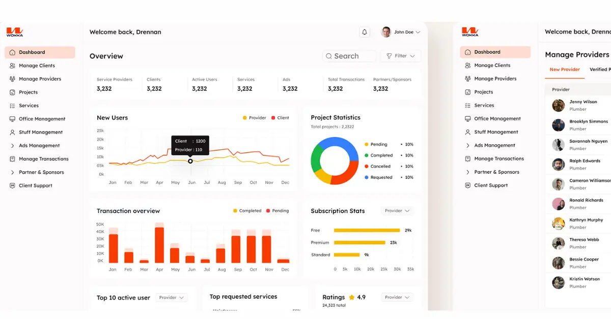
3️. Wokka Dashboard
Good Dashboard Example– Wokka. Built for an on-demand service platform, this dashboard ensures seamless task and service management.
.webp)
- User-friendly UI allows quick task assignment and tracking.
- Real-time monitoring improves service efficiency.
- Clear typography & color coding make key data easy to find.
This dashboard helps Wokka connect service providers with customers effortlessly, ensuring smooth day-to-day operations.
4️. Simple Pin Dashboard
Good Dashboard Example–Simple Pin. A well-structured financial dashboard that simplifies transaction tracking and payment insights.
.webp)
- Organized financial data keeps everything clear and structured.
- Neutral, professional color scheme avoids distractions.
- Intuitive graphs & reports allow quick financial decision-making.
With this dashboard, Simple Pin helps businesses manage finances with ease and confidence.
More read about 15 Inspiring Product Design Examples for Startups in 2025
5️. BraidPay Dashboard
Good Dashboard design Example– BraidPay. A clean and intuitive payment management dashboard, designed for seamless financial tracking.
.webp)
- Simple navigation allows quick access to reports.
- Real-time transaction tracking ensures accuracy.
- Minimal distractions focus attention on critical financial data.
This dashboard helps businesses monitor cash flow effortlessly while ensuring transparency and control.
Bad Dashboard Design Examples (Common Mistakes to Avoid)
A bad dashboard slows decisions, confuses users, and creates frustration.
Below are 5 real-world examples of dashboard mistakes, along with how they were fixed.
.webp)
Bad Dashboard Design Example 1- Overcrowded Dashboards
The old Google Analytics dashboard had too much information in one place, making it hard to find key insights. Users had to search for important data, slowing down decisions.
.webp)
Mistakes
- Too many charts and numbers on one screen.
- No clear structure, making it overwhelming.
- Hard to find key metrics quickly.
How to Fix It
- Simplify the layout with a clear structure.
- Focus on key metrics, removing unnecessary data.
- Group similar information to make navigation easier.
More read about 11 Bad UX Design Examples That Teach Us How Not to Do UX.
Bad Dashboard Design Example 2 – Poor Data Visualization
The old Facebook Ads Manager dashboard used confusing charts, making it hard to analyze campaign performance.
.webp)
Mistakes
- Pie charts for time-based trends (ineffective).
- Too many different chart types, making comparisons difficult.
- No clear focus on key performance metrics.
How to Fix It
- Use line charts for trends and bar charts for comparisons.
- Keep visuals consistent and easy to read.
- Highlight important insights clearly.
Read more about 10 Bad UI Examples That Hurt UX (and How to Fix Them)
Bad Dashboard Design Example 3- Data Without Meaning
Apple’s Screen Time Dashboard shows daily and weekly reports, but without comparisons or trends, the data lacks meaning.
.webp)
Mistakes
- No past data comparisons to show progress.
- No benchmarks to define "good" or "bad" usage.
- No insights on improving screen habits.
How to Fix It
- Show trends over time to track progress.
- Add benchmarks to compare performance.
- Include goal-setting features to encourage improvement.
Bad Dashboard Design Example 4- Poor Use of Colors
The old Yahoo Finance dashboard relied heavily on red and green, making it hard to interpret trends, especially for colorblind users.
.webp)
Mistakes
- Overuse of red and green made differences unclear.
- No alternative indicators (like labels or arrows).
- Poor contrast, making numbers hard to read.
How to Fix It
- Use high-contrast colors for better readability.
- Add labels, bold text, or icons for clarity.
- Ensure colorblind-friendly design with alternative indicators.
Bad Dashboard Example 5- Confusing Navigation
PriyoPay’s original dashboard was difficult to navigate, making it hard for users to complete transactions efficiently.
.webp)
Mistakes
- No clear menu, making it hard to find features.
- Key actions like payments and transaction history were hidden.
- No onboarding, making it confusing for new users.
How it was fixed
The Ofspace team redesigned the dashboard with a cleaner layout and clear navigation.
- Key financial tools were reorganized for easy access.
- A guided onboarding process was added to help new users.
See the transformation
Why is a Business Dashboard Design Important?
Advantages of Beautiful Dashboard Design turns data into actionable insights, helping businesses make faster, smarter decisions.
Here’s why it matters:
1. Instant Clarity
No more guessing—see real-time data, track growth, and spot opportunities at a glance.
2. Smarter Decisions
Make fast, data-driven choices that help you scale faster and stay ahead of the competition.
3. Real-Time Control
Stay on top of key metrics, react instantly, and solve problems before they slow you down.
4. Stronger Team Alignment
Keep everyone on the same page with a shared dashboard that makes teamwork effortless.
5. Future-Proof Growth
Predict trends, minimize risks, and make confident decisions that drive long-term success.
Get The Best Dashboard Design With OFSPACE
At Ofspace Digital Agency, we bring expert design and strategic thinking to every project.
Our team has successfully delivered:
- 200+ Completed Projects
- 100+ Startup Partnerships
Dashboard development often appears at our work as a part of UI/UX design.
If you are thinking about a reliable and stunning dashboard for your business.
Our team at Ofspace specializes in designing custom dashboards that drive results. Let's discuss your project!